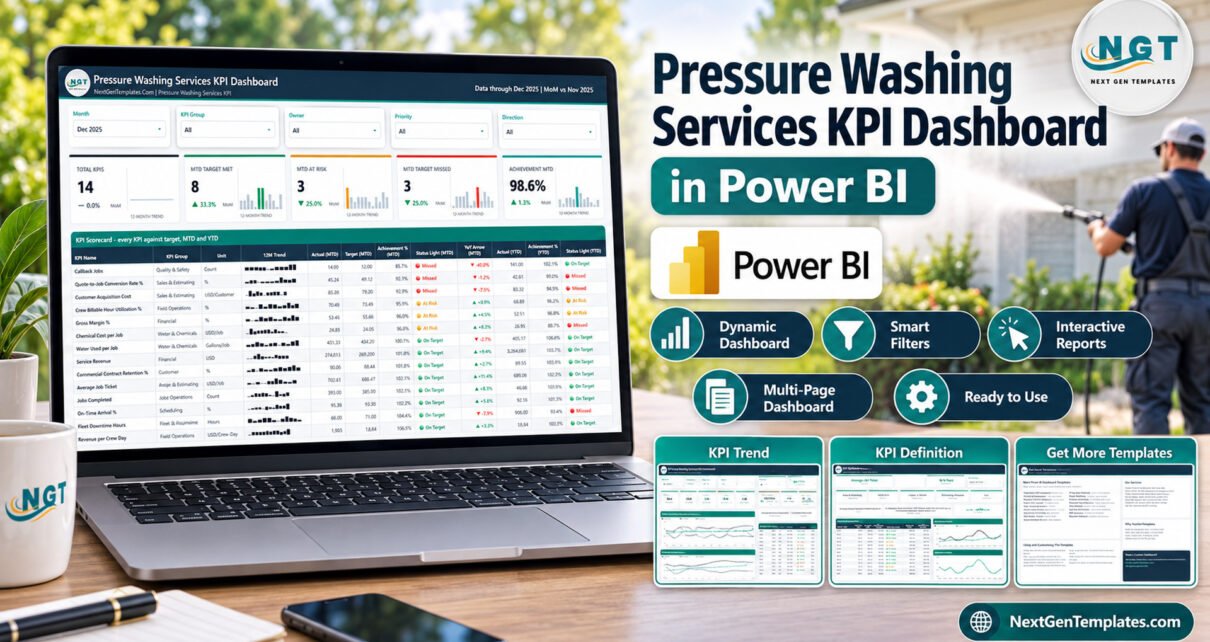
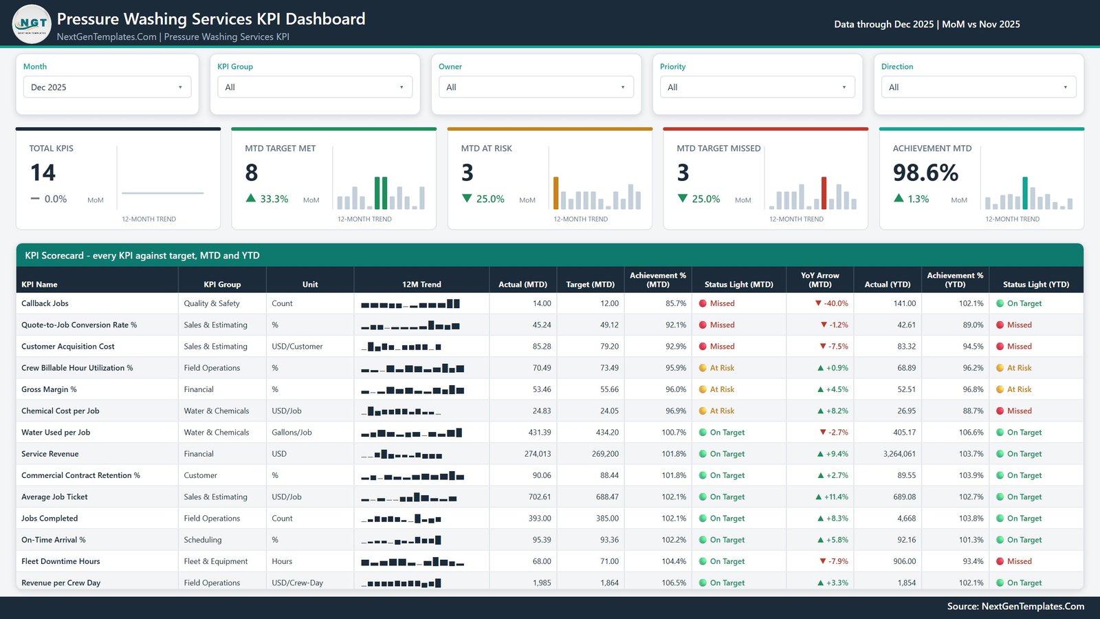
The Pressure Washing Services KPI Dashboard in Power BI gives a pressure washing or soft washing company one monthly scorecard for 14 KPIs in 8 groups, with MTD and YTD traffic lights, a 12-month sparkline per KPI and a month picker, across 4 report pages. Its sample data runs to December 2025 and shows 8 KPIs On Target, 3 At Risk and 3 Missed, at 98.6% achievement MTD.
Exterior cleaning companies make money on small residential tickets and large commercial contracts at the same time. A $280 driveway wash, a $640 house soft wash and a recurring restaurant flatwork route all need crews, water, chemicals and working rigs. The numbers that decide profit sit in different places: revenue and margin with the owner, estimates and conversion with sales, crew days and arrival windows with dispatch, callbacks with the quality lead, and downtime with whoever looks after the trailers. This template scores all of them the same way on one page, so the monthly review starts with what is off track.
It belongs to our Power BI KPI Dashboard family: a month-picker KPI scorecard with traffic lights plus KPI Trend and KPI Definition pages. It is not an analytical dashboard with transaction-level charts. Separate Excel and Google Sheets KPI editions of this topic are in preparation.
Key Features of the Pressure Washing Services KPI Dashboard
- 14 pressure washing KPIs in 8 groups. Financial (2), Sales & Estimating (3), Field Operations (3), Scheduling (1), Quality & Safety (1), Water & Chemicals (2), Fleet & Equipment (1) and Customer (1), each with a unit, formula, definition, owner and priority.
- Month picker plus four more slicers. Month, KPI Group, Owner, Priority and Direction filter the whole scorecard page.
- Direction-aware achievement. Nine KPIs are higher-is-better and score Actual ÷ Target. Five are lower-is-better and score Target ÷ Actual, so a Chemical Cost per Job figure below target scores above 100%.
- Consistent traffic lights. On Target means 100% or more, At Risk means 95% to 100%, and Missed means below 95%, for both MTD and YTD.
- Prior-year comparison built in. Data.xlsx carries actuals for 2024 and 2025, so the YoY arrow and the PY lines on the trend charts read from real rows.
- No hard-coded KPIs. Rename, add or remove KPIs in the input sheets and press Refresh; counts, lists and charts follow.
Dashboard Pages Explanation
Page 1: KPI Scorecard
Five header cards show Total KPIs, MTD Target Met, MTD At Risk, MTD Target Missed and Achievement MTD, each with a month-on-month change and a 12-month trend. Below them the scorecard lists every KPI with KPI Group, Unit, 12M Trend, Actual and Target (MTD), Achievement % (MTD), Status Light (MTD), YoY Arrow (MTD), Actual (YTD), Achievement % (YTD) and Status Light (YTD). Rows run from the weakest to the strongest MTD achievement, so problems sit at the top. The screenshot above shows this page for December 2025.
Page 2: KPI Trend
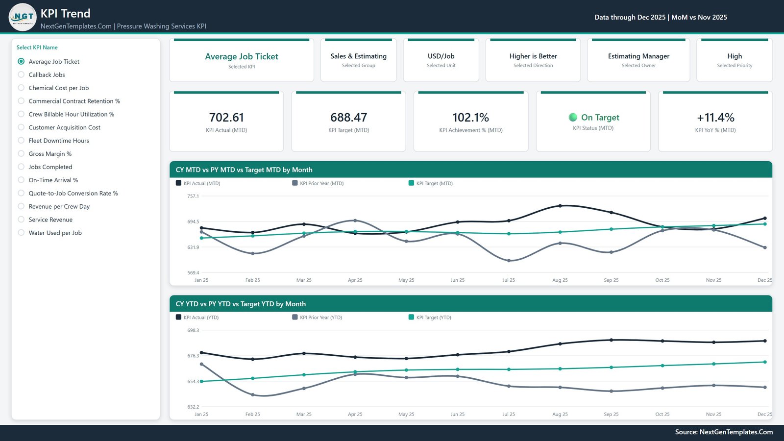
Select a KPI from the list on the left. Context cards show the selected group, unit, direction, owner and priority, and value cards show KPI Actual, Target, Achievement %, Status and YoY % for the month. Two line charts compare CY MTD vs PY MTD vs Target MTD by Month and CY YTD vs PY YTD vs Target YTD by Month. For Average Job Ticket the December card reads 702.61 against a 688.47 target, On Target at 102.1% and +11.4% on the prior year.
Page 3: KPI Definition
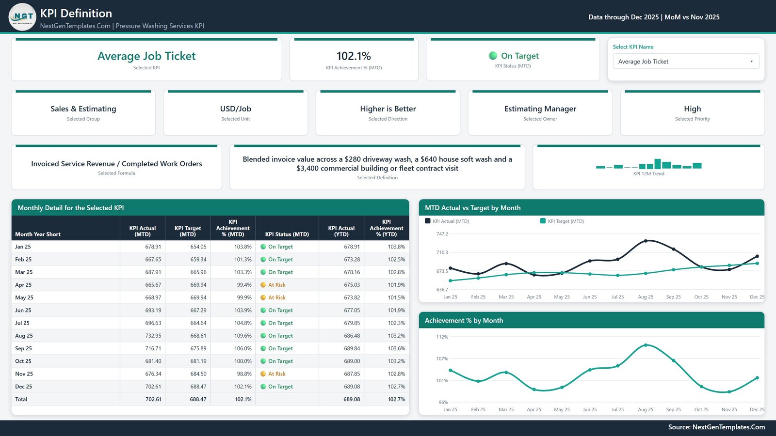
A KPI dropdown shows the chosen KPI’s formula, definition and 12-month trend. A Monthly Detail for the Selected KPI table lists Actual, Target, Achievement % and Status by month for MTD, plus Actual and Achievement % for YTD. Charts show MTD Actual vs Target by Month and Achievement % by Month, so a team can see exactly which months pulled a KPI into At Risk.
Page 4: Get More Templates
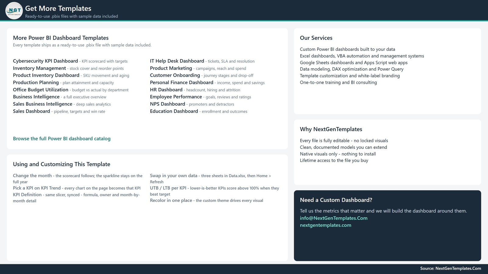
A support page with usage tips (change the month, pick a KPI, swap in your data, recolour the theme) and a list of more Power BI templates and services.
The 14 KPIs
| KPI Group | KPI | Unit | Direction |
|---|---|---|---|
| Financial | Service Revenue | USD | Higher is better |
| Financial | Gross Margin % | % | Higher is better |
| Sales & Estimating | Average Job Ticket | USD/Job | Higher is better |
| Sales & Estimating | Quote-to-Job Conversion Rate % | % | Higher is better |
| Sales & Estimating | Customer Acquisition Cost | USD/Customer | Lower is better |
| Field Operations | Jobs Completed | Count | Higher is better |
| Field Operations | Revenue per Crew Day | USD/Crew-Day | Higher is better |
| Field Operations | Crew Billable Hour Utilization % | % | Higher is better |
| Scheduling | On-Time Arrival % | % | Higher is better |
| Quality & Safety | Callback Jobs | Count | Lower is better |
| Water & Chemicals | Water Used per Job | Gallons/Job | Lower is better |
| Water & Chemicals | Chemical Cost per Job | USD/Job | Lower is better |
| Fleet & Equipment | Fleet Downtime Hours | Hours | Lower is better |
| Customer | Commercial Contract Retention % | % | Higher is better |
Power BI KPI Scorecard vs. Tableau / Qlik vs. Field Service SaaS: Feature Comparison
| Feature | This Power BI template | Tableau / Qlik build | Field service SaaS (e.g. Jobber, Housecall Pro) |
|---|---|---|---|
| Cost | ✅ $12.99 one-time | Per-user licences plus build time | Recurring monthly subscription |
| Platform | Power BI Desktop (free, Windows) | Tableau or Qlik client | Vendor web and mobile app |
| Setup | ✅ Open the .pbix and explore at once | Design from a blank canvas | Account setup and job import |
| Pressure washing KPIs included | ✅ 14 with formulas and definitions | None until built | Generic job and invoice reports |
| Direction-aware traffic lights | ✅ Yes | Custom calculation | Rarely |
| Customisable KPIs | ✅ Edit Data.xlsx, then Refresh | Yes, with development | Limited to vendor fields |
| Scheduling and invoicing | Not included | Not included | ✅ Built in |
| Share with a team | Needs a Power BI service licence | Server or cloud licence | ✅ Built in |
| Year-1 cost at 5 users | ✅ $12.99 for the file (sharing licences separate) | Five annual licences | Twelve months of a multi-user plan |
For pressure washing companies that already run jobs in another tool and want a monthly KPI scorecard without another subscription, this Power BI template sits in the sweet spot.
Who Should Use This Template
Perfect for:
- Owners and general managers of pressure washing, soft washing and exterior cleaning companies running a monthly KPI review
- Operations managers and dispatch coordinators who watch jobs completed, revenue per crew day, crew utilization and on-time arrival
- Power BI analysts who want a working KPI scorecard model to adapt rather than build from scratch
Not a fit if:
- You need scheduling, quoting, invoicing or environmental compliance software. This template reports monthly values you enter and makes no wastewater, permit or regulatory check
- You only use a Mac and have no Windows machine for Power BI Desktop
- You need live, daily or job-by-job reporting instead of monthly KPI values
Real-World Use Cases
An owner preparing the month-end review sets Priority to Critical and gets five KPIs: Service Revenue, Gross Margin %, Revenue per Crew Day, Crew Billable Hour Utilization % and Callback Jobs. In the December sample Callback Jobs is Missed at 85.7% (14 against a target of 12), while Gross Margin % and utilization are both At Risk. Quality and crew time come first on the agenda.
An estimating manager chasing growth filters to Sales & Estimating. Average Job Ticket is On Target at 102.1%, but Quote-to-Job Conversion Rate % is Missed at 92.1% and Customer Acquisition Cost is Missed at 92.9%. The KPI Trend page shows whether conversion has been sliding against last year or only dipped this month.
A fleet lead planning maintenance filters Owner to Fleet & Compliance Lead. Fleet Downtime Hours is On Target for December at 104.4% but Missed on YTD at 93.4%, and Chemical Cost per Job is Missed on YTD at 88.7%. That points to pump and burner servicing, and to mix ratios, before the busy season.
Advantages of This Pressure Washing KPI Scorecard
- One scoring rule for every KPI. Revenue in dollars, water in gallons per job and downtime in hours all land on the same Achievement % scale.
- Accountability by owner. Ten named owner roles in the sample, from Estimating Manager to Dispatch Coordinator, make the Owner slicer a ready meeting filter.
- Definitions travel with the numbers. The KPI Definition page shows how each figure is calculated, for example Water Used per Job as metered fill volume plus reclaim make-up divided by jobs completed.
- One-time cost. The .pbix and Data.xlsx are yours to edit and extend, with no subscription.
Opportunities for Improvement
- YTD values are typed, not calculated. Input_ Target and Input_ Actual hold both MTD and YTD columns. Follow the Read Me: sum additive KPIs and average rates and percentages.
- The YoY arrow is direction-adjusted. For lower-is-better KPIs a rise shows as a negative red arrow. Callback Jobs went from 10 to 14 and reads ▼ -40.0%, which can surprise a first-time reader.
- Monthly grain only. There is no job, crew or route drill-down; add columns and visuals if you need them.
- Sample figures are fictional. They show how the report behaves and are not industry benchmarks.
Best Practices
- Agree each KPI’s formula and owner before typing numbers, and record them in the KPI Definition sheet.
- Set Type correctly: UTB for higher-is-better and LTB for lower-is-better, or the traffic lights will read backwards.
- Enter the prior year’s actuals as well, so the YoY arrows and PY lines have data.
- Review Critical KPIs first each month, then filter by owner for follow-up actions.
- Keep Data.xlsx beside the .pbix and use Power BI data refresh after each monthly update.
Explore Relevant Templates
On this blog, the same KPI scorecard model is covered for the Swimming Pool Service KPI Dashboard in Power BI, the Pest Control Business KPI Dashboard in Power BI, the Septic Tank Service KPI Dashboard in Power BI and the Garage Door Service KPI Dashboard in Power BI.
On NextGenTemplates, wash businesses that need day-to-day records can look at the Car Wash Management System Web App, and service trades on the same Power BI model include the Swimming Pool Service KPI Dashboard in Power BI.
Frequently Asked Questions
What does the pressure washing KPI dashboard in Power BI measure?
It measures 14 KPIs for a pressure washing business: service revenue and gross margin; average job ticket, quote-to-job conversion and customer acquisition cost; jobs completed, revenue per crew day and crew utilization; on-time arrival; callback jobs; water used and chemical cost per job; fleet downtime hours; and commercial contract retention.
Do I need a paid Power BI licence?
No. Power BI Desktop is free and opens, edits and refreshes the .pbix. A Power BI service licence is only needed if you want to publish the report online and share it with colleagues.
How are the traffic lights calculated?
Achievement % is Actual ÷ Target for higher-is-better KPIs and Target ÷ Actual for lower-is-better KPIs. 100% or more is On Target, 95% to 100% is At Risk, and below 95% is Missed. The same thresholds apply to MTD and YTD.
Does the template track wastewater or environmental compliance?
No. Water Used per Job and Chemical Cost per Job are monthly usage and cost figures you type in. The template does not record wastewater handling, permits or any regulation, and the shipped numbers are fictional sample data.
How long does setup take?
You can explore the sample report straight away. Switching to your own numbers means editing the KPI Definition sheet, pasting monthly MTD and YTD values into the two input sheets and pressing Refresh, so the time mostly depends on gathering your monthly figures.
How does this compare with field service software?
This template costs $12.99 once and focuses on a monthly KPI scorecard. Field service platforms add scheduling, quoting and invoicing, but charge a recurring subscription. If you already run jobs elsewhere and need the scorecard, the template covers it without a contract.
About the Author
Built by PK, a Microsoft Certified Professional with 15+ years of Excel, Google Sheets and Power BI experience and the founder of NextGenTemplates. Every template is hand-built and tested before release.
Conclusion
A pressure washing company wins or loses the month on ticket size, crew time, callbacks and rig uptime, and this report scores all of them on one page. With 14 KPIs, direction-aware traffic lights, prior-year trends and editable definitions, the Pressure Washing Services KPI Dashboard in Power BI turns a scattered monthly pack into a single review.
👉 Click here to purchase the Pressure Washing Services KPI Dashboard in Power BI
✅ Instant download · One-time payment · No subscription
🎥 Watch step-by-step tutorials on Youtube.com/@PKAnExcelExpert
Last updated: September 2026