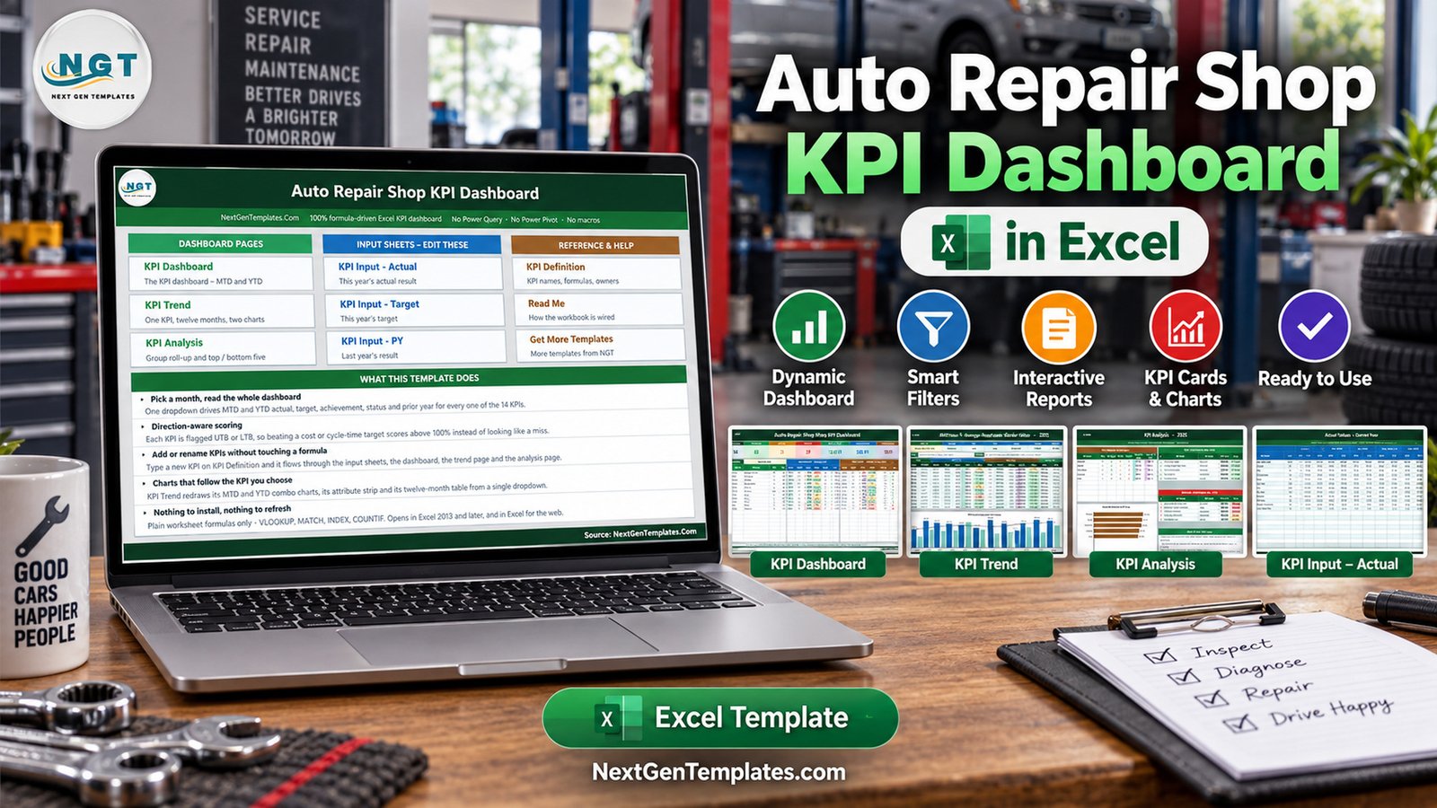
Most repair shops measure two things well — money in and cars out — and everything else anecdotally. The Auto Repair Shop KPI Dashboard in Excel is a month-picker scorecard that puts fourteen service metrics on one screen with their target, their achievement percentage, a traffic-light status and last year’s number, for the selected month and the year to date at the same time. In the sample data it ships with, eight KPIs are On Target for the year, three are At Risk and three are Missed, average achievement is 100.9% for the month and 98.2% for the year, and eleven of the fourteen are improving against last year. That is the whole point: a single page that tells a service manager which three rows to argue about on Monday morning.
Every number in the file is a plain worksheet formula. There is no Power Query, no data model, no macro and no add-in, which means it opens in Excel 2013 or later and in Excel for the web without a single security prompt. This post walks through each page, what it calculates, where it fits and where it honestly does not.
Key Features of the Auto Repair Shop KPI Dashboard in Excel
- Fourteen KPIs in five groups — Financial (4), Quality (2), Operations (5), Customer (2) and Sales (1), each with a named owner, a priority and a reporting frequency.
- One dropdown drives the whole file — cell D6 on the KPI Dashboard sheet holds the twelve months of the reporting year.
- MTD and YTD side by side — Actual, Target, Achievement %, Status, Prior Yr and vs PY, twice, on every KPI row.
- Direction-aware achievement — UTB and LTB flags per KPI, so Actual ÷ Target for the ones you want high and Target ÷ Actual for the ones you want low.
- Editable traffic lights — On Target from 100%, At Risk 95% to 99%, Missed below 95%, with the thresholds living in dashboard columns L and U.
- A twelve-month trend page for any single KPI, with MTD and YTD combo charts.
- A group analysis page with a roll-up table, an achievement bar chart and ranked Top 5 and Bottom 5 tables.
- Wired for 22 KPIs, 14 filled in, so eight more can be added with no formula work.
- Plain formulas only — VLOOKUP, MATCH, INDEX and COUNTIF, nothing locked or hidden.
Dashboard Pages Explanation
Home
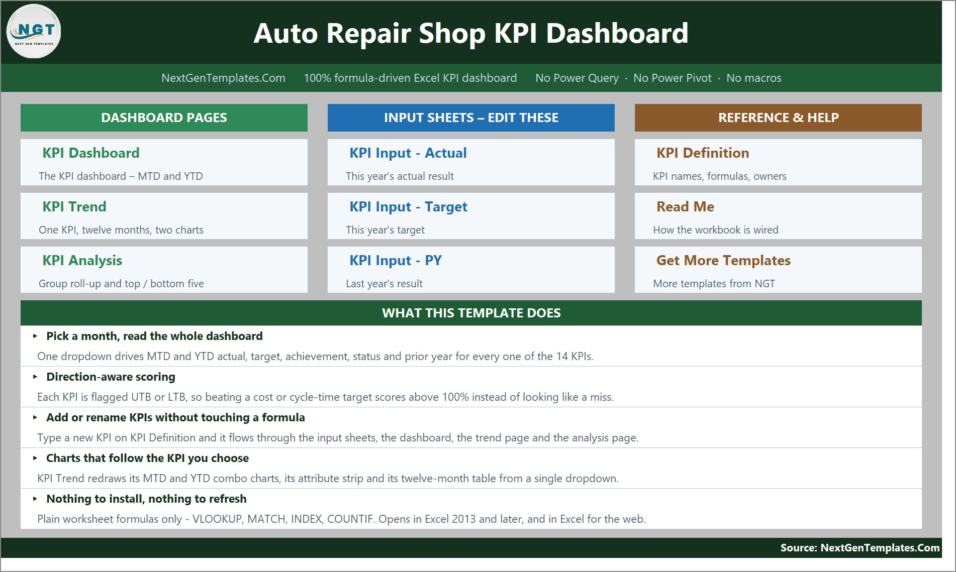
A navigation hub in three columns — Dashboard Pages, Input Sheets – Edit These, and Reference & Help — with a What This Template Does panel underneath that states the five things the workbook actually promises, including that nothing needs installing and nothing needs refreshing.
KPI Dashboard
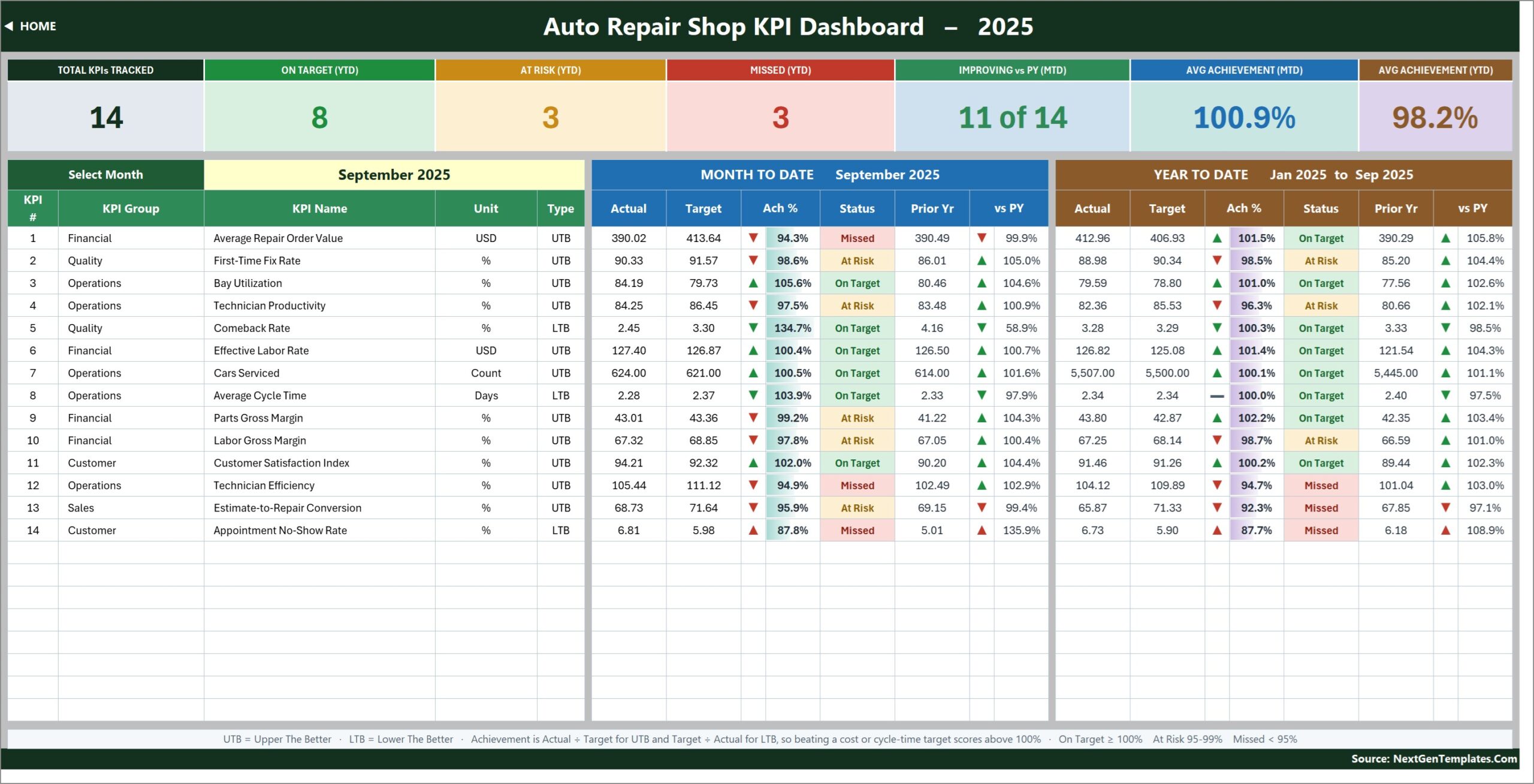
Seven summary cards run along the top: Total KPIs Tracked, On Target (YTD), At Risk (YTD), Missed (YTD), Improving vs PY (MTD), Avg Achievement (MTD) and Avg Achievement (YTD). Underneath, every KPI gets a row with its number, group, name, unit and UTB/LTB type, then a Month To Date block and a Year To Date block of six columns each.
The fourteen metrics are Average Repair Order Value, First-Time Fix Rate, Bay Utilization, Technician Productivity, Comeback Rate, Effective Labor Rate, Cars Serviced, Average Cycle Time, Parts Gross Margin, Labor Gross Margin, Customer Satisfaction Index, Technician Efficiency, Estimate-to-Repair Conversion and Appointment No-Show Rate. Three of them — Comeback Rate, Average Cycle Time and Appointment No-Show Rate — are lower-is-better, and the workbook scores them accordingly rather than making a good month look like a failure.
The arrows are worth understanding because they carry two signals at once. The direction shows whether the actual sits above or below the comparator; the colour shows whether that direction is good for that particular KPI. So a Comeback Rate of 2.45% against a 3.30% target shows a green down arrow and an achievement of 134.7%, while an Appointment No-Show Rate of 6.81% against a 5.98% target shows a red up arrow and 87.8%.
KPI Trend
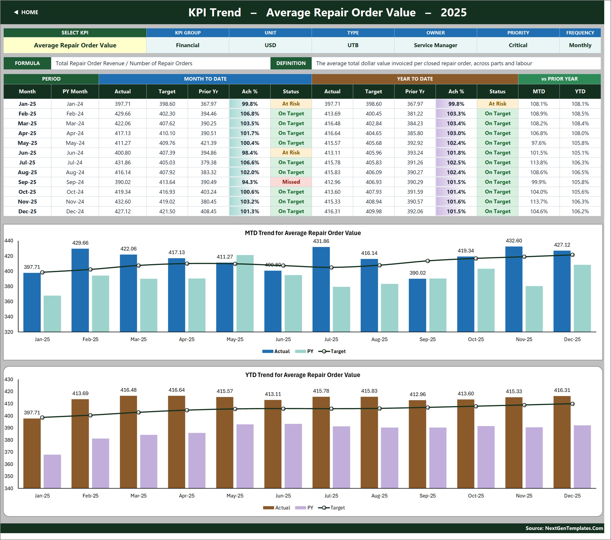
Pick a KPI in cell B4 and the whole page follows. The attribute strip shows KPI Group, Unit, Type, Owner, Priority and Frequency; beside it sit the metric’s formula and its written definition, so nobody has to remember that Effective Labor Rate means total labour revenue divided by total labour hours sold. The table beneath gives all twelve months of MTD and YTD actual, target, prior year, achievement and status, plus movement against last year in both views.
Two combo charts close the page — MTD Trend for Average Repair Order Value and YTD Trend for Average Repair Order Value in the sample — each plotting actual and prior-year columns against a target line, and both retitle themselves when you choose a different KPI. They are ordinary Excel charts pointed at helper ranges, so if you want a different data validation list or a different chart style, nothing stops you.
KPI Analysis
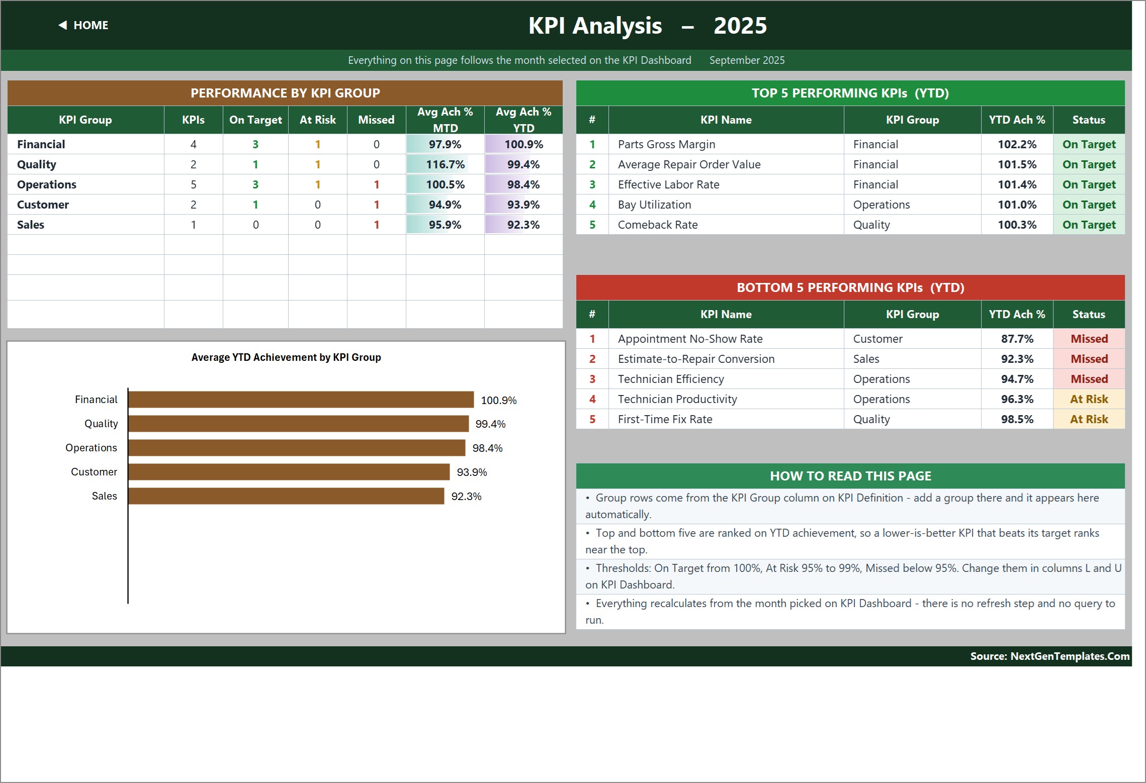
Everything on this page follows the month chosen on the dashboard. Performance By KPI Group counts the KPIs in each group and how many are On Target, At Risk or Missed, then averages MTD and YTD achievement per group. The Average YTD Achievement by KPI Group bar chart plots those five averages. Two ranked tables list the Top 5 and Bottom 5 Performing KPIs for the year to date, and because ranking is done on achievement rather than raw value, a lower-is-better KPI that beats its target ranks near the top exactly as it should. A How To Read This Page panel spells out the thresholds and where to change them.
The three input sheets
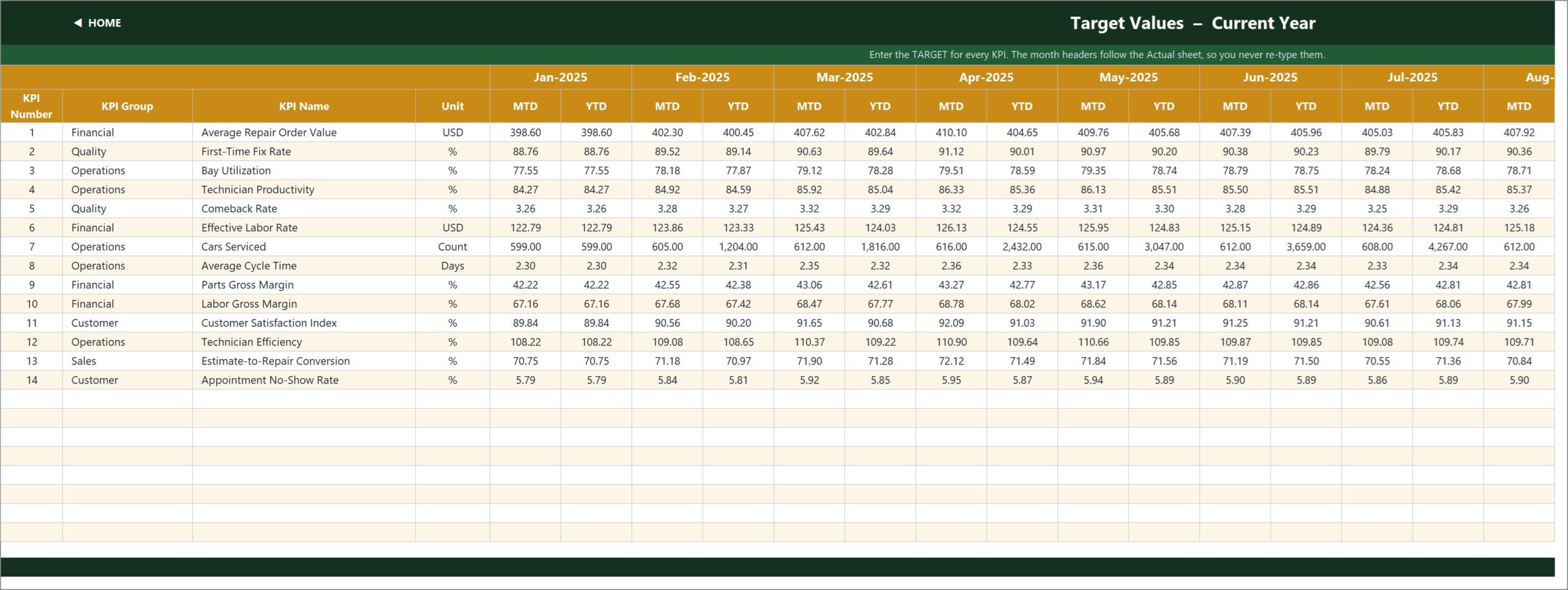
KPI Input – Actual, KPI Input – Target and KPI Input – PY are the only sheets you normally type into, and they are laid out identically: an MTD and a YTD column for each month, one row per KPI. The KPI rows on all three are driven by the KPI Definition sheet, so they cannot drift apart. Cell E3 on the Actual sheet sets the first month of the reporting year, and changing it re-bases the Target sheet, the Prior Year sheet, the month dropdown and every sheet title.
The workbook is explicit about YTD method, which matters more than people expect: volumes and counts accumulate through the year, while rates, ratios, indices and per-unit costs are running averages. If your percentage adds up to 1,100% by December, the Read Me tells you that is a signal to revisit the method rather than a bug in the file.
KPI Definition and Read Me
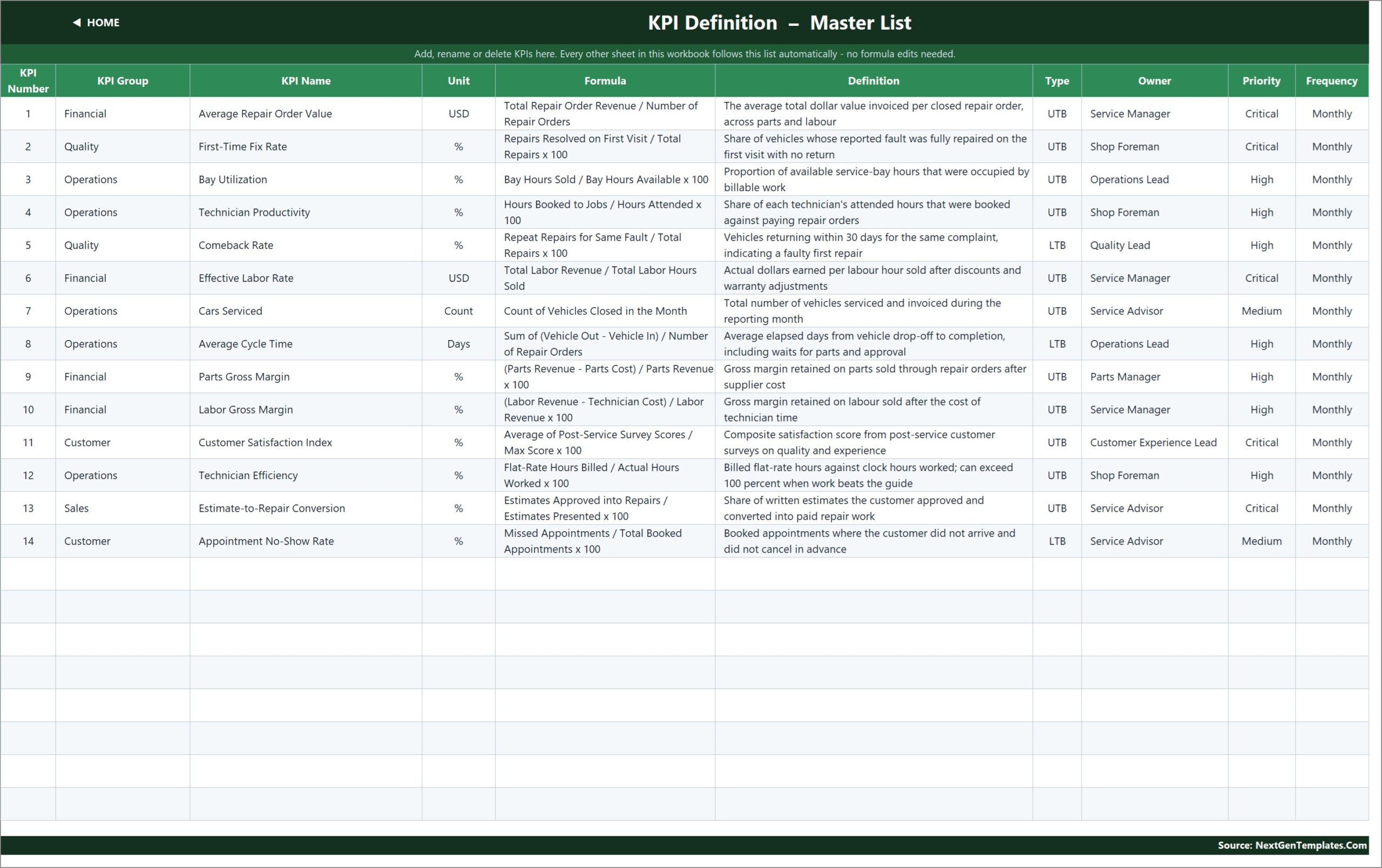
KPI Definition is the master list and the only place a KPI is named: number, group, name, unit, formula, definition, type, owner, priority, frequency. The sample assigns owners across Service Manager, Shop Foreman, Operations Lead, Quality Lead, Parts Manager, Service Advisor and Customer Experience Lead, which is half the value of the page — a KPI with no owner never improves. Read Me documents the five-minute setup, the rules the numbers follow, how to add, rename or remove a KPI, and a sheet-by-sheet map. A Support sheet holds the helper calculations behind the dropdowns, the arrow glyphs and the chart series, and a Get More Templates page links out to the rest of the catalogue.
Auto Repair Shop KPI Dashboard vs. Google Sheets vs. Paid Shop-Management SaaS — Feature Comparison
| This Excel template | A Google Sheets build | Tekmetric / Shopmonkey-class SaaS | |
|---|---|---|---|
| Cost | One-time file purchase | One-time file purchase | Monthly subscription per shop |
| Platform | Excel 2013+ and Excel for the web | Browser, Google account required | Vendor cloud |
| Setup time | An afternoon of typing | Similar | Weeks, plus migration |
| Real-time team collaboration | Via OneDrive or SharePoint co-authoring | Native | Native |
| Mobile access | Excel mobile app, read-only in practice | Browser and app | Full mobile app |
| Customizable fields | Every cell, formula and label | Every cell | Vendor-defined only |
| Share with link | Yes, via OneDrive | Yes | Named user seats |
| Year-1 cost at 5 users | The file price, once | The file price, once | Typically four figures and up |
| Writes repair orders / orders parts | No | No | Yes |
| Direction-aware UTB / LTB scoring | Built in per KPI | Must be built | Varies by vendor |
| Works offline | Yes | Limited | No |
Who Should Use This Template
Independent garages and multi-bay repair shops that already close repair orders somewhere and want a monthly management view on top. Service managers who report upward to an owner, a group or a franchisor and need the same fourteen rows every month. Fixed-operations managers comparing this year to last. Consultants who want a clean KPI pack to re-skin per client. And anyone whose current reporting is a spreadsheet of revenue with no target column at all — the jump from “we did $412 average RO” to “we did $412 against a $413 target, up 5.8% on last year” is the entire exercise.
It is a poor fit if you want live, per-repair-order tracking. This is a monthly reporting layer. It also does not connect to Mitchell 1, Shopware, Tekmetric or any other shop-management platform, it does not link to a dealer management system or an accounting package, and it does not price jobs or order parts. The numbers arrive because somebody types or pastes them in once a month.
Real-World Use Cases
The Monday meeting. A four-bay independent closes the month in its invoicing software, pastes fourteen figures into the Actual sheet and prints the dashboard. In the sample month the foreman can see that Technician Efficiency at 94.9% and Estimate-to-Repair Conversion at 95.9% are the two rows worth an argument, while Bay Utilization at 105.6% is fine.
Three locations, one format. A fixed-operations manager keeps one copy per site, renames two KPIs to match group definitions, and uses the KPI Analysis page to compare Financial against Operations achievement across all three shops on one slide.
The consulting diagnostic. A consultant drops a client’s twelve months into the input sheets and steps the month dropdown through the year. The YTD trend chart shows Average Repair Order Value beating target every month since February, while Appointment No-Show Rate has quietly worsened against last year — two conclusions that no monthly revenue report would have surfaced.
Advantages of the Auto Repair Shop KPI Dashboard in Excel
- Nothing to install or refresh. No macros, no Power Query, no add-ins, so no security prompt and no broken connection six months later. VLOOKUP, MATCH, INDEX and COUNTIF do all the work.
- It is honest about direction. Most home-made scorecards punish a shop for cutting cycle time. This one does not.
- The KPI list is data, not formulas. Rename a metric in one place and it changes everywhere, including the chart titles.
- Prior year is built in. Target comparison alone hides a shop that is drifting; the vs PY columns catch it.
- Auditable. Every cell can be traced, which matters when an owner asks where a number came from.
- Portable. One .xlsx that works on a shop PC, a laptop and a browser.
Opportunities for Improvement
Being fair about the gaps: there is no automated import, so month-end still involves manual entry or a paste from another report. Granularity stops at the month — you cannot drill from Cars Serviced into individual repair orders, technicians or job types, because the workbook stores aggregates, not transactions. There is no multi-site consolidation sheet, so comparing three shops means three files and a manual roll-up. Charts are fixed to the KPI Trend and KPI Analysis pages rather than being user-placeable. And the shipped data is fictional sample data for a 2025 reporting year, which needs clearing before anything is circulated. None of these are defects; they are the cost of a file that opens anywhere with no dependencies.
Best Practices
- Set the reporting year first. Change cell E3 on KPI Input – Actual before you type anything else.
- Trim the KPI list before you fill it. Fourteen is already at the edge of what a weekly conversation can hold. Delete what you will not act on.
- Give every KPI a real owner. The Owner column is not decoration; it decides who answers for a red row.
- Agree the YTD method per KPI — cumulative for volumes, running average for rates — and write it into the Definition column.
- Tune the thresholds once. If your shop treats 98% as acceptable, edit columns L and U rather than arguing about the colour every month.
- Work the Bottom 5, not the whole table. Open each one on KPI Trend to judge whether it is a bad month or a bad year.
- Keep last year’s file. The PY sheet is only as good as the data you carried forward.
Explore Relevant Templates
- Garage Door Service KPI Dashboard in Excel — the same scorecard engine for a service-call business.
- Elevator Maintenance KPI Dashboard in Excel — contract maintenance KPIs on the same layout.
- HVAC Contractor KPI Dashboard in Excel — technician and first-visit metrics for the trades.
- Welding Shop KPI Dashboard in Excel — a workshop variant with fabrication KPIs.
- An Auto Repair Shop KPI Scorecard in Excel and a Tire Shop KPI Dashboard in Excel are being prepared and are not published yet, so they are named here without links.
Frequently Asked Questions
Does the Auto Repair Shop KPI Dashboard in Excel connect to my shop-management software?
No. There is no connection to Mitchell 1, Shopware, Tekmetric, a dealer management system or an accounting package. You type or paste fourteen monthly numbers into three input sheets. That keeps the file portable and means no vendor export change can break it.
Do I need macros or Power Query?
Neither. It is a plain .xlsx built on worksheet formulas, so it opens in Excel 2013 and later and in Excel for the web, with no security prompt and no refresh step.
Can I add or rename KPIs?
Yes. The sheets are wired for 22 KPIs and 14 are filled in, so eight more need no formula work — add the row on KPI Definition and type its numbers. Renaming is done on KPI Definition only; every other sheet reads the name from there.
Why do some KPIs score over 100% when the number went down?
Because Comeback Rate, Average Cycle Time and Appointment No-Show Rate are flagged LTB, so achievement is Target ÷ Actual for them. Beating a cost or cycle-time target scores above 100% just as beating a revenue target does.
Can I change the status thresholds?
Yes. On Target, At Risk and Missed are defined in the formulas in columns L and U on the KPI Dashboard sheet, and the Read Me page tells you exactly where.
Is the sample data real?
No. It is fictional data for a 2025 reporting year with 2024 as the prior year, included so every card, chart and traffic light is demonstrably working before you replace it.
What comes in the download?
A ZIP containing the .xlsx workbook and an Excel KPI Dashboard user manual in PDF. Nothing is locked or password protected.
About the Author
Built by PK – Microsoft Certified Professional with 15+ years of Excel, Google Sheets, and Power BI experience. Founder of NextGenTemplates, reaching 300K+ subscribers across YouTube channels. Every template is hand-built and tested before release.
Conclusion
A repair shop does not need more numbers; it needs the same fourteen numbers every month, against a target, against last year, with somebody’s name beside each one. That is exactly what this workbook does, and it does it without asking you to install anything or learn anything new. If you already run a shop-management platform, the Auto Repair Shop KPI Dashboard in Excel becomes the management view sitting on top of it. If you do not, it gives you the KPI discipline without the subscription.
Get the template here: Auto Repair Shop KPI Dashboard in Excel on NextGenTemplates. For video walkthroughs of this and every other dashboard on the site, subscribe to @PKAnExcelExpert on YouTube.