The Comparative Analysis Dashboard in Power BI compares current-year sales with previous-year sales and budget. It shows year-over-year growth, budget variance, category and product analysis, and monthly trends. The example extends the reporting ideas in our Power BI sales dashboard tutorial.
How to Interpret the Comparisons
| Comparison | Question it answers |
|---|---|
| Current-year and previous-year sales | How does the selected year compare with the prior year? |
| Year-over-year sales growth | What percentage change does the report show between those periods? |
| Current-year and budget sales | How does actual sales performance compare with the planned amount? |
| Budget variance | What difference from budget is shown for the selected data? |
What should I check before comparing results?
Confirm the year slicer and other active filters first. Compare the headline cards with the monthly trend and the product/category table to locate where differences occur. YoY growth and budget variance answer different questions, so review them separately rather than treating both as the same performance measure.
Click to buy Comparative Analysis Dashboard in Power BI
Understanding the Comparative Analysis Dashboard
Click to buy Comparative Analysis Dashboard in Power BI
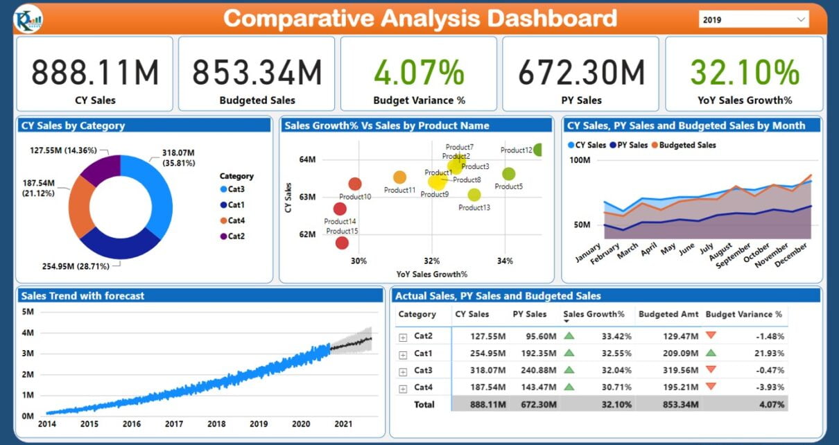
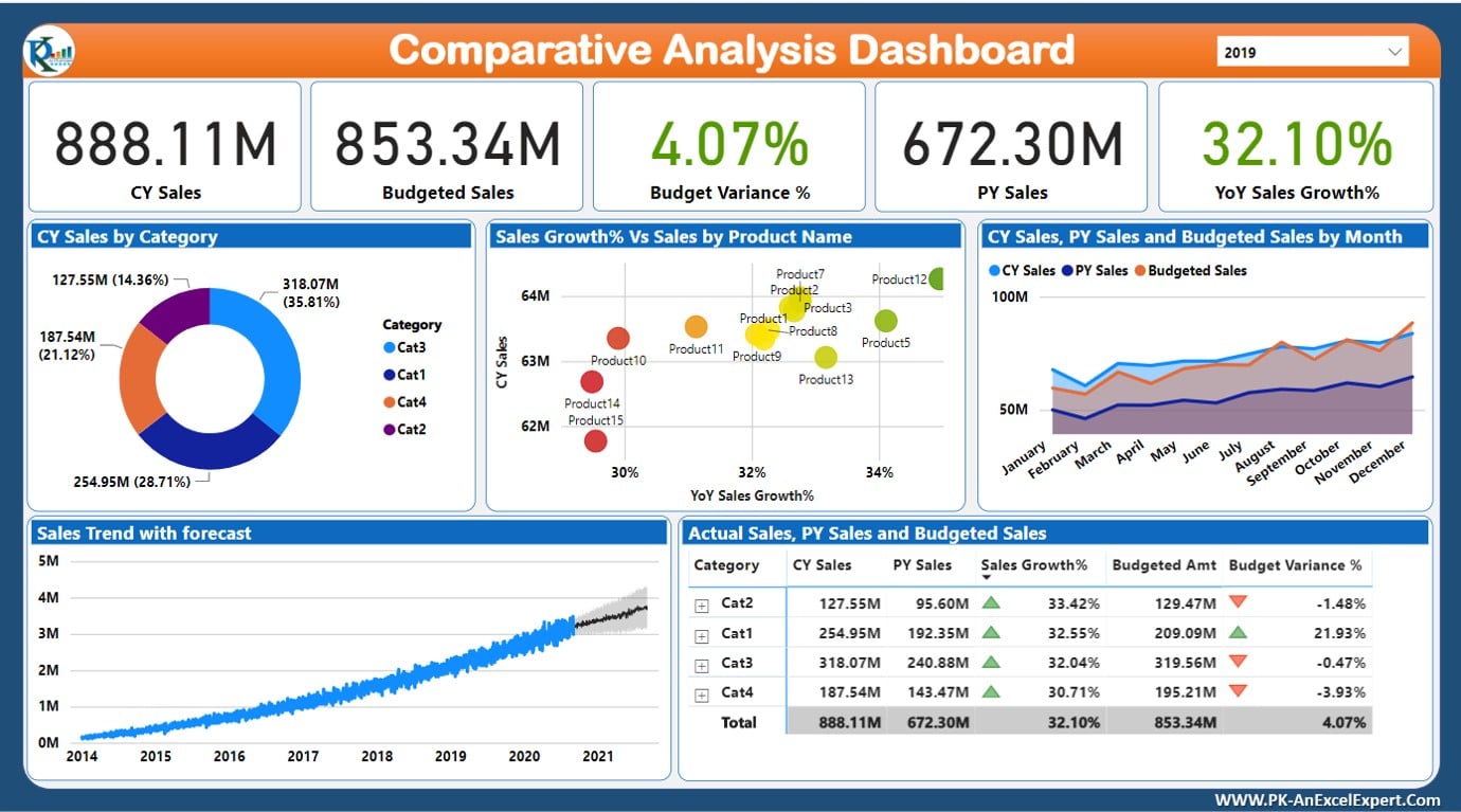
On the top card, we have displayed the cards for CY Sales, Budget Sales, Budget Variance, PY Sales and YOY Sales Growth. From the top-right corner, you can select the year using slicer.
In the middle of the page, we are showing the Current Year Sales by category in a doughnut chart. Sales Growth% and Sales amount by Product on a scatter chart. The Monthly trend of the CY Sale, PY Sales and Budget Sales.
At the bottom of the dashboard, we are showing Sales Trend with the Sales Forecast. And, a Table with conditional formatting with CY Sales, Budget Sales, Budget Variance, PY Sales and YOY Sales Growth by Product and Category.
Watch the step by step video tutorial:
Click to buy Comparative Analysis Dashboard in Power BI
Below is the live dashboard.
Click to buy Comparative Analysis Dashboard in Power BI
Conclusion
In our journey to create a Comparative Analysis Dashboard in Power BI, we’ve aimed to bring your data to life in a way that’s both insightful and accessible. Our YouTube video stands as a guidepost for those eager to harness the analytical power of Power BI, offering a step-by-step blueprint for turning raw data into a compelling narrative of your business’s journey. Join us in exploring the capabilities of Power BI and unlock the stories your data is just waiting to tell.
Visit our YouTube channel to learn step-by-step video tutorials
Click to buy Comparative Analysis Dashboard in Power BI