In today’s fast-paced digital world, IT and tech operations play a crucial role in every organization’s success. Whether you’re managing a small IT department or a full-fledged tech infrastructure, you must constantly monitor performance, track KPIs, and optimize operations. This is where the IT and Tech Operations KPI Dashboard in Excel becomes your go-to tool.
Let’s explore everything you need to know about this powerful dashboard—from its key features to best practices, benefits, and FAQs.
Click to Purchases IT and Tech Operations KPI Dashboard in Excel
What Is an IT and Tech Operations KPI Dashboard?
An IT and Tech Operations KPI Dashboard is a visual tool built in Excel that helps you track, manage, and analyze key performance indicators (KPIs) specific to your IT department. It combines data visualization, conditional formatting, and automation to offer clear insights into your daily, monthly, and yearly operations.
This Excel-based dashboard is designed for IT managers, project leads, tech analysts, and CIOs who want to make smarter decisions using data they already have.
Why Should You Use an Excel-Based IT KPI Dashboard?
You might be wondering, Why Excel? While there are complex platforms out there, Excel remains one of the most accessible and flexible tools for data tracking. Here’s why it makes sense:
-
Easy to customize
-
No learning curve for most teams
-
Supports automation with formulas and VBA
-
Works offline without any third-party tools
You don’t need a data science degree to use this dashboard. If you can use Excel, you can run your IT department like a pro.
Key Features of the IT and Tech Operations KPI Dashboard
This ready-to-use Excel template comes with 7 well-structured worksheets that streamline every aspect of your IT operations.
Home Sheet
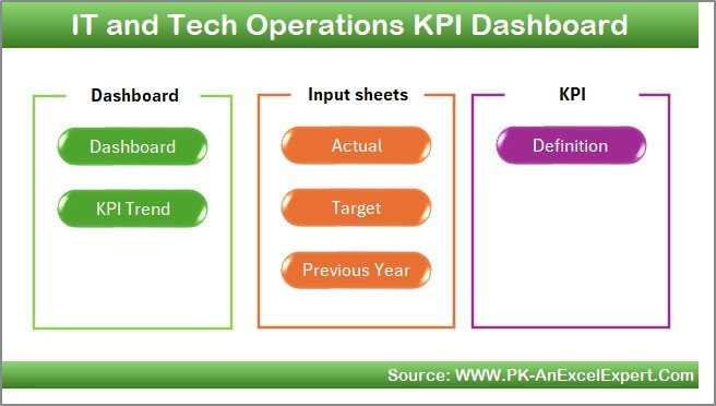
This is your index sheet, offering quick navigation across the entire dashboard. It includes six clickable buttons that take you to each section instantly, improving user experience and saving time.
Dashboard Sheet
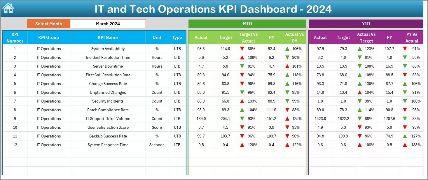
This is the heart of the tool. On this sheet:
-
Select the month from the drop-down menu in cell
D3 -
Instantly view MTD (Month-To-Date) and YTD (Year-To-Date) KPIs
Click to Purchases IT and Tech Operations KPI Dashboard in Excel
-
Analyze performance across three views:
✅ Actual
🎯 Target
📅 Previous Year -
Visual cues like up/down arrows make trend analysis easy
It’s not just about viewing data—it’s about understanding it at a glance.
KPI Trend Sheet
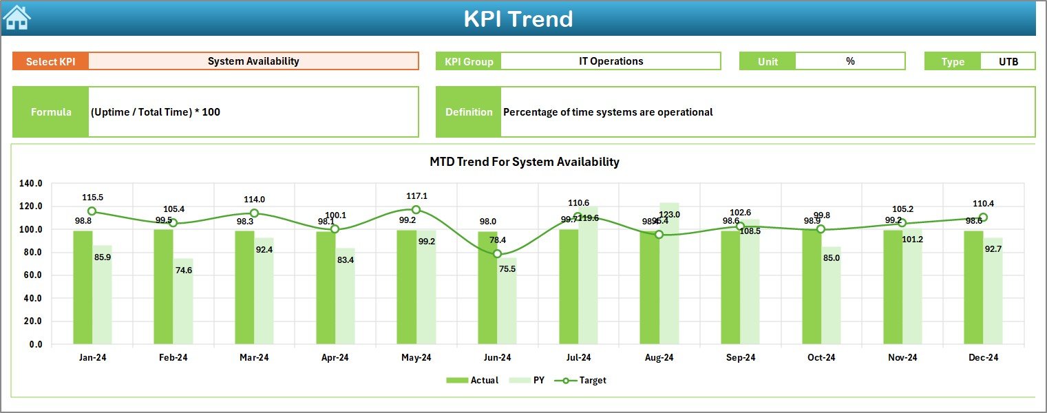
Want to track how a specific KPI is performing over time? This is the place.
-
Select your KPI from a drop-down in C3
-
See KPI Group, Unit, Type (UTB or LTB), Formula, and Definition
-
Visualize MTD and YTD trends via charts
This sheet ensures you’re not just looking at one snapshot but monitoring trends that guide long-term decisions.
Actual Numbers Input Sheet
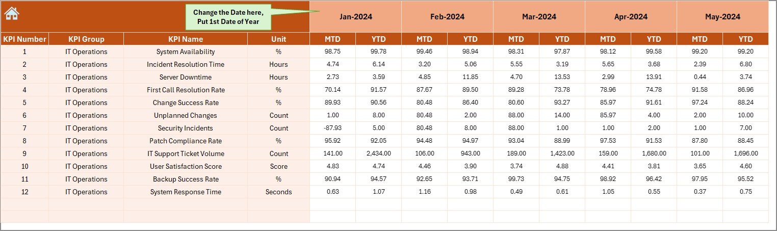
Input your actual MTD and YTD data here. Change the month from cell E1 and update your performance numbers accordingly. It’s quick, intuitive, and fully editable.
Target Sheet
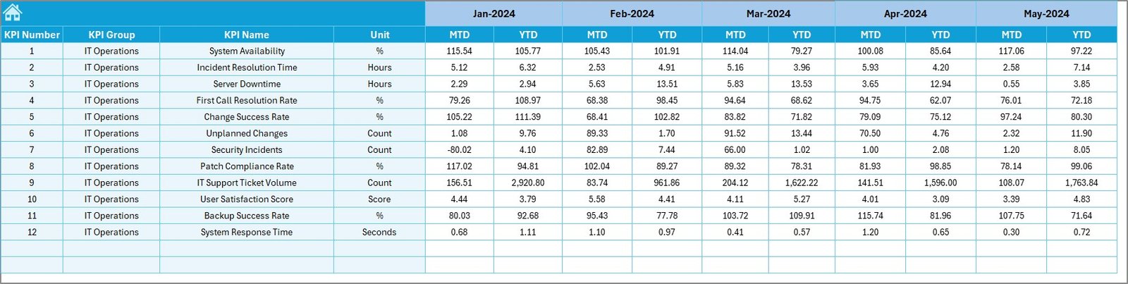
Enter your monthly and yearly targets for each KPI. This allows the dashboard to calculate gaps, deviations, and comparisons on the main Dashboard sheet.
Previous Year Number Sheet
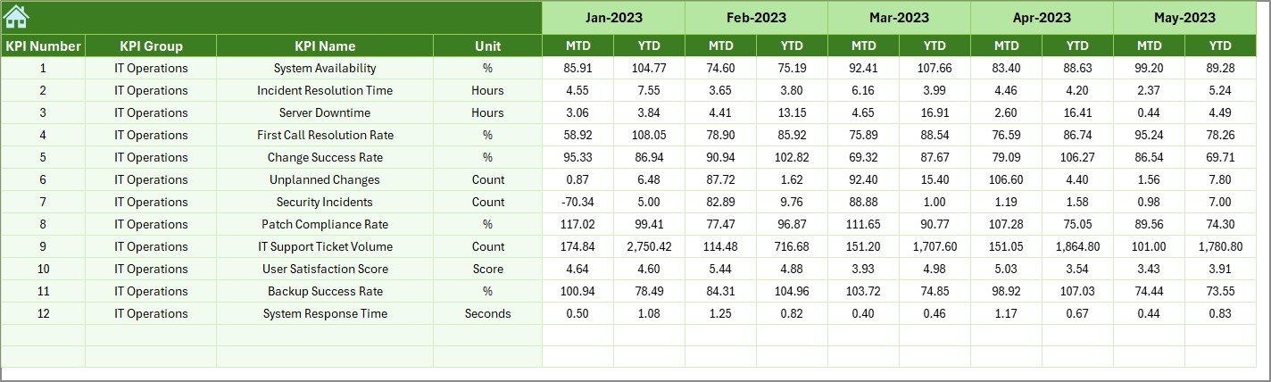
Store the prior year’s numbers here. This comparison helps in evaluating growth, seasonality, and improvement areas.
KPI Definition Sheet
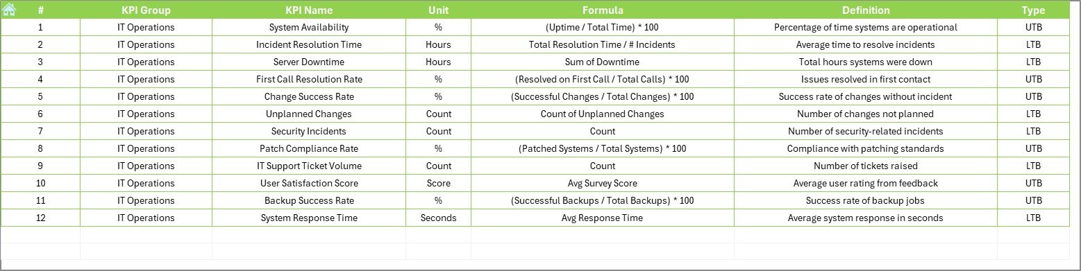
This sheet is your reference guide. Define each KPI with the following fields:
-
KPI Name
-
KPI Group
-
Unit
-
Formula
-
Short Definition
Advantages of Using the IT & Tech KPI Dashboard in Excel
Let’s break down the biggest benefits of using this tool:
📈 Real-Time Monitoring
Get up-to-date insights by selecting any month. The dashboard updates instantly—no need to build charts or filter data manually.
📊 All-in-One Data View
View actual vs target vs previous year data in one place. You don’t need to switch between files or systems.
📉 Identifies Gaps Quickly
Visual alerts help you detect when you’re underperforming or exceeding targets, allowing you to act fast.
🔄 Easy to Customize
Add more KPIs, change units, or even update formulas based on your operational goals.
🧠 Informed Decision-Making
Data-driven decisions reduce guesswork. Know what’s working, what’s not, and where to focus next.
Best Practices for IT and Tech KPI Dashboard Usage
To get the most out of your dashboard, follow these best practices:
1. Keep It Clean and Simple
Avoid cluttering the dashboard with too many KPIs. Focus on metrics that drive outcomes.
2. Update Data Monthly
Set a reminder to update MTD and YTD data on the first working day of each month.
3. Define KPIs Clearly
Use the KPI Definition sheet wisely. Make sure every stakeholder understands what each KPI means.
4. Involve Your Team
Share the dashboard with your team. Use it in review meetings to boost accountability.
5. Monitor Trends
Use the KPI Trend sheet often to spot early signs of issues or growth opportunities.
How to Customize the Dashboard for Your Organization
Click to Purchases IT and Tech Operations KPI Dashboard in Excel
Every business is unique. Here’s how you can customize the dashboard to meet your needs:
-
Add or Remove KPIs: Use the KPI Definition sheet to make changes.
-
Update Units or Formulas: Modify the formula cells as per your internal metrics.
-
Brand the Dashboard: Add your company logo and update fonts or colors.
-
Extend to Departments: Clone the file for different teams like Helpdesk, DevOps, or Security.
When Should You Use This Dashboard?
Still unsure when to put it into action? Use this dashboard:
-
During monthly performance reviews
-
When preparing for IT audits
-
While presenting to senior management
-
For incident tracking and RCA reports
-
To align IT goals with business KPIs
Conclusion: Your IT Team’s Secret Weapon
The IT and Tech Operations KPI Dashboard in Excel is not just a spreadsheet—it’s a strategic tool. It transforms how you view performance, helping you move from reactive problem-solving to proactive planning.
With powerful visuals, easy navigation, and real-time tracking, this dashboard keeps you in control of every operation, big or small. Whether you’re a startup or a global enterprise, it’s the perfect way to ensure your IT team is not just working—but excelling.
Frequently Asked Questions (FAQs)
Q1. Can I use this dashboard for multiple departments?
Yes. You can duplicate the dashboard for different departments like IT Support, Cybersecurity, or Infrastructure. Each one can have its own set of KPIs.
Q2. How many KPIs can I track using this dashboard?
There’s no hard limit. However, to keep it effective, it’s best to focus on 10–15 key KPIs at a time.
Q3. Is Excel better than Power BI for dashboards?
It depends on your needs. Excel is perfect for lightweight dashboards that don’t need live data connections. For more advanced analytics, Power BI might be a better fit.
Q4. Can I add graphs and charts to this dashboard?
Absolutely! The dashboard already includes trend charts, and you can add more using Excel’s built-in chart tools.
Q5. Is the dashboard compatible with older Excel versions?
Yes. The dashboard works smoothly on Excel 2013 and above. For the best experience, use Excel 2016 or later.
Visit our YouTube channel to learn step-by-step video tutorials