In today’s hybrid work environment, optimizing office space has become a top priority for businesses. As organizations adapt to flexible schedules and diverse workspace demands, monitoring how office space is used can significantly cut costs, enhance efficiency, and improve employee satisfaction. This is where the Office Space Utilization Dashboard in Power BI steps in. It transforms raw data into meaningful insights, helping decision-makers analyze space usage, booking trends, cleaning schedules, and overall resource efficiency.
This article provides a comprehensive guide to the features, benefits, best practices, and real-world applications of the Office Space Utilization Dashboard in Power BI.
Click to Purchases Office Space Utilization Dashboard in Power BI
What is an Office Space Utilization Dashboard?
An Office Space Utilization Dashboard is a dynamic visual reporting tool built in Power BI that helps organizations monitor and analyze how office spaces are being used. The dashboard tracks data like booking frequency, department usage, cleaning time, attendee numbers, and space preferences.
By presenting data through charts, slicers, and KPI cards, it allows office managers and facility teams to make informed decisions about space planning and operational improvements.
Key Features of the Office Space Utilization Dashboard
This Power BI dashboard is built with five interactive pages, each designed to offer a specific lens into how space is being used. Let’s walk through each of these.
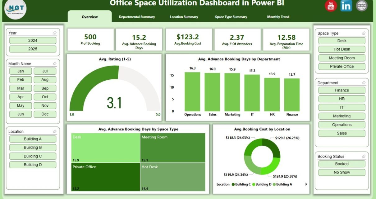
Overview Page
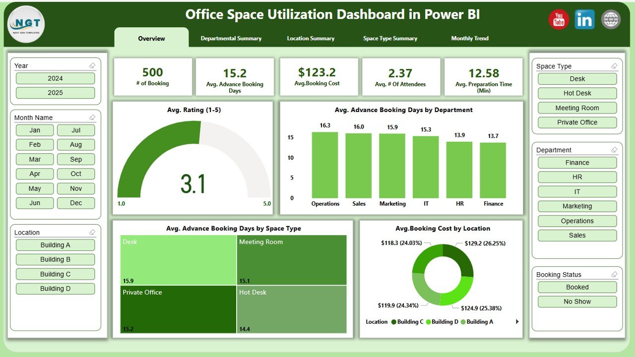
The Overview page serves as the central hub of the dashboard. It includes:
- 6 slicers to filter the data by department, location, space type, and other dimensions
5 KPI cards showing metrics like:
- Total Bookings
- Average Rating (1-5)
- Avg. Advance Booking Days
- Avg. Cleaning Time
- Avg. Booking Cost
4 insightful charts:
- Avg. Rating (1-5)
- Avg. Advance Booking Days by Department
- Avg. Advance Booking Days by Space Type
- Avg. Advance Booking Days by Location
Departmental Summary Page
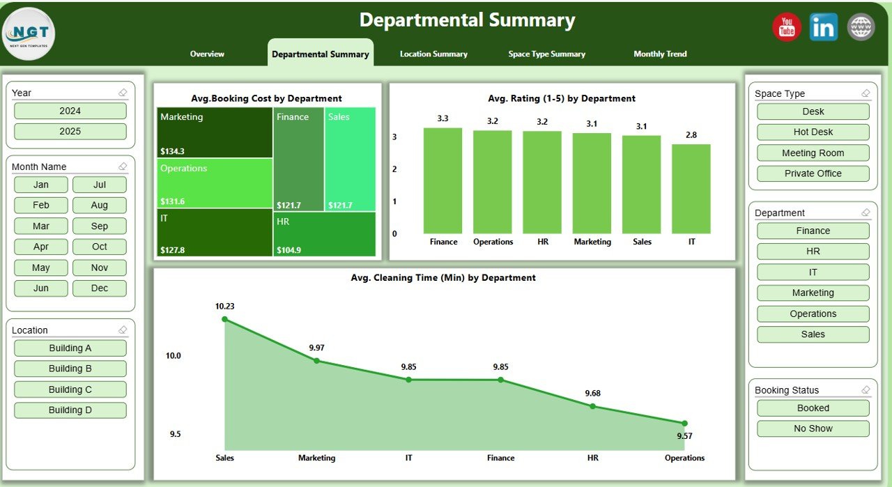
This page offers a department-wise analysis. You get:
- 6 slicers for filtering
3 powerful charts:
- Avg. Booking Cost by Department
- Avg. Rating (1-5) by Department
- Avg. Cleaning Time (Min) by Department
Location Summary Page
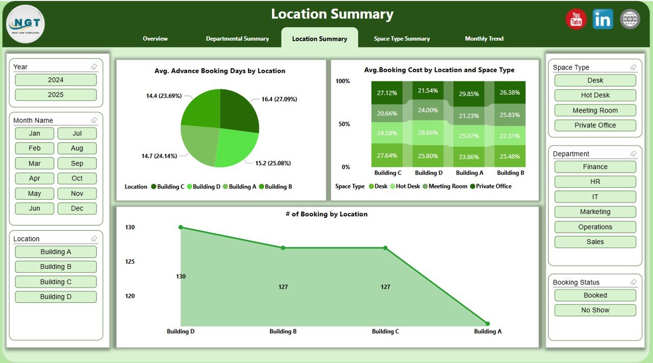
This view highlights trends and patterns based on office location. Features include:
Click to Purchases Office Space Utilization Dashboard in Power BI
- 6 slicers
3 charts:
- Avg. Advance Booking Days by Location
- Avg. Booking Cost by Location and Space Type
- Number of Bookings by Location
Space Type Summary Page
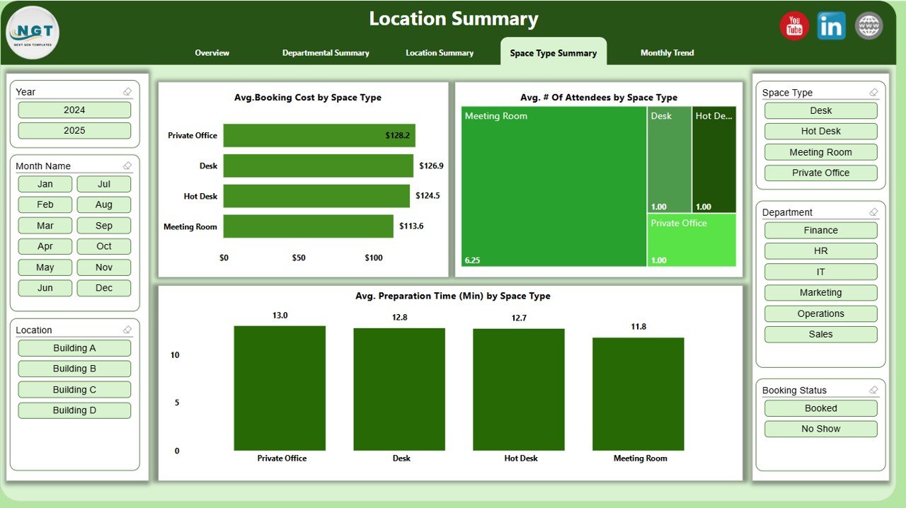
A great tool for understanding how different types of rooms or spaces are being used.
- 6 slicers
3 charts:
- Avg. Booking Cost by Space Type
- Avg. Number of Attendees by Space Type
- Avg. Preparation Time (Min) by Space Type
Monthly Trend Page
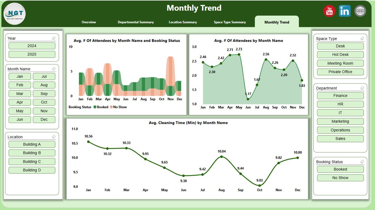
Spot monthly trends in attendance, cleaning time, and booking activity.
- 6 slicers
3 trend charts:
- Avg. Number of Attendees by Month Name and Booking Status
- Avg. Number of Attendees by Month Name
- Avg. Cleaning Time (Min) by Month Name
Why Should You Use a Power BI Dashboard for Space Utilization?
Power BI provides an intuitive interface, powerful data integration, and visually rich dashboards. The Office Space Utilization Dashboard combines these strengths to offer real-time insights that are both actionable and easy to interpret.
- Helps reduce overhead by identifying underused spaces
- Improves facility management efficiency
- Supports better space allocation and planning
- Enables smarter cleaning and maintenance schedules
- Encourages data-driven decisions
Advantages of Using the Office Space Utilization Dashboard
Let’s explore the main benefits of implementing this dashboard:
1. Cost Savings
You can pinpoint underutilized spaces and eliminate unnecessary office space expenses.
2. Improved Space Planning
With trends and usage data, you can plan expansions or reductions with greater confidence.
3. Employee Comfort
By understanding preferences (e.g., which locations or space types are booked more), you can tailor office spaces for better comfort and efficiency.
4. Data Transparency
Make every stakeholder aware of space usage trends, leading to better collaboration and transparency in decision-making.
5. Automated and Dynamic Reporting
No more manual Excel sheets. With real-time Power BI integration, the dashboard updates as your Excel data changes.
Best Practices for Using the Office Space Utilization Dashboard
To maximize the value of this dashboard, follow these best practices:
1. Keep Your Source Data Clean
Ensure that the Excel data is accurate, consistent, and up to date. Regularly check for missing values or duplicate entries.
2. Use Slicers Effectively
Train users to leverage the slicers for targeted analysis. Filtering by space type, department, or location reveals granular insights.
3. Monitor Trends Monthly
Make it a habit to check the Monthly Trend page to understand how usage changes over time. This will support long-term planning.
4. Engage Department Heads
Share Departmental Summary insights with department managers. It can drive more responsible and optimized space booking behavior.
5. Customize KPIs Based on Goals
Tailor the KPI cards to reflect the metrics that matter most to your organization.
6. Encourage Feedback
Allow employees to rate bookings (captured in Avg. Rating) and collect qualitative feedback outside the dashboard.
Who Can Benefit from This Dashboard?
This dashboard isn’t limited to large corporations. It is equally valuable for:
- Facility managers
- HR teams
- Operations departments
- Real estate and infrastructure teams
- Co-working space managers
Whether you operate one office or multiple locations, this dashboard helps you get a pulse on space usage.
How Does the Dashboard Work with Excel Data?
The dashboard connects to a structured Excel file containing key data fields like:
- Booking Date
- Department Name
- Space Type
- Booking Status
- Location
- Number of Attendees
- Booking Cost
- Cleaning and Preparation Times
- Ratings
Once linked, Power BI imports the data and refreshes visuals automatically as changes are made in the Excel file.
Tips to Customize the Dashboard Further
- Add more visuals for specific KPIs like utilization percentage.
- Use conditional formatting for alerts (e.g., red flags for overbooked spaces).
- Introduce user-level access if you plan to share it organization-wide.
- Incorporate advanced DAX formulas to calculate usage ratios.
Conclusion
The Office Space Utilization Dashboard in Power BI is a powerful tool that can transform how your organization views and manages office spaces. From improving booking efficiency to reducing costs and enhancing the workplace experience, this dashboard provides everything you need to make smart, data-backed decisions.
Instead of relying on assumptions, let real-time data guide your space management strategy. With the right setup and best practices in place, your office can become a well-oiled, optimized machine.
Frequently Asked Questions (FAQs)
Q1. What data do I need to run this dashboard?
You need structured Excel data with columns like Booking Date, Department, Space Type, Location, Attendee Count, Cost, and Ratings.
Q2. Can I use this dashboard for multiple office locations?
Yes. The dashboard supports location-based analysis and is designed to handle multi-location data effectively.
Q3. Is this dashboard suitable for hybrid or shared workspaces?
Absolutely. It’s ideal for hybrid work environments, co-working spaces, or hot desk setups.
Q4. How do I update the dashboard with new data?
Simply update the Excel source file. When you refresh the Power BI dashboard, all visuals will update accordingly.
Q5. Do I need Power BI Pro to use this?
You can build and view the dashboard in Power BI Desktop for free. But for sharing and collaboration in the cloud, a Power BI Pro license is required.
Q6. Can I add more KPIs to this dashboard?
Click to Purchases Office Space Utilization Dashboard in Power BI
Yes. Power BI allows you to customize and expand the dashboard with additional charts, cards, or tables.
Q7. Is this dashboard beginner-friendly?
Yes. With intuitive slicers and visual aids, even non-technical users can navigate and understand the insights easily.
Click to Purchases Office Space Utilization Dashboard in Power BI
Visit our YouTube channel to learn step-by-step video tutorials