Part of the free Module 9: Advanced Charts and Infographics · Lesson 4 of 8 · Full Excel course
Updated on 5 September 2026 · Works in Excel 365, 2021, 2019 and 2016 unless noted.
A progress circle chart in Excel shows a single KPI, such as service level or completion, as a coloured ring that fills clockwise to the achieved percentage, with the value printed in the centre. It is a percentage doughnut chart built from two doughnut series on separate axes plus a linked text box. This lesson builds the ring from a blank sheet so it updates whenever the KPI cell changes.
How a progress circle chart works
The inner doughnut is a static ring of twenty equal segments coloured in your brand colour. The outer doughnut, plotted on the secondary axis so it sits on top, has two values: the KPI and its remainder. The KPI slice is made transparent so the coloured ring shows through, and the remainder slice is filled white with slight transparency so it fades the unachieved part. A text box linked to the KPI cell displays the number.
Progress circles are the standard KPI tile on modern dashboards. They work in Excel 2013 through Microsoft 365 with no VBA.
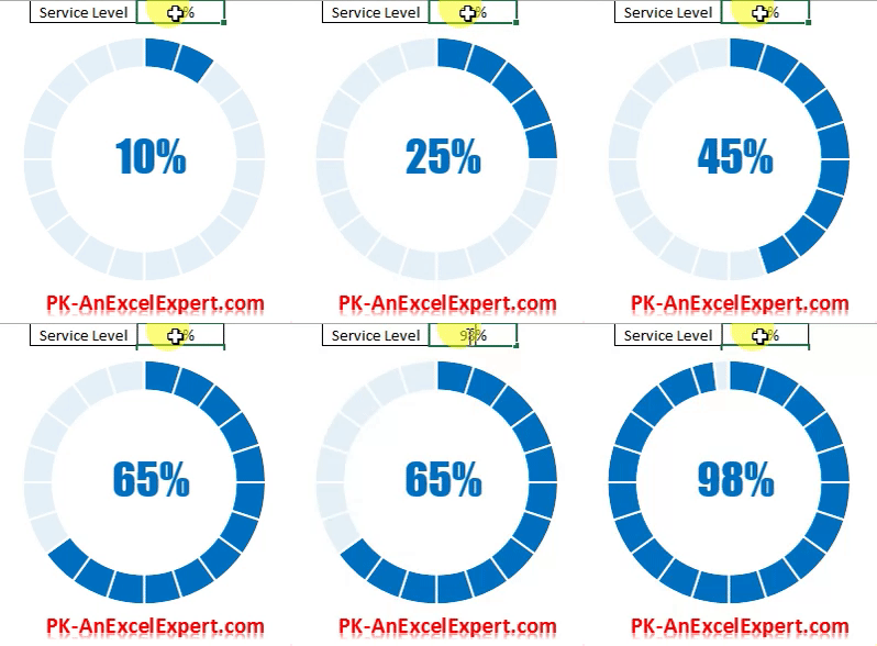
The two doughnut series compared
| Series | Values | Axis | Formatting |
|---|---|---|---|
| Base ring | ={1,1,1,1,1,1,1,1,1,1,1,1,1,1,1,1,1,1,1,1} (twenty ones) |
Primary | Whole ring in one brand colour |
| KPI ring | G1 (KPI) and H1 =100%-G1 |
Secondary | KPI slice No fill; remainder white, 10% transparency |
Because the KPI ring sits on top, its white remainder slice hides the base ring beyond the achieved percentage, and the transparent KPI slice reveals it. The base ring never changes; only the split between the two slices of the KPI ring moves.
Step 1: insert the base doughnut
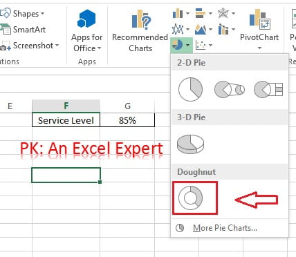
- Click an empty cell and go to Insert > Charts > Insert Pie or Doughnut Chart > Doughnut. A blank chart appears.
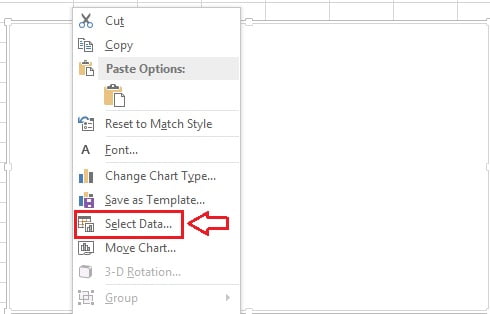
- Right-click the chart and choose Select Data.
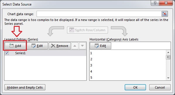
- Click Add under Legend Entries (Series).
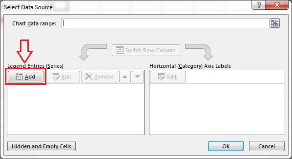
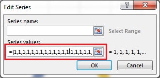
- Leave Series name blank and in Series values type twenty ones as an array:
={1,1,1,1,1,1,1,1,1,1,1,1,1,1,1,1,1,1,1,1}. Click OK twice.
- Click the plus sign beside the chart and untick Chart Title and Legend.

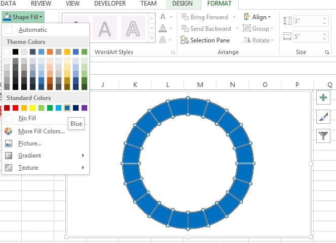
- Click the doughnut, open the Format tab and use Shape Fill to colour the whole ring blue (or your brand colour).
Step 2: add the KPI doughnut on the secondary axis
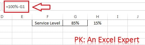
- Type the KPI name in F1 and its value in G1 (for example Service Level and 75%). In H1 enter
=100%-G1.
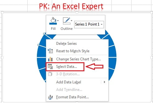
- Right-click the doughnut and choose Select Data.
- Click Add to create a second series.
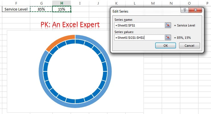
- Set Series name to F1 and Series values to G1:H1. Click OK twice.
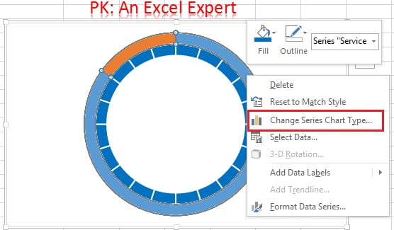
- A second ring appears outside the first. Right-click it and choose Change Series Chart Type.
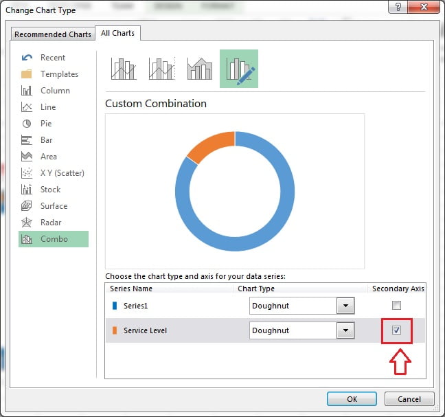
- Tick Secondary Axis for the Service Level series and click OK. The KPI ring now sits on top of the base ring.
- Double-click the KPI slice (blue) and use Format > Shape Fill > No Fill so the coloured base ring shows through it.
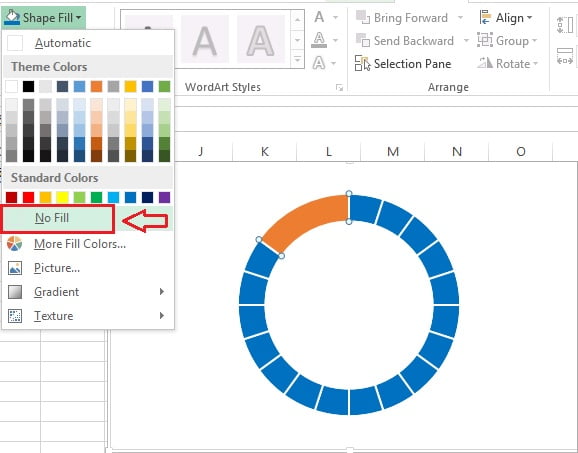
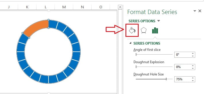
- Double-click the remainder slice (orange) to open Format Data Point and click Fill & Line.
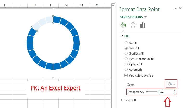
- Choose Solid fill, colour White, Transparency 10%. The unachieved part of the ring now appears faded.
Step 3: add the value in the centre
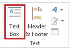
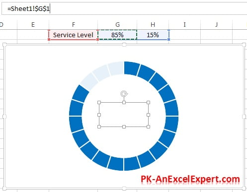
- Go to Insert > Text Box and draw a text box over the hole of the ring.
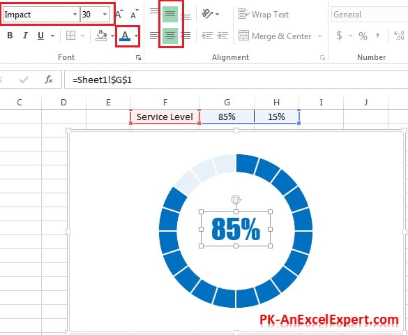
- With the text box selected, click in the formula bar, type =, click cell G1 and press Enter. The box now shows the KPI value and updates with the cell.
- On the Home tab set vertical alignment to Middle, horizontal alignment to Center, font Impact (or any bold face), size 30, and the same blue as the ring.
Change the KPI and watch the ring move
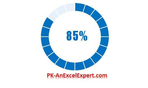
Type a new value in G1. The remainder in H1 recalculates, the white slice shrinks or grows, and the centre text updates. Click the chart below to download the finished workbook.
Worked example: a red, amber, green progress circle
A project office wants the ring to change colour with the completion percentage. Extend the support data with three conditional cells.
| Cell | Label | Formula |
|---|---|---|
| G1 | Completion | 58% |
| G3 | Red | =IF(G1<50%,G1,0) |
| G4 | Amber | =IF(AND(G1>=50%,G1<80%),G1,0) |
| G5 | Green | =IF(G1>=80%,G1,0) |
| G6 | Remainder | =100%-G1 |
- Delete the twenty-ones base ring and instead add one series with values G3:G6 on the primary axis.
- Colour the first three points red, amber and green and set the fourth point (remainder) to light grey.
- Type 58% in G1: the ring shows 58 percent in amber. Type 85%: it turns green. Only one coloured slice is ever non-zero.
Result: a single-ring progress circle that changes colour at your thresholds, with no conditional formatting or VBA.
When to use a progress circle chart
- Single percentage KPIs on dashboard tiles: service level, completion, attainment, satisfaction score.
- Side-by-side rings for several teams or products, each with its own value in the centre.
- Not for negative values, values above 100 percent, or part-to-whole splits with several categories; use a plain doughnut chart for those.
Tips and common mistakes
- Use the secondary axis. If the KPI series stays on the primary axis it is drawn behind the base ring and nothing appears to change.
- Use twenty segments. A single-segment base ring works, but twenty equal segments make the white fade look smooth at any percentage.
- Cap the input. Wrap the KPI in
MIN(G1,100%)so the remainder can never go negative. - Format the source cell. If the text box shows 0.75 instead of 75%, apply a percentage format to G1; the text box inherits the cell’s number format.
- Adjust the hole. Set Doughnut Hole Size to 60 to 70 percent so there is room for the number.
- Add a caption. A second, smaller linked text box under the value can show the KPI name from F1.
- Group before moving. Select the chart and text boxes and press Ctrl+G; set the chart area to No fill so the ring floats on the dashboard.
Practice exercise
- Build the basic ring with 75 percent, then test 0, 50 and 100 percent to confirm the ring fills correctly at the extremes.
- Build the red, amber, green version from the worked example with the thresholds held in cells rather than typed into the formulas.
- Copy the finished chart three times and link each copy to a different KPI to make a row of tiles.
- Replace the text box with a chart data label on the KPI slice, linked to G1, and compare which is easier to position.
Key takeaways
- A progress circle is two doughnut series: a static coloured base ring and a two-slice KPI ring on the secondary axis.
- The KPI slice is No fill and the remainder is white with slight transparency; that is what creates the fill effect.
- The centre value is a text box linked to the KPI cell with
=G1in the formula bar. - Conditional colours come from extra series driven by IF formulas.
- Everything reads from one cell, so linking that cell to your data makes the tile live.
Related lessons
- Advanced Charts and Infographics course hub
- Speedometer chart in Excel
- Battery chart in Excel
- Waffle chart in Excel (another way to show one percentage)
- Doughnut chart basics
- Half circle KPI charts using doughnut charts (blog post)
- IF function and AND function for the colour thresholds
- Microsoft Support: Present your data in a doughnut chart
Frequently asked questions
Why does the ring not change when I edit the value?
The KPI series is almost certainly on the primary axis, behind the base ring, so its changes are hidden. Right-click the chart, open Change Series Chart Type and tick Secondary Axis for the KPI series. If the ring still looks static, check that H1 contains =100%-G1 and not a typed number.
How do I show the percentage in the middle of the doughnut?
Insert a text box over the hole, select it, type = in the formula bar and click the KPI cell. The text updates whenever the cell changes and takes the cell’s number format. Format the text on the Home tab like any cell: font, size, colour and centre alignment.
Can the ring change colour when the KPI is low?
Yes. Replace the base ring with three series driven by IF formulas for red, amber and green, so only one is non-zero at a time, and colour each accordingly. The worked example above shows the formulas. The KPI ring on the secondary axis stays exactly as it is.
How do I make a progress circle that starts at the top?
Both doughnut series start at 12 o’clock by default, so the fill begins at the top and runs clockwise. If you want it to start elsewhere, set Angle of first slice in Format Data Series to the same value for both series, otherwise the rings will be out of step.
Is there a built-in progress circle in Excel 365?
No. Excel 365 has no native progress ring or KPI tile chart type, and this doughnut technique remains the standard approach. Copilot can insert a doughnut chart for you, but the transparency trick and the linked text box still have to be applied by hand as shown here.
Want the finished version? Ready-made Excel KPI tiles, dashboards and chart templates are available at NextGenTemplates.com.