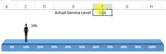
A Chart for KPI Metrics
Moving Man Chart is very innovative chart to show the KPI Metrics like Service Level.
![Moving Man Chart](https://www.pk-anexcelexpert.com/wp-content/uploads/AdvancedChartandInfo-graphics/MovingManChart/Moving-Man-Chart.gif)
Below are the steps to create the Moving Man Chart in MS Excel
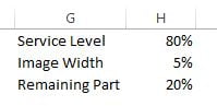
To create the moving man chart we need below support data:
- Service Level (or your Metric Name) and Service Level Performance(this cell will be changed with a formula later on)
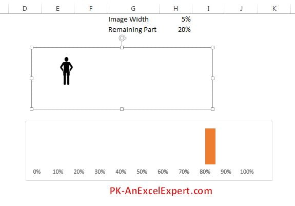
- Image Width take as 5%
- Remaining Part – put formula =”100%-H1“
![Support Data](https://www.pk-anexcelexpert.com/wp-content/uploads/AdvancedChartandInfo-graphics/MovingManChart/Moving-Man-Chart-1.jpg)
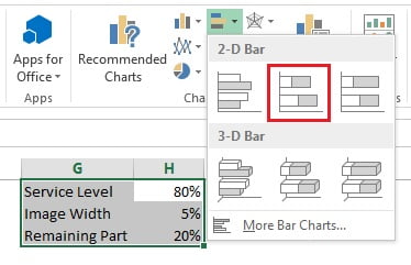
- Select Range “G1:H3” and go to Insert>>Charts>>2D Bar>> Insert Stacked Bar Chart
![Insert 2D Stacked Bar Chart](https://www.pk-anexcelexpert.com/wp-content/uploads/AdvancedChartandInfo-graphics/MovingManChart/Moving-Man-Chart-2.jpg)
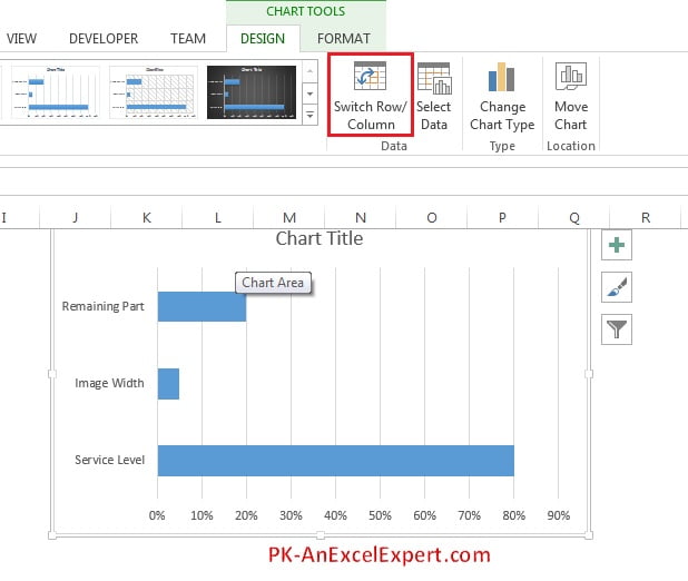
- Select the chart and go to Chart Tools>>Design Tab>>Click on Switch Row/Column
![Switch Row/Column](https://www.pk-anexcelexpert.com/wp-content/uploads/AdvancedChartandInfo-graphics/MovingManChart/Moving-Man-Chart-3.jpg)
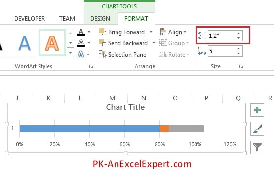
- Go to Format Tab and change chart height as 1.2″
![Chart Size](https://www.pk-anexcelexpert.com/wp-content/uploads/AdvancedChartandInfo-graphics/MovingManChart/Moving-Man-Chart-4.jpg)
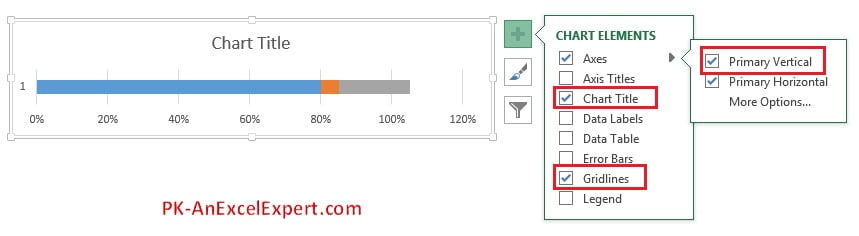
- Remove the Chart Title, Gridlines, and Axes >> Primary Vertical
![Chart Elements](https://www.pk-anexcelexpert.com/wp-content/uploads/AdvancedChartandInfo-graphics/MovingManChart/Moving-Man-Chart-5.jpg)
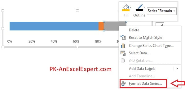
- Right Click on chart and click on Format Data Series
![Format Data Series](https://www.pk-anexcelexpert.com/wp-content/uploads/AdvancedChartandInfo-graphics/MovingManChart/Moving-Man-Chart-6.jpg)
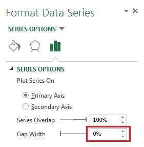
- In Series option take the Gap Width as 0%
![Change Gap Width](https://www.pk-anexcelexpert.com/wp-content/uploads/AdvancedChartandInfo-graphics/MovingManChart/Moving-Man-Chart-7.jpg)
- Right Click on Horizontal Axis and click on Format Axis
![Format Axis](https://www.pk-anexcelexpert.com/wp-content/uploads/AdvancedChartandInfo-graphics/MovingManChart/Moving-Man-Chart-8.jpg)
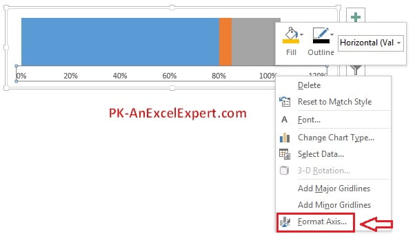
- Change the Axis option as below:
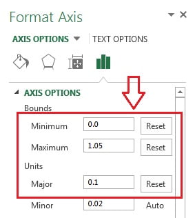
- Take Minimum as 0 (If it is already 0 then still change it so that it can be changed to Reset from Auto)
- Take Maximum as 1.05 (If it is already 1.05 then still change it so that it can be changed to Reset from Auto)
- Take Major as 0.1 (If it is already 0.1 then still change it so that it can be changed to Reset from Auto)
![Axis Option](https://www.pk-anexcelexpert.com/wp-content/uploads/AdvancedChartandInfo-graphics/MovingManChart/Moving-Man-Chart-9.jpg)
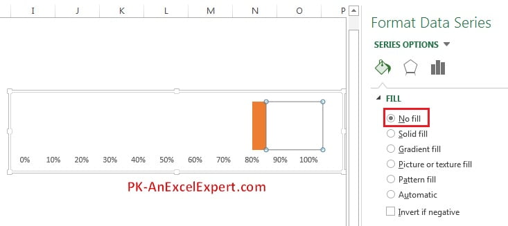
- Double click on the blue slice and fill color as No Fill
![Fill Color as No Fill](https://www.pk-anexcelexpert.com/wp-content/uploads/AdvancedChartandInfo-graphics/MovingManChart/Moving-Man-Chart-10.jpg)
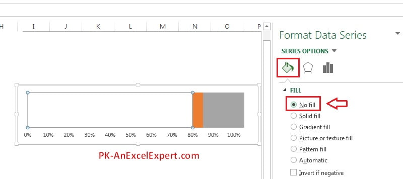
- Double click on the gray slice and fill color as No Fill
![Fill Color as No Fill](https://www.pk-anexcelexpert.com/wp-content/uploads/AdvancedChartandInfo-graphics/MovingManChart/Moving-Man-Chart-11.jpg)
- Click on the worksheet anywhere and go to Insert>>Click on symbol
![Symbols](https://www.pk-anexcelexpert.com/wp-content/uploads/AdvancedChartandInfo-graphics/MovingManChart/Moving-Man-Chart-12.jpg)
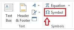
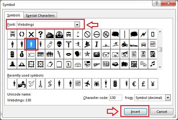
- In Symbol window select Font Webdings
- Scroll down and select Webdings-130 (A man icon)
- Click on Insert button
![Symbol window](https://www.pk-anexcelexpert.com/wp-content/uploads/AdvancedChartandInfo-graphics/MovingManChart/Moving-Man-Chart-13.jpg)
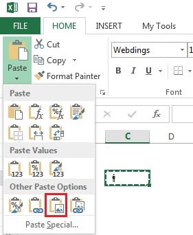
- Copy the cell wherein symbol was inserted.
![Copy the cell](https://www.pk-anexcelexpert.com/wp-content/uploads/AdvancedChartandInfo-graphics/MovingManChart/Moving-Man-Chart-15.jpg)
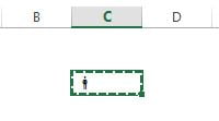
- Paste special as a picture.
![Paste Special as Picture](https://www.pk-anexcelexpert.com/wp-content/uploads/AdvancedChartandInfo-graphics/MovingManChart/Moving-Man-Chart-16.jpg)
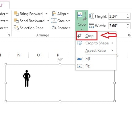
- Make the size of picture bigger as give below in the image.
![Change the Size](https://www.pk-anexcelexpert.com/wp-content/uploads/AdvancedChartandInfo-graphics/MovingManChart/Moving-Man-Chart-17.jpg)
- Select the Picture and go to Format>>Crop
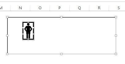
- Crop the picture to remove the extra blank area.
![Crop Picture](https://www.pk-anexcelexpert.com/wp-content/uploads/AdvancedChartandInfo-graphics/MovingManChart/Moving-Man-Chart-18.jpg)
- Do not leave any extra are while cropping as given below image
![Remove Extra Area](https://www.pk-anexcelexpert.com/wp-content/uploads/AdvancedChartandInfo-graphics/MovingManChart/Moving-Man-Chart-19.jpg)
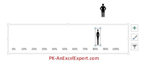
- After cropping successfully, copy the picture (Select the picture and press Ctrl + C)
- Select the orange slice in the chart and paste (press Ctrl + V)
![Paste Image in the chart](https://www.pk-anexcelexpert.com/wp-content/uploads/AdvancedChartandInfo-graphics/MovingManChart/Moving-Man-Chart-20.jpg)
- Select the Chart area
- Go to Format>>Shape Fill>>Fill as No Fill
![Fill Chart Color as No Color](https://www.pk-anexcelexpert.com/wp-content/uploads/AdvancedChartandInfo-graphics/MovingManChart/Moving-Man-Chart-21.jpg)
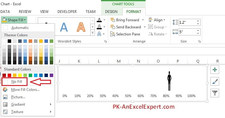
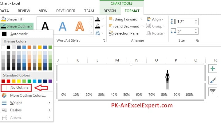
- Go to Format>>Shape Outline>>Select No Outline
![Shape Outline](https://www.pk-anexcelexpert.com/wp-content/uploads/AdvancedChartandInfo-graphics/MovingManChart/Moving-Man-Chart-22.jpg)
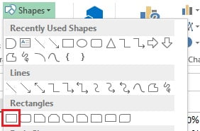
- Go to Insert>>Shapes>>Insert a Rectangle
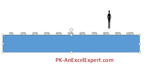
![Insert Rectangle](https://www.pk-anexcelexpert.com/wp-content/uploads/AdvancedChartandInfo-graphics/MovingManChart/Moving-Man-Chart-23.jpg)
- Take the Rectangle width bigger than the chart width
![Rectangle Size](https://www.pk-anexcelexpert.com/wp-content/uploads/AdvancedChartandInfo-graphics/MovingManChart/Moving-Man-Chart-24.jpg)
- Right Click on the Shape and click on Format Shape
![Format Shape option](https://www.pk-anexcelexpert.com/wp-content/uploads/AdvancedChartandInfo-graphics/MovingManChart/Moving-Man-Chart-25.jpg)
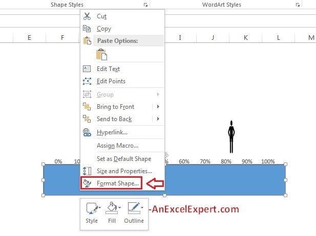
- Click on Effects button in Format Shape options
![Effect button](https://www.pk-anexcelexpert.com/wp-content/uploads/AdvancedChartandInfo-graphics/MovingManChart/Moving-Man-Chart-26.jpg)
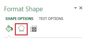
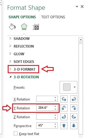
- Under 3-D Rotation, click on Presets
![Presets Option](https://www.pk-anexcelexpert.com/wp-content/uploads/AdvancedChartandInfo-graphics/MovingManChart/Moving-Man-Chart-27-290x381.jpg)
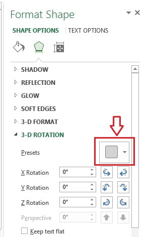
- Under the Perspective, select the Perspective Relaxed
![Perspective Relaxed](https://www.pk-anexcelexpert.com/wp-content/uploads/AdvancedChartandInfo-graphics/MovingManChart/Moving-Man-Chart-28.jpg)
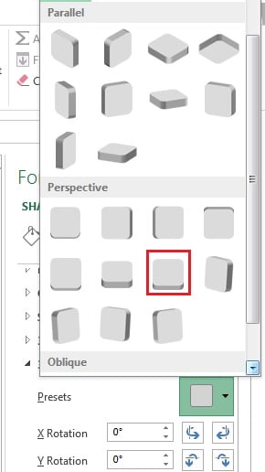
- After Select the Perspective Relaxed Change the Y Rotation angle as 284.6°
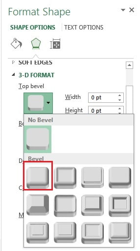
- Click on 3-D Format Option.
![Change Y Rotation](https://www.pk-anexcelexpert.com/wp-content/uploads/AdvancedChartandInfo-graphics/MovingManChart/Moving-Man-Chart-29.jpg)
- In the 3-D Format option Select the Top bevel as Circle
![Top Bevel](https://www.pk-anexcelexpert.com/wp-content/uploads/AdvancedChartandInfo-graphics/MovingManChart/Moving-Man-Chart-30.jpg)
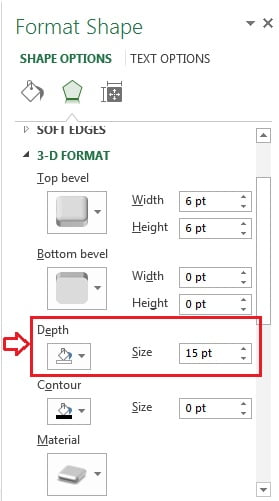
- Change the Depth as 15 pt
![Depth of Image](https://www.pk-anexcelexpert.com/wp-content/uploads/AdvancedChartandInfo-graphics/MovingManChart/Moving-Man-Chart-31.jpg)
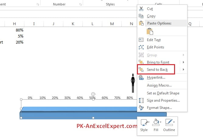
- Right click on the image and click on Send to Back
- Adjust the Image with the chart.
![Send to Back](https://www.pk-anexcelexpert.com/wp-content/uploads/AdvancedChartandInfo-graphics/MovingManChart/Moving-Man-Chart-32.jpg)
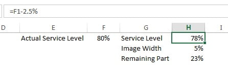
- Put your Active Service Level (Your Performance Metric) on range “F1”
- On Range “H1” Put formula (F1-2.5%)
Note: Since Image width has been taken 5%, hence the formula on range “H1” is “F1- half of Image Width” is being taken so that image will displayed on the chart in exact position.
![Active Service Level](https://www.pk-anexcelexpert.com/wp-content/uploads/AdvancedChartandInfo-graphics/MovingManChart/Moving-Man-Chart-34.jpg)
- Right click on the man image (in the chart)
- Click on the Add Data Labels
![Add Data Labels](https://www.pk-anexcelexpert.com/wp-content/uploads/AdvancedChartandInfo-graphics/MovingManChart/Moving-Man-Chart-33.jpg)
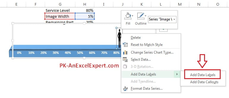
- Select the 5% (Data label on the chart)
- Go to formula bar and click on range “F1”
![Connect data label with cell value](https://www.pk-anexcelexpert.com/wp-content/uploads/AdvancedChartandInfo-graphics/MovingManChart/Moving-Man-Chart-35.jpg)
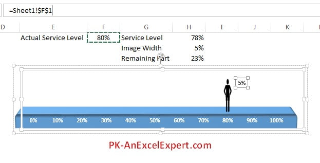
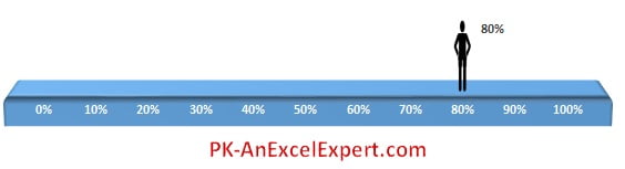
Our Moving Man Chart is ready.
Please download the excel file for practice.