Running administration efficiently is a challenge in every organization. Administrative teams handle a wide range of tasks such as document management, facility operations, employee support, and compliance tracking. Without proper measurement, it becomes difficult to identify gaps and opportunities for improvement. This is where an Administration KPI Dashboard in Excel plays a vital role.
An Administration KPI Dashboard consolidates performance metrics into a single file. It gives managers and executives a quick overview of performance trends, targets, and achievements. With easy-to-use features like slicers, charts, and conditional formatting, organizations can monitor their administrative efficiency in real time.
In this article, we will explain everything you need to know about the Administration KPI Dashboard in Excel. You will learn about its structure, benefits, best practices, and how you can use it to transform administrative management.
Click to Purchases Administration KPI Dashboard in Excel
What Is an Administration KPI Dashboard in Excel?
An Administration KPI Dashboard is a structured Excel file designed to measure and analyze administrative performance metrics. These dashboards track critical KPIs such as employee support response time, facility maintenance costs, resource utilization, and compliance scores.
Instead of using scattered spreadsheets or manual reports, the dashboard centralizes all information. It provides monthly and yearly comparisons, helps track actual versus target performance, and simplifies decision-making.
Key Features of the Administration KPI Dashboard
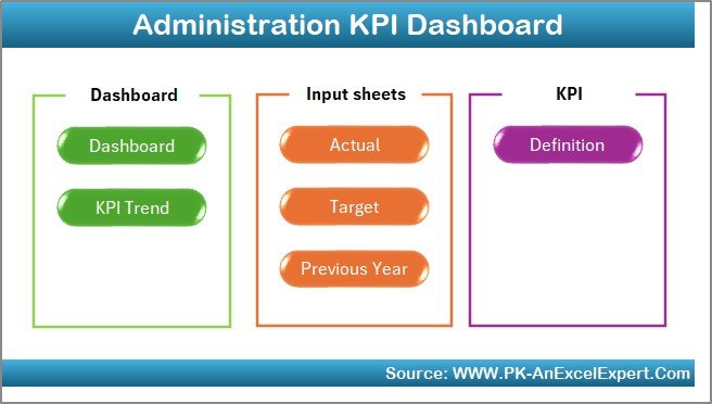
This ready-to-use Excel dashboard has been designed with seven interactive worksheet tabs:
Home Sheet
The Home sheet acts as the navigation hub. It includes buttons that allow users to jump directly to other sheets. This makes it user-friendly and saves time compared to scrolling through multiple tabs.
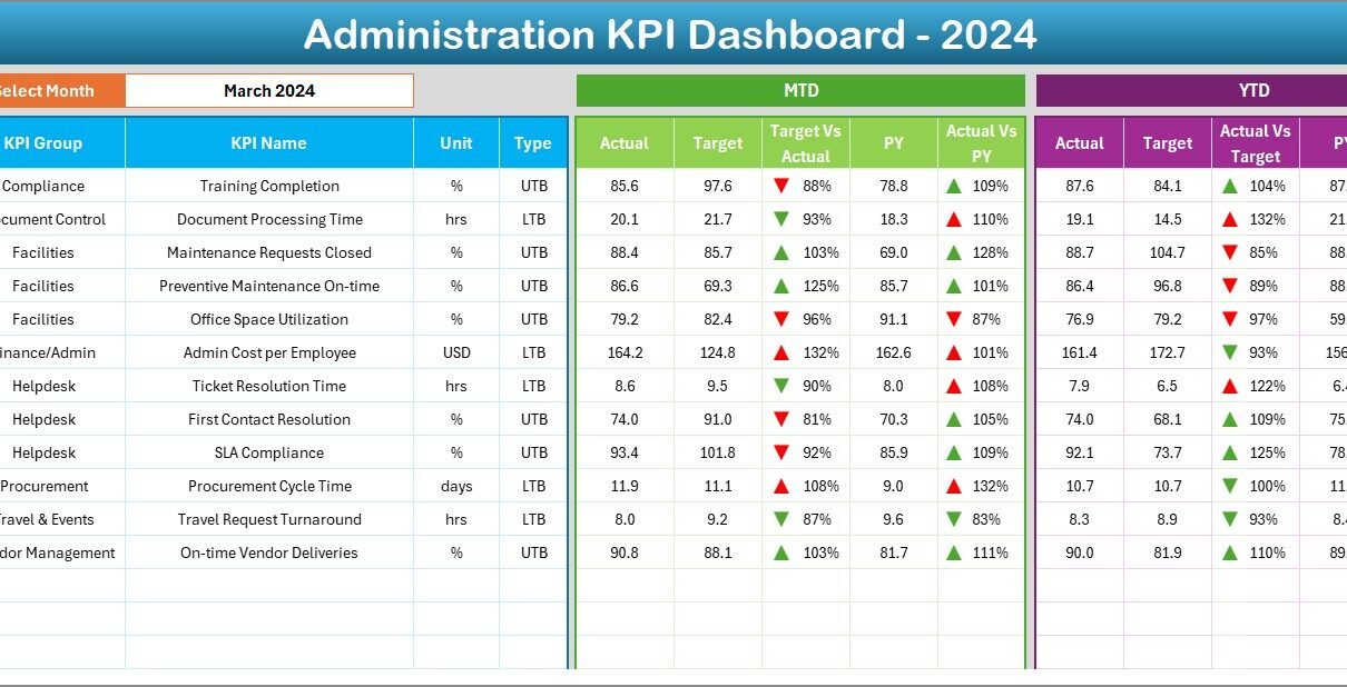
Dashboard Sheet
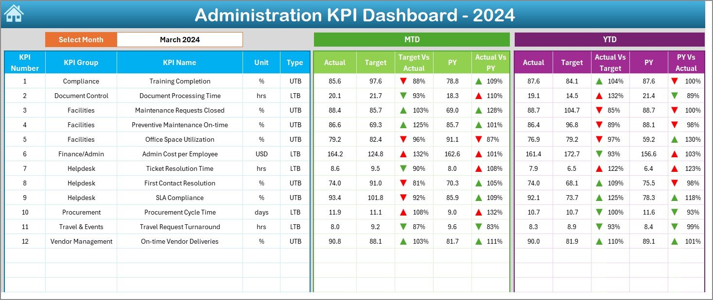
This is the main sheet of the dashboard. On this sheet:
-
You can select the reporting month from a drop-down menu (cell D3).
-
The dashboard updates automatically to show Month-to-Date (MTD) and Year-to-Date (YTD) results.
-
It displays Actual vs. Target and Actual vs. Previous Year (PY) numbers.
-
Conditional formatting with up and down arrows highlights performance trends.
This sheet provides a quick summary for managers to evaluate administrative performance at a glance.
KPI Trend Sheet
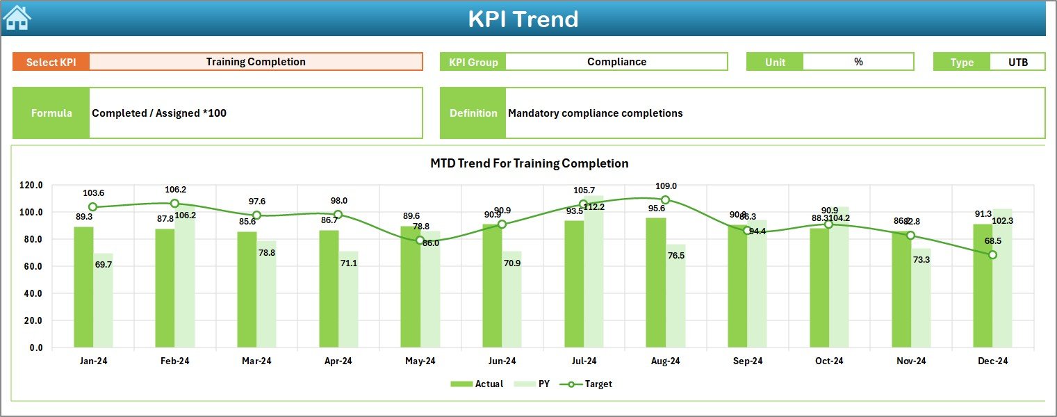
The KPI Trend sheet is designed for deep analysis.
-
You can select a specific KPI from a drop-down menu (cell C3).
-
It displays KPI details such as Group, Unit, Type (Lower the Better or Upper the Better), Formula, and Definition.
-
It shows trend charts for both MTD and YTD across Actual, Target, and Previous Year numbers.
This feature is useful for spotting long-term performance patterns.
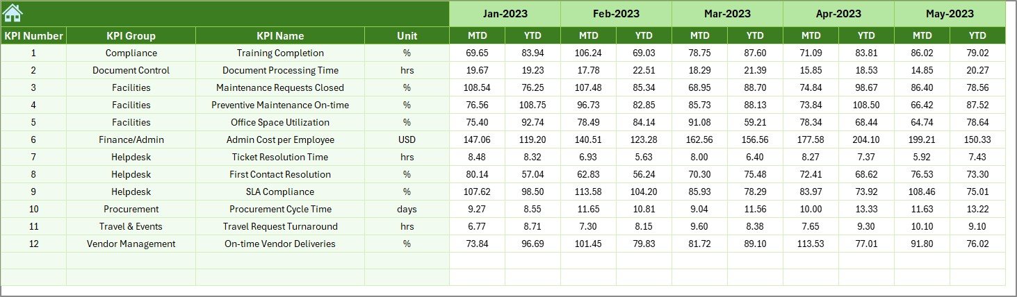
Actual Numbers Input Sheet
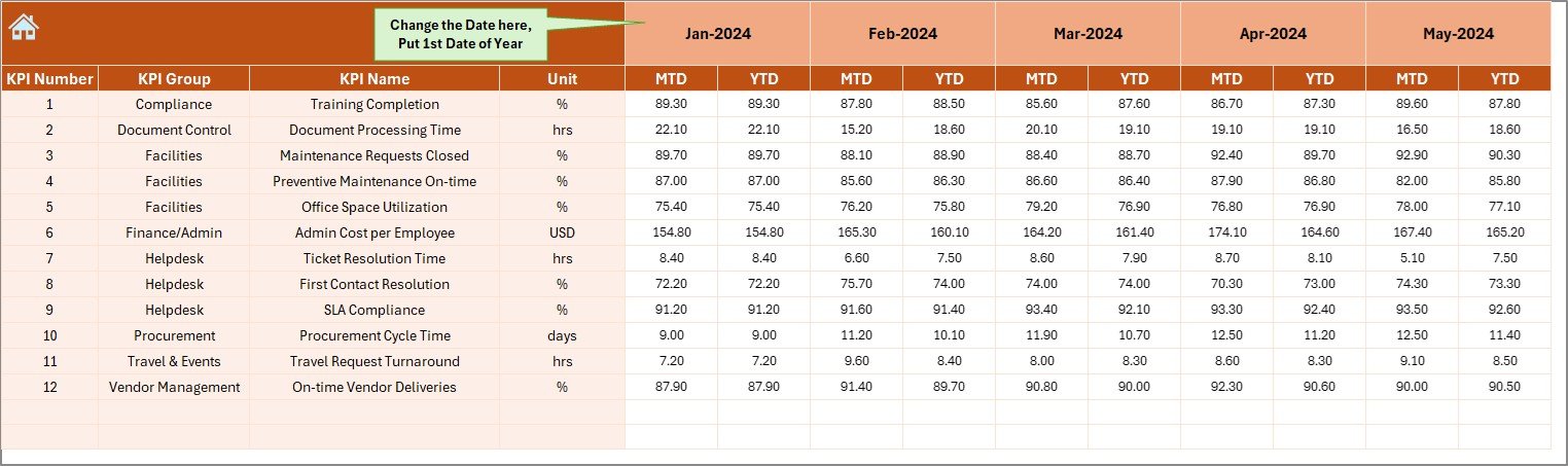
This sheet is where the real data entry happens.
-
Users enter actual monthly performance numbers.
-
A simple control at cell E1 allows you to set the starting month of the year.
-
It captures both MTD and YTD figures.
By centralizing actual inputs, the dashboard ensures accurate reporting.
Target Sheet
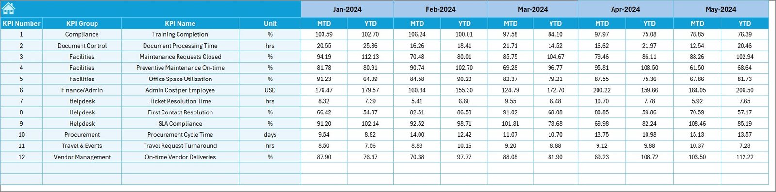
The Target sheet is where administrators enter the planned performance targets.
-
Monthly and yearly targets can be recorded for each KPI.
-
MTD and YTD targets are maintained in alignment with business goals.
This ensures that performance comparisons remain consistent.
Click to Purchases Administration KPI Dashboard in Excel
Previous Year Numbers Sheet
To provide context, this sheet stores historical performance data.
-
The structure is the same as the current year’s numbers.
-
It allows side-by-side comparisons with past performance.
This helps measure improvements and track long-term trends.
KPI Definition Sheet
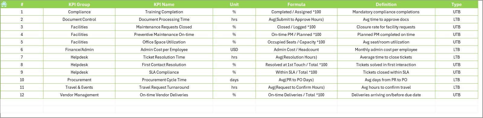
The final sheet is a reference library of all KPIs.
-
It lists KPI Name, Group, Unit, Formula, and Definition.
-
It helps users clearly understand how each KPI is calculated.
-
It also defines whether a KPI is UTB (Upper the Better) or LTB (Lower the Better).
Why Do You Need an Administration KPI Dashboard?
Without a structured dashboard, administrative performance remains fragmented and unclear. Managers might receive scattered reports from multiple departments, which wastes time and often leads to confusion.
With a KPI dashboard, you can:
-
Standardize Reporting: All departments follow the same structure.
-
Track Performance: Compare results against targets and previous years.
-
Improve Transparency: Everyone understands how KPIs are measured.
-
Save Time: Automated formulas and charts reduce manual reporting.
-
Enhance Decision-Making: Real-time insights lead to better actions.
Examples of Key Administration KPIs
Some of the most common KPIs for administration include:
-
Employee Support Response Time (hours)
-
Facility Maintenance Cost per Employee (USD)
-
Meeting Room Utilization Rate (%)
-
Document Processing Time (minutes)
-
Administrative Error Rate (%)
-
Budget Utilization Rate (%)
-
Compliance Score (%)
These KPIs can be customized based on organizational needs.
Advantages of an Administration KPI Dashboard in Excel
An Excel-based dashboard offers several advantages:
-
Ease of Use: Most organizations already use Excel, making it simple to adopt.
-
Flexibility: KPIs can be customized as per business requirements.
-
Automation: Formulas, conditional formatting, and charts update results automatically.
-
Cost-Effective: No expensive software or training is required.
-
Accessibility: Easy to share across teams through email or cloud storage.
-
Transparency: Clear KPI definitions and targets improve accountability.
Opportunities for Improvement in Administration KPI Dashboards
Even though Excel dashboards are powerful, they also have room for improvement:
-
Scalability: Excel can become slow when handling very large datasets.
-
Integration: Connecting Excel with external tools (e.g., HR systems) may require VBA or Power Query.
-
User Training: Some employees may need guidance on entering data correctly.
-
Security: Sensitive administrative data requires password protection or access control.
-
Visualization: While Excel charts are strong, tools like Power BI offer more advanced visuals.
Best Practices for the Administration KPI Dashboard
To make the most out of your dashboard, follow these best practices:
-
Define KPIs Clearly: Every KPI should have a clear definition and formula.
-
Set Realistic Targets: Align targets with business goals and capacity.
-
Ensure Data Accuracy: Regularly audit actual numbers to avoid errors.
-
Update Consistently: Enter data monthly or quarterly without delay.
-
Use Conditional Formatting: Highlight performance gaps with arrows or color codes.
-
Keep It Simple: Avoid overloading the dashboard with too many KPIs.
-
Review Trends: Focus not only on single-month results but also on long-term progress.
Conclusion
The Administration KPI Dashboard in Excel is more than just a reporting tool—it is a complete performance management solution. With its structured worksheets, automated calculations, and trend analysis features, organizations can monitor administrative efficiency effectively. It simplifies reporting, improves decision-making, and ensures accountability across departments.
By adopting this dashboard, businesses gain visibility into their administrative processes and can drive continuous improvement. When implemented correctly, it becomes a critical part of organizational success.
Frequently Asked Questions (FAQs)
1. What is an Administration KPI Dashboard in Excel?
It is an Excel-based tool that tracks administrative KPIs such as employee support, facility costs, and compliance. It consolidates all performance data into one dashboard.
2. Which KPIs should I include in the dashboard?
Common KPIs include response time, document processing time, budget utilization, compliance score, and facility maintenance costs. However, you can customize them based on your needs.
3. How does the dashboard handle monthly data?
The dashboard allows you to input actual, target, and previous year data for each month. It then calculates MTD and YTD values with automated charts and conditional formatting.
4. Is this dashboard suitable for small businesses?
Yes. Small businesses can use it without investing in expensive software. Excel provides a cost-effective way to monitor performance.
5. Can I integrate the dashboard with other tools?
Yes. With Power Query or VBA, you can connect the dashboard to external data sources such as HR systems, finance software, or cloud databases.
6. How often should I update the data?
It is recommended to update the dashboard at least once a month. Regular updates ensure accuracy and help managers take timely actions.
7. What makes Excel better than other dashboard tools?
Excel is widely used, flexible, and cost-efficient. Unlike advanced tools, it requires no new software investment. However, for advanced visuals, Power BI or Google Data Studio may be better.
Visit our YouTube channel to learn step-by-step video tutorials