Managing automotive operations requires accurate data and quick insights. Fuel costs, vehicle performance, maintenance expenses, and utilization rates can easily get out of control if managers rely only on manual reports. This is where an Automotive Dashboard in Excel becomes a game-changer.
In this article, we will explain what an automotive dashboard is, why Excel is the perfect platform to build it, the features of our ready-to-use dashboard template, and the best practices to maximize its impact.
Click to Purchases Automotive Dashboard in Excel
What Is an Automotive Dashboard in Excel?
An Automotive Dashboard in Excel is a visual reporting tool designed to track and analyze critical automotive data. It organizes complex numbers into interactive charts, KPIs, and reports, helping managers make data-driven decisions quickly.
Instead of scattered spreadsheets, this dashboard brings together all important metrics, such as:
-
Total cost by department
-
Active vs inactive vehicles
-
Mileage by fuel type
-
Fuel cost vs maintenance cost
-
Trips completed by region or vehicle type
The dashboard gives one-click access to insights through slicers, cards, and charts. Since it is built in Excel, users do not need to learn new software.
Why Use Excel for Automotive Dashboards?
Many organizations already rely on Excel for data entry and reporting. Building dashboards in Excel offers several benefits:
-
Familiarity: Most employees already know Excel, so no extra training is needed.
-
Cost-effective: No need to purchase expensive software.
-
Customizable: The dashboard can be tailored to match business needs.
-
Interactive tools: Features like slicers, pivot charts, and conditional formatting make it powerful.
-
Automation: With VBA integration, you can add buttons for navigation and automation.
Key Features of the Automotive Dashboard in Excel
Our ready-to-use dashboard is built with five main analytical pages, supported by a data sheet and a support sheet. Let’s go through each page in detail.
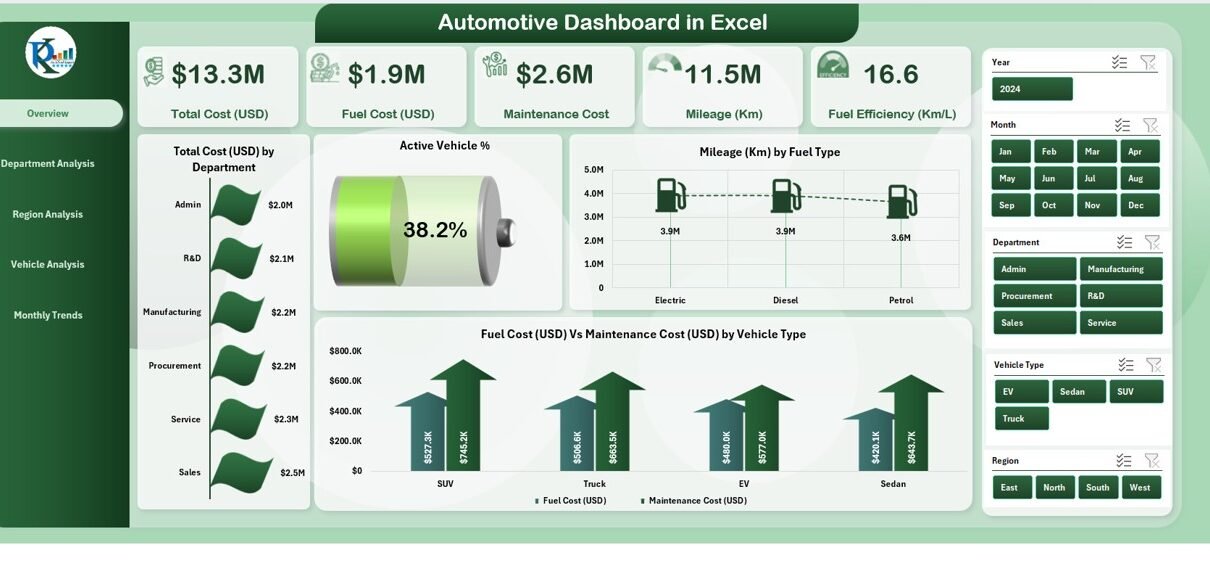
Overview Page
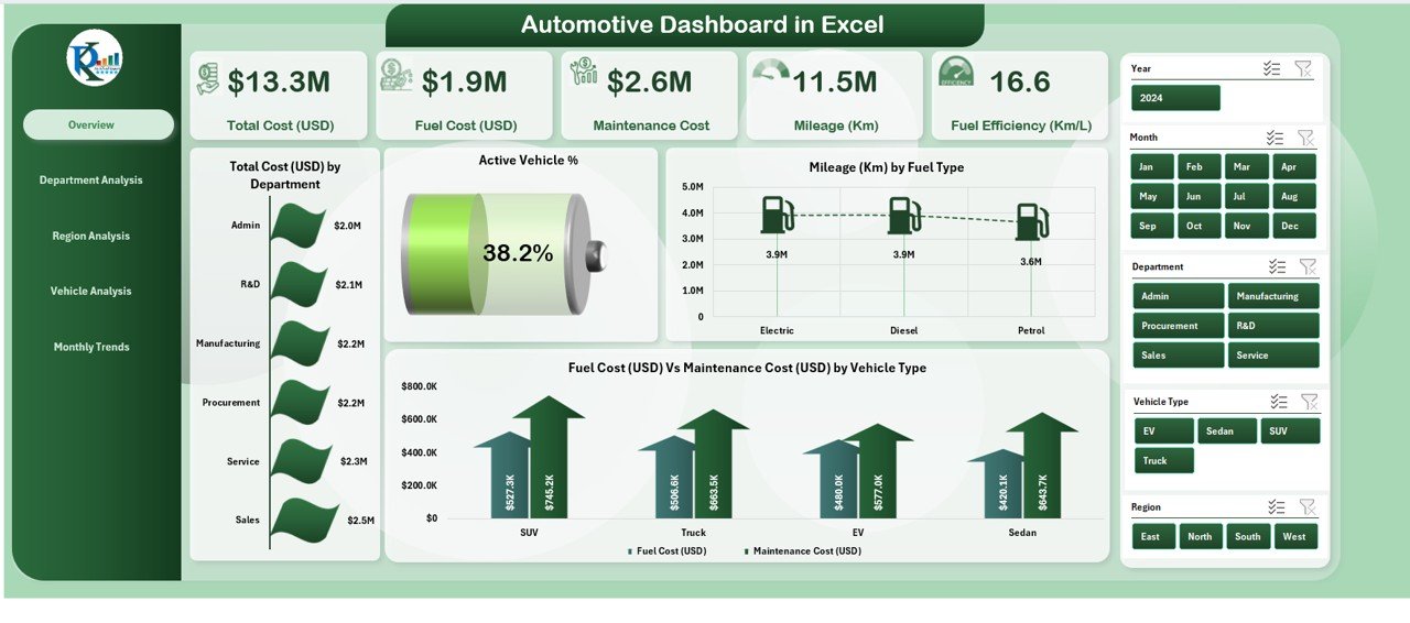
The Overview Page serves as the main landing page. It includes:
-
5 KPI Cards: Quick metrics like total cost, active vehicle percentage, and more.
4 Charts:
- Total Cost (USD) by Department
- Active Vehicle %
- Mileage (KM) by Fuel Type
- Fuel Cost (USD) vs Maintenance Cost (USD) by Vehicle Type
This page provides a snapshot of the entire automotive operation, making it easy for managers to check performance at a glance.
Department Analysis
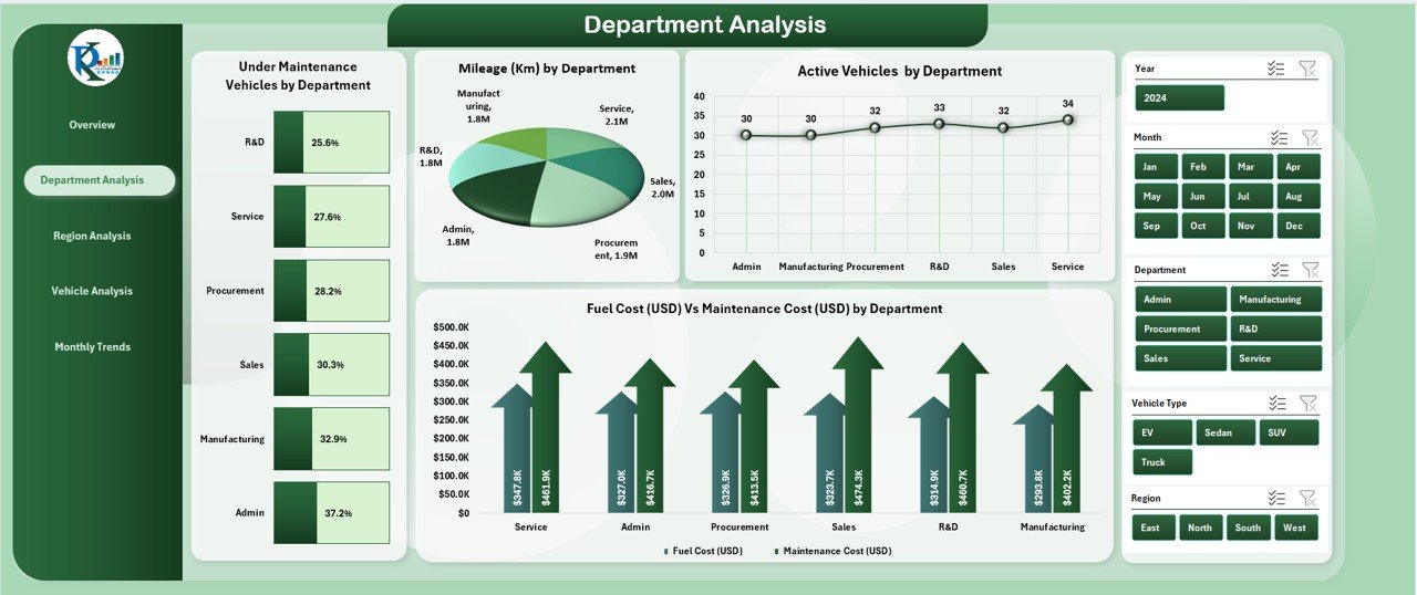
The Department Analysis Page focuses on department-level performance. It shows:
-
Vehicles under maintenance by department
-
Mileage by department
-
Active vehicles by department
-
Cost vs maintenance cost by department
This helps managers identify which departments are driving higher costs and which are more efficient.
Click to Purchases Automotive Dashboard in Excel
Region Analysis
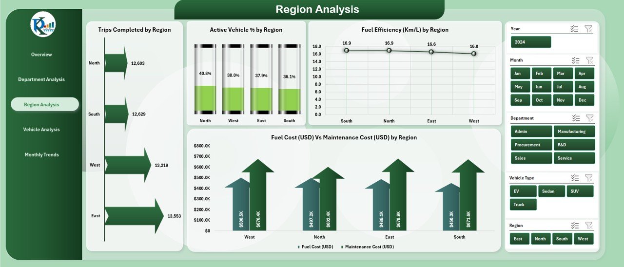
Regional performance is critical for transportation and logistics companies. This page highlights:
-
Trips completed by region
-
Active vehicle % by region
-
Fuel efficiency (Km/L) by region
-
Fuel cost vs maintenance cost by region
By comparing regions, managers can optimize resources and identify areas with higher efficiency.
Vehicle Analysis
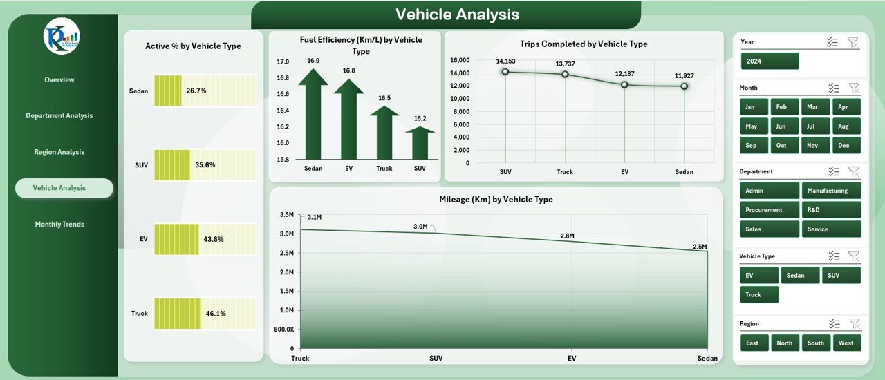
This page focuses on vehicle-level insights. It includes:
-
Active % by vehicle type
-
Fuel efficiency (Km/L) by vehicle
-
Trips completed by vehicle type
-
Mileage (Km) by vehicle type
Fleet managers can use this to monitor performance of specific vehicle categories, plan replacements, or reassign vehicles based on usage.
Monthly Trends
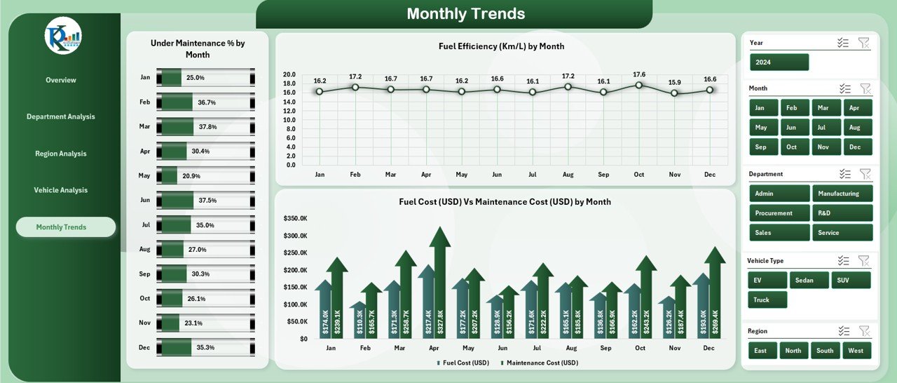
The Monthly Trends Page reveals patterns over time. It shows:
-
Under Maintenance % by region
-
Fuel efficiency (Km/L) by month
-
Fuel cost vs maintenance cost by month
These insights help forecast future costs and track long-term performance trends.
Data Sheet
The Data Sheet is where all raw data is stored. Users can input:
-
Vehicle details
-
Maintenance records
-
Fuel consumption
-
Department assignments
-
Region and trip information
Since the dashboard is pivot-based, any data update reflects instantly on the charts.
Support Sheet
The Support Sheet contains reference data such as drop-down values for slicers and unique lists (departments, regions, vehicle types, etc.). It ensures consistency across the dashboard.
Advantages of Automotive Dashboard in Excel
Using this dashboard provides several business benefits:
📊 Centralized Data: Keep all automotive records in one file.
⚡ Faster Decision-Making: View KPIs instantly without manual calculations.
💰 Cost Control: Track fuel and maintenance costs with real-time comparison.
🚗 Vehicle Utilization: Identify active vs inactive vehicles to optimize fleet usage.
🌍 Regional Insights: Compare performance across multiple regions.
📅 Trend Analysis: Understand monthly patterns to plan ahead.
🛠️ User-Friendly: Simple Excel-based structure without complex tools.
Opportunities for Improvement in Automotive Dashboards
Even though Excel dashboards are powerful, you can enhance them further:
🔄 Automate data refresh: Connect the dashboard with external databases.
🧾 Add predictive analytics: Use forecasting models for cost and usage.
📱 Make it mobile-friendly: Export interactive reports to Power BI for mobile access.
🔐 Improve security: Add password protection for sensitive vehicle and cost data.
📊 Expand KPIs: Include safety incidents, driver performance, and downtime tracking.
Best Practices for the Automotive Dashboard in Excel
To maximize the value of this dashboard, follow these practices:
✅ Keep data clean and structured for accurate reports.
✅ Update the dashboard regularly with the latest records.
✅ Use slicers and filters for quick insights.
✅ Customize KPIs to align with your organization’s goals.
✅ Back up your data sheet before making changes.
✅ Train users on how to read charts and interpret KPIs.
Conclusion
An Automotive Dashboard in Excel empowers organizations to track costs, monitor vehicles, and improve efficiency without investing in expensive tools. With interactive charts, KPI cards, and department-level insights, it becomes easier to manage complex automotive operations.
By following best practices and continuously improving the dashboard, companies can achieve significant cost savings and optimize fleet performance.
Frequently Asked Questions (FAQs)
1. What is an Automotive Dashboard in Excel?
It is a visual reporting tool built in Excel that tracks automotive KPIs such as fuel cost, maintenance, mileage, and vehicle utilization.
2. Who can use this dashboard?
Fleet managers, logistics companies, transport departments, and any business with vehicles can benefit from this dashboard.
3. Do I need advanced Excel skills to use it?
No. The template comes with built-in slicers, charts, and navigation, so basic Excel knowledge is enough.
4. Can I customize the dashboard?
Yes. You can add or remove KPIs, update chart designs, and connect external data sources.
5. How often should I update the data sheet?
Ideally, update it weekly or monthly depending on your organization’s reporting cycle.
6. Is the dashboard password protected?
You can add password protection in Excel to secure sensitive data if needed.
7. Can this dashboard be integrated with Power BI?
Yes. You can export the data sheet to Power BI for advanced analytics and mobile access.
Visit our YouTube channel to learn step-by-step video tutorials