Managing administration tasks requires efficiency, accuracy, and strong tracking systems. In any organization, whether corporate, educational, healthcare, or non-profit, administrative processes keep operations running smoothly. However, with increasing volumes of requests, multiple departments, and diverse regions, manual tracking often leads to errors, delays, and inefficiencies.
This is where an Administration Dashboard in Excel makes a real difference. A well-designed Excel dashboard centralizes all key information, provides real-time insights, and helps decision-makers monitor performance effectively. In this article, we will explore what an administration dashboard is, its features, benefits, best practices, and how you can implement one in Excel.
Click to Purchases Administration Dashboard in Excel
What Is an Administration Dashboard in Excel?
An Administration Dashboard in Excel is a structured and visual reporting tool that helps organizations track, analyze, and manage administrative activities. It uses tables, charts, and KPIs (Key Performance Indicators) to summarize large amounts of data into meaningful insights.
Instead of searching through lengthy spreadsheets, users can instantly see:
-
Requests by department
-
Escalation percentages
-
High-priority tasks
-
Regional performance
-
Monthly progress
This dashboard provides decision-makers with actionable insights, making it easier to identify issues and implement improvements quickly.
Key Features of the Administration Dashboard
The dashboard we created is a ready-to-use template designed to simplify administrative management. It includes five main analytical pages and a support sheet, connected with a left-side page navigator for quick access.
Overview Page
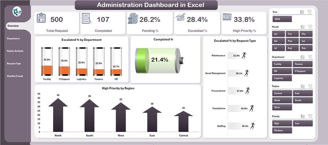
The Overview Page acts as the central hub of the dashboard. It provides high-level insights through cards and charts.
-
Cards Section: Displays summary metrics like total requests, completed requests, escalated requests, and high-priority cases.
Charts Section:
- Escalated % by Department
- Completed %
- Escalated % by Request Type
- High Priority by Region
This page helps administrators get a quick snapshot of the organization’s current status.
Department Analysis
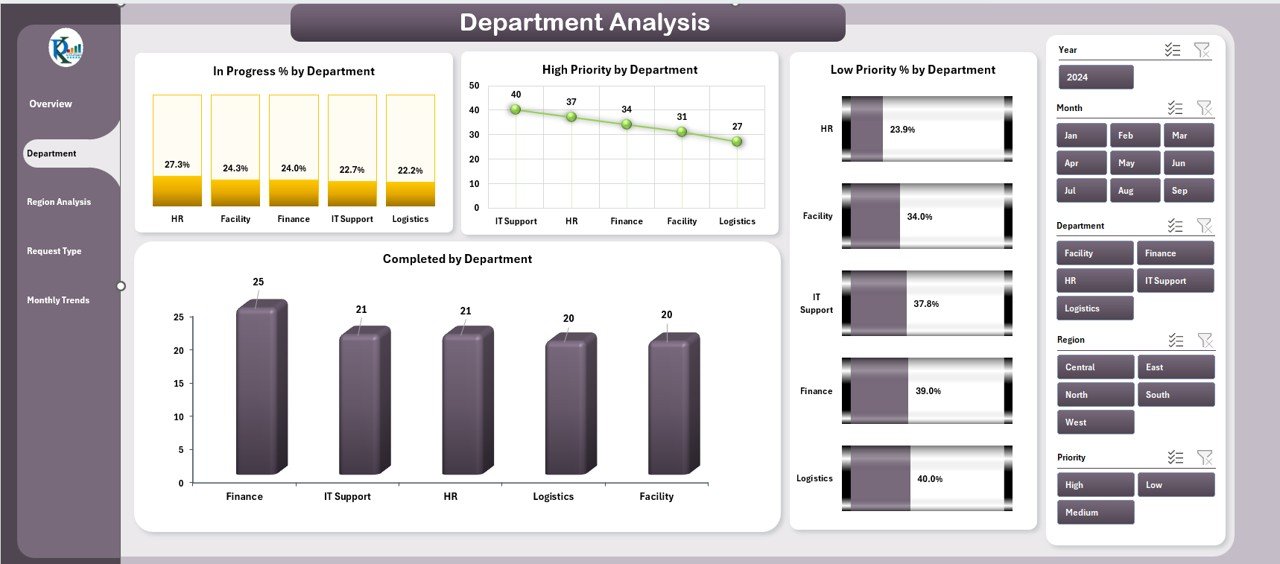
The Department Analysis Page focuses on performance across different organizational departments.
Charts Included:
- In Progress % by Department
- High Priority by Department
- Low Priority % by Department
- Completed by Department
This section allows leaders to identify which departments handle tasks efficiently and which need additional support.
Region Analysis
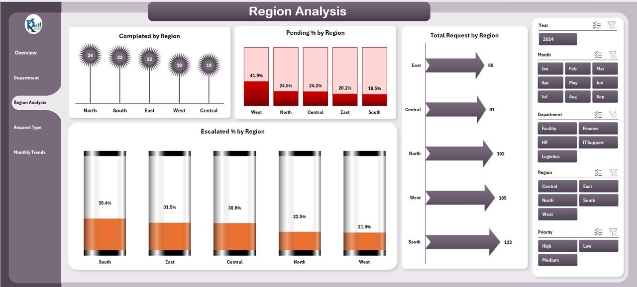
Administrative work often varies by location. The Region Analysis Page highlights geographical performance trends.
Charts Included:
- Completed by Region
- Pending % by Region
- Total Requests by Region
- Escalated % by Region
With this information, decision-makers can allocate resources where they are needed most.
Click to Purchases Administration Dashboard in Excel
Request Type Analysis
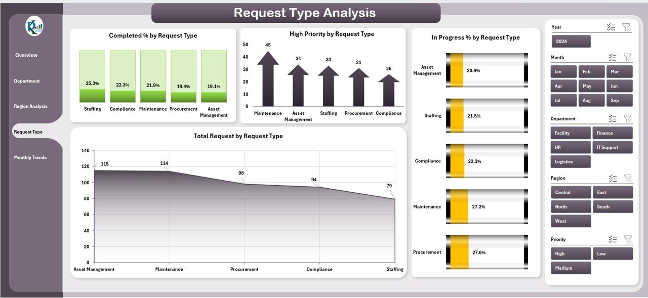
Requests can differ in nature, such as IT support, HR issues, facility management, or compliance checks. The Request Type Analysis Page provides clarity.
Charts Included:
- Completed by Request Type
- High Priority by Request Type
- In Progress % by Request Type
- Total Requests by Request Type
This analysis ensures administrators understand the demand patterns across different request types.
Monthly Trends
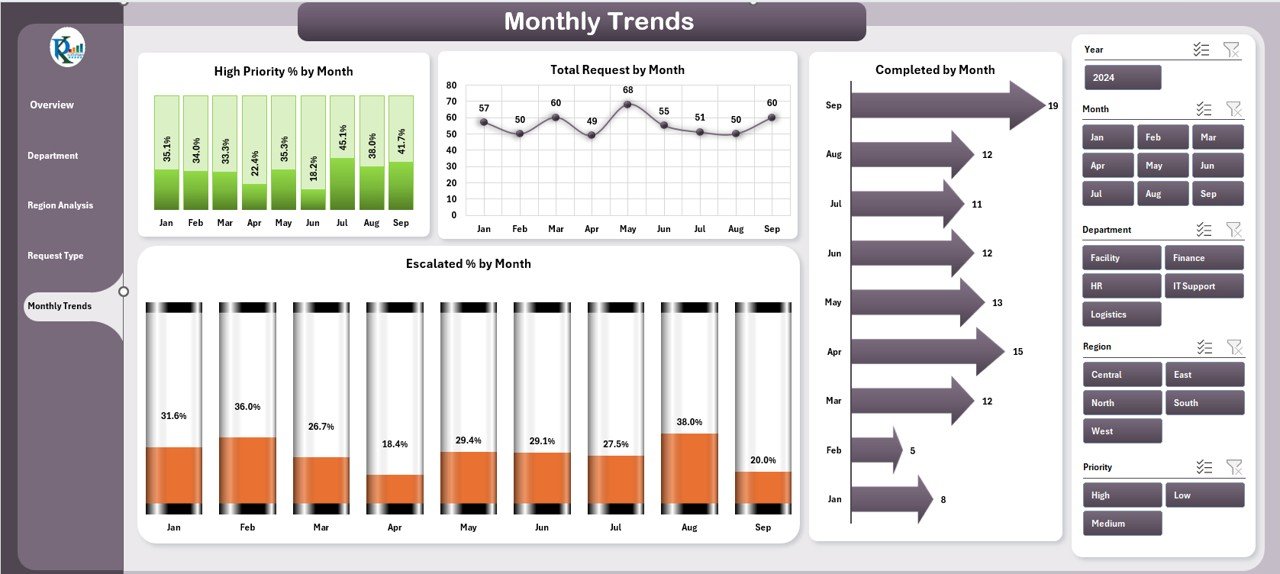
The Monthly Trends Page tracks performance over time, helping organizations identify patterns and forecast future workloads.
Charts Included:
- High Priority % by Month
- Total Requests by Month
- Completed by Month
- Escalated % by Month
This time-based analysis supports continuous improvement and trend forecasting.
Support Sheet
The Support Sheet holds the backend data that powers the dashboard. It includes request details, department names, regions, request types, priorities, and dates. By keeping data structured here, the dashboard can update automatically when new information is entered.
Why Use an Administration Dashboard in Excel?
Excel remains one of the most widely used tools for management. The reasons organizations prefer Excel dashboards include:
-
Easy to customize without complex software.
-
Compatible with different departments.
-
No need for additional licenses or IT dependency.
-
Highly visual with built-in charts and conditional formatting.
By centralizing data in Excel, organizations gain flexibility while maintaining simplicity.
Advantages of Administration Dashboard in Excel
Implementing this dashboard brings several advantages:
✅ Improved Decision-Making – Managers can identify bottlenecks and act quickly.
✅ Centralized Data – All information is stored in one structured file.
✅ Transparency – Every department and region’s performance is visible.
✅ Time-Saving – Reduces the need for manual reporting.
✅ Scalability – Can be expanded with additional KPIs as needed.
✅ Cost-Effective – No expensive software is required.
Opportunities for Improvement
While Excel dashboards are powerful, there are always areas for improvement:
🔹 Automation: Integrate with VBA or Power Query for real-time data refresh.
🔹 Scalability: For very large datasets, consider linking Excel with databases.
🔹 User Training: Train staff to interpret dashboard insights correctly.
🔹 Data Security: Apply protection and access controls to sensitive information.
Best Practices for Using an Administration Dashboard
To maximize the value of your Excel dashboard, follow these best practices:
-
Define Clear KPIs
-
Ensure each metric aligns with business goals.
-
-
Maintain Data Accuracy
-
Regularly update and validate backend data in the support sheet.
-
-
Use Consistent Formatting
-
Keep charts, tables, and slicers uniform for clarity.
-
-
Apply Conditional Formatting
-
Highlight escalated cases or overdue tasks automatically.
-
-
Incorporate Filters and Slicers
-
Allow users to select timeframes, departments, or regions easily.
-
-
Keep It Simple
-
Avoid cluttered visuals; focus only on actionable insights.
-
-
Review Regularly
-
Evaluate whether the dashboard continues to meet business needs.
-
Conclusion
An Administration Dashboard in Excel is an essential tool for modern organizations. It simplifies administrative monitoring, improves transparency, and ensures better decision-making. With structured pages such as Overview, Department Analysis, Region Analysis, Request Type Analysis, and Monthly Trends, organizations can track performance from multiple angles.
By following best practices and continuously improving the system, organizations can make their administrative processes more efficient, transparent, and effective.
Frequently Asked Questions (FAQs)
1. What is an Administration Dashboard in Excel?
It is a structured Excel-based reporting tool that tracks administrative performance through KPIs, charts, and analysis pages.
2. Who can use this dashboard?
It is suitable for corporate offices, schools, hospitals, NGOs, and government organizations that handle multiple administrative requests.
3. Do I need advanced Excel knowledge to use this dashboard?
No. Basic Excel skills are enough to operate the dashboard since most features are automated and user-friendly.
4. Can I customize the dashboard for my organization?
Yes. You can add or remove KPIs, modify charts, or expand the support sheet according to your specific needs.
5. How often should I update the data?
Ideally, update the data daily or weekly, depending on the volume of requests in your organization.
6. Is Excel better than specialized dashboard software?
For small to medium organizations, Excel is cost-effective and flexible. However, for very large datasets, advanced BI tools like Power BI may be more suitable.
7. How can I ensure data accuracy in the dashboard?
Maintain a clear data-entry process, validate information regularly, and use Excel’s data validation features.
8. Can this dashboard track trends over time?
Yes. The Monthly Trends Page specifically analyzes performance month by month to identify patterns.
Visit our YouTube channel to learn step-by-step video tutorials