Managing community services requires more than goodwill and effort. It demands clear performance measurement, effective data tracking, and actionable insights. Community organizations often deal with programs related to healthcare, social welfare, education, housing, volunteer support, and more. Without a proper tracking system, leaders struggle to measure progress, prove accountability, and improve outcomes.
This is where a Community Services KPI Dashboard in Excel becomes a game-changing solution. It helps community leaders, program managers, and volunteers monitor progress, analyze results, and make data-driven decisions. Instead of scattered reports or manual calculations, this dashboard provides a single structured platform to manage key performance indicators (KPIs) in real-time.
Click to Purchases Community Services KPI Dashboard in Excel
In this article, we will explore everything you need to know about the Community Services KPI Dashboard in Excel—its features, structure, benefits, best practices, and practical applications. By the end, you will understand why every community organization needs this tool.
What Is a Community Services KPI Dashboard in Excel?
A Community Services KPI Dashboard in Excel is a ready-to-use template designed to measure and monitor the performance of community programs. It consolidates data into an interactive interface, making it easy for managers to track KPIs such as:
-
Service delivery completion rates
-
Volunteer participation
-
Budget utilization
-
Beneficiary satisfaction
-
Project timelines
-
Event success metrics
Unlike standard spreadsheets, this dashboard uses charts, slicers, conditional formatting, and automated calculations to present data in a clear and actionable format. With just a few clicks, you can switch between months, view Year-to-Date (YTD) vs. Month-to-Date (MTD) progress, and compare performance with previous years.
Click to Purchases Community Services KPI Dashboard in Excel
Key Features of the Community Services KPI Dashboard
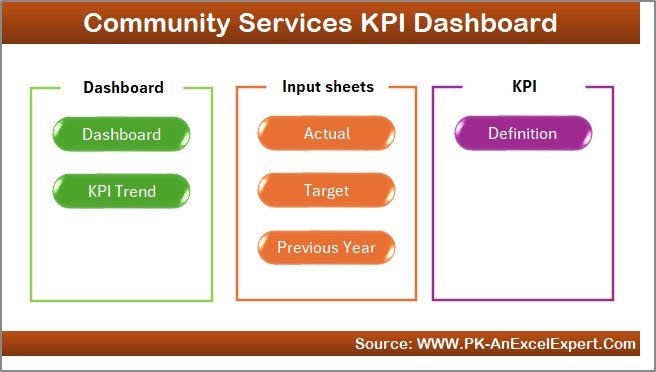
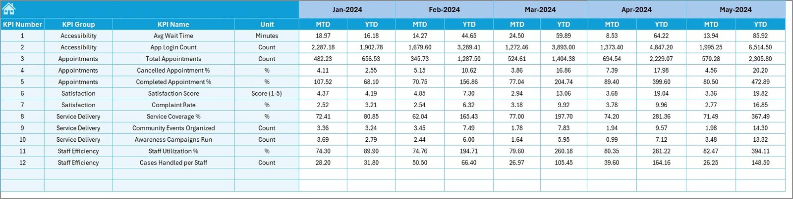
This dashboard is built with seven key worksheets, each serving a unique purpose:
1. Home Sheet
-
Acts as an index page.
-
Includes six navigation buttons to jump directly to respective sheets.
-
Saves time and ensures users don’t get lost in complex files.
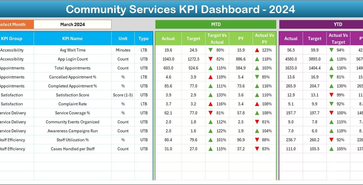
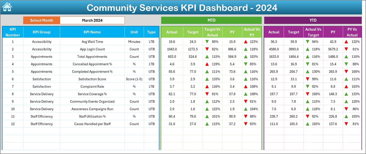
2. Dashboard Sheet Tab
-
The main hub where all KPIs are displayed.
-
Month selection available on cell D3.
-
Dynamic updates: when you select a month, all KPIs refresh automatically.
-
Displays MTD Actual vs. Target vs. Previous Year (PY).
-
Includes YTD Actual vs. Target vs. PY with arrows for performance comparison.
-
Uses conditional formatting (up and down arrows) for quick insights.
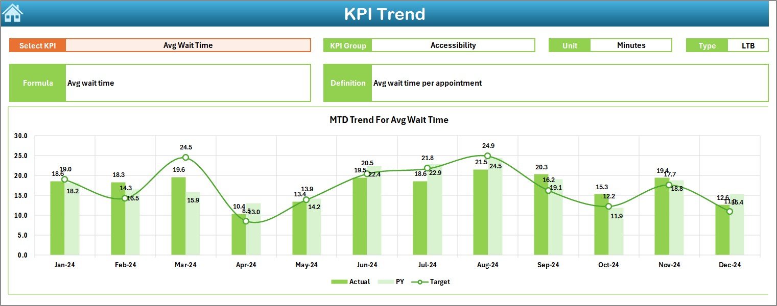
3. KPI Trend Sheet Tab
-
Lets you select a KPI from a drop-down menu (cell C3).
-
Displays details such as KPI Group, Unit, Type (Lower the Better or Upper the Better), Formula, and Definition.
-
Shows MTD and YTD trend charts for Actual, Target, and PY data.
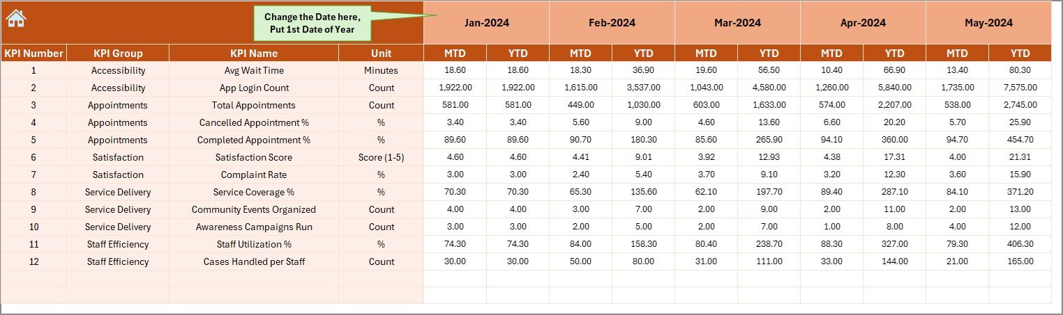
4. Actual Numbers Input Sheet
-
Input MTD and YTD actual numbers here.
-
Month can be changed from cell E1.
-
Ensures easy data entry with structured fields.
5. Target Sheet Tab
-
Stores monthly KPI targets.
-
Helps compare planned vs. achieved performance.
-
Includes both MTD and YTD targets.
6. Previous Year Number Sheet Tab
-
Contains last year’s data for benchmarking.
-
Helps identify year-on-year growth or decline.
7. KPI Definition Sheet Tab
-
Acts as a reference for users.
-
Lists KPI Name, KPI Group, Unit, Formula, and Definition.
-
Standardizes KPI usage across the organization.
Why Do Community Services Need a KPI Dashboard?
Community services often deal with tight budgets, diverse stakeholders, and high accountability. Tracking performance manually through multiple spreadsheets wastes time and increases errors. A KPI dashboard solves these challenges by:
-
Consolidating data into one platform.
-
Saving time with automated calculations.
-
Improving decision-making through visual insights.
-
Enhancing accountability for donors, stakeholders, and government bodies.
-
Tracking volunteer and staff performance with measurable KPIs.
Advantages of Using a Community Services KPI Dashboard
✔ Improved Transparency – Share clear performance reports with stakeholders.
✔ Quick Insights – Conditional formatting and charts make analysis easier.
✔ Time-Saving – No need to prepare manual reports every month.
✔ Standardized KPIs – Definitions and formulas avoid confusion.
✔ Better Planning – Compare Actual vs. Target to adjust strategies.
✔ Historical Benchmarking – Track progress against the previous year.
✔ Scalability – Can be adapted for different departments or programs.
Best Practices for Using a Community Services KPI Dashboard
To get maximum value from your dashboard, follow these best practices:
-
Define Clear KPIs: Make sure every KPI is specific, measurable, and aligned with your community goals.
-
Update Data Regularly: Enter actual and target numbers on time to avoid outdated results.
-
Use Conditional Formatting: Apply red/green arrows or traffic lights to highlight achievements or risks.
-
Benchmark with Previous Year: Always compare with last year’s numbers for better context.
-
Keep it Simple: Avoid overloading the dashboard with too many KPIs—focus on what matters most.
-
Train Users: Ensure staff and volunteers know how to read and update the dashboard.
-
Review Trends Monthly: Use the KPI Trend sheet to identify early warning signals.
How Can Community Organizations Apply This Dashboard?
Community service organizations can apply this Excel-based KPI dashboard in various areas:
-
Healthcare Programs
-
Track number of patients served.
-
Monitor average waiting times.
-
Measure patient satisfaction scores.
-
-
Educational Initiatives
-
Track student enrollment and attendance.
-
Monitor training program completion rates.
-
Measure teacher performance.
-
-
Social Welfare Programs
-
Track food distribution metrics.
-
Monitor housing support beneficiaries.
-
Measure financial aid disbursement.
-
-
Volunteer Management
-
Track volunteer participation hours.
-
Measure retention rates.
-
Compare planned vs. actual volunteer deployment.
-
-
Event Planning & Community Engagement
-
Track attendance.
-
Measure participant satisfaction.
-
Compare costs vs. budget.
-
Real-World Benefits of the Dashboard
When community services use this Excel tool, they experience:
-
Better funding approvals – Donors trust data-backed performance reports.
-
Increased efficiency – Staff can focus on service delivery rather than reporting.
-
Improved community impact – With accurate tracking, services reach more people effectively.
-
Enhanced collaboration – Teams work with shared, transparent data.
Challenges Without a KPI Dashboard
Without a proper dashboard, organizations may face:
-
Data silos – Information scattered across multiple spreadsheets.
-
Inconsistent reporting – Different people use different metrics.
-
Delayed decision-making – No real-time updates available.
-
Limited accountability – Hard to justify performance to funders.
Conclusion
The Community Services KPI Dashboard in Excel is more than just a reporting tool—it is a strategic partner for decision-making. It ensures that community service organizations can track their progress, evaluate performance, and make improvements where needed.
By using this dashboard, organizations can boost transparency, efficiency, and accountability, ultimately improving the quality of services delivered to the community.
Click to Purchases Community Services KPI Dashboard in Excel
If you manage community projects, adopting this dashboard can save time, reduce errors, and strengthen your impact.
Frequently Asked Questions (FAQs)
1. What is a Community Services KPI Dashboard?
It is an Excel-based tool that tracks key performance indicators of community programs such as healthcare, education, and volunteer services.
2. Who can use this dashboard?
Community leaders, managers, NGOs, social workers, and volunteers can all benefit from using this dashboard.
3. Do I need advanced Excel skills to use it?
No. The dashboard is prebuilt and user-friendly. You only need basic Excel knowledge to enter data and view results.
4. Can I customize the KPIs?
Yes. You can add, remove, or modify KPIs based on your organization’s needs.
5. How often should I update the dashboard?
Ideally, update it monthly to ensure the numbers reflect the latest performance.
6. Can this dashboard be shared with stakeholders?
Yes. You can share the Excel file or export reports as PDFs or images for presentations.
Visit our YouTube channel to learn step-by-step video tutorials
Click to Purchases Community Services KPI Dashboard in Excel