In today’s competitive world, engineering teams face constant pressure to improve efficiency, reduce costs, and deliver projects on time. Managing large volumes of data and monitoring performance manually can often lead to errors, delays, and missed opportunities. To overcome these challenges, businesses need a structured way to track, analyze, and visualize their engineering performance.
This is where an Engineering KPI Dashboard in Excel becomes a powerful solution. With the help of Excel’s advanced features like pivot tables, slicers, charts, and conditional formatting, organizations can create a performance monitoring tool that brings clarity to complex data.
In this article, we will explore everything you need to know about the Engineering KPI Dashboard in Excel—its structure, key features, advantages, best practices, and real-world applications. By the end, you will have a clear roadmap to implement it in your organization.
Click to Purchases Engineering KPI Dashboard in Excel
What Is an Engineering KPI Dashboard in Excel?
An Engineering KPI Dashboard is a structured Excel-based tool that helps organizations track, measure, and analyze engineering performance using Key Performance Indicators (KPIs). Instead of scattered spreadsheets or manual reports, the dashboard consolidates all important metrics into one interactive platform.
It gives engineering managers and executives a real-time view of performance across projects, teams, and departments. With this information, decision-makers can identify areas that need improvement and take quick action.
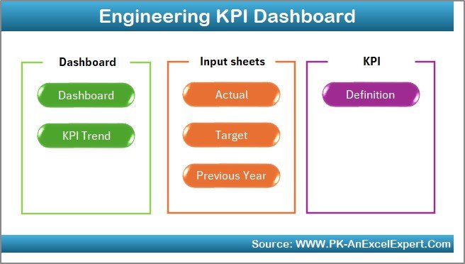
Structure of the Engineering KPI Dashboard
The dashboard comes with seven interactive worksheets designed for seamless navigation and data analysis. Let’s go through each of them in detail:
1. Home Sheet
-
Acts as the index page.
-
Provides six navigation buttons to jump directly to different sheets.
-
Saves time and ensures smooth navigation.
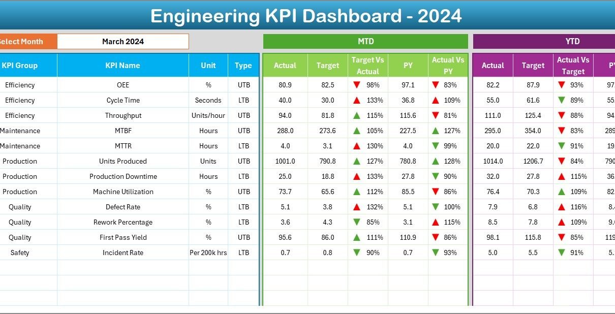
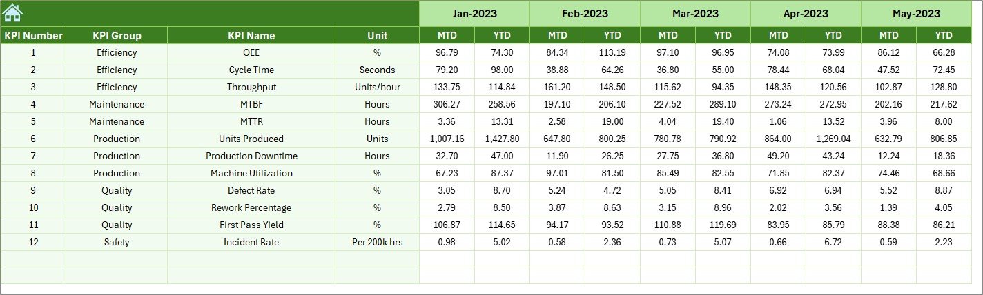
2. Dashboard Sheet
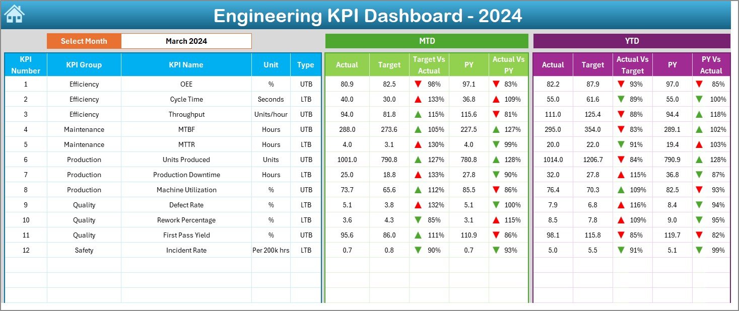
-
The main analytical page.
-
On cell D3, users can select the desired month from a drop-down menu.
-
Displays MTD (Month-to-Date) and YTD (Year-to-Date) actuals, targets, and previous year data.
-
Conditional formatting with up and down arrows highlights performance vs. target.
-
Helps in quick monthly and yearly comparisons.
3. KPI Trend Sheet
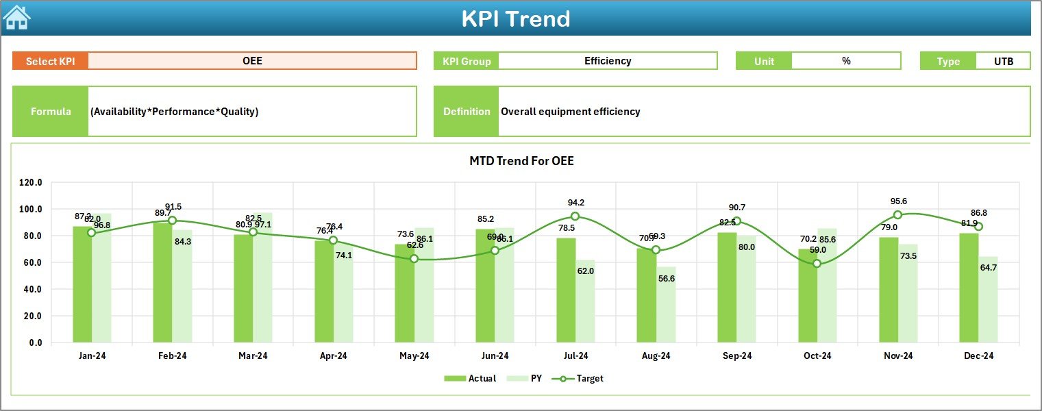
-
Allows selection of a KPI from a drop-down list (cell C3).
-
Displays KPI details like Group, Unit, Type (UTB/LTB), Formula, and Definition.
-
Provides MTD and YTD trend charts for Actual, Target, and Previous Year numbers.
-
Helps in analyzing trends over time rather than just static numbers.
4. Actual Numbers Input Sheet
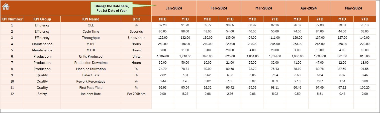
-
Input sheet for actual monthly performance values.
-
User selects the first month of the year in cell E1.
-
MTD and YTD values are recorded for each KPI.
-
Ensures accurate reporting by separating input data from dashboard visuals.
5. Target Sheet
-
Target Sheet Stores monthly and yearly target values for each KPI.
-
Allows tracking of both short-term (MTD) and long-term (YTD) goals.
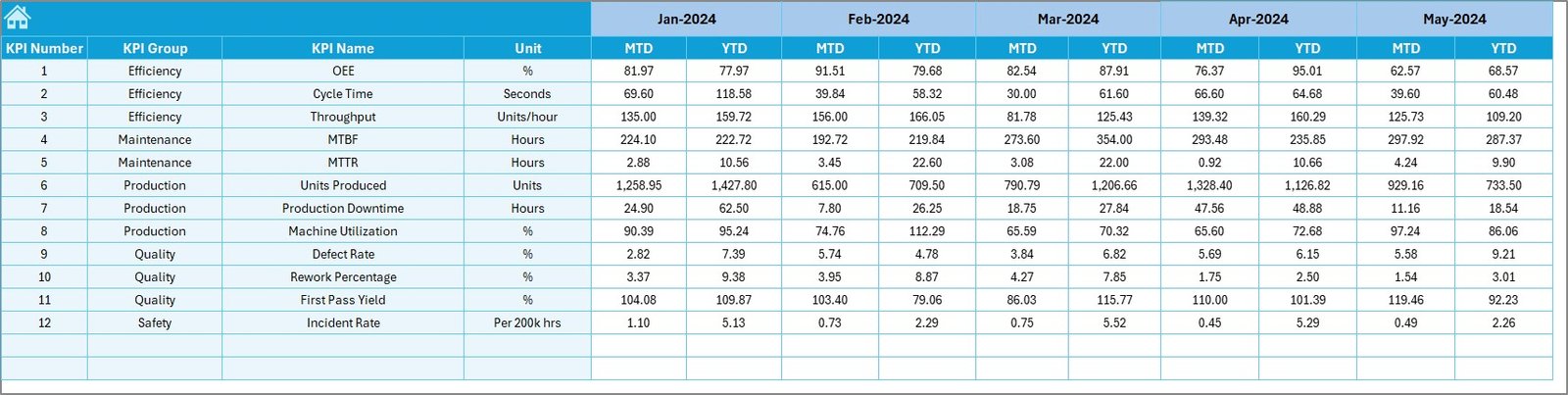
6. Previous Year Numbers Sheet
-
Stores last year’s performance values for comparison.
-
Useful for trend analysis and benchmarking against past performance.
7. KPI Definition Sheet
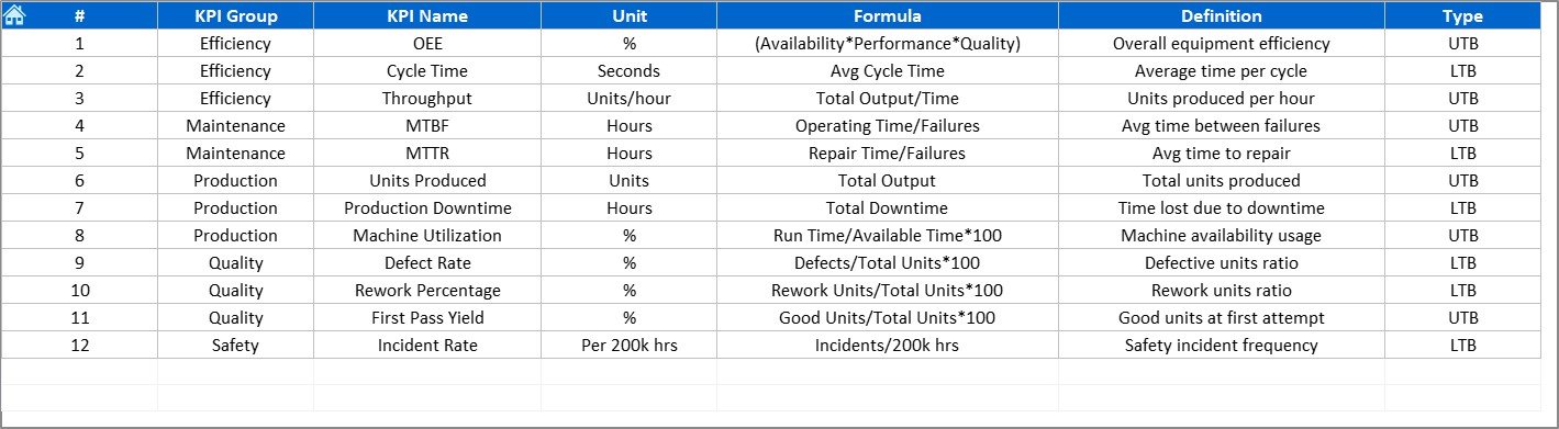
-
Stores KPI metadata including:
-
KPI Name
-
KPI Group
-
Unit
-
Formula
-
Definition
-
-
Acts as the knowledge base of the dashboard.
Why Do You Need an Engineering KPI Dashboard?
Engineering operations generate large amounts of data—ranging from project timelines, defect rates, and production efficiency to cost overruns. Without a proper dashboard, this data remains underutilized. Here’s why an Excel-based dashboard becomes essential:
Click to Purchases Engineering KPI Dashboard in Excel
-
Centralized tracking: Brings all KPIs into one place.
-
Improved decision-making: Enables leaders to act quickly.
-
Error reduction: Minimizes mistakes that occur in manual reporting.
-
Historical comparisons: Tracks performance across multiple years.
-
Visual clarity: Turns raw data into easy-to-read charts and visuals.
Key KPIs to Track in Engineering
An Engineering KPI Dashboard can include a variety of performance indicators. Here are some commonly used KPIs:
-
Project Completion Rate (%) – Measures on-time project delivery.
-
Resource Utilization (%) – Tracks how efficiently resources are allocated.
-
Defect Density – Identifies the number of defects per unit of work.
-
Downtime (Hours) – Records machine or system downtime.
-
Cost Variance (%) – Compares planned vs. actual project costs.
-
Change Order Rate (%) – Tracks frequency of engineering changes.
-
Cycle Time – Measures how long it takes to complete a task.
-
Innovation Rate (%) – Percentage of new ideas or designs implemented.
By tracking these KPIs, organizations can optimize engineering workflows, reduce inefficiencies, and ensure higher quality outcomes.
Advantages of Using an Engineering KPI Dashboard
Implementing an Engineering KPI Dashboard in Excel offers several advantages:
✅ Centralized Performance Monitoring
All KPIs are tracked in one place, reducing dependency on scattered spreadsheets.
✅ Better Decision-Making
With visual insights and trend charts, leaders can make informed decisions quickly.
✅ Cost-Effective Solution
Unlike expensive BI tools, Excel dashboards can be built with minimal cost.
✅ Easy to Customize
KPIs, formulas, and charts can be modified easily to fit different business needs.
✅ Improved Accountability
Clear visibility of metrics ensures that each department is accountable for its performance.
Opportunities for Improvement
Even though the Engineering KPI Dashboard in Excel is powerful, there are always opportunities to make it better:
-
Automation with VBA: Automate repetitive tasks like data input and report generation.
-
Integration with ERP systems: Connect the dashboard with external systems for real-time updates.
-
Data Validation: Add dropdowns and validation rules to reduce input errors.
-
Interactive Charts: Use slicers and pivot charts for more dynamic analysis.
-
Cloud Sharing: Store and share the dashboard via OneDrive or SharePoint for team collaboration.
Best Practices for the Engineering KPI Dashboard
To get the most out of your Engineering KPI Dashboard, follow these best practices:
-
Define Clear KPIs: Align KPIs with organizational goals before setting up the dashboard.
-
Keep It Simple: Avoid overcrowding the dashboard with too many visuals.
-
Use Conditional Formatting: Highlight performance gaps with green/red indicators.
-
Update Regularly: Input actual numbers monthly to keep the dashboard relevant.
-
Provide Context: Use trend charts alongside raw data to give context to performance.
-
Secure Sensitive Data: Use password protection or restricted access for sensitive engineering data.
-
Train Your Team: Make sure employees know how to use and interpret the dashboard.
Real-World Applications
An Engineering KPI Dashboard in Excel can be applied in several scenarios:
-
Manufacturing Plants: Track production efficiency, machine downtime, and defect rates.
-
Construction Projects: Monitor project timelines, cost variances, and resource allocation.
-
Product Development: Measure cycle times, innovation rates, and design changes.
-
Energy & Utilities: Track safety incidents, equipment utilization, and operational costs.
-
Automotive Industry: Monitor defects per unit, supply chain delays, and warranty claims.
Step-by-Step Guide to Using the Dashboard
-
Set Up KPI Definitions
-
List all KPIs in the KPI Definition sheet with formulas and units.
-
-
Input Targets
-
Record monthly and yearly targets in the Target sheet.
-
-
Enter Previous Year Data
-
Add last year’s actuals for comparison.
-
-
Input Actual Numbers
-
Update the Actual Numbers sheet with monthly performance data.
-
-
Analyze Trends
-
Use the KPI Trend sheet to monitor month-over-month changes.
-
-
Review Dashboard Page
-
Use the Dashboard sheet for a quick snapshot of MTD vs. YTD performance.
-
Conclusion
An Engineering KPI Dashboard in Excel is not just a reporting tool—it’s a complete performance management system. By consolidating data, automating reporting, and visualizing performance metrics, it enables organizations to stay ahead in today’s competitive landscape.
Whether you are in manufacturing, construction, or product development, this dashboard can help you track the right KPIs, identify gaps, and drive continuous improvement. And the best part—it’s all done in Excel, a tool that every organization already uses.
Click to Purchases Engineering KPI Dashboard in Excel
Frequently Asked Questions (FAQs)
1. What is the main purpose of an Engineering KPI Dashboard?
It helps organizations track and analyze engineering performance through KPIs in one centralized tool.
2. Can I customize the KPIs in the dashboard?
Yes. You can edit the KPI Definition sheet to add, remove, or modify KPIs.
3. Do I need advanced Excel skills to use this dashboard?
Basic Excel knowledge is enough. However, knowing pivot tables and slicers will make navigation easier.
4. How often should I update the dashboard?
Update the actual numbers monthly to ensure accurate reporting.
5. Is this dashboard suitable for small companies?
Yes. It is cost-effective, easy to use, and can be scaled as the company grows.
6. Can the dashboard integrate with other tools?
Yes. With VBA or Power Query, you can connect it to ERP systems, databases, or cloud sources.
Visit our YouTube channel to learn step-by-step video tutorials
Click to Purchases Engineering KPI Dashboard in Excel