Public safety is one of the most important aspects of any community. Whether it is handling fire emergencies, responding to road accidents, managing law enforcement cases, or tracking healthcare emergencies, authorities must have a reliable system to monitor, analyze, and resolve incidents quickly.
Traditionally, many departments used manual records or scattered spreadsheets, which made it difficult to track performance, monitor incident trends, or evaluate department effectiveness. To address this challenge, modern tools such as Public Safety Dashboards in Excel have become highly popular.
A Public Safety Dashboard in Excel is a ready-to-use template that consolidates all safety-related data into one place. It transforms raw incident data into meaningful insights with the help of interactive charts, summary cards, and slicers. This allows managers, policymakers, and safety officers to make informed decisions faster.
In this article, we will explore everything you need to know about a Public Safety Dashboard in Excel—its structure, features, benefits, use cases, and best practices.
Click to Purchases Public Safety Dashboard in Excel
What Is a Public Safety Dashboard in Excel?
A Public Safety Dashboard in Excel is a pre-built analytical tool designed to help public safety organizations track and analyze incidents across departments, regions, and time periods.
Instead of relying on multiple manual reports, this dashboard centralizes information, ensuring that decision-makers can evaluate incident trends, measure public satisfaction, and monitor cost efficiency in real time.
It provides:
-
A consolidated view of incidents across different categories.
-
Performance tracking for each department and region.
-
Monthly trend analysis to identify recurring patterns.
-
Cost insights to monitor financial implications of incidents.
-
Satisfaction measures to understand public response.
By using Excel as the platform, the dashboard is easy to adopt, customize, and integrate into existing reporting workflows.
Key Features of the Public Safety Dashboard in Excel
This dashboard includes five main analytical pages along with a support sheet for data handling.
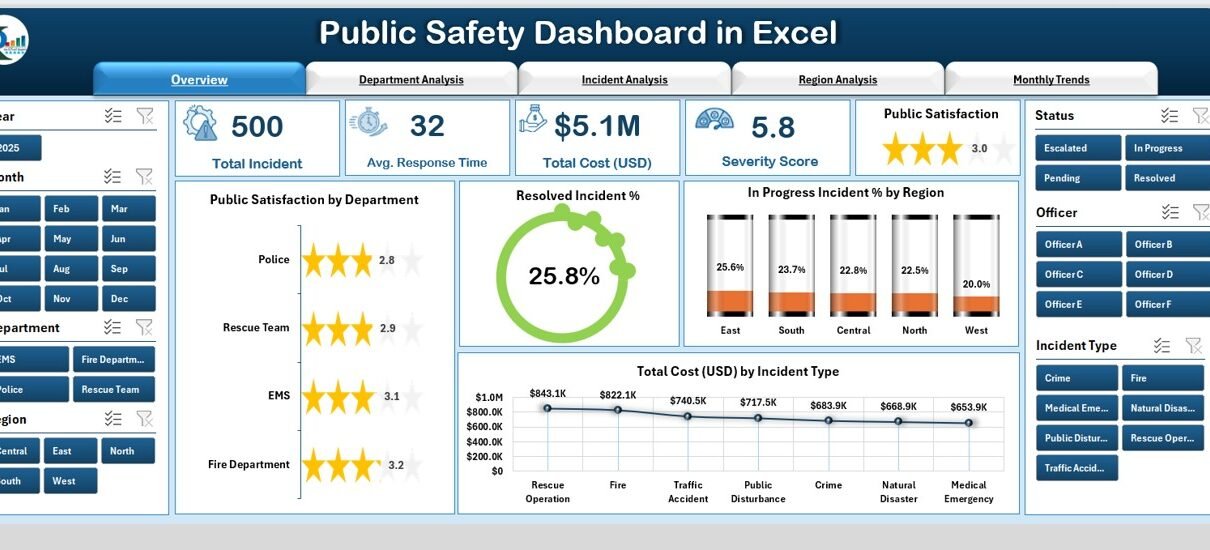
Overview Page
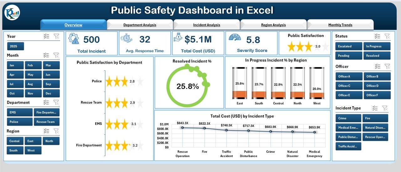
The Overview Page provides a high-level snapshot of public safety performance.
-
Page Navigator: Located on the left side for easy movement between different dashboard pages.
-
Summary Cards: Five key cards that display top-level numbers such as total incidents, satisfaction rate, and incident resolution.
Charts:
- Public Satisfaction by Department
- Resolved Incident %
- In-Progress Incident % by Region
- Total Cost (USD) by Incident Type
This page acts as the executive summary for managers and stakeholders.
Department Analysis
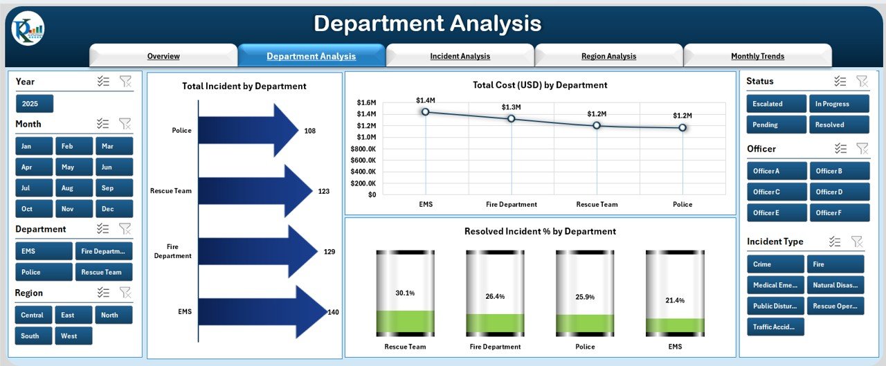
The Department Analysis Page gives a detailed breakdown of incidents and costs for each department.
Charts Included:
- Total Incidents by Department
- Total Cost (USD) by Department
- Resolved Incident % by Department
This helps identify which departments are managing safety effectively and which ones need improvement.
Click to Purchases Public Safety Dashboard in Excel
Incident Analysis
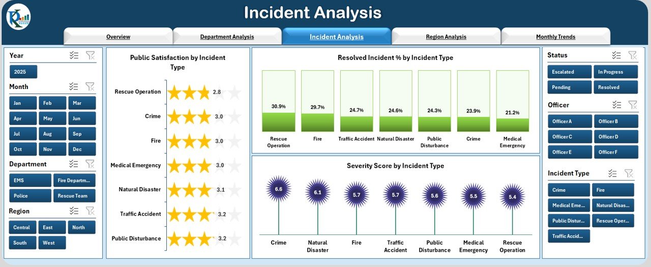
The Incident Analysis Page focuses on types of incidents and their severity.
Charts Included:
- Public Satisfaction by Incident Type
- Resolved Incident % by Incident Type
- Severity Score by Incident Type
This analysis helps authorities prioritize high-severity issues and allocate resources accordingly.
Region Analysis
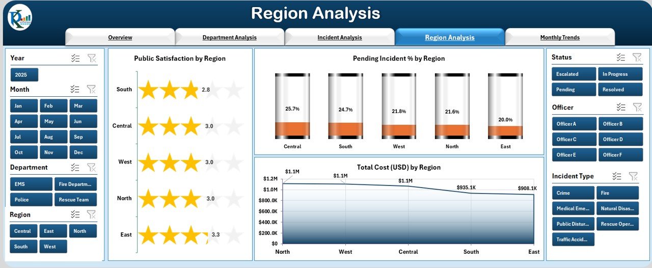
The Region Analysis Page highlights performance across different locations.
Charts Included:
- Public Satisfaction by Region
- Pending Incident % by Region
- Total Cost (USD) by Region
This ensures that regional disparities are identified, allowing policymakers to provide extra support to underperforming areas.
Monthly Trends
The Monthly Trends Page provides a time-based perspective.
Charts Included:
- Resolved Incident % by Month
- Public Satisfaction by Month
- Total Cost (USD) by Month
This is particularly useful for spotting seasonal spikes in incidents and tracking improvements over time.
Support Sheet
The Support Sheet stores raw data and reference lists. It ensures the dashboard runs smoothly and allows easy customization when adding new data.
Why Do Organizations Need a Public Safety Dashboard in Excel?
Public safety is a multi-dimensional challenge involving people, departments, regions, and resources. Without a proper monitoring system, important details may go unnoticed.
The dashboard helps organizations:
-
Track real-time incident resolution rates.
-
Compare actual performance vs. targets.
-
Monitor financial spending on safety operations.
-
Improve public trust and satisfaction.
-
Reduce response times by identifying bottlenecks.
By consolidating all of this information into a single platform, organizations can make quicker and smarter decisions.
Advantages of Public Safety Dashboard in Excel
✅ Centralized Data – All safety metrics are in one place, reducing confusion.
✅ User-Friendly Interface – Excel’s simple layout ensures anyone can use it.
✅ Cost-Effective – No expensive software is required, making it budget-friendly.
✅ Customizable – Users can modify charts, KPIs, and design to match their needs.
✅ Real-Time Analysis – With dynamic slicers, the dashboard updates instantly.
✅ Improved Decision-Making – Authorities can act faster with accurate insights.
✅ Cross-Department Collaboration – Departments can track performance collectively.
✅ Enhanced Accountability – Each unit’s performance is visible to stakeholders.
Opportunities for Improvement in Public Safety Dashboards
🔹 Integration with Other Tools: Linking the Excel dashboard with external systems such as ERP or GIS can improve real-time tracking.
🔹 Automation of Data Entry: Automating data feeds can reduce manual errors and save time.
🔹 Mobile Accessibility: Making dashboards mobile-friendly can help officers access insights on the go.
🔹 Predictive Analytics: Adding forecasting models can help anticipate future safety challenges.
🔹 Enhanced Visualization: Using advanced Excel charts or connecting to Power BI can improve data storytelling.
Best Practices for Using a Public Safety Dashboard in Excel
✔ Maintain Clean Data: Ensure that raw data in the support sheet is accurate and up to date.
✔ Use Consistent KPI Definitions: Define metrics like “Resolved Incident %” uniformly across departments.
✔ Update Data Regularly: Refresh data inputs at least monthly, if not weekly.
✔ Leverage Slicers Wisely: Use filters for department, region, and time to drill down effectively.
✔ Provide Training: Train staff to understand the dashboard features and interpretations.
✔ Secure Sensitive Data: Since public safety data can be sensitive, restrict access where necessary.
How to Implement the Public Safety Dashboard in Your Organization
-
Collect Incident Data: Gather information from departments such as police, fire, medical, and emergency response.
-
Standardize Formats: Ensure all data uses consistent units and naming conventions.
-
Input Data into the Support Sheet: Add new incidents and updates in a structured format.
-
Customize KPIs: Modify charts and cards to match your organization’s goals.
-
Distribute the Dashboard: Share the file with managers, policymakers, and safety officers.
-
Review Regularly: Conduct monthly reviews to ensure goals are being met.
Practical Use Cases of Public Safety Dashboard in Excel
-
Police Departments: Monitor crime rates, response times, and clearance rates.
-
Fire Services: Track fire incidents, response times, and property damage costs.
-
Emergency Medical Services: Monitor patient response times and treatment success rates.
-
Municipal Authorities: Measure public satisfaction with local safety services.
-
Disaster Management Units: Track incidents during floods, storms, or earthquakes.
Conclusion
The Public Safety Dashboard in Excel is more than just a reporting tool. It is a powerful solution that transforms raw safety data into actionable insights. With its easy-to-use interface, interactive charts, and customizable features, it empowers organizations to monitor incidents effectively, improve response times, and build stronger trust with the public.
By adopting this dashboard, authorities can ensure that safety operations are efficient, transparent, and impactful.
Frequently Asked Questions (FAQs)
1. What is a Public Safety Dashboard in Excel?
It is a pre-built Excel template that tracks and analyzes public safety incidents, helping organizations monitor performance, satisfaction, costs, and trends.
2. Who can use this dashboard?
Police departments, fire services, medical emergency units, municipal authorities, and disaster management teams can use this dashboard.
3. Can I customize the KPIs in the dashboard?
Yes, the dashboard is fully customizable. You can add or modify KPIs, charts, and data fields to match your organizational needs.
4. How often should I update the dashboard?
For best results, update it at least once a month. High-incident departments may update weekly.
5. Is the dashboard suitable for small organizations?
Absolutely. Since it is built in Excel, even small teams can use it without heavy IT investments.
6. Can the dashboard be linked with real-time systems?
Yes. With automation and integration, it can pull data directly from databases or ERP systems.
7. Why choose Excel over other BI tools?
Excel is widely available, user-friendly, and budget-friendly. It is also flexible enough to customize for different reporting needs.
Visit our YouTube channel to learn step-by-step video tutorials