In the modern healthcare landscape, hospitals are under constant pressure to deliver high-quality patient care while maintaining operational efficiency. From managing staff workloads to tracking patient outcomes, hospitals generate a massive amount of data every single day. Turning that data into actionable insights is a major challenge — and that’s exactly where a Hospitals KPI Dashboard in Excel becomes invaluable.
This ready-to-use Excel template allows healthcare administrators, finance teams, and hospital managers to visualize key performance indicators (KPIs) across departments. It enables better tracking of patient satisfaction, cost efficiency, treatment outcomes, and operational performance — all in one place.
In this article, we’ll explore the structure, features, advantages, and best practices of the Hospitals KPI Dashboard in Excel, along with its real-world applications and benefits for hospital management.
Click to Purchases Hospitals KPI Dashboard in Excel
🧩 What Is a Hospitals KPI Dashboard in Excel?
A Hospitals KPI Dashboard is a data-driven performance management tool designed to track critical healthcare metrics. It consolidates key information — from patient wait times to bed occupancy rates — into visual summaries and trend charts.
Built entirely in Microsoft Excel, this dashboard helps hospital decision-makers analyze Month-to-Date (MTD) and Year-to-Date (YTD) performance, compare results against targets, and evaluate year-over-year progress.
The dashboard provides clarity and transparency across departments, allowing managers to make informed decisions that directly improve patient care and hospital efficiency.
🗂️ Structure of the Hospitals KPI Dashboard in Excel
This comprehensive Excel dashboard consists of seven interconnected worksheets, each serving a specific purpose to ensure complete control over hospital performance tracking.
1️⃣ Home Sheet – The Navigation Hub
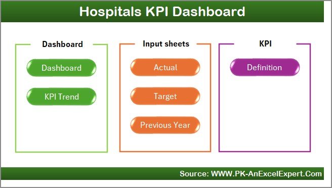
The Home Sheet is the starting point of the dashboard. It acts as an index, featuring six interactive buttons that link directly to other sheets in the workbook.
Highlights:
-
🧭 Quick navigation to Dashboard, KPI Trend, Input, Target, Previous Year, and Definition sheets.
-
📋 Provides a clear structure for new users to understand how the system works.
-
🏠 Serves as a clean, user-friendly interface for accessing data quickly.
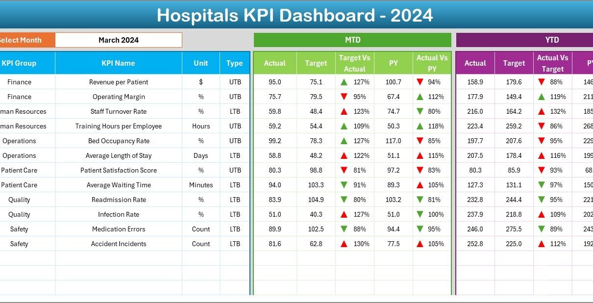
2️⃣ Dashboard Sheet – The Main Analytics Page
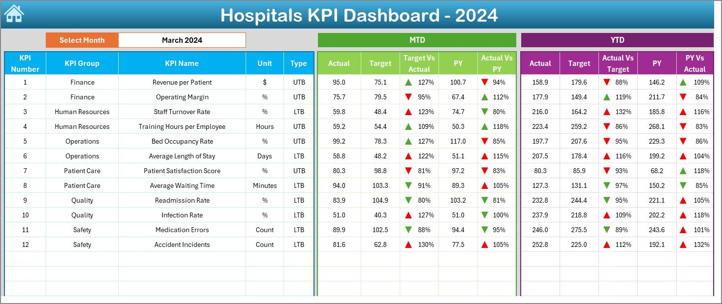
The Dashboard Sheet is the centerpiece of the workbook, presenting a visual snapshot of hospital performance.
Key Features:
-
🗓️ Month Selection: A dropdown in cell
D3lets you select any month to view performance. -
📈 Dynamic Updates: Selecting a month automatically refreshes MTD and YTD data.
-
🎯 Actual vs Target Comparison: Displays progress for each KPI, showing whether performance is meeting expectations.
-
🔄 Previous Year Comparison: Provides a historical reference for evaluating long-term improvement.
-
🚦 Conditional Formatting: Arrows and color indicators (green for success, red for underperformance) make results easy to interpret.
This sheet empowers hospital leaders to review clinical, financial, and operational KPIs instantly without manual reporting.
3️⃣ KPI Trend Sheet – Track Progress Over Time
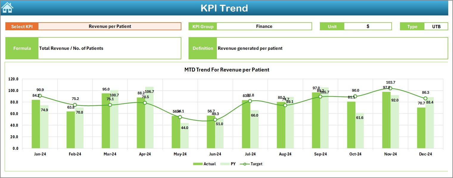
The KPI Trend Sheet focuses on detailed performance analysis for individual KPIs.
Features include:
-
🎯 Dropdown in C3: Select a KPI to view its data.
-
🧮 KPI Details Displayed: Shows KPI Group, Unit of Measurement, Type (UTB or LTB), Formula, and Definition.
-
📊 Trend Visualization: MTD and YTD trend charts for Actual, Target, and Previous Year data help identify performance patterns.
This sheet enables data-driven discussions about trends in patient care, hospital efficiency, and compliance.
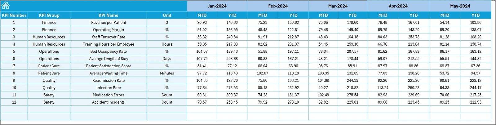
4️⃣ Actual Numbers Input Sheet – Manage Monthly Data
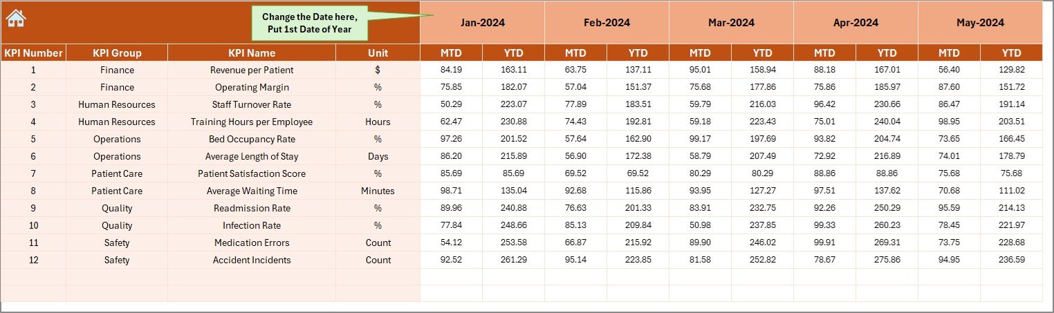
The Actual Numbers Input Sheet is where you enter the core performance data.
Key Highlights:
-
✍️ Enter MTD and YTD actuals for each KPI.
-
📆 Define the first month of the fiscal year in cell
E1. -
🔄 All charts and dashboards update automatically when data is entered.
This sheet ensures that real-time data is always reflected across all visuals.
5️⃣ Target Sheet – Define Performance Goals
In the Target Sheet, you can enter monthly targets for every KPI, both MTD and YTD.
Why It Matters:
-
Helps management set realistic and measurable goals.
-
Encourages accountability and continuous improvement.
-
Supports transparent performance evaluation across hospital departments.
6️⃣ Previous Year Numbers Sheet – Historical Benchmarking
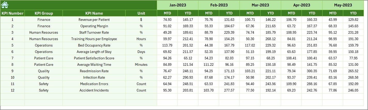
The Previous Year Sheet stores historical data, allowing direct comparisons between current and past performance.
Click to Purchases Hospitals KPI Dashboard in Excel
Benefits:
-
Reveals trends in patient outcomes and operational improvements.
-
Helps identify areas where consistent underperformance needs attention.
-
Facilitates year-over-year progress analysis.
7️⃣ KPI Definition Sheet – Maintain Standardization
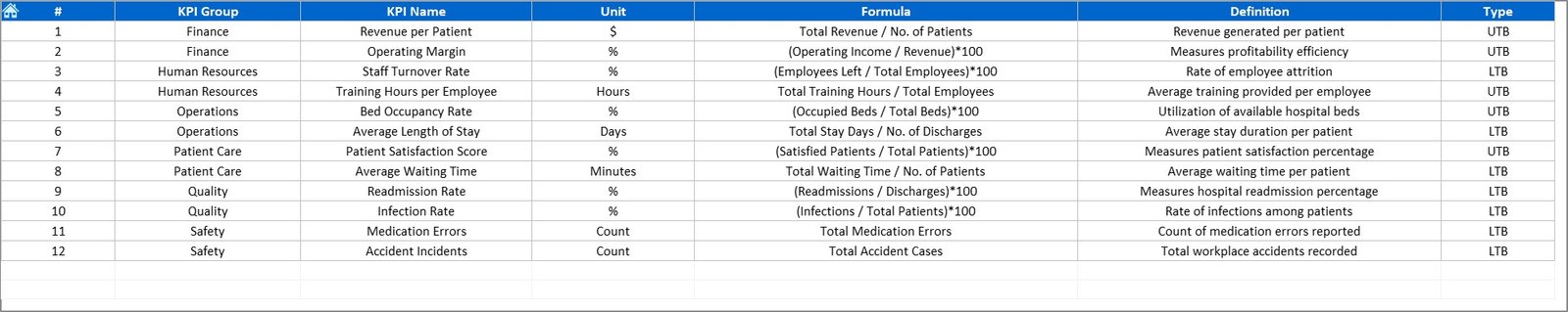
The KPI Definition Sheet provides a clear record of all metrics used across the hospital.
It includes:
-
KPI Name
-
KPI Group
-
Unit
-
Formula
-
KPI Definition
Having all definitions standardized ensures that all departments interpret KPIs consistently — reducing confusion and improving reporting accuracy.
Click to Purchases Hospitals KPI Dashboard in Excel
📈 Key Features of the Hospitals KPI Dashboard
-
✅ Automated Calculations: Instantly updates results when new data is entered.
-
📊 Dynamic Visuals: Displays charts and indicators that make insights intuitive.
-
🎯 MTD/YTD Comparison: Helps evaluate both short-term and long-term performance.
-
🔄 Actual vs Target & PY Analysis: Enables quick identification of gaps.
-
🧩 Fully Customizable: Add or edit KPIs to match hospital-specific needs.
-
📉 Conditional Formatting: Uses arrows and color codes for easy interpretation.
-
🏥 Comprehensive Design: Covers both clinical and administrative KPIs.
-
🕒 Historical Comparison: Tracks multi-year progress.
🌟 Advantages of Hospitals KPI Dashboard in Excel
🎯 1. Holistic View of Hospital Performance
The dashboard combines clinical, financial, and administrative metrics in one place — ensuring no area of performance is overlooked.
📊 2. Data-Driven Decision-Making
Real-time visuals and indicators allow hospital leaders to make quick, informed decisions based on facts.
⏱️ 3. Saves Time and Effort
Automated calculations and charts reduce manual reporting time by hours every month.
🧮 4. Error Reduction
Built-in formulas and validation minimize human errors in reporting.
💰 5. Cost-Effective Solution
Since it’s built in Excel, there’s no need for expensive business intelligence tools.
💬 6. Improved Transparency
Standardized KPIs foster communication across departments and promote accountability.
🩺 7. Enhances Patient Care
Tracking patient satisfaction, wait times, and quality indicators helps improve the patient experience and care outcomes.
🔍 Opportunities for Improvement
While the Excel-based system is powerful, it can be enhanced further:
-
🔄 Automate Data Imports: Use Power Query or VBA to link Excel to hospital databases.
-
☁️ Enable Cloud Collaboration: Store files on OneDrive for multi-user access.
-
📧 Set Automated Alerts: Highlight underperforming KPIs via formulas or conditional notifications.
-
📊 Integrate with Power BI: Combine Excel visuals with Power BI dashboards for deeper analytics.
-
🧾 Expand KPI Coverage: Add sustainability, digital transformation, or telemedicine KPIs.
-
🔐 Implement Security Controls: Protect patient-sensitive information with password protection.
🧭 Best Practices for Using Hospital KPI Dashboards
1️⃣ Define SMART KPIs
Ensure each KPI is Specific, Measurable, Achievable, Relevant, and Time-bound.
2️⃣ Review Data Monthly
Regular updates ensure accurate MTD and YTD analysis.
3️⃣ Maintain Data Consistency
Use consistent units and data formats to prevent confusion.
4️⃣ Benchmark Against Industry Standards
Compare your metrics with national or regional healthcare benchmarks.
5️⃣ Use Conditional Formatting Effectively
Highlight critical values with logical color coding — green (good), yellow (average), red (needs attention).
6️⃣ Foster Cross-Department Collaboration
Share results with clinical and administrative teams to encourage accountability.
7️⃣ Archive Historical Data
Keep older data to analyze long-term trends and improvement efforts.
8️⃣ Ensure Data Security
Protect the Excel file to prevent unauthorized editing or exposure of confidential data.
🏥 Real-World Use Cases
This Excel dashboard can be used by:
-
Hospital Administrators: To monitor efficiency, safety, and compliance metrics.
-
Finance Teams: To control costs, analyze revenue, and manage budgets.
-
Clinical Directors: To evaluate patient outcomes and service quality.
-
HR Managers: To track staffing levels and training compliance.
-
Quality Assurance Teams: To ensure ongoing adherence to regulatory standards.
It’s suitable for hospitals of all sizes — from small private clinics to large healthcare networks.
📊 How the Dashboard Enhances Decision-Making
-
Identifies underperforming areas before they escalate into major issues.
-
Improves operational planning and budget allocation.
-
Supports strategic initiatives like quality improvement or digital health adoption.
-
Increases accountability by showing measurable results for each department.
-
Provides evidence-based insights for board presentations and compliance reporting.
🧾 Conclusion
The Hospitals KPI Dashboard in Excel is an indispensable tool for healthcare organizations seeking to improve performance through data-driven management. With its dynamic visuals, automated analysis, and flexible structure, it simplifies complex hospital operations into a clear, actionable format.
From patient satisfaction to financial performance and safety metrics, this dashboard ensures that every critical KPI is monitored efficiently. Whether you manage a single hospital or an entire healthcare network, this Excel-based tool gives you the visibility and insights needed to make informed decisions and deliver exceptional care.
Click to Purchases Hospitals KPI Dashboard in Excel
❓ Frequently Asked Questions (FAQs)
1. What is a Hospitals KPI Dashboard?
It’s an Excel-based tool that tracks and visualizes hospital KPIs like patient satisfaction, efficiency, and costs.
2. Can I customize KPIs?
Yes. You can add, modify, or remove KPIs in the KPI Definition Sheet as per your hospital’s requirements.
3. Does the dashboard auto-update?
Yes. Once you input new data in the Actual Numbers Sheet, the visuals and calculations update automatically.
4. Is it suitable for small hospitals?
Absolutely. It’s designed to work for hospitals and clinics of any size.
5. What types of KPIs are included?
The template includes KPIs for patient care, finance, safety, HR, and compliance.
6. Can I analyze MTD and YTD performance?
Yes. You can toggle between MTD and YTD views to analyze monthly or annual performance.
7. Does it allow historical comparison?
Yes. You can compare performance with previous years using the dedicated sheet.
8. Can I share this file with multiple users?
Yes, using SharePoint or OneDrive for collaborative access.
9. Does it require advanced Excel skills?
No. The dashboard is user-friendly and designed for users with basic Excel knowledge.
10. Who benefits most from it?
Hospital managers, finance officers, quality teams, and healthcare administrators will find this tool invaluable.
Click to Purchases Hospitals KPI Dashboard in Excel
Visit our YouTube channel to learn step-by-step video tutorials