In the modern digital era, technology departments generate vast amounts of data every single day. From tracking budgets and project hours to resolving technical issues and optimizing resources — the challenge lies in transforming this data into actionable insights.
That’s where a Technology Dashboard in Power BI comes in.
This interactive, visually rich dashboard helps IT managers, analysts, and executives monitor key performance indicators (KPIs) and make informed, data-driven decisions.
In this article, we’ll explore what a Technology Dashboard in Power BI is, its structure, features, benefits, and the best practices to make the most out of it.
Click to Purchases Technology Dashboard in Power BI
What Is a Technology Dashboard in Power BI?
A Technology Dashboard in Power BI is a visual analytics solution designed to consolidate all your IT and technology performance data in one place.
It helps you track critical metrics such as budget utilization, project efficiency, issue resolution, and departmental performance through easy-to-read visuals.
Built using Microsoft Power BI, this dashboard leverages Excel or database sources to present real-time reports through interactive visuals — such as bar charts, slicers, pie charts, and KPI cards.
With a single glance, decision-makers can assess progress, identify inefficiencies, and improve performance across departments or regions.
Structure of the Technology Dashboard in Power BI
This prebuilt Power BI desktop file includes five interactive pages, each focusing on a key dimension of IT operations. Let’s look at each page in detail.
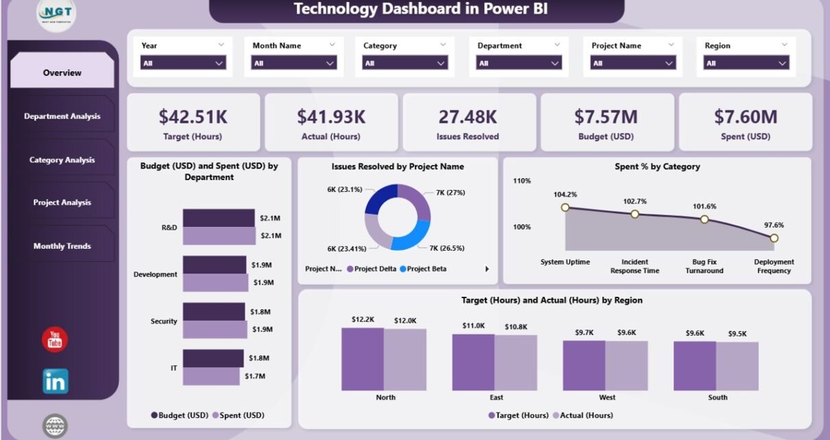
Overview Page
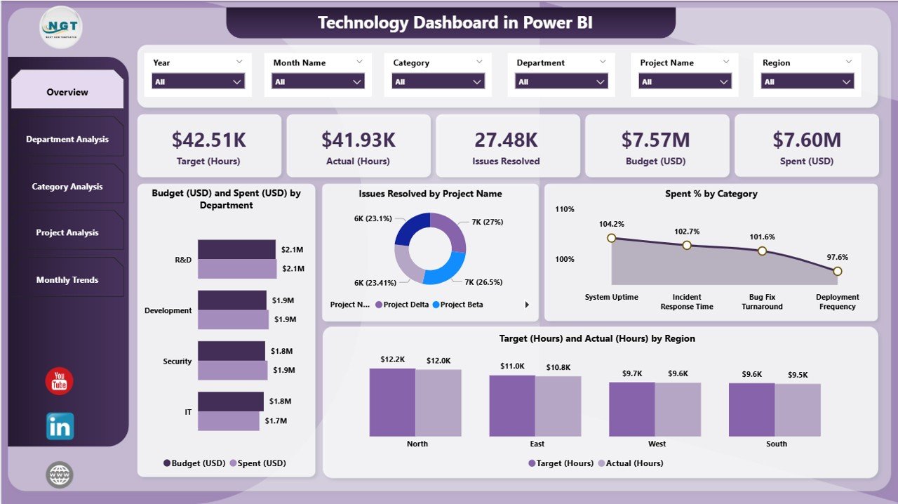
The Overview Page acts as the central hub of the dashboard. It presents a quick snapshot of the overall technology performance through a combination of KPI cards and charts.
Key elements on this page:
-
Five Summary Cards: Display top KPIs such as total budget, total spend, total hours worked, average issue resolution, and spending efficiency.
Four Insightful Charts:
- Budget (USD) vs. Spent (USD) by Department — helps identify which departments are staying within budget and which are overspending.
- Issues Resolved by Project Name — monitors support or development projects based on the number of issues resolved.
- Spend % by Category — analyzes spending distribution across various cost categories.
- Target (Hours) vs. Actual (Hours) by Region — evaluates how effectively teams across regions meet their allocated work hours.
This page provides a bird’s-eye view of your entire IT ecosystem, enabling executives to assess health and performance instantly.
Department Analysis Page
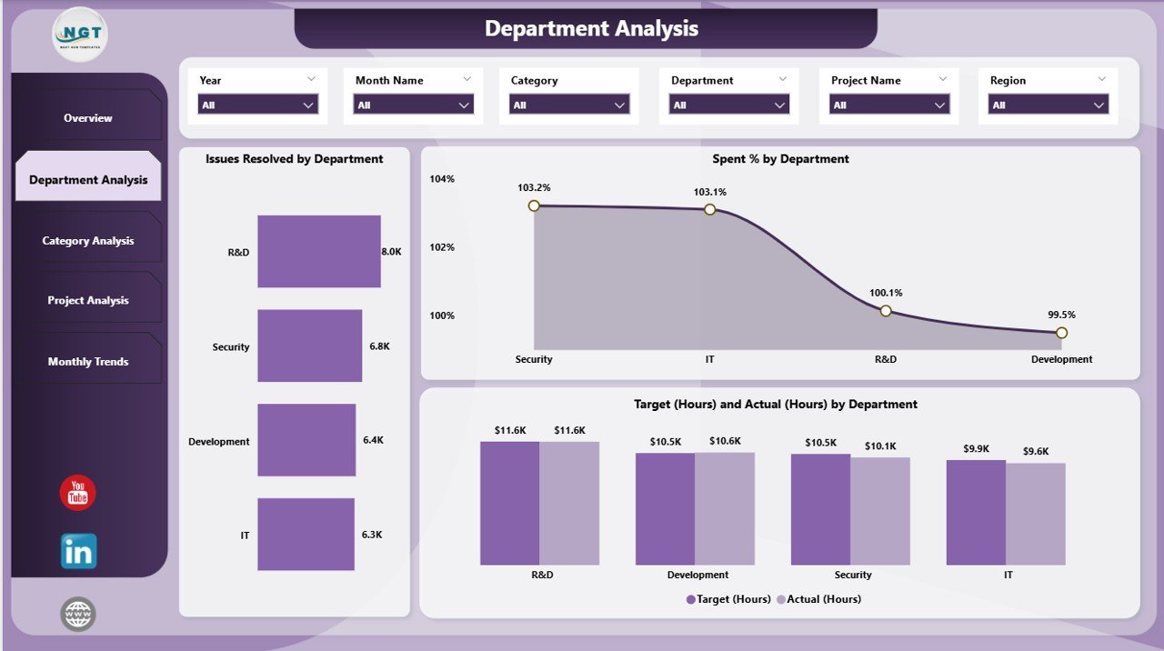
The Department Analysis Page focuses on how each department contributes to the overall technology goals.
It provides detailed insights into workload, spending, and efficiency across divisions like IT Support, Development, Infrastructure, and Cybersecurity.
Key visuals include:
-
Issues Resolved by Department: Tracks productivity and responsiveness of each department.
-
Spend % by Department: Helps identify departments that consume the highest percentage of resources.
-
Target (Hours) vs. Actual (Hours) by Department: Monitors how efficiently departments utilize their allocated work hours.
This page is particularly useful for department heads and project managers who need granular visibility into team performance and budget adherence.
Click to Purchases Technology Dashboard in Power BI
Category Analysis Page
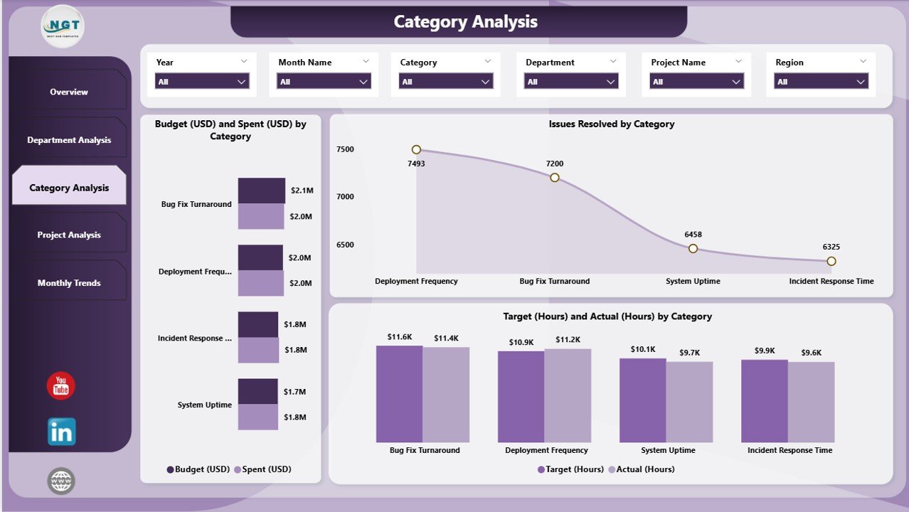
Every technology operation involves multiple spending categories — hardware, software, cloud services, maintenance, etc.
The Category Analysis Page highlights how resources are distributed and utilized across these cost areas.
Included visuals:
-
Budget (USD) vs. Spent (USD) by Category — identifies cost optimization opportunities.
-
Issues Resolved by Category — connects resource allocation with productivity levels.
-
Target (Hours) vs. Actual (Hours) by Category — helps understand workload balance and potential overutilization in specific categories.
This page ensures financial transparency and operational accountability within technology management.
Project Analysis Page
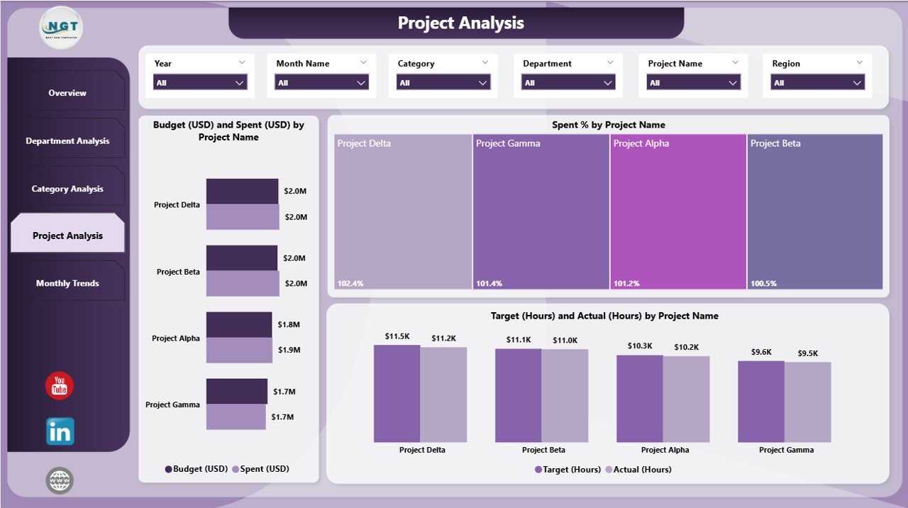
Project management is the backbone of every technology department. The Project Analysis Page allows you to evaluate the financial and operational efficiency of each project.
Key metrics covered:
-
Budget (USD) vs. Spent (USD) by Project Name — tracks whether projects are on budget or exceeding financial limits.
-
Spend % by Project Name — compares the spending ratio among different projects.
-
Target (Hours) vs. Actual (Hours) by Project Name — measures how effectively teams are utilizing their time allocations.
This view helps project managers and executives make informed decisions about resource redistribution and project prioritization.
Monthly Trends Page
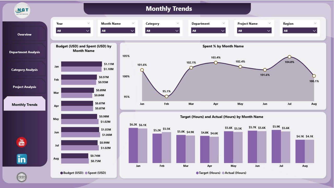
The Monthly Trends Page brings time-based analytics into focus. It displays performance metrics and patterns across months, enabling long-term analysis and forecasting.
Key visuals:
-
Budget (USD) and Spent (USD) by Month Name — reveals spending trends over time.
-
Spend % by Month Name — measures efficiency and identifies spikes or irregularities in costs.
-
Target (Hours) and Actual (Hours) by Month Name — evaluates workforce efficiency month by month.
This page is particularly useful for management reviews and quarterly performance discussions, offering clear insights into budget utilization and workload trends.
Data Source: Excel Integration
The Technology Dashboard in Power BI is powered by an Excel dataset that contains raw data for budgets, issues, projects, hours, and spending.
This integration allows users to update data easily without modifying the Power BI model.
When new data is added to the Excel file, the Power BI dashboard refreshes automatically — keeping insights always up to date.
Advantages of using Excel as a data source:
-
Familiar and easy to maintain
-
Simple data entry for non-technical users
-
Compatible with multiple systems
-
Reduces dependency on complex databases
Key Features of the Technology Dashboard in Power BI
Here’s a detailed look at what makes this dashboard powerful and user-friendly:
🧭 Multi-Page Navigation: Five dedicated pages for overview, departments, categories, projects, and trends.
📈 Dynamic Charts: Automatically adjust when you apply slicers or filters.
💼 Budget and Cost Analysis: Compare planned vs. actual budgets at every level.
🧩 Interactive Slicers: Instantly filter visuals by department, project, or category.
⏱️ Performance Tracking: Measure time utilization and target achievement.
📅 Monthly Insights: Identify recurring patterns and track progress over time.
💡 User-Friendly Design: Simplified visuals for managers and non-technical users.
🔄 Real-Time Refresh: Syncs with Excel or data sources for live updates.
Why Use Power BI for Technology Dashboards?
Power BI is one of the most versatile and powerful business intelligence tools available. It combines data visualization, analytics, and interactivity in a single platform.
Here’s why Power BI is ideal for technology dashboards:
-
Centralized View: Consolidates multiple data sources into one unified platform.
-
Interactive Exploration: Allows you to drill down into specific metrics for deeper insights.
-
Customization Options: Offers flexibility to design visuals according to business needs.
-
Cloud Integration: Enables sharing and collaboration across teams.
-
Security and Access Control: Ensures that sensitive data is protected with role-based permissions.
Power BI empowers organizations to make faster, data-backed decisions that align with business goals.
Advantages of the Technology Dashboard in Power BI
Click to Purchases Technology Dashboard in Power BI
A well-designed technology dashboard delivers numerous operational and strategic benefits. Here are the top advantages:
1. Real-Time Visibility
Get instant access to key performance indicators, updated automatically from your data source.
2. Better Budget Management
Track how much has been spent versus how much was planned — helping teams stay within financial limits.
3. Improved Resource Allocation
See how time and money are distributed across projects, departments, and regions to make smarter resourcing decisions.
4. Enhanced Accountability
Each department and project has measurable KPIs, improving transparency and ownership.
5. Simplified Reporting
Eliminate manual reporting — the dashboard updates automatically, saving hours of work every week.
6. Data-Driven Culture
Encourage leaders to rely on insights rather than intuition for decision-making.
How to Use the Technology Dashboard Effectively
To get the most out of your dashboard, follow these practical tips:
-
Define KPIs clearly: Make sure each visual measures something meaningful and aligned with business objectives.
-
Keep data clean: Ensure the Excel source is properly formatted and consistent.
-
Refresh data regularly: Schedule automatic updates for accurate reporting.
-
Use slicers wisely: Limit filters to avoid overloading visuals.
-
Involve key stakeholders: Let department heads review and validate insights periodically.
-
Customize visuals: Modify charts and color schemes to match your organization’s branding.
Best Practices for Building and Managing the Technology Dashboard in Power BI
Here are the best practices to ensure your Technology Dashboard performs optimally and delivers long-term value:
1. Keep It Simple and Intuitive
Avoid overcrowding visuals. Focus on the most impactful KPIs that help managers make decisions quickly.
2. Maintain Data Quality
Ensure that input data from Excel or other sources is complete, accurate, and up to date.
3. Use Consistent Formatting
Apply consistent date formats, labels, and color codes across all visuals for clarity.
4. Optimize for Performance
Limit unnecessary visuals and optimize data models for faster refresh times.
5. Enable Drillthrough Features
Allow users to explore detailed reports by clicking on charts for deeper analysis.
6. Protect Sensitive Data
Implement Power BI’s row-level security and role-based access to prevent unauthorized access.
7. Review Regularly
Conduct periodic reviews of KPIs and visual layouts to ensure relevance and accuracy.
Opportunities for Improvement
While this dashboard provides a solid foundation, there are always ways to enhance its capabilities:
-
Integrate Power Automate for automated alerts and notifications.
-
Connect with SharePoint or Azure SQL for enterprise-level data sources.
-
Add AI-powered forecasting visuals to predict future performance trends.
-
Include custom tooltips for contextual insights without cluttering visuals.
-
Enable mobile optimization for better accessibility on smartphones and tablets.
These upgrades can turn a functional dashboard into a strategic decision-support system.
Conclusion
A Technology Dashboard in Power BI bridges the gap between raw data and actionable insights.
By bringing together financial, operational, and performance data into one interactive report, it enables technology leaders to make faster, smarter, and more informed decisions.
Whether you’re tracking budgets, analyzing workloads, or evaluating project performance, this dashboard offers the visibility you need to drive growth, efficiency, and accountability.
Power BI’s intuitive interface, combined with Excel integration, makes it a perfect choice for organizations seeking real-time technology performance tracking without heavy technical investment.
❓ Frequently Asked Questions (FAQs)
1. What is the purpose of a Technology Dashboard in Power BI?
It provides a centralized platform to visualize IT performance metrics like budgets, issues, and project hours in real time for better decision-making.
2. Can I connect the dashboard to other data sources besides Excel?
Yes. Power BI supports data from SQL Server, SharePoint, Azure, and many other platforms for seamless integration.
3. How often should I update the data in my dashboard?
Ideally, refresh your data daily or weekly depending on the frequency of operational updates.
4. Who can benefit from using this dashboard?
IT managers, finance teams, project leads, and executives can all benefit from real-time insights provided by this dashboard.
5. Is the dashboard customizable?
Absolutely. You can modify visuals, add KPIs, and adjust color schemes to align with your organization’s needs.
6. Can I share this dashboard with my team?
Yes. You can publish it to Power BI Service and securely share access with authorized users.
7. Does it require advanced technical knowledge to use?
Not at all. It’s designed for business users — no coding or complex setup is needed.
Visit our YouTube channel to learn step-by-step video tutorials