In the fast-paced world of telecommunications, data drives every decision. From network uptime and customer satisfaction to service revenue and operational efficiency — every metric matters. Yet, managing this complex data across multiple systems can be overwhelming.
That’s where the Telecommunications KPI Scorecard in Excel becomes a game-changer. This powerful, easy-to-use tool allows telecom managers, analysts, and executives to track key performance indicators (KPIs) in one centralized, visual, and interactive dashboard.
Whether you’re monitoring signal quality, service delivery, or financial performance, this Excel-based scorecard simplifies the process, ensuring you stay in control of your network’s health and business performance.
Click to Purchases Telecommunications KPI Scorecard in Excel
📊 What Is a Telecommunications KPI Scorecard?
A Telecommunications KPI Scorecard is a structured performance tracking system designed to measure, monitor, and improve critical metrics across telecom operations. It consolidates data related to network reliability, service usage, revenue, and customer experience.
Built in Microsoft Excel, this scorecard serves as a single source of truth for managers and stakeholders. It turns complex datasets into easy-to-read visuals, enabling real-time decision-making and strategic planning.
In short:
It bridges the gap between raw data and actionable insights, helping telecom organizations maintain operational excellence.
Click to Purchases Telecommunications KPI Scorecard in Excel
🧩 Structure of the Telecommunications KPI Scorecard in Excel
The Telecommunications KPI Scorecard is organized into four interactive worksheets that work together to streamline tracking, analysis, and reporting.
1️⃣ Scorecard Sheet – Central Performance Hub
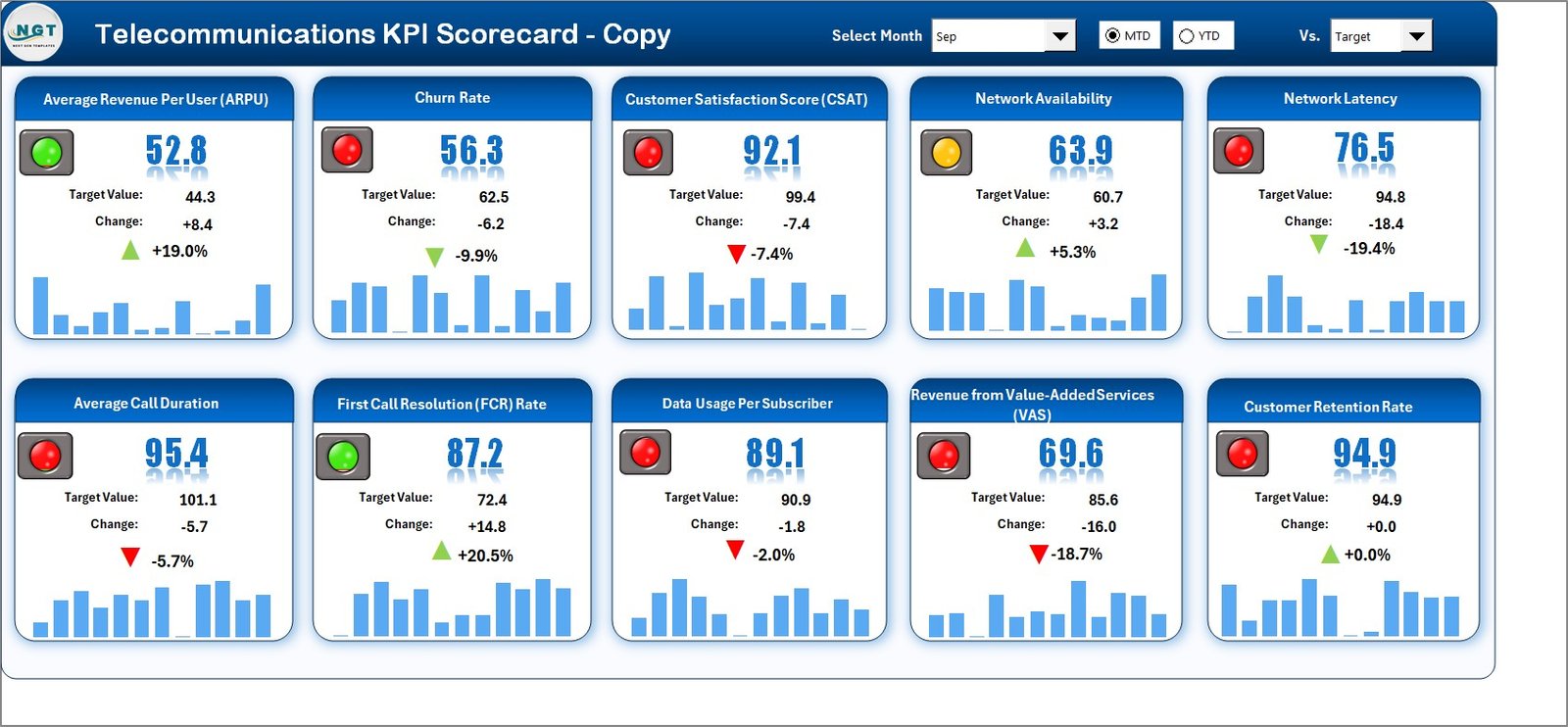
The Scorecard Sheet is the main interface where you can view and analyze overall performance across all KPIs. It’s designed for clarity, interactivity, and speed.
Key Features:
🎚 Dropdown Menus: Select the desired Month, MTD (Month-to-Date), or YTD (Year-to-Date) mode for performance analysis.
📊 Actual vs Target Comparison: Instantly see how actual performance measures up against set targets.
🟩🟥 Visual Indicators: Color-coded arrows (up/down) show whether performance is improving or declining.
📈 Comprehensive Overview: View multiple KPIs in one glance, covering both operational and financial dimensions.
Why It Matters:
It gives managers a snapshot of what’s working and what needs attention — from network uptime to revenue metrics.
2️⃣ KPI Trend Sheet – Performance Over Time
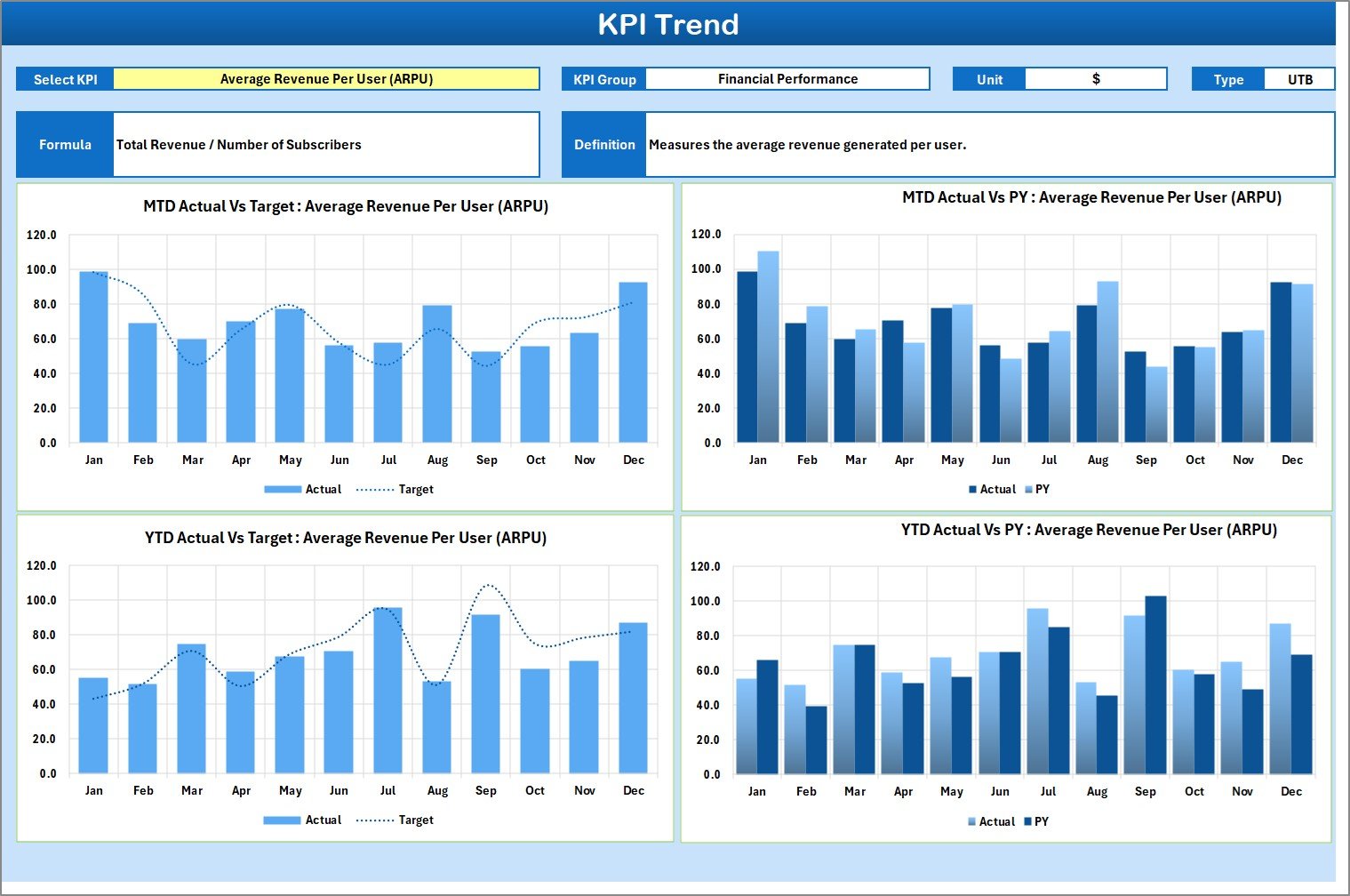
The KPI Trend Sheet provides a dynamic and visual representation of performance trends across time. It helps you understand how your KPIs evolve month by month.
Key Features:
-
🔽 Dropdown Selection (C3): Choose a specific KPI to display its trend data.
-
📋 KPI Details: Displays KPI Group, Unit, Type (LTB – Lower the Better, UTB – Upper the Better), Formula, and Definition.
-
📈 Trend Charts: Visualize MTD and YTD performance for Actual, Target, and Previous Year (PY).
Why It Matters:
This feature helps identify patterns, detect recurring issues, and measure the success of improvement strategies.
3️⃣ Input Data Sheet – Core Data Management
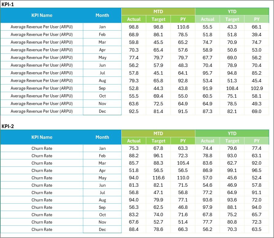
The Input Data Sheet is where you feed the backbone data into the system. It stores actual, target, and previous year numbers for each KPI.
Key Features:
-
🧾 Data Entry Columns: Record MTD and YTD data by month.
-
🔁 Flexible Updating: Easily adjust as new performance data becomes available.
-
📅 Accurate Record Keeping: Ensure that every metric aligns with real-world performance.
Why It Matters:
This sheet enables data-driven decisions by ensuring the scorecard always reflects the latest performance information.
4️⃣ KPI Definition Sheet – Complete Metric Reference
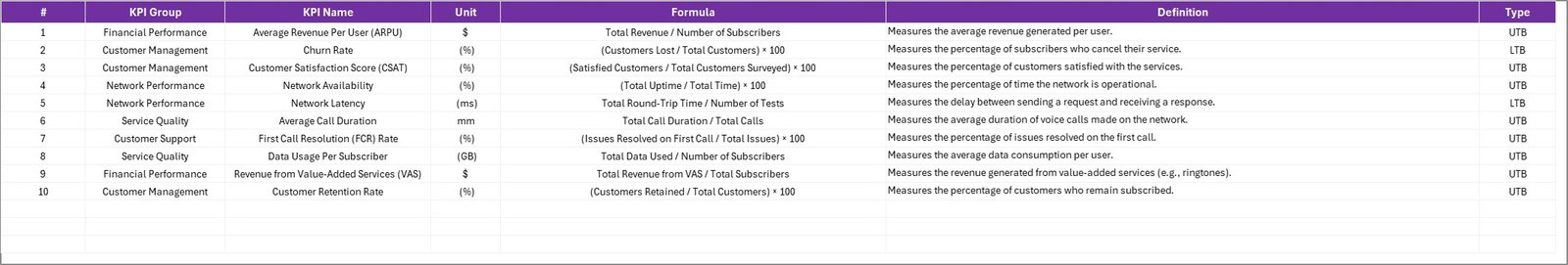
The KPI Definition Sheet defines every KPI used in the scorecard, ensuring transparency and standardization across teams.
Key Features:
-
📘 Structured Columns: Includes KPI Name, Group, Unit, Formula, Definition, and KPI Type.
-
🧠 Clear Understanding: Ensures everyone in the organization interprets KPIs the same way.
-
⚙️ Foundation for Automation: Makes it easy to update and add new KPIs.
Why It Matters:
Standardized KPI definitions help maintain consistency in how results are calculated, reported, and understood across departments.
Click to Purchases Telecommunications KPI Scorecard in Excel
⚡ Importance of KPI Tracking in Telecommunication
In the telecom industry, performance monitoring is not optional — it’s essential. The volume of data generated daily from network towers, customer interactions, and billing systems demands robust tracking mechanisms.
Here’s why KPI tracking matters in telecom:
📶 Ensures Network Reliability: Tracks uptime, latency, and failure rates.
💰 Improves Revenue Management: Monitors ARPU, churn, and cost efficiency.
😊 Enhances Customer Experience: Measures satisfaction and complaint resolution times.
🧩 Optimizes Resource Utilization: Identifies inefficiencies in manpower and system capacity.
🌐 Supports Data-Driven Decisions: Empowers leadership with real-time insights for strategy execution.
🌟 Advantages of Using Telecommunications KPI Scorecard in Excel
Implementing this Excel-based scorecard delivers numerous operational and strategic benefits:
✅ 1. Centralized Monitoring
View all KPIs — financial, technical, and customer — in one file for streamlined analysis.
✅ 2. Easy Comparison
Quickly compare Actual vs Target vs Previous Year performance for a comprehensive overview.
✅ 3. Visual Insights
Leverage conditional formatting and charts to transform numbers into visual stories.
✅ 4. Customization Flexibility
Modify formulas, KPIs, and visuals to match your company’s objectives.
✅ 5. Cost-Effective Solution
No need for complex BI tools — Excel offers the same clarity at a fraction of the cost.
✅ 6. Real-Time Decision Support
Interactive elements and auto-calculations ensure instant insights as data updates.
🔍 Step-by-Step Guide to Using the Scorecard
-
Set Up KPI Definitions: Populate the KPI Definition Sheet with names, units, and formulas.
-
Enter Data: Input monthly Actual, Target, and Previous Year data in the Input Data Sheet.
-
View Performance: Use the Scorecard Sheet to analyze results and identify areas needing action.
-
Analyze Trends: Open the KPI Trend Sheet for detailed performance visualization.
-
Review and Update: Refresh data monthly to keep your reports current.
🔧 Opportunities for Improvement
While the Telecommunications KPI Scorecard is powerful, you can enhance it further with these upgrades:
-
🔄 Automate Data Imports: Connect the sheet with telecom databases or APIs.
-
💻 Integrate with Power BI: For advanced dashboards and real-time analytics.
-
🧮 Include Predictive KPIs: Add forecasting for churn or network failures.
-
🗂 Segment by Region: Add regional filters to compare performance by geography.
-
📱 Add Mobile Accessibility: Use Excel Online for on-the-go monitoring.
🧭 Best Practices for Telecommunications KPI Scorecard
💡 1. Define Clear Objectives
Align KPIs with business strategy — whether it’s growth, retention, or efficiency.
💡 2. Update Data Frequently
Regular updates ensure management decisions reflect current realities.
💡 3. Standardize Formats
Keep KPI names, units, and formulas consistent across all reports.
💡 4. Visualize Data Effectively
Use graphs and color codes for better readability and quick interpretation.
💡 5. Share Insights
Present findings to key stakeholders in monthly review meetings.
💡 6. Secure Data Integrity
Protect formula cells and use controlled input fields to prevent errors.
💡 7. Monitor Action Items
Use KPI trends to assign responsibilities and track improvement initiatives.
📡 Real-World Example
Imagine a telecom company that uses this dashboard to monitor call drop rates and customer churn.
By correlating poor network performance with rising churn, they identified underperforming regions and reallocated resources. Within six months, they achieved:
-
📉 18% reduction in churn rate
-
📈 25% improvement in call resolution efficiency
-
💰 Increased ARPU by 12% through targeted service upgrades
These results demonstrate how data visibility drives measurable growth.
🏁 Conclusion
The Telecommunications KPI Scorecard in Excel empowers telecom companies to track critical metrics efficiently, visualize trends, and make smarter operational decisions.
By consolidating performance indicators into one centralized platform, organizations gain better control over network reliability, financial outcomes, and customer experience.
This ready-to-use Excel template transforms complex data into simple insights — helping you monitor, manage, and improve your telecom operations continuously.
Whether you’re managing a single region or a global network, this scorecard is your roadmap to performance excellence.
Click to Purchases Telecommunications KPI Scorecard in Excel
Frequently Asked Questions (FAQs)
1. What is a Telecommunications KPI Scorecard?
It’s an Excel-based tool that tracks key telecom performance metrics like network uptime, churn rate, and revenue.
2. Who should use this scorecard?
It’s ideal for telecom analysts, operations managers, finance teams, and executives.
3. How often should I update it?
Monthly updates ensure MTD and YTD performance accuracy.
4. What data do I need to use it?
You’ll need network data, customer service stats, and financial KPIs.
5. Can I add new KPIs?
Yes. The dashboard is fully customizable — add new rows and formulas as needed.
6. Does it support automation?
Yes, you can link it to databases or Power BI for live updates.
7. Is it beginner-friendly?
Absolutely! It’s built with dropdowns, formulas, and ready-to-use formatting — no coding required.Click to Purchases Telecommunications KPI Scorecard in Excel
Visit our YouTube channel to learn step-by-step video tutorials
Watch the step-by-step video tutorial: