Managing logistics costs efficiently is one of the biggest challenges for supply chain professionals. Rising fuel expenses, unpredictable demand, complex routing, and multi-modal shipping make cost control harder than ever. This is where Power BI becomes a game-changer.
The Logistics Cost Optimization KPI Dashboard in Power BI helps businesses visualize, analyze, and optimize their logistics performance in real time. It transforms raw data from Excel or other sources into actionable insights — giving logistics managers the ability to reduce costs, improve delivery efficiency, and make faster data-driven decisions.
In this article, we’ll explore everything about this dashboard: its structure, working, benefits, best practices, and common questions.
Click to Purchases Logistics Cost Optimization KPI Dashboard in Power BI
What Is a Logistics Cost Optimization KPI Dashboard?
A Logistics Cost Optimization KPI Dashboard is a data visualization tool built in Power BI that tracks key performance indicators (KPIs) related to logistics and transportation expenses. It consolidates data from multiple sources — like shipment records, route information, inventory costs, and delivery performance — into one interactive platform.
With this dashboard, organizations can:
-
Identify high-cost routes and suppliers
-
Monitor actual vs target performance
-
Measure cost per shipment, per mile, or per order
-
Compare current performance with previous periods
-
Detect inefficiencies and improvement opportunities instantly
In short, it converts complex logistics data into easy-to-understand visuals that empower decision-makers.
Key Components of the Logistics Cost Optimization KPI Dashboard
This Power BI dashboard is designed with three main pages that provide a complete view of logistics performance — from summary metrics to trend analysis to KPI definitions.
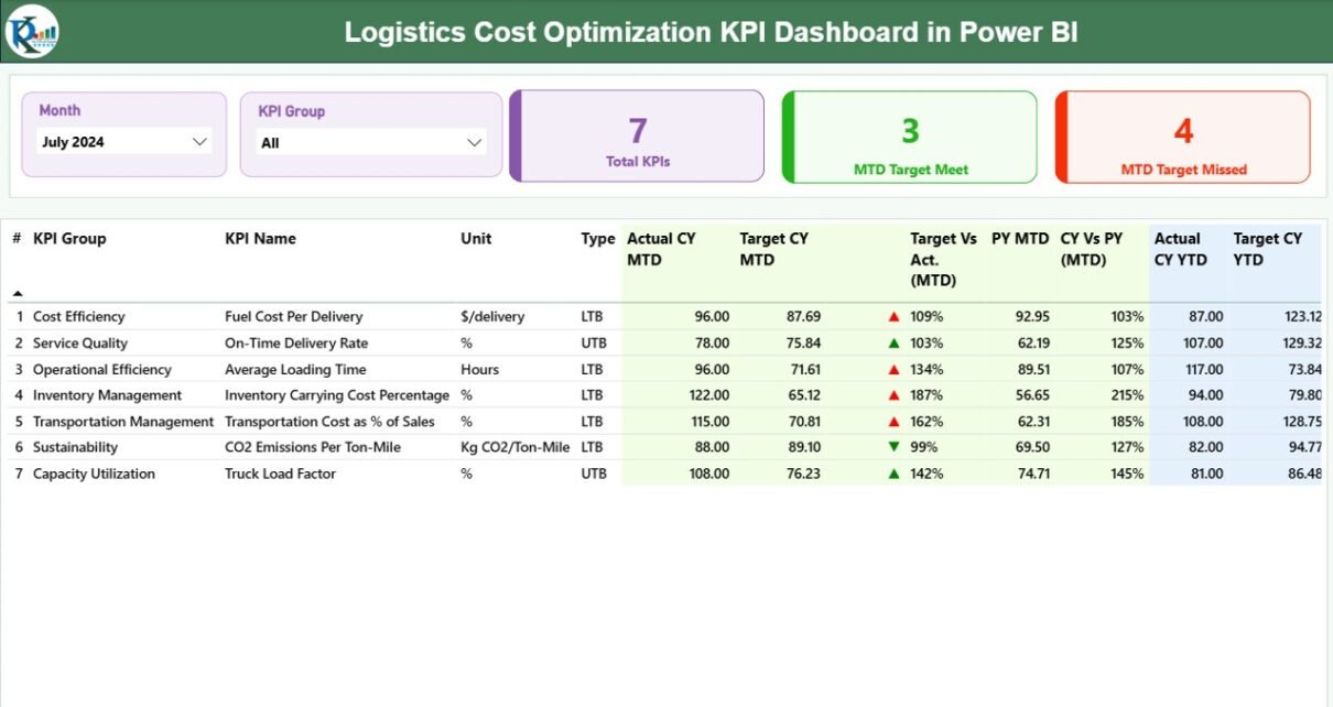
1️⃣ Summary Page
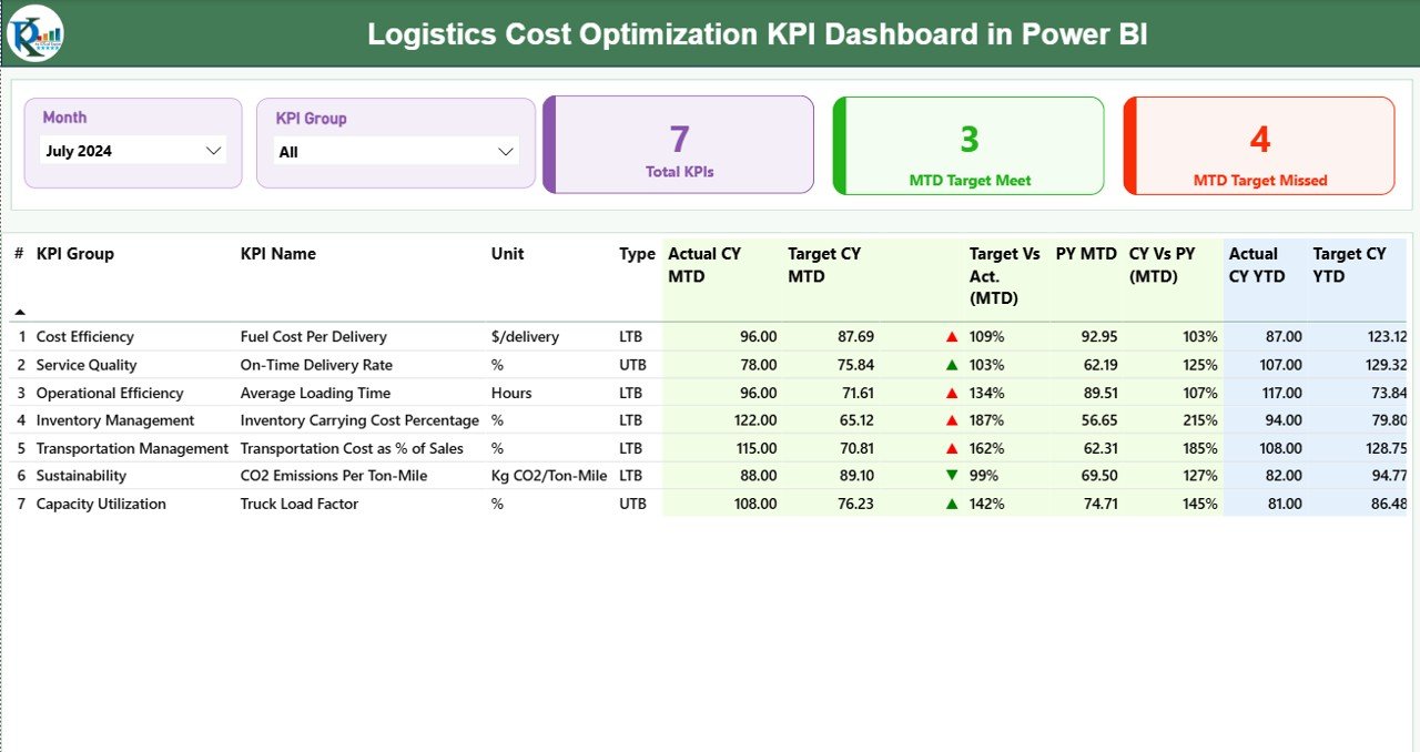
The Summary Page serves as the main control panel for the entire dashboard. It provides a clear snapshot of logistics performance for a selected month.
✳️ Main Highlights:
-
Month and KPI Group Slicers:
Users can filter data by month or KPI group, ensuring focused analysis.
Performance Cards:
The top section displays three performance cards:
- Total KPIs Count
- MTD (Month-to-Date) Target Met
- MTD Target Missed
These help you quickly assess how well logistics operations are performing against goals.
2️⃣ KPI Trend Page
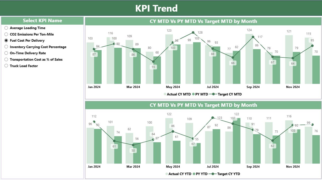
The KPI Trend Page offers a deeper look into performance over time. Here, users can select any KPI from the dropdown slicer to view trends across months.
🔹 Features:
-
Two combo charts visualize Actual, Target, and Previous Year data for both MTD and YTD.
-
Clear graphical representation helps identify seasonal variations and consistent underperformance.
-
The page empowers decision-makers to track long-term progress and align goals accordingly.
This page acts as the “storytelling layer” of the dashboard — showing not just what is happening, but how performance evolves month by month.
3️⃣ KPI Definition Page
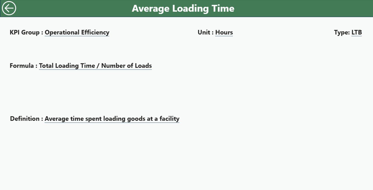
This is a drill-through page, usually hidden from the main navigation. When users click on a specific KPI in the Summary Page, they can drill through to this page to view more details like the KPI’s formula, definition, and type.
Example:
-
KPI Name: Freight Cost per Shipment
-
Formula: Total Freight Cost ÷ Number of Shipments
-
Definition: Measures the average cost spent per shipment to monitor efficiency.
-
Type: LTB (Lower the Better)
This design ensures transparency and clarity in KPI tracking. Users can easily return to the main page using the back button at the top left corner.
Data Structure Behind the Dashboard
The foundation of this dashboard lies in a well-structured Excel data source. It contains three important sheets:
📘 1. Input_Actual Sheet
This sheet holds actual performance data for each KPI.
Columns include:
-
KPI Name
-
Month (using the first date of the month)
-
MTD values
-
YTD values
📗 2. Input_Target Sheet
This sheet stores target data for each KPI.
Columns mirror the Actual sheet, helping Power BI calculate performance variances.
Click to Purchases Logistics Cost Optimization KPI Dashboard in Power BI
📙 3. KPI Definition Sheet
This is the reference table that defines every KPI.
Columns include:
-
KPI Number
-
KPI Group
-
KPI Name
-
Unit
-
Formula
-
Definition
-
Type (LTB/UTB)
By connecting these sheets to Power BI, you create a dynamic and automated reporting environment that refreshes instantly when new data is added.
Why Use Power BI for Logistics Cost Optimization?
Power BI’s interactive nature and real-time capabilities make it ideal for logistics analysis. It allows users to:
-
Consolidate data from multiple sources (Excel, ERP, TMS, etc.)
-
Create drill-through and drill-down visualizations
-
Enable dynamic filtering for months, KPI groups, and categories
-
Highlight performance gaps instantly through icons and conditional formatting
-
Share reports across teams through Power BI Service or dashboards
It bridges the gap between data and decision, ensuring logistics managers always have the right insights at their fingertips.
Key KPIs to Track in Logistics Cost Optimization
Tracking the right KPIs ensures precise monitoring of logistics performance. Some important KPIs include:
-
Freight Cost per Shipment – Measures transportation cost efficiency.
-
On-Time Delivery Rate – Evaluates delivery punctuality.
-
Fuel Efficiency (km/l or mpg) – Tracks fuel consumption per vehicle.
-
Warehouse Utilization Rate – Checks space optimization in warehouses.
-
Cost per Mile or per km – Indicates cost effectiveness of routes.
-
Inventory Carrying Cost – Reflects storage and holding expenses.
-
Transportation Cost as % of Sales – Evaluates cost-to-revenue efficiency.
-
Claims Ratio – Tracks number of damaged or lost shipment claims.
-
Lead Time Variance – Measures deviation between planned and actual lead times.
Monitoring these KPIs regularly helps organizations stay lean, agile, and cost-efficient.
How This Dashboard Helps Decision-Makers
The Logistics Cost Optimization KPI Dashboard provides both operational and strategic insights:
-
Identifies Cost Drivers: Pinpoints which areas (transport, warehousing, or handling) contribute most to costs.
-
Improves Budget Accuracy: Tracks performance vs targets, improving financial forecasting.
-
Enhances Performance Transparency: Every team knows where improvements are needed.
-
Supports Proactive Action: Visual alerts and comparisons highlight problems early.
-
Boosts Collaboration: Shared dashboards enable departments to work toward unified cost-saving goals.
Advantages of Logistics Cost Optimization KPI Dashboard in Power BI
Using this dashboard offers multiple benefits that extend beyond cost savings:
✅ Data Centralization
All logistics data — from costs to performance — is stored and analyzed in one platform, removing silos.
✅ Real-Time Insights
Power BI’s live data connection ensures that users always access the most updated information.
✅ Improved Decision-Making
Managers can quickly identify trends, inefficiencies, or anomalies through visual dashboards.
✅ Enhanced Accountability
Performance indicators clearly show which departments meet targets and which fall short.
✅ Cost Reduction
By revealing inefficiencies and optimizing routes, companies can significantly lower operational costs.
✅ Better Strategic Planning
Historical comparisons guide management in setting achievable and data-driven targets.
Opportunities for Improvement
Even a well-designed logistics dashboard can evolve further. Here are some ideas to enhance it:
📈 Add Forecasting Features: Use Power BI’s predictive analytics to project future costs.
🌍 Integrate GPS and IoT Data: Include real-time vehicle tracking to connect cost with live operations.
🧾 Automate Data Refresh: Link directly with ERP or TMS to update KPIs without manual input.
📦 Include Supplier Scorecards: Track supplier reliability and delivery performance.
⚙️ Develop What-If Scenarios: Simulate the cost impact of route or supplier changes.
🔄 Enable Mobile Access: Make insights available on smartphones and tablets for field managers.
🧰 Best Practices for Using the Logistics Cost Optimization KPI Dashboard
Click to Purchases Logistics Cost Optimization KPI Dashboard in Power BI
To ensure the dashboard delivers maximum value, follow these best practices:
1. Maintain Data Consistency
Always verify data accuracy in the Excel sheets. Even small errors in MTD or YTD can distort insights.
2. Define KPIs Clearly
Use precise formulas and definitions so everyone understands how performance is measured.
3. Update Data Regularly
Refresh the Power BI report frequently — ideally monthly or weekly — for real-time tracking.
4. Use Color Coding Wisely
Keep visual cues intuitive: green for good performance, red for underperformance.
5. Train Users
Provide training sessions to logistics teams so they understand how to interpret dashboards.
6. Review and Improve
Periodically assess if current KPIs align with business goals and adjust as logistics operations evolve.
Example Insights You Can Derive
Here are a few actionable insights users can gain from this dashboard:
-
Identify routes with the highest cost per delivery.
-
Compare monthly warehouse costs to revenue contribution.
-
Track improvement in on-time delivery rate over months.
-
Evaluate if increased shipment volumes are impacting fuel efficiency.
-
Measure if logistics cost reductions correlate with improved profitability.
These insights not only reduce costs but also enhance service quality.
Conclusion
The Logistics Cost Optimization KPI Dashboard in Power BI is an essential tool for modern supply chain management. It transforms scattered logistics data into meaningful insights that help organizations minimize costs, maximize performance, and maintain customer satisfaction.
By combining the flexibility of Excel with the analytical power of Power BI, this dashboard empowers decision-makers to visualize trends, monitor KPIs, and take timely corrective action.
Ultimately, it brings clarity to logistics performance — enabling smarter, faster, and more cost-effective business decisions.
Frequently Asked Questions (FAQs)
1. What is the main purpose of a Logistics Cost Optimization Dashboard?
It helps track logistics KPIs like transportation cost, fuel efficiency, and warehouse utilization to identify areas for cost reduction and efficiency improvement.
2. How does Power BI improve logistics reporting?
Power BI integrates multiple data sources and provides interactive visuals, enabling managers to analyze performance and trends in real time.
3. Can this dashboard be customized?
Yes. You can modify KPI definitions, add visuals, or integrate external systems like ERP, GPS, or IoT data for deeper insights.
4. What is the difference between MTD and YTD analysis?
-
MTD (Month-to-Date) shows performance for the current month.
-
YTD (Year-to-Date) represents cumulative performance since the start of the year.
5. What industries can benefit from this dashboard?
Any industry relying on logistics — such as manufacturing, retail, FMCG, and e-commerce — can benefit from cost visibility and optimization.
6. Can I connect live data sources instead of Excel?
Absolutely. Power BI allows connections to SQL databases, APIs, ERP systems, or cloud storage for automatic data refresh.
7. How often should I update the dashboard?
Most companies refresh data monthly, though weekly or daily updates are ideal for high-volume logistics operations.
Visit our YouTube channel to learn step-by-step video tutorials