Managing a fleet efficiently is one of the most important aspects of any logistics or transportation business. Whether you are operating trucks, vans, or delivery vehicles, every organization wants to maximize vehicle usage, minimize idle time, and control operational costs. However, manually tracking this information through spreadsheets can quickly become complex and time-consuming.
That’s where the Fleet Utilization KPI Dashboard in Power BI comes in. It provides an interactive and data-driven view of your fleet’s performance, helping you analyze utilization rates, track KPIs, and take strategic actions in real-time.
This article explains everything you need to know about this professional dashboard — including its structure, features, advantages, best practices, and frequently asked questions.
Click to Purchases Fleet Utilization KPI Dashboard in Power BI
What Is a Fleet Utilization KPI Dashboard?
A Fleet Utilization KPI Dashboard is a visual management tool built in Microsoft Power BI. It consolidates operational data from Excel or other sources and presents it in an easy-to-understand, interactive format. This dashboard helps fleet managers monitor performance indicators like vehicle usage rate, downtime, maintenance frequency, fuel efficiency, and cost per kilometer.
Instead of manually comparing multiple spreadsheets, Power BI automates the process — transforming raw data into actionable insights. With visual indicators, slicers, and dynamic charts, you can evaluate fleet efficiency for any month or year at a glance.
Purpose of the Fleet Utilization KPI Dashboard
The main goal of this dashboard is to give companies a comprehensive and real-time understanding of their fleet operations. It helps decision-makers identify:
-
Which vehicles are underutilized or overused
-
Which routes or drivers are causing delays
-
How well current performance aligns with targets
-
How utilization trends change month-to-month and year-to-year
By having these insights in one place, managers can optimize scheduling, improve resource allocation, and reduce maintenance costs.
Structure of the Dashboard
The Fleet Utilization KPI Dashboard in Power BI consists of three main pages, each designed for specific analysis purposes. Let’s break them down.
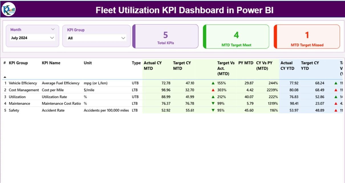
Summary Page – The Core of the Dashboard

The Summary Page acts as the main control panel. It provides a snapshot of your overall KPI performance for both Month-to-Date (MTD) and Year-to-Date (YTD) metrics.
Key Components:
-
Month and KPI Group Slicers:
Located at the top, these slicers allow users to filter data based on specific months or KPI groups instantly. -
KPI Performance Cards:
Three cards display the Total KPIs Count, MTD Target Met Count, and MTD Target Missed Count.
These cards provide a quick overview of how many KPIs are performing above or below expectations.
Detailed KPI Table:
The table shows in-depth information such as:
- KPI Number
- KPI Group
- KPI Name
- Unit of Measurement
- Type (LTB – Lower the Better, UTB – Upper the Better)
- Actual CY MTD, Target CY MTD, and MTD Performance Icons
- Previous Year (PY) MTD data
- YTD performance values for both Current Year and Previous Year
Each KPI includes colored icons (▲ green for improved, ▼ red for declined) to indicate whether performance meets or misses the target —making the dashboard visually intuitive.
KPI Trend Page – Visualize Performance Over Time
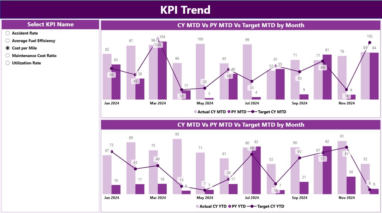
The KPI Trend Page provides a clear visual representation of performance trends. It includes combo charts that compare Actual, Target, and Previous Year values for both MTD and YTD metrics.
Features:
-
A KPI Name Slicer on the left side lets users choose a specific KPI to analyze in depth.
Dual Combo Charts display:
- Actual vs Target MTD Trends
- Actual vs Target YTD Trends
-
These visuals highlight seasonal fluctuations, consistent performance patterns, and deviations from goals.
This page helps users quickly understand how each KPI performs across months, supporting data-backed decision-making.
KPI Definition Page – Drill-Through Insights
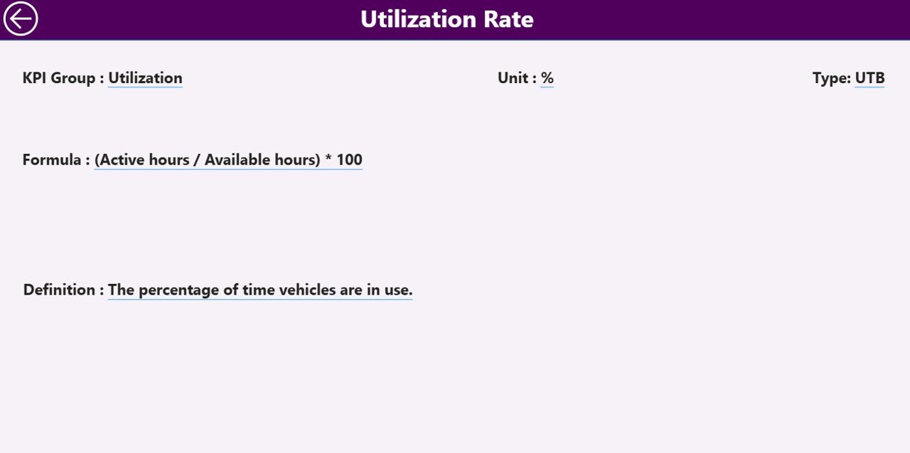
The KPI Definition Page provides a detailed description of each KPI, including:
-
Formula
-
Unit of Measurement
-
Definition
-
Type (LTB or UTB)
This page is hidden by default and can be accessed via drill-through from the Summary Page. Users simply right-click on any KPI and choose “Drill Through” to open this page.
A convenient Back Button is available at the top-left corner, allowing users to return to the main Summary Page with one click.
Excel Data Structure Behind the Dashboard
The Power BI dashboard connects to an Excel workbook, which serves as the data source. This Excel file contains three key worksheets:
🧾 1. Input_Actual Sheet
-
Contains actual data for each KPI.
-
Columns include:
KPI Name | Month | MTD Actual | YTD Actual -
The Month uses the first date of each month for consistent filtering in Power BI.
🎯 2. Input_Target Sheet
-
Contains target data for each KPI.
-
Columns include:
KPI Name | Month | MTD Target | YTD Target -
This helps measure the variance between targets and actuals across time.
📘 3. KPI Definition Sheet
-
Contains meta information about each KPI.
-
Columns include:
KPI Number | KPI Group | KPI Name | Unit | Formula | Definition | Type (LTB/UTB)
By maintaining all three sheets properly, users can refresh Power BI anytime to get real-time updated visuals.
Advantages of the Fleet Utilization KPI Dashboard in Power BI
Click to Purchases Fleet Utilization KPI Dashboard in Power BI
Using this dashboard provides numerous strategic and operational benefits.
✅ 1. Centralized Performance Tracking
All key fleet metrics are displayed in one unified platform. This reduces the need for multiple reports and gives managers instant visibility into performance.
✅ 2. Data-Driven Decision Making
Interactive charts and filters allow users to drill down into details. Decisions are made based on facts, not assumptions.
✅ 3. Real-Time Updates
As the dashboard connects directly with Excel or a live database, updates appear automatically when new data is added.
✅ 4. Visual and Intuitive Interface
Conditional formatting, icons, and color coding make it easy to spot issues and successes at a glance.
✅ 5. Easy Customization
You can modify KPI groups, color themes, and data connections without deep technical knowledge.
✅ 6. Time and Cost Savings
Automated data aggregation and visual reporting save hours of manual analysis each month.
✅ 7. Improved Operational Efficiency
The dashboard identifies underperforming areas, helping organizations enhance resource allocation and reduce idle vehicle time.
🧠 Opportunities for Improvement
Although the Fleet Utilization Dashboard in Power BI is powerful, businesses can enhance it further by:
-
Integrating GPS and IoT data for live vehicle tracking
-
Adding driver-level performance metrics for accountability
-
Including maintenance schedule forecasting to reduce downtime
-
Automating data refreshes via Power Automate for seamless updates
-
Incorporating predictive analytics to forecast future utilization trends
These improvements can make the dashboard even more insightful and proactive.
Best Practices for Using the Fleet Utilization KPI Dashboard
To make the most out of this dashboard, follow these best practices:
🧩 1. Maintain Clean Data
Ensure the Excel data source is free of missing or duplicate records.
Accurate data leads to accurate insights.
🔁 2. Refresh Data Regularly
Update your Actual and Target sheets every month.
Use Power BI’s refresh schedule to automate this process.
📅 3. Use Meaningful KPI Names
Each KPI should have a clear and descriptive name so stakeholders can easily understand it.
📊 4. Use Conditional Formatting Wisely
Red and green icons instantly show whether performance meets or misses targets. Keep visuals consistent and simple.
🧮 5. Validate KPI Formulas
Before publishing, double-check formulas for Target vs Actual and CY vs PY to ensure accuracy.
🧭 6. Encourage Team Collaboration
Share the Power BI dashboard with all stakeholders. When everyone views the same data, alignment improves across departments.
🔐 7. Protect Sensitive Data
If financial data or operational costs are included, apply role-based access in Power BI to control who can see what.
How to Get Started
-
Prepare your Excel data source with three sheets — Actual, Target, and KPI Definition.
-
Connect Power BI to your Excel workbook.
-
Load and transform data using Power Query if needed.
-
Design visuals and cards as per the described layout.
-
Use slicers for Month and KPI Group filtering.
-
Add drill-through navigation and the back button.
-
Publish your dashboard to the Power BI Service for easy sharing.
Following these steps ensures you build a professional and interactive Fleet Utilization KPI Dashboard in Power BI with minimal setup time.
Conclusion
The Fleet Utilization KPI Dashboard in Power BI revolutionizes how logistics and transport companies track, analyze, and optimize their operations.
With its interactive visuals, dynamic slicers, and real-time updates, this tool helps decision-makers stay ahead of issues, improve asset utilization, and reduce costs.
In short, this dashboard turns complex fleet data into clear, actionable insights — enabling you to drive efficiency, improve service quality, and boost profitability.
❓ Frequently Asked Questions (FAQs)
1. What is Fleet Utilization in logistics?
Fleet Utilization refers to how effectively a company uses its vehicles. It measures the percentage of time and capacity that vehicles are used compared to their total availability.
2. Why use Power BI for fleet management?
Power BI offers real-time data visualization, interactive reports, and easy integration with Excel or databases, making it perfect for monitoring fleet KPIs.
3. Can I customize the KPIs in the dashboard?
Yes. You can modify KPI names, groups, formulas, or thresholds directly in the Excel source file, and Power BI will update automatically.
4. How often should the data be updated?
It’s best to refresh the dashboard monthly to align with operational reporting cycles. Automated refreshes can be set using Power BI Service.
5. What are the key metrics in fleet utilization analysis?
Some important KPIs include:
-
Vehicle Utilization Rate
-
Maintenance Cost per Vehicle
-
Fuel Efficiency
-
On-Time Delivery Rate
-
Average Downtime
6. Can this dashboard handle large data sets?
Absolutely. Power BI can efficiently process thousands of records, especially when optimized with Power Query and DAX measures.
7. How can I share this dashboard with my team?
You can publish it to Power BI Service and share it through links, workspaces, or Teams integration.
8. Is this dashboard suitable for small businesses?
Yes. Even small companies with fewer vehicles can benefit from tracking utilization and performance in this structured, visual way.
Visit our YouTube channel to learn step-by-step video tutorials