Managing inventory efficiently is essential for every business that deals with physical goods — whether you’re in retail, manufacturing, logistics, or distribution. Without accurate inventory data, decision-making becomes risky, operational costs rise, and customer satisfaction drops.
To solve these challenges, businesses today rely on data-driven dashboards that visualize and monitor inventory performance in real time. Among these tools, the Inventory Accuracy KPI Dashboard in Power BI stands out as one of the most effective solutions for tracking and improving warehouse accuracy, inventory movement, and operational performance.
In this article, we’ll explore everything about the Inventory Accuracy KPI Dashboard in Power BI — including its features, advantages, best practices, and frequently asked questions.
Click to Purchases Inventory Accuracy KPI Dashboard in Power BI
What Is an Inventory Accuracy KPI Dashboard in Power BI?
An Inventory Accuracy KPI Dashboard is an interactive performance monitoring solution built using Microsoft Power BI. It helps organizations measure how accurately their inventory records match the physical stock available in warehouses or stores.
This dashboard consolidates data from an Excel-based data source, processes it within Power BI, and provides real-time visualizations of critical Key Performance Indicators (KPIs).
By tracking both Month-to-Date (MTD) and Year-to-Date (YTD) values, the dashboard allows users to identify performance gaps, analyze historical trends, and take corrective actions immediately.
In simple terms, it bridges the gap between data and decisions — transforming raw Excel numbers into clear visuals, trend lines, and actionable insights.
Key Features of the Inventory Accuracy KPI Dashboard in Power BI
The dashboard comes with three powerful pages: Summary Page, KPI Trend Page, and KPI Definition Page. Each serves a unique purpose to ensure comprehensive inventory performance analysis.
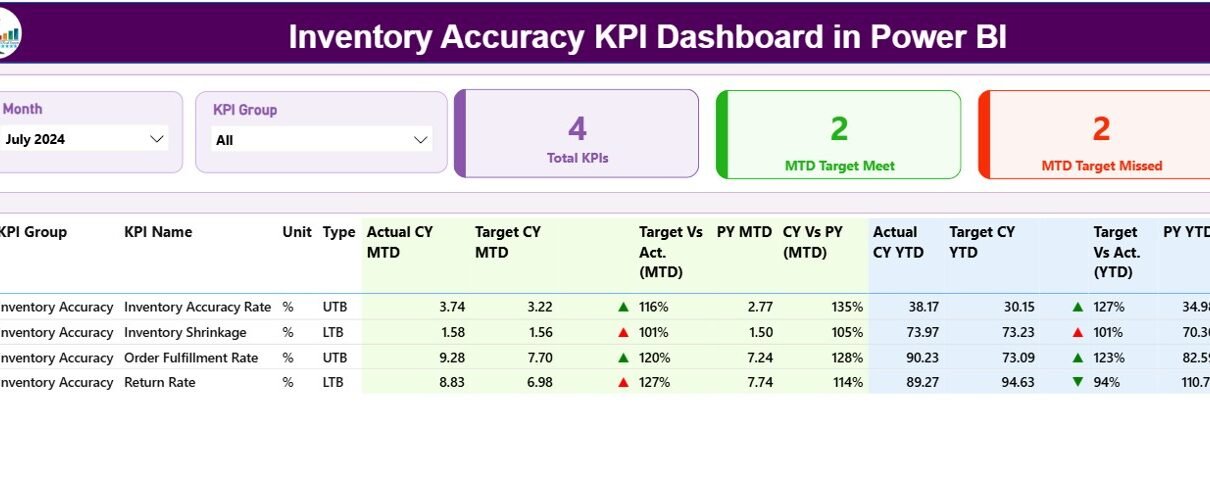
Summary Page – Your Performance Overview
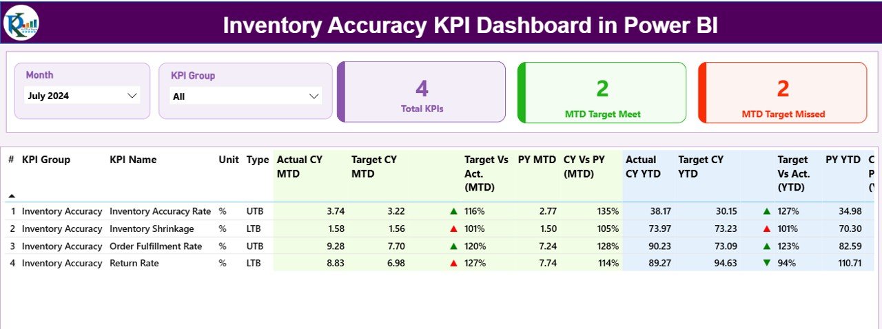
The Summary Page is the main landing page of the dashboard. It presents a clear and concise overview of all inventory KPIs in one place.
🔹 Key Functionalities:
-
Slicers for Month and KPI Group:
Users can easily select the desired month and KPI group to filter and visualize relevant data instantly.
Performance Cards:
At the top, three cards summarize key insights:
- Total KPI Count
- MTD Target Met Count
- MTD Target Missed Count
Detailed KPI Table:
Below the cards, a comprehensive table lists essential KPI details:
- KPI Number – Serial identifier for easy reference
- KPI Group – Category of the KPI (e.g., Accuracy, Efficiency, Cost)
- KPI Name – The specific metric being measured
- Unit – The unit of measurement (e.g., %, Units, Days)
- Type – LTB (Lower The Better) or UTB (Upper The Better)
Performance Metrics Included:
-
Actual CY MTD – Current Year’s Month-to-Date performance
-
Target CY MTD – Current Year’s MTD target value
-
MTD Icon – Green ▲ or Red ▼ icons visually indicate performance vs target
-
Target vs Actual (MTD) – Displays the performance percentage for MTD
-
PY MTD – Previous Year’s MTD values for comparison
-
CY vs PY (MTD) – Compares current MTD with the previous year’s MTD values
Similarly, for YTD data:
-
Actual CY YTD
-
Target CY YTD
-
YTD Icon (▲/▼)
-
Target vs Actual (YTD)
-
PY YTD
-
CY vs PY (YTD)
With this structure, users can instantly assess whether KPIs are improving or declining, both month-to-month and year-over-year.
KPI Trend Page – Dive Deeper into Data
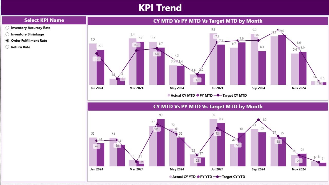
The KPI Trend Page focuses on performance visualization. It allows users to analyze how KPIs evolve over time through interactive charts.
🔹 Key Features:
Combo Charts:
Two combo charts illustrate:
- Actual vs Target vs Previous Year (MTD)
- Actual vs Target vs Previous Year (YTD)
-
KPI Name Slicer:
A slicer on the left lets users select a specific KPI and instantly visualize its trends.
These charts help identify patterns such as seasonal variations, recurring accuracy issues, or consistent improvements, enabling data-driven decision-making.
KPI Definition Page – Know Your Metrics
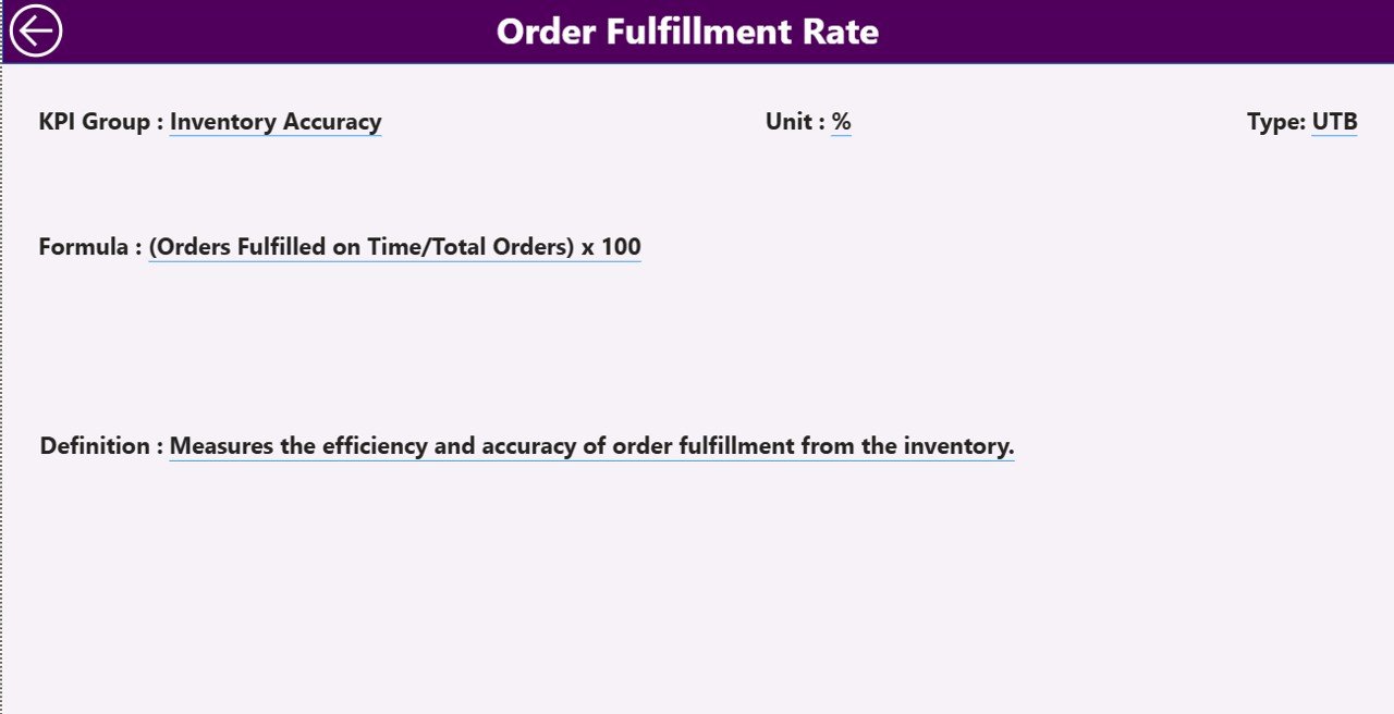
The KPI Definition Page acts as a drill-through page that provides detailed information about each KPI.
When you right-click on a KPI in the Summary Page and select “Drill Through,” this hidden page reveals:
-
KPI Formula
-
KPI Definition
-
Unit of Measurement
-
Type (UTB or LTB)
This feature ensures transparency and consistency across the organization by letting every user understand the logic behind each KPI calculation.
To return to the main dashboard, simply click the Back Button at the top-left corner.
Excel Data Structure Behind the Dashboard
Click to Purchases Inventory Accuracy KPI Dashboard in Power BI
The backbone of this Power BI dashboard is an Excel file that contains three key worksheets:
1️⃣ Input_Actual Sheet
Used to record the actual KPI data.
Columns include:
-
KPI Name
-
Month (first date of the month)
-
MTD Number
-
YTD Number
2️⃣ Input_Target Sheet
Used to record target values for the same KPIs.
Columns include:
-
KPI Name
-
Month (first date of the month)
-
MTD Target
-
YTD Target
3️⃣ KPI Definition Sheet
Provides detailed metadata for each KPI.
Columns include:
-
KPI Number
-
KPI Group
-
KPI Name
-
Unit
-
Formula
-
Definition
-
Type (LTB or UTB)
With this structure, the Power BI model refreshes data directly from Excel, ensuring real-time visibility with minimal manual updates.
How the Dashboard Works
-
Data Collection:
The Excel sheets capture monthly and yearly KPI values. -
Data Integration:
Power BI connects to these Excel sheets as a data source. -
Transformation:
Using Power Query, the data is cleaned, shaped, and merged for visualization. -
Visualization:
The Summary Page, KPI Trend Page, and Definition Page display performance visually using cards, tables, and charts. -
Analysis & Decision:
Users review trends, identify performance gaps, and take corrective actions.
Advantages of Inventory Accuracy KPI Dashboard in Power BI
The dashboard offers numerous benefits for businesses seeking operational excellence.
✅ 1. Real-Time Visibility
Power BI’s dynamic visuals update as soon as data changes in Excel. Managers can make real-time decisions based on the most current information.
✅ 2. Improved Accuracy and Transparency
All KPIs are standardized with clear definitions and formulas. This ensures every team measures performance using the same benchmarks.
✅ 3. Time Efficiency
Manual data compilation and reporting are eliminated. The dashboard automates calculations and comparisons, saving hours of manual effort.
✅ 4. Enhanced Decision-Making
Visual indicators (green/red arrows) instantly highlight which areas require attention. This enables proactive management and faster resolutions.
✅ 5. Year-over-Year Comparison
The dashboard’s CY vs PY metrics empower organizations to measure progress against historical performance.
✅ 6. Easy Integration with Existing Data
Since the source is Excel, the setup is straightforward — no need for complex databases or coding.
✅ 7. Customization and Scalability
New KPIs or data points can easily be added, allowing the dashboard to grow with your business needs.
Why Is Inventory Accuracy Important?
Inventory accuracy is not just about counting products correctly — it’s about optimizing business performance.
High inventory accuracy leads to:
-
Lower stock discrepancies
-
Reduced write-offs and shrinkage
-
Improved customer satisfaction due to fewer stockouts
-
Better financial reporting accuracy
-
Streamlined procurement and replenishment processes
When accuracy improves, both operational and financial outcomes strengthen.
Key KPIs You Can Track in This Dashboard
Here are some of the most common inventory-related KPIs businesses track using this dashboard:
-
Inventory Accuracy (%)
Measures how closely recorded inventory matches actual stock. -
Cycle Count Accuracy
Tracks the accuracy of cycle count results over time. -
Order Fulfillment Accuracy
Monitors whether orders are shipped correctly and on time. -
Shrinkage Rate (%)
Identifies inventory loss due to theft, damage, or administrative errors. -
Stockout Frequency
Shows how often inventory levels drop to zero. -
Inventory Turnover Ratio
Indicates how quickly inventory is sold or used within a period. -
Carrying Cost of Inventory
Measures total holding costs compared to inventory value.
Each of these KPIs can be categorized as LTB (Lower The Better) or UTB (Upper The Better) depending on their nature.
Best Practices for Using the Inventory Accuracy KPI Dashboard
Click to Purchases Inventory Accuracy KPI Dashboard in Power BI
To make the most out of your dashboard, follow these best practices:
🔹 1. Keep Data Clean and Updated
Ensure your Excel data source is updated monthly. Remove duplicates or errors to maintain accuracy.
🔹 2. Define KPIs Clearly
Each KPI should have a unique name, formula, and definition to avoid confusion across departments.
🔹 3. Monitor Trends Regularly
Don’t just rely on one-time reports. Track MTD and YTD performance consistently to identify patterns early.
🔹 4. Use Drill-Through Wisely
Leverage the KPI Definition page to understand the root cause of performance changes before making decisions.
🔹 5. Compare MTD and YTD Together
Evaluating both time frames gives a better view of short-term fluctuations and long-term progress.
🔹 6. Automate Data Refresh
Schedule automatic Power BI data refreshes to keep your dashboard up to date without manual effort.
🔹 7. Share Insights Organization-Wide
Distribute the Power BI report through Power BI Service so every stakeholder stays informed.
Opportunities for Improvement
Even though the dashboard is powerful, organizations can take it a step further by:
-
Integrating with ERP systems like SAP, Oracle, or Microsoft Dynamics for automated data flow.
-
Adding predictive analytics using Power BI’s AI visuals to forecast inventory issues.
-
Incorporating warehouse-level filters to identify regional or location-specific performance gaps.
-
Using Power BI Mobile to access KPIs anytime, anywhere.
-
Implementing data alerts for KPIs that fall below target thresholds.
Conclusion
The Inventory Accuracy KPI Dashboard in Power BI is an indispensable tool for modern inventory management.
It transforms static Excel files into an interactive, automated, and insightful performance monitoring system.
By tracking both MTD and YTD metrics, visualizing trends, and comparing results against targets and past performance, organizations can enhance operational control, minimize losses, and drive better business outcomes.
In today’s competitive environment, data-driven decision-making is no longer optional — it’s a necessity.
And this dashboard ensures that every decision you make is backed by accurate, timely, and visualized data.
Frequently Asked Questions (FAQs)
1. What is an Inventory Accuracy KPI Dashboard in Power BI?
It’s a visual reporting tool that helps track inventory performance metrics like accuracy, shrinkage, and stockouts. It connects Excel data with Power BI to provide interactive insights.
2. How can I update the dashboard data?
Simply update the Excel data sheets (Actual, Target, and KPI Definition), and then refresh the Power BI model to view the latest data.
3. Can I add more KPIs to the dashboard?
Yes. You can expand the KPI Definition sheet with new KPIs, formulas, and categories — Power BI will automatically detect them after refresh.
4. What is the difference between MTD and YTD metrics?
-
MTD (Month-to-Date): Measures performance within the current month.
-
YTD (Year-to-Date): Tracks cumulative performance from the beginning of the year until now.
5. Do I need coding knowledge to use this dashboard?
Not at all. The dashboard is completely no-code. You only need to input data into Excel and refresh Power BI.
6. Can I share this dashboard with my team?
Yes, you can publish it to the Power BI Service and share it securely with your organization or clients.
7. What makes this dashboard better than Excel charts?
Unlike static Excel reports, Power BI offers dynamic visuals, slicers, and drill-through functionality that enable deeper and faster analysis.
Visit our YouTube channel to learn step-by-step video tutorials