In today’s fast-paced retail and e-commerce environment, product returns play a major role in defining a company’s operational efficiency and customer satisfaction. Managing returns effectively is not just about processing refunds — it’s about reducing costs, improving turnaround time, and enhancing customer loyalty. This is where the Returns Management KPI Dashboard in Power BI becomes an essential tool.
Built using Microsoft Power BI and powered by Excel data, this dashboard offers an intelligent, data-driven solution for analyzing and optimizing the entire returns process. It helps businesses visualize key performance indicators (KPIs), identify inefficiencies, and make informed decisions in real-time.
Click to Purchases Returns Management KPI Dashboard in Power BI
This article explores the complete structure, features, and benefits of the Returns Management KPI Dashboard in Power BI, along with best practices and practical insights for implementation.
What Is a Returns Management KPI Dashboard in Power BI?
A Returns Management KPI Dashboard in Power BI is an analytical reporting solution that tracks, measures, and visualizes performance indicators related to product returns. It consolidates data from Excel sheets — including actual, target, and definition tables — into interactive visuals that provide actionable insights.
The dashboard not only helps in monitoring monthly and yearly trends but also supports better forecasting, root-cause analysis, and strategic decision-making.
Through dynamic visuals, slicers, and drill-through capabilities, Power BI transforms complex return data into an intuitive and user-friendly format.
Structure of the Returns Management KPI Dashboard
The dashboard consists of three main pages in the Power BI file and is fully powered by Excel-based data sources. Each page serves a specific purpose and works together to provide a complete view of returns performance.
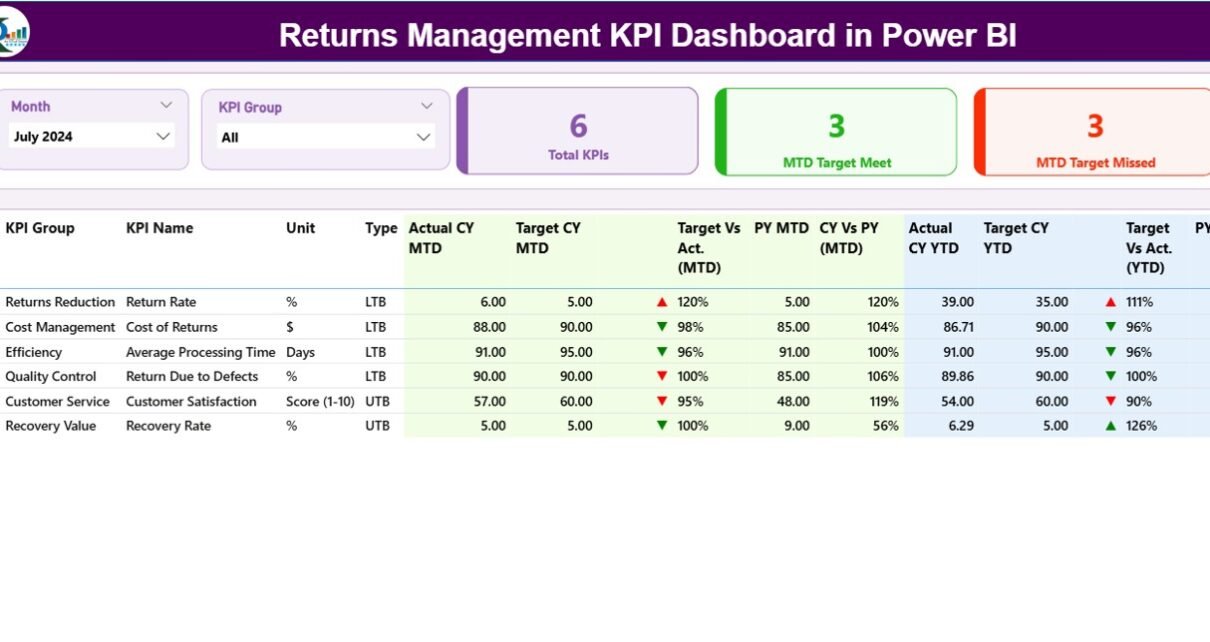
Summary Page
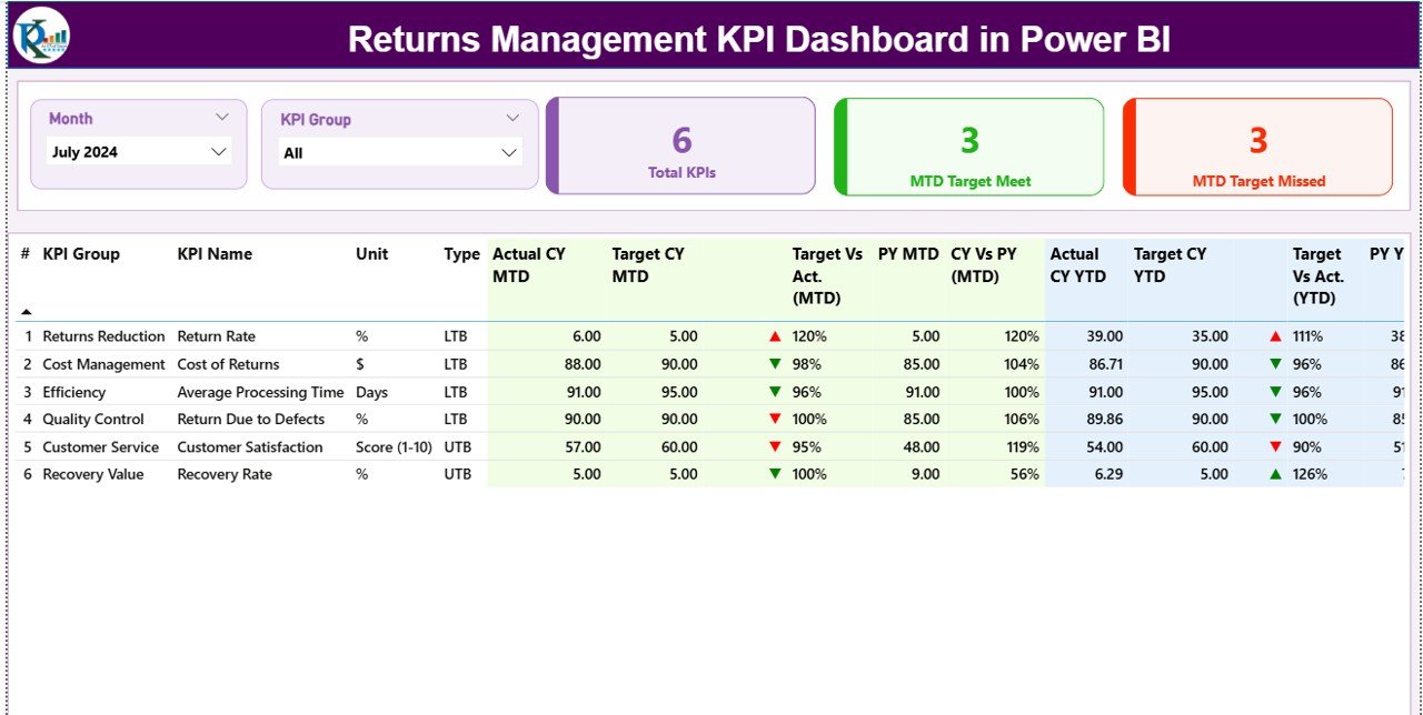
The Summary Page is the primary interface where users can explore overall return performance. It contains the following components:
-
Month and KPI Group Slicers: These interactive controls let users filter data by time period or category.
-
KPI Cards: Display total KPIs count, MTD Target Met count, and MTD Target Missed count.
Click to Purchases Returns Management KPI Dashboard in Power BI
Detailed Table: Shows granular data for each KPI, including:
- KPI Number
- KPI Group
- KPI Name
- Unit (e.g., %, Count, USD)
- Type (LTB – Lower the Better / UTB – Upper the Better)
- Actual CY MTD & Target CY MTD
- MTD Status Icons (▲ for achieved, ▼ for missed)
- Target vs Actual (MTD %)
- PY MTD and CY vs PY (MTD %)
- Actual CY YTD & Target CY YTD
- YTD Icons for quick visual cues
- Target vs Actual (YTD %)
- PY YTD and CY vs PY (YTD %)
Each metric provides immediate insight into how the company is performing both month-to-date (MTD) and year-to-date (YTD).
KPI Trend Page
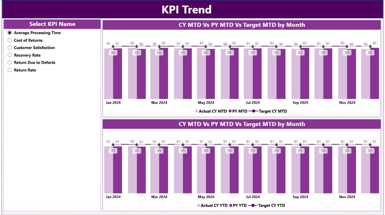
The KPI Trend Page focuses on the visualization of performance over time.
It includes:
-
Combo Charts: Two charts compare Actual, Target, and Previous Year numbers for both MTD and YTD.
-
KPI Slicer: Located on the left, this slicer allows users to choose a specific KPI to analyze.
-
Dynamic Comparison: The charts update automatically to show trends for the selected KPI, highlighting whether targets are being achieved consistently.
This page helps in identifying patterns, forecasting potential bottlenecks, and planning improvement strategies.
KPI Definition Page
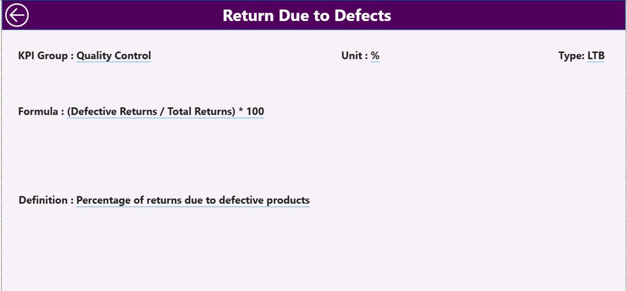
The KPI Definition Page serves as a drill-through page that provides detailed information about each KPI.
When users right-click on a KPI in the Summary Page and choose “Drill Through,” they can access:
-
KPI Formula
-
Detailed KPI Definition
-
Type (LTB or UTB)
This page remains hidden by default, maintaining a clean user interface. A Back button in the top-left corner allows users to return to the main Summary Page seamlessly.
Excel Data Structure Behind the Dashboard
The dashboard is powered by three Excel worksheets. These sheets serve as the foundation for Power BI data modeling and visualization.
1. Input_Actual Sheet
This sheet contains the actual performance data for each KPI.
It includes the following columns:
-
KPI Name
-
Month (use the first day of each month, e.g., 01-Jan-2024)
-
MTD Number
-
YTD Number
Users update this sheet regularly to reflect current actual values.
2. Input_Target Sheet
This sheet defines the target values for each KPI.
Columns include:
-
KPI Name
-
Month (first date of each month)
-
MTD Target
-
YTD Target
These targets act as benchmarks for performance comparison across months and years.
3. KPI Definition Sheet
The KPI Definition sheet stores metadata about each performance indicator, including:
-
KPI Number
-
KPI Group
-
KPI Name
-
Unit (e.g., %, USD, Count)
-
Formula
-
Definition
-
Type (LTB or UTB)
This data enables the KPI Definition page in Power BI to dynamically display detailed KPI context.
Why Businesses Need a Returns Management KPI Dashboard
Managing returns efficiently is vital for maintaining profitability and customer trust. Traditional spreadsheets often make it hard to get a clear, real-time view of performance. The Power BI dashboard solves these challenges by offering:
-
Centralized visibility of all KPIs
-
Automated updates from Excel data
-
Real-time performance tracking for MTD and YTD
-
Easy drill-through and filtering options
-
Dynamic visual cues for quick analysis
Instead of manually calculating performance, teams can now focus on understanding insights and making data-backed decisions.
Key Benefits of the Returns Management KPI Dashboard
Let’s explore the major advantages that make this dashboard a must-have tool for modern organizations.
1. Enhanced Decision-Making
Visual insights allow managers to quickly evaluate performance against targets. They can immediately see which KPIs are on track and which need attention.
2. Time Savings
Manual reporting can take hours. With Power BI, the dashboard updates automatically once the Excel data is refreshed — saving time and reducing errors.
3. Improved Accountability
Every KPI is clearly defined with its formula and ownership, fostering transparency and responsibility across departments.
4. Visual Performance Tracking
Color-coded icons (green for met, red for missed) and dynamic arrows instantly communicate success or shortfall.
5. Historical Comparison
MTD and YTD comparisons with previous year values reveal long-term performance trends, making it easier to identify areas of improvement.
6. Real-Time Monitoring
Since Power BI can be scheduled to refresh automatically, decision-makers can rely on up-to-date insights at any time.
Advantages of the Returns Management KPI Dashboard
A dedicated Returns Management KPI Dashboard offers several unique advantages that go beyond basic data visualization:
-
Holistic View: Combines operational, financial, and customer-centric KPIs in one place.
-
Action-Oriented Insights: Empowers managers to make quick, data-driven adjustments.
-
Scalability: Can easily integrate new KPIs or expand to cover multiple regions or product categories.
-
Accuracy: Reduces human error through automation and standardized data input.
-
Customization: Users can tailor visualizations, slicers, and reports based on business needs.
-
Accessibility: With Power BI Service, teams can access dashboards from anywhere, using any device.
Best Practices for the Returns Management KPI Dashboard
Click to Purchases Returns Management KPI Dashboard in Power BI
To make the most of your Power BI Returns Management Dashboard, follow these proven best practices:
-
Maintain Clean Data Sources:
Keep Excel sheets structured and free from blank rows or inconsistent entries. -
Update Data Regularly:
Refresh MTD and YTD numbers consistently to ensure real-time accuracy. -
Use Consistent Naming Conventions:
KPI names and groups should follow a uniform format to avoid confusion during data modeling. -
Leverage Conditional Formatting:
Use visual indicators (colors, icons, arrows) to simplify performance interpretation. -
Design for User Experience:
Keep slicers easily accessible and visuals aligned for quick navigation. -
Add Descriptive KPI Definitions:
Include detailed formulas and measurement criteria in the definition sheet for better understanding. -
Monitor Trends Over Time:
Use the KPI Trend page to analyze long-term patterns and forecast potential issues. -
Automate Refreshes:
Schedule Power BI refreshes using gateways for seamless data synchronization. -
Integrate with Other Systems:
Combine this dashboard with sales, logistics, or inventory datasets for end-to-end visibility. -
Train Users:
Conduct short training sessions so all stakeholders can interpret the dashboard efficiently.
How to Use the Dashboard Effectively
-
Open Power BI Desktop and load the dashboard file.
-
Connect the Excel Data Source by linking the updated Excel workbook.
-
Use the Month Slicer to view performance for a specific month.
-
Select KPI Groups to analyze different operational areas.
-
Click on any KPI to Drill Through and review detailed definitions and formulas.
-
Switch to the KPI Trend Page to view monthly or yearly performance comparisons.
-
Export insights or snapshots directly from Power BI to Excel or PDF for management reporting.
By following these steps, even non-technical users can interpret complex return data with ease.
Practical Applications Across Industries
The Returns Management KPI Dashboard can be adapted to various sectors, including:
-
Retail & E-commerce: Track product return rates, refund turnaround time, and reasons for returns.
-
Manufacturing: Analyze defect-related returns and identify process inefficiencies.
-
Logistics: Monitor reverse logistics performance and transportation efficiency.
-
Consumer Electronics: Measure warranty claims and product replacement timelines.
-
Apparel: Evaluate return ratios by product type, size, or region to optimize stock management.
This adaptability makes it a versatile tool for performance analysis across multiple business domains.
Tips to Improve Returns Performance Using KPIs
-
Identify Repeat Issues: Track recurring reasons for returns to address product quality or packaging problems.
-
Benchmark Against Targets: Use MTD and YTD comparisons to align performance with business goals.
-
Reward Positive Trends: Recognize teams that consistently meet or exceed return process targets.
-
Use Predictive Analytics: Integrate Power BI AI visuals to forecast future return patterns.
-
Collaborate Across Teams: Share insights with customer service, logistics, and product teams to implement process improvements.
Conclusion
The Returns Management KPI Dashboard in Power BI empowers organizations to take control of their return processes through data-driven insights. By combining interactive visuals, real-time data tracking, and smart analytics, it transforms complex datasets into actionable intelligence.
Whether you are a supply chain manager, operations leader, or business analyst, this dashboard provides everything you need to monitor performance, identify inefficiencies, and enhance profitability.
Implementing such a dashboard ensures your organization moves from reactive to proactive decision-making — a key differentiator in today’s competitive market.
Frequently Asked Questions (FAQs)
1. What is the main purpose of the Returns Management KPI Dashboard in Power BI?
The dashboard helps businesses track key return metrics, monitor trends, and compare performance against targets using visual analytics.
2. Which industries can benefit from this dashboard?
Industries such as retail, logistics, manufacturing, and e-commerce can all use this dashboard to manage and optimize their return processes.
3. How is the data connected to Power BI?
The dashboard uses Excel as its data source. Users update the input sheets (Actual, Target, Definition), and Power BI automatically refreshes visuals.
4. What are MTD and YTD in the dashboard?
MTD stands for Month-to-Date, and YTD stands for Year-to-Date. These metrics compare current performance within the month or year to targets and previous year values.
5. Can the dashboard be customized for other KPIs?
Yes, users can add or modify KPIs in the Excel Definition sheet, and Power BI will automatically reflect those changes after a data refresh.
6. Do I need Power BI Pro to use this dashboard?
No, you can use it with Power BI Desktop. However, if you want to share it online, Power BI Pro or Service access is recommended.
7. How often should I update the data?
It’s best to update your Excel source data at least once a month to ensure accurate MTD and YTD calculations.
Visit our YouTube channel to learn step-by-step video tutorials