The airline industry runs on precision, efficiency, and real-time decision-making. With tight schedules, fluctuating fuel prices, and complex operations, airlines need an easy way to measure performance and maintain profitability.
That’s where the Airlines KPI Dashboard in Excel comes in — a ready-to-use, interactive dashboard designed to track and analyze critical airline performance indicators (KPIs).
Whether you manage flight operations, maintenance, customer service, or finance, this dashboard provides a clear and visual overview of your business performance — all inside Microsoft Excel.
Click to Purchases Airlines KPI Dashboard in Excel
🎯 What Is an Airlines KPI Dashboard in Excel?
An Airlines KPI Dashboard in Excel is a data visualization tool that helps airline managers, analysts, and decision-makers track performance metrics across various departments such as operations, safety, maintenance, customer satisfaction, and finance.
It displays Month-to-Date (MTD), Year-to-Date (YTD), and Previous Year comparisons, allowing teams to see where they are excelling and where improvement is needed.
With dynamic dropdowns, conditional formatting, and automated calculations, this Excel dashboard simplifies complex airline data into clear visuals that support faster and smarter business decisions.
Click to Purchases Airlines KPI Dashboard in Excel
🧩 Structure of the Airlines KPI Dashboard Template
This dashboard template is built with seven interconnected worksheets that together form a complete performance analysis system.
Let’s look at each worksheet in detail:
1️⃣ Home Sheet — Your Navigation Hub
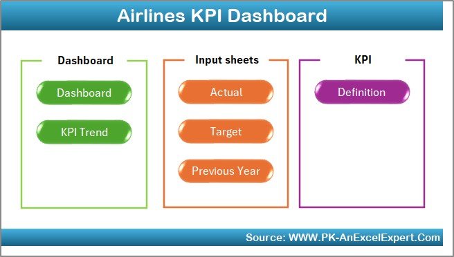
The Home Sheet serves as an index page. It contains six buttons that allow users to jump directly to different sections of the dashboard.
This design ensures smooth navigation and quick access to reports, making it beginner-friendly and efficient.
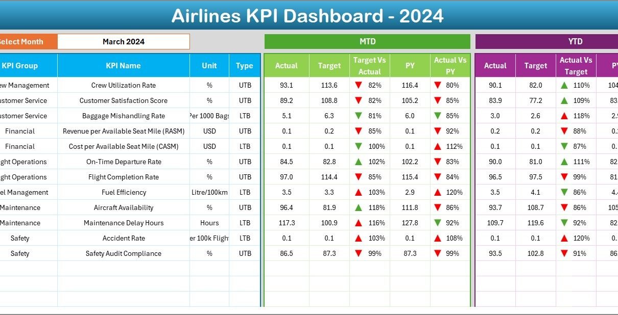
2️⃣ Dashboard Sheet — The Main Analytics Page
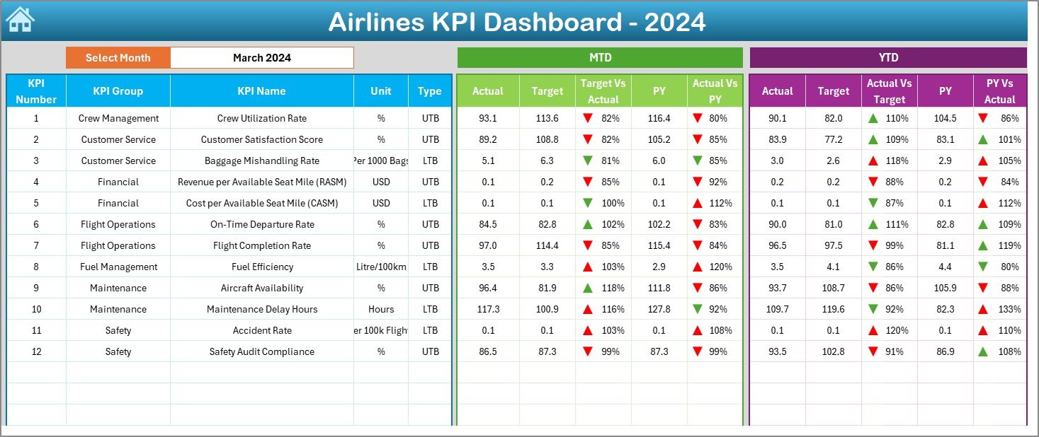
The Dashboard Sheet is the heart of the workbook. It provides a visual overview of all airline KPIs for a selected month.
Key Features:
-
📅 Month Selection Dropdown: Choose a month in cell D3. The entire dashboard updates automatically for that period.
-
📊 Performance Metrics: Displays MTD Actuals, Targets, and Previous Year (PY) values.
-
📈 Conditional Formatting Arrows:
-
Green ▲ indicates improvement or target achievement.
-
Red ▼ highlights performance shortfalls.
-
-
🧮 Comparisons:
-
Target vs Actual (%) — How current numbers compare to goals.
-
PY vs Actual (%) — Year-over-year performance.
-
-
📉 YTD Section:
View cumulative results for the year to monitor long-term progress.
This sheet offers a quick and complete visual summary — ideal for leadership presentations and performance reviews.
3️⃣ KPI Trend Sheet — Analyze Performance Over Time
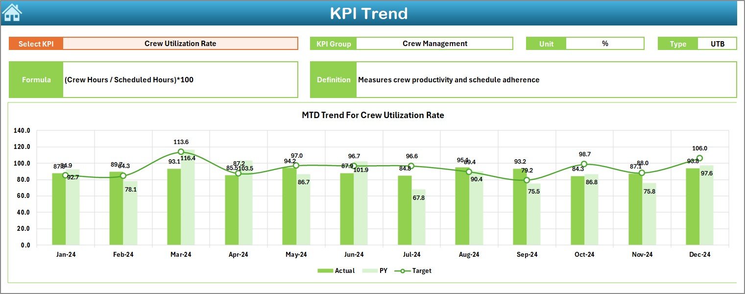
The KPI Trend Sheet allows users to view trends for any selected KPI.
Key Features:
-
🎯 Dropdown for KPI Selection: Located in cell C3, this dropdown lets you choose a specific KPI to analyze.
-
⚙️ KPI Details Display: Shows the KPI Group, Unit, Type (UTB or LTB), Formula, and Definition.
-
📊 Dynamic Charts:
View MTD and YTD trends for Actual, Target, and Previous Year values in interactive graphs.
This page helps airlines track consistency, identify bottlenecks, and understand long-term trends in performance.
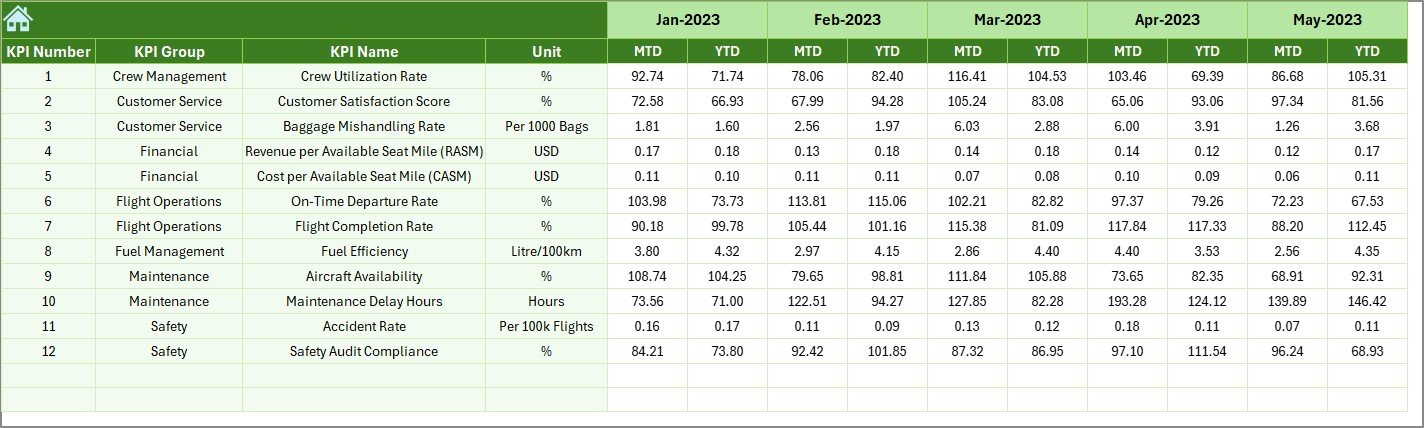
4️⃣ Actual Numbers Input Sheet — Record Performance Data
The Actual Numbers Input Sheet is where you enter the actual data for your KPIs each month.
Features:
-
📅 Change the first month of the year using the dropdown in cell E1.
-
✏️ Enter MTD and YTD numbers for each KPI.
-
🔄 The dashboard updates automatically once you fill in the values.
This ensures real-time updates across all sheets and charts.
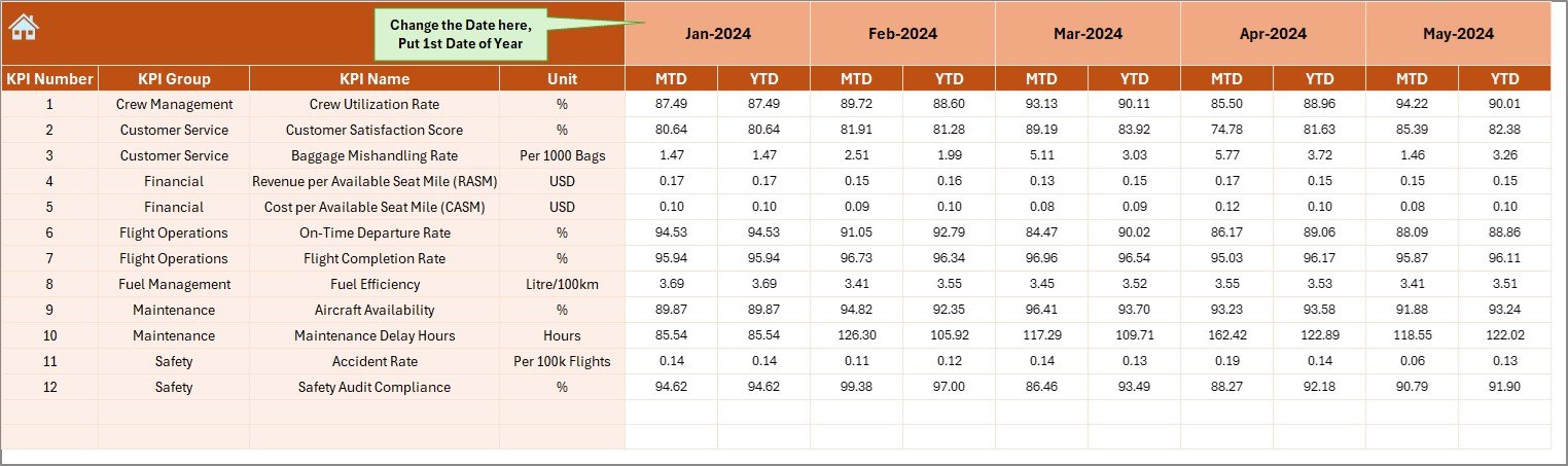
5️⃣ Target Sheet — Define Goals
The Target Sheet contains the benchmark values for every KPI.
You can:
-
Enter monthly MTD and YTD targets.
-
Compare them against actual data to measure performance gaps.
Setting accurate targets ensures accountability and helps align operations with strategic business goals.
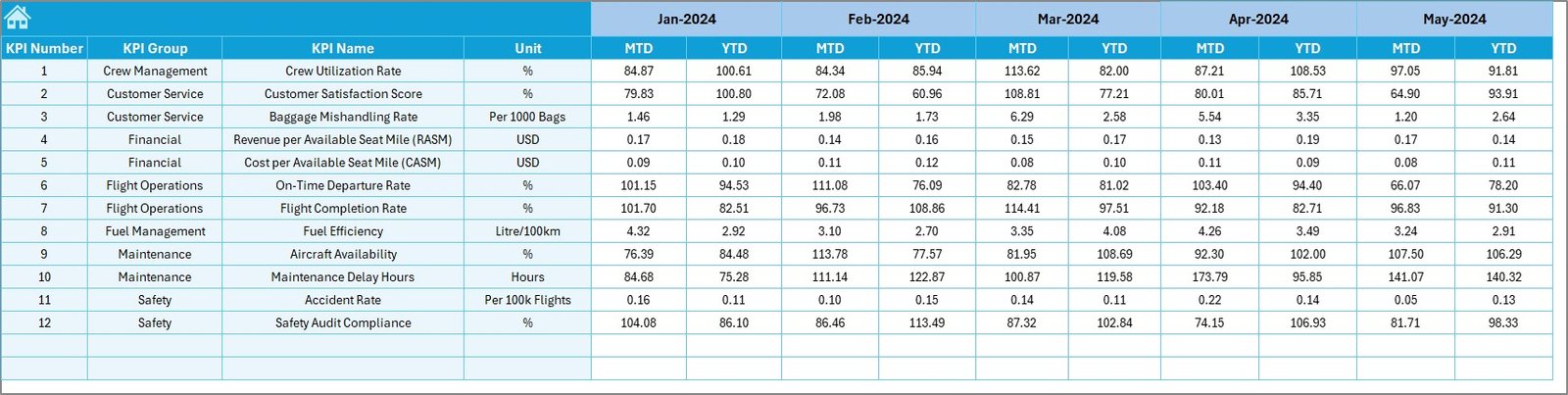
6️⃣ Previous Year Sheet — For Year-over-Year Analysis
In the Previous Year Sheet, you input the last year’s MTD and YTD numbers.
By comparing these values with current data, the dashboard calculates growth rates, variances, and improvement percentages.
This is essential for evaluating whether your airline operations are progressing year over year.
7️⃣ KPI Definition Sheet — The Knowledge Reference
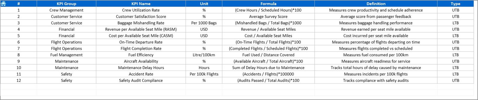
The KPI Definition Sheet explains every metric used in the dashboard.
It includes:
-
KPI Name
-
KPI Group (e.g., Operations, Safety, Finance)
-
Unit (%, Count, Hours, etc.)
-
Formula
-
Definition
This ensures that everyone — from analysts to management — interprets the KPIs consistently.
Click to Purchases Airlines KPI Dashboard in Excel
✈️ Why Airlines Need a KPI Dashboard
Airline operations involve complex processes — from scheduling and fuel management to crew coordination and customer service. Managing all of this manually can lead to inefficiency.
An Airlines KPI Dashboard in Excel offers:
-
📊 Centralized Performance Data: Track all critical KPIs in one place.
-
🕒 Real-Time Insights: Get updated metrics for decision-making.
-
💡 Visual Storytelling: Understand complex data through charts and icons.
-
📉 Improved Efficiency: Identify problem areas early.
-
💰 Cost Optimization: Control operating costs and maximize profit margins.
This dashboard acts as your control tower for performance management.
⚙️ Advantages of Airlines KPI Dashboard in Excel
-
✅ User-Friendly: No coding or Power BI knowledge required.
-
📈 Automated Analysis: Charts and tables update with a single data refresh.
-
🎨 Visually Appealing: Conditional formatting and icons highlight performance instantly.
-
💼 Customizable: Add or modify KPIs to suit specific departments.
-
🔍 Transparent Reporting: Easy for stakeholders to interpret.
-
🧮 Affordable Solution: Built entirely in Excel — no subscription required.
💡 Best Practices for Using the Airlines KPI Dashboard
To get the best results, follow these practices:
-
Update Data Monthly: Ensure all MTD and YTD values are accurate.
-
Set Clear KPI Targets: Define realistic goals for each department.
-
Keep Definitions Consistent: Use the KPI Definition sheet for alignment.
-
Track Trends Regularly: Monitor KPI patterns in the Trend sheet.
-
Simplify Data Entry: Use Excel’s data validation to avoid entry errors.
-
Review YTD vs PY: Understand long-term performance.
-
Involve Key Teams: Operations, finance, and management should collaborate.
-
Use Color Indicators: Stick to standard visual codes — green for good, red for poor.
🧮 Types of Analysis You Can Perform
This dashboard supports multiple forms of analysis, such as:
-
Target vs Actual Analysis: Identify whether goals are achieved.
-
Year-over-Year (YoY) Comparison: Evaluate growth or decline.
-
Trend Analysis: View performance over time.
-
Variance Analysis: Detect gaps between targets and actuals.
-
Operational Efficiency Analysis: Measure resource usage.
These insights help you make data-driven operational and strategic decisions.
✈️ Example: How It Works in Real Life
Imagine an airline analyzing its monthly performance:
-
In May, the On-Time Departure Rate drops from 91% to 86%.
-
The dashboard highlights this KPI in red with a ▼ symbol.
-
A deeper look reveals increased ground time due to maintenance delays.
-
Management decides to adjust maintenance scheduling.
In the next month, the on-time rate improves to 92%. The dashboard reflects this instantly, showing green ▲ icons and an improved YTD trend.
This simple, data-backed approach helps maintain high service standards while minimizing delays and costs.
Click to Purchases Airlines KPI Dashboard in Excel
🚀 Benefits for Airline Teams
-
✈️ Operations Team: Monitor flight efficiency and scheduling accuracy.
-
🧰 Maintenance Department: Track downtime and aircraft performance.
-
👩✈️ Crew Management: Evaluate training, performance, and workload.
-
💼 Finance Team: Control costs and monitor budget utilization.
-
💬 Customer Experience Team: Improve service quality based on satisfaction scores.
Every department gains from having a unified view of performance data.
🏁 Conclusion — Excel at Airline Performance with Data
The Airlines KPI Dashboard in Excel transforms complex operational data into simple, meaningful insights.
It enables airlines to measure key metrics, compare performance over time, and ensure smooth, efficient operations — all without needing expensive software.
With interactive visuals, trend analysis, and automatic updates, this dashboard empowers airline professionals to make smart, data-driven decisions and fly toward success.
If you’re in the aviation industry, this Excel template is your co-pilot for performance excellence.
❓ Frequently Asked Questions (FAQs)
1️⃣ What is an Airlines KPI Dashboard in Excel?
It’s a performance-tracking tool built in Excel that monitors key airline metrics like efficiency, safety, and costs.
2️⃣ Who can use this dashboard?
Airline operations, maintenance, finance, and customer service departments can all benefit.
3️⃣ How does it track performance?
By comparing MTD, YTD, and Previous Year data using conditional visuals and formulas.
4️⃣ Can it be customized?
Yes, you can add, edit, or remove KPIs as per your airline’s requirements.
5️⃣ Does it work automatically?
Yes, once you input Actual, Target, and Previous Year data, all visuals update automatically.
6️⃣ Is Excel enough for KPI analysis?
Absolutely. Excel offers all the tools needed for effective KPI monitoring and visualization.
7️⃣ Can I use it for multiple years?
Yes, just replace old data with new entries each year.
8️⃣ Do I need coding skills?
No, it’s fully formula-based and beginner-friendly.
Click to Purchases Airlines KPI Dashboard in Excel
Visit our YouTube channel to learn step-by-step video tutorials