Managing public transportation efficiently requires more than just tracking bus schedules or ticket sales. Modern transit systems depend on data-driven decision-making to improve punctuality, reduce operating costs, and enhance passenger satisfaction. That’s where the Public Transit KPI Dashboard in Excel becomes a powerful management tool.
This ready-to-use Excel dashboard helps public transit authorities, city planners, and transport managers analyze key performance indicators (KPIs) in one interactive and visual interface.
Let’s explore its structure, features, benefits, and how it can transform your transit operations.
Click to Purchases Public Transit KPI Dashboard in Excel
🧭 What Is a Public Transit KPI Dashboard in Excel?
A Public Transit KPI Dashboard in Excel is a comprehensive tool designed to track, visualize, and evaluate transit performance across different operational areas — such as ridership, service reliability, safety, cost efficiency, and maintenance.
Instead of managing data in multiple files, this dashboard brings everything together. With automated calculations, monthly comparisons, and trend charts, users can easily identify strengths, detect issues, and take corrective actions.
This dashboard is particularly useful for:
-
Municipal transport corporations
-
Metro, tram, and bus system administrators
-
Operations analysts and planners
-
Public policy researchers
-
Transit system consultants
📊 Key Features of the Public Transit KPI Dashboard
This ready-made Excel file contains 7 structured worksheet tabs, each designed for a specific function.
1️⃣ Home Sheet – Navigation Made Simple
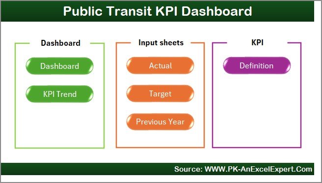
The Home sheet works as your central navigation hub.
It includes six interactive buttons that allow you to jump directly to other sheets like Dashboard, KPI Trend, Actual Input, Target, and KPI Definition.
This design saves time and provides a clean, professional look to the dashboard.
2️⃣ Dashboard Sheet – The Control Center
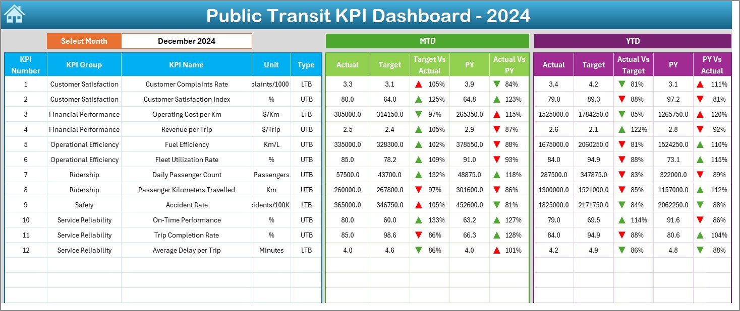
The Dashboard sheet is where all the analytics come together.
Here’s what you’ll find:
-
A Month selection dropdown (cell D3) to choose any month and update all charts and metrics automatically.
-
MTD (Month-to-Date) and YTD (Year-to-Date) comparisons for Actual, Target, and Previous Year values.
-
Visual performance indicators:
-
🔺 Up arrows show improvement
-
🔻 Down arrows highlight performance decline
-
-
Conditional formatting provides quick color cues (green = achieved, red = missed).
This page gives an instant snapshot of the system’s overall health, making it ideal for management reviews and presentations.
3️⃣ KPI Trend Sheet – Performance Over Time
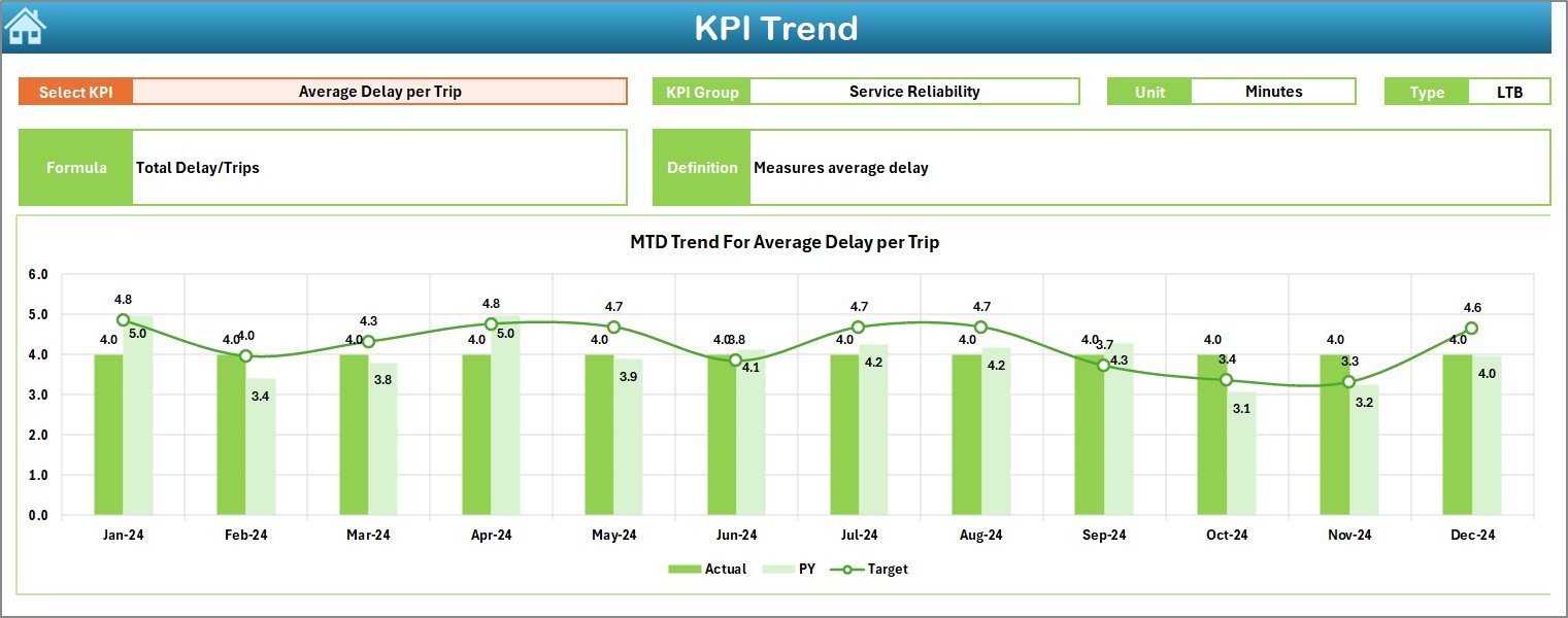
The KPI Trend sheet provides deeper insight into performance trends.
-
You can select any KPI from the dropdown (cell C3).
-
The dashboard displays the KPI’s group, unit, type (Lower-the-Better or Upper-the-Better), formula, and definition.
-
Dual trend charts for MTD and YTD show the variations in Actual, Target, and Previous Year values.
This helps identify seasonal patterns, growth areas, and performance gaps throughout the year.
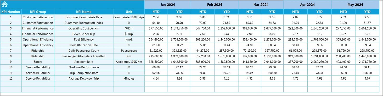
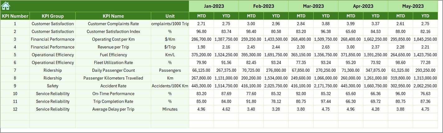
4️⃣ Actual Numbers Input Sheet – Data Entry Simplified
This sheet is designed for entering the real-time performance data.
-
Update Actual values for MTD and YTD per KPI and month.
-
Use cell E1 to change the starting month of the year.
-
The system automatically updates all related charts and summaries.
With structured input fields, it reduces manual errors and ensures consistent data formatting.
5️⃣ Target Sheet – Setting Clear Goals
Every performance management system begins with clear targets.
In the Target Sheet, you can:
-
Enter monthly and yearly target values for each KPI.
-
Define both MTD and YTD targets.
-
Ensure that the dashboard correctly compares Actual vs Target and highlights performance gaps visually.
This helps align teams with organizational goals and improves accountability.
6️⃣ Previous Year Sheet – Benchmarking for Growth
Performance comparison makes analysis meaningful.
This sheet allows you to:
-
Enter previous year’s MTD and YTD data for each KPI.
-
Automatically generate year-over-year comparisons in the dashboard and trend charts.
By comparing data across years, you can see progress, stagnation, or decline — a critical aspect of operational benchmarking.
7️⃣ KPI Definition Sheet – Maintain KPI Clarity
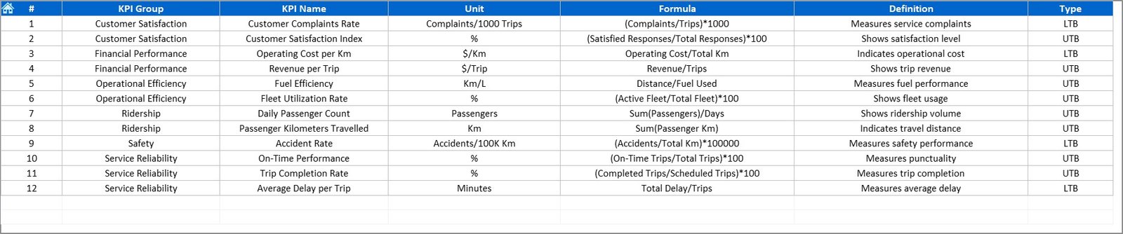
This sheet defines every KPI used in the dashboard. It includes:
-
KPI Name
-
KPI Group
-
Unit
-
Formula
-
Definition
-
Type (UTB / LTB)
Having this structured reference ensures that everyone understands each KPI consistently — from executives to field managers.
🚦 Why Every Transit Authority Needs a KPI Dashboard
Public transportation networks deal with thousands of data points daily — from ticket sales and fleet operations to customer complaints and maintenance activities.
Without automation, tracking all this manually becomes inefficient and prone to error.
A Public Transit KPI Dashboard solves this by offering:
-
Data transparency across all operational levels
-
Visual clarity through graphs and indicators
-
Instant performance comparison (MTD, YTD, PY)
-
Simplified reporting for internal and external stakeholders
In short, it bridges the gap between data collection and decision-making.
Click to Purchases Public Transit KPI Dashboard in Excel
💡 How to Use the Dashboard Effectively
To get the best results from your Public Transit KPI Dashboard, follow these steps:
-
Input Data Monthly:
Update MTD and YTD actuals at the start of each month. -
Review Target Sheet:
Adjust targets yearly or when operational policies change. -
Compare with Previous Year:
Track growth patterns and identify seasonal fluctuations. -
Monitor Trend Charts:
Use trend lines to analyze long-term progress or recurring challenges. -
Present Insights:
Share dashboard visuals during board meetings or quarterly reviews.
🚀 Advantages of the Public Transit KPI Dashboard in Excel
Implementing this Excel-based KPI dashboard offers several operational and strategic benefits:
🎯 1. Comprehensive Performance Overview
All metrics appear in one centralized place. You can assess ridership, costs, service levels, and safety without switching between multiple reports.
💰 2. Low-Cost Implementation
No expensive software is required. Since it’s built in Excel, any transport office can use it instantly.
⚙️ 3. Easy Customization
Users can add or remove KPIs, update formulas, or modify visuals according to organizational requirements.
📈 4. Real-Time Analysis
The dashboard auto-updates whenever you enter new data, giving you immediate visibility into current performance.
🕒 5. Time-Saving Automation
Automated calculations reduce manual effort, freeing staff for strategic planning instead of repetitive reporting.
🧠 6. Better Decision-Making
Clear visuals and monthly comparisons allow managers to take corrective actions quickly and confidently.
Click to Purchases Public Transit KPI Dashboard in Excel
📉 Opportunities for Improvement
Even the best systems evolve with feedback. Here are a few ways you can enhance your Public Transit KPI Dashboard further:
-
Add dynamic slicers: Let users filter KPIs by department, route, or city zone.
-
Integrate Power BI: Convert Excel data into interactive dashboards for web sharing.
-
Include forecasting models: Predict future ridership or cost trends.
-
Automate data imports: Connect Excel to live data sources via Power Query.
-
Enhance visuals: Add heat maps or performance gauges for improved readability.
⚡ Best Practices for Using the Public Transit KPI Dashboard
To ensure accurate and meaningful insights, follow these best practices:
✅ Keep KPI Definitions Clear
Define every KPI in the KPI Definition Sheet with its formula and type. This ensures consistency across departments.
✅ Maintain Data Accuracy
Double-check all entries, especially monthly actuals and targets. Small data errors can lead to misleading performance trends.
✅ Standardize Data Entry
Follow a uniform format for all numeric values (for example, two decimal places or “%” symbols).
✅ Review Data Periodically
Conduct quarterly data audits to ensure information reflects reality and aligns with operational reports.
✅ Backup Regularly
Since Excel files store large volumes of data, create periodic backups to avoid accidental loss.
🧮 Example Analysis from the Dashboard
Let’s understand how a transport manager can use the dashboard:
-
Select “July” from the month dropdown.
-
Review On-Time Performance (UTB): Actual = 91%, Target = 95%, PY = 89%.
-
The Target vs Actual column shows a down arrow (🔻), meaning underperformance.
-
In the KPI Trend sheet, the line chart shows improvement from April to June but a dip in July.
-
The manager can now analyze possible causes — road construction, route delay, or driver shortage — and take corrective action.
This workflow shows how the dashboard turns data into actionable intelligence.
🧭 How the Dashboard Enhances Data-Driven Governance
Public transit authorities operate under tight budgets and high expectations.
The dashboard supports data-driven governance by:
-
Enabling transparency in decision-making
-
Providing factual performance data for policy updates
-
Strengthening accountability among departments
-
Supporting sustainability initiatives through measurable KPIs
By linking daily operations to strategic goals, it ensures that transport systems remain efficient, reliable, and customer-focused.
Click to Purchases Public Transit KPI Dashboard in Excel
🔍 Why Choose Excel for Transit Analytics?
You might wonder why Excel, and not a complex BI tool, for transit analytics.
Here’s why Excel remains a strong contender:
-
Universal Availability: Every organization already uses it.
-
Flexibility: Supports advanced formulas, charts, and macros.
-
Low Technical Barriers: No programming knowledge needed.
-
Integration: Easily connects with CSV, databases, and APIs.
-
Scalability: Suitable for small cities or large metropolitan systems alike.
Excel provides an excellent starting point for data analytics before transitioning to tools like Power BI or Tableau.
🏁 Conclusion
The Public Transit KPI Dashboard in Excel is a powerful yet simple tool for transport professionals who want to make performance management smarter, faster, and data-driven.
With seven dedicated worksheets, visual indicators, and trend analysis, this dashboard eliminates manual reporting headaches and brings transparency to every level of operation.
Whether you’re managing buses, metros, or ferries — this Excel-based system gives you complete control over your transit KPIs and helps you improve service delivery continuously.
Click to Purchases Public Transit KPI Dashboard in Excel
❓ Frequently Asked Questions (FAQs)
1. What is a Public Transit KPI Dashboard?
It’s an Excel-based analytical tool that tracks operational, financial, and customer-centric KPIs for public transport systems.
2. How many sheets does the dashboard include?
The dashboard includes seven sheets: Home, Dashboard, KPI Trend, Actual Input, Target, Previous Year, and KPI Definition.
3. Can I customize the KPIs?
Yes. You can add or edit KPIs in the KPI Definition sheet and adjust corresponding formulas.
4. Is the dashboard automated?
Yes. Dropdowns, conditional formatting, and formulas automate updates once you input data.
5. Do I need technical knowledge to use it?
No. Basic Excel skills are enough to operate and maintain the dashboard.
6. Can I compare performance across years?
Absolutely. You can compare MTD and YTD values with previous-year data using visual arrows and color indicators.
7. How does this dashboard improve transit operations?
It centralizes data, highlights performance gaps, and supports timely decision-making — improving overall efficiency.
8. Is it suitable for both small and large transport systems?
Yes. The design is flexible, so you can scale it for any transport network size.
9. Can this dashboard be linked with Power BI?
Yes, you can connect it with Power BI using Excel data connections to create advanced visuals.
10. Where can I get this dashboard?
You can download the ready-to-use version from your preferred Excel templates marketplace or create one using the structure described above.
Click to Purchases Public Transit KPI Dashboard in Excel
Visit our YouTube channel to learn step-by-step video tutorials