In today’s rapidly changing workplace, diversity and inclusion (D&I) are no longer just HR initiatives — they are strategic priorities. Organizations that embrace diversity benefit from improved innovation, creativity, and productivity. However, managing D&I effectively requires consistent measurement and data-driven decision-making.
That’s where the Diversity & Inclusion KPI Dashboard in Power BI comes in. This ready-to-use business intelligence solution helps organizations track, analyze, and visualize key diversity and inclusion metrics using data from Excel.
Whether you’re an HR leader, DEI manager, or executive looking to measure progress, this dashboard turns complex workforce data into simple, actionable insights.
Click to Purchases Diversity & Inclusion KPI Dashboard in Power BI
📊 What Is a Diversity & Inclusion KPI Dashboard in Power BI?
A Diversity & Inclusion KPI Dashboard in Power BI is an interactive analytical tool that tracks and visualizes KPIs related to workforce diversity, equity, and inclusion.
It combines raw HR and demographic data from Excel files and transforms it into interactive visuals that highlight trends, gaps, and opportunities. By monitoring key indicators such as gender ratio, minority representation, pay equity, and hiring diversity, this dashboard provides leaders with a clear picture of organizational inclusiveness.
Unlike static reports, Power BI dashboards offer real-time insights and dynamic filtering, helping organizations make evidence-based decisions to enhance equality, representation, and belonging.
🧩 Structure of the Dashboard
The Diversity & Inclusion KPI Dashboard in Power BI is designed with simplicity and depth in mind. It includes three main pages — each dedicated to a specific layer of analysis.
Here’s how the dashboard is structured:
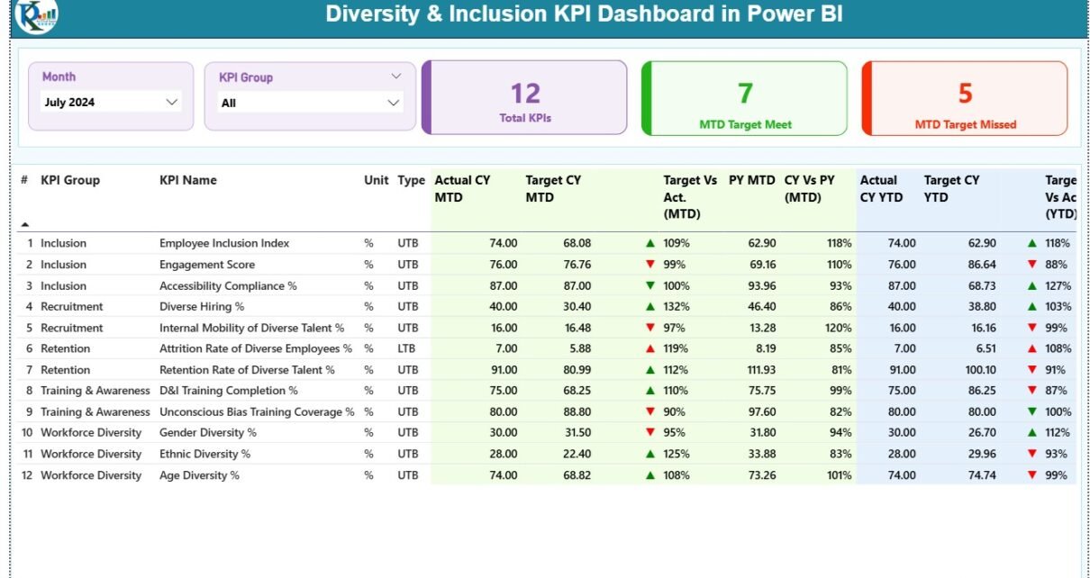
1️⃣ Summary Page – Overview of Diversity & Inclusion Metrics
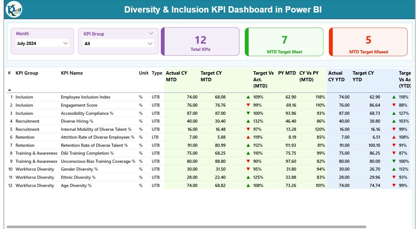
The Summary Page is the heart of the dashboard. It gives users a snapshot of overall performance using dynamic visuals and KPI cards.
Key Highlights:
-
📅 Month and KPI Group slicers: Easily filter data by month or category.
-
🎯 Performance Cards: Display key metrics such as total KPIs, MTD (Month-to-Date) target achieved, and MTD target missed.
-
📈 Detailed KPI Table:
-
KPI Number: Sequence for easy tracking.
-
KPI Group: The main category such as Gender Diversity, Ethnicity, Pay Equity, etc.
-
KPI Name: Specific measurable indicator (e.g., “Female Representation %”).
-
Unit: Measurement unit (percentage, ratio, or count).
-
Type: KPI type — UTB (Upper the Better) or LTB (Lower the Better).
-
Actual vs Target Values: Compare performance for both MTD and YTD (Year-to-Date).
-
Icons: Red and green arrows (▼ ▲) indicate progress or decline.
-
Previous Year Comparison: Quickly assess improvement or regression against last year.
-
This page acts as a control center, giving HR and leadership teams a complete, visual summary of diversity performance.
2️⃣ KPI Trend Page – Tracking Progress Over Time
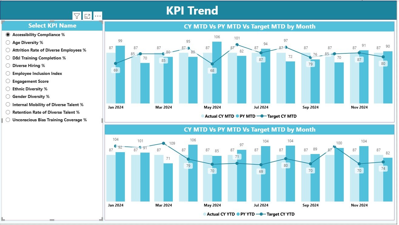
The KPI Trend Page enables deeper insights into specific metrics.
Key Features:
-
🎚️ KPI Name Slicer (on the left): Select a particular KPI for focused analysis.
-
📊 Combo Charts: Two visuals display the MTD and YTD trends for Actual, Target, and Previous Year data.
-
🔁 Trend Comparison: Easily spot fluctuations, improvement patterns, or concerning drops.
This page is perfect for identifying whether diversity efforts are delivering consistent results or if certain initiatives need recalibration.
3️⃣ KPI Definition Page – Understanding Each Metric
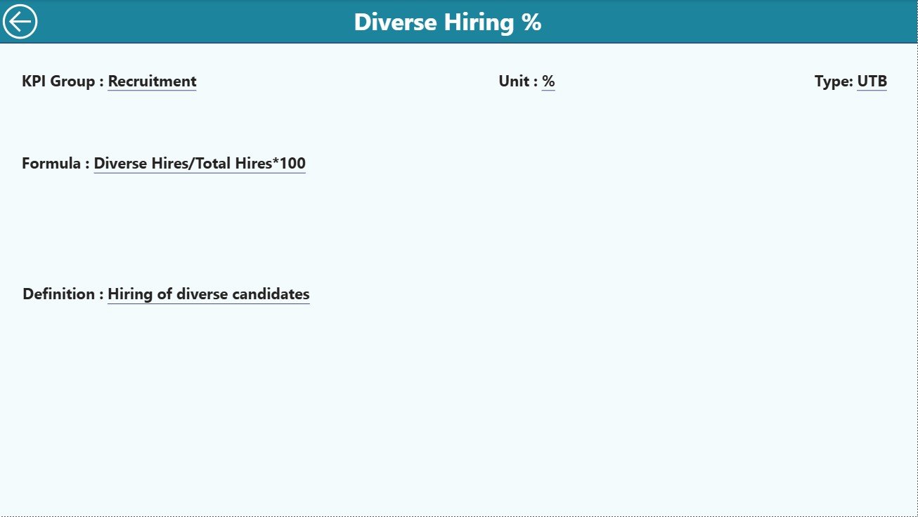
The KPI Definition Page provides documentation for every KPI used in the dashboard.
It includes:
-
KPI Name
-
KPI Number
-
KPI Group
-
Unit of Measure
-
Formula
-
Definition
-
Type (UTB or LTB)
This page ensures clarity and consistency across departments. You can access it through a drill-through feature on the Summary page. After viewing details, simply click the Back button (top-left corner) to return to the main screen.
Click to Purchases Diversity & Inclusion KPI Dashboard in Power BI
📂 Excel Data Source Structure
The dashboard connects to an Excel workbook that contains three worksheets. Keeping data structured ensures smooth Power BI integration and accurate visualizations.
1. Input_Actual Sheet
-
Contains actual monthly and yearly values for each KPI.
-
Fields include: KPI Name, Month (first day of the month), MTD Actual, and YTD Actual.
2. Input_Target Sheet
-
Stores the target figures for each KPI for both MTD and YTD.
-
Allows you to compare performance goals vs actual results directly in Power BI.
3. KPI Definition Sheet
-
Documents all KPI details — Name, Group, Formula, Unit, Type, and Definition.
-
Acts as the single source of truth for metric meaning and calculation logic.
This simple structure keeps the dashboard flexible, scalable, and easy to maintain.
⚙️ Key Features of the Diversity & Inclusion KPI Dashboard
Let’s look at the standout features that make this dashboard an indispensable HR analytics tool:
-
✅ Interactive Filters: Instantly slice data by Month or KPI Group.
-
📊 Real-time Comparison: View Actual vs Target and Current vs Previous Year.
-
🎯 Automatic Variance Calculation: Instantly see performance gaps with percentage metrics.
-
🔺 Visual Indicators: Red/green arrows for MTD and YTD progress status.
-
🧭 Trend Visualization: MTD and YTD combo charts for historical comparisons.
-
🧮 KPI Documentation: Built-in KPI definition sheet for standardization.
-
🧾 Excel Integration: Simple data input structure — no database required.
-
🔄 Drill-Through Capability: Click any KPI to view its formula and definition.
-
💻 User-friendly Interface: Intuitive design suitable for HR, management, and analytics teams.
Together, these features make the dashboard a robust solution for transparent, data-driven diversity reporting.
🌈 Why Diversity and Inclusion KPIs Matter
Tracking diversity and inclusion metrics isn’t just a compliance exercise — it’s a catalyst for better performance. Research shows that diverse teams drive stronger innovation, higher engagement, and better financial outcomes.
KPIs help organizations:
-
Identify gaps in representation and pay equity.
-
Monitor recruitment, promotion, and retention fairness.
-
Build accountability for inclusion goals.
-
Foster transparency and trust among employees.
The Power BI dashboard centralizes all these insights, ensuring that every D&I initiative stays measurable and aligned with strategic priorities.
💼 Benefits of Using the Diversity & Inclusion KPI Dashboard in Power BI
1. Centralized Performance Tracking
View all diversity and inclusion KPIs on a single dashboard instead of managing multiple Excel sheets or manual reports.
2. Improved Transparency
With visual indicators and open KPI definitions, teams can easily interpret performance metrics.
3. Data-Driven Strategy
Make informed decisions about recruitment, promotions, and engagement programs based on data, not assumptions.
4. Time-Saving Automation
No need for repetitive report creation — once data is updated in Excel, Power BI visuals refresh automatically.
5. Real-Time Insights
Dynamic visuals enable leaders to monitor progress continuously and respond quickly to emerging issues.
6. Standardized Metrics
Everyone in the organization uses the same KPI definitions and calculations, ensuring data consistency.
7. Scalable Design
You can easily expand the dashboard with additional KPIs or departments as your D&I strategy evolves.
Click to Purchases Diversity & Inclusion KPI Dashboard in Power BI
🔍 Opportunities for Improvement
Even though this dashboard is comprehensive, you can enhance it further with these ideas:
-
Automate Data Refresh: Use Power BI’s scheduled refresh feature to sync Excel data automatically.
-
Add Department Filters: Enable department or region-level drilldowns for localized analysis.
-
Integrate with HR Systems: Connect Power BI with HRIS or ATS data for real-time updates.
-
Include Employee Feedback: Incorporate survey results or sentiment scores to measure inclusiveness qualitatively.
-
Add Benchmarking: Compare internal KPIs against industry or regional diversity averages.
These improvements will make your diversity tracking even more powerful and insightful.
Click to Purchases Diversity & Inclusion KPI Dashboard in Power BI
🧭 Best Practices for Using the Diversity & Inclusion KPI Dashboard
Follow these best practices to maintain accuracy and maximize impact:
1. Maintain Consistent Data Entry
Ensure every month’s data in Excel is complete and formatted correctly before refreshing Power BI.
2. Standardize KPI Definitions
Use the KPI Definition sheet as the master reference across all reports and departments.
3. Validate Targets Regularly
Update target values yearly to align with organizational goals and changing demographics.
4. Encourage Cross-Department Collaboration
Share the dashboard across HR, leadership, and DEI committees for joint accountability.
5. Visualize Trends
Regularly use the KPI Trend page to spot long-term progress or stagnation.
6. Protect Sensitive Data
Restrict access to demographic details and anonymize sensitive fields to ensure compliance with privacy laws.
7. Communicate Findings Clearly
Present dashboard insights during monthly HR or leadership meetings to drive awareness and action.
By following these steps, you can ensure that your diversity data remains accurate, secure, and actionable.
🌟 How the Dashboard Supports Decision-Making
The Diversity & Inclusion KPI Dashboard in Power BI empowers decision-makers at every level:
-
HR Managers: Track hiring, promotion, and pay metrics to ensure fairness.
-
Executives: Evaluate how D&I initiatives align with business strategy.
-
Team Leaders: Identify representation gaps within their teams.
-
DEI Committees: Use factual data to recommend inclusive policies and initiatives.
Because the dashboard integrates easily with Excel, organizations can manage D&I reporting without costly tools or external software.
🏁 Conclusion
The Diversity & Inclusion KPI Dashboard in Power BI transforms how organizations monitor and promote inclusivity.
With its simple Excel-based input and interactive visuals, it streamlines diversity tracking, empowers HR teams, and provides leadership with measurable insights. From gender representation and pay equity to minority participation and engagement scores — every KPI tells a story of progress and opportunity.
By adopting this Power BI dashboard, your organization can shift from intention to impact, ensuring that diversity, equity, and inclusion remain at the heart of every business decision.
Click to Purchases Diversity & Inclusion KPI Dashboard in Power BI
❓ Frequently Asked Questions (FAQs)
1. What is the Diversity & Inclusion KPI Dashboard in Power BI?
It’s an interactive Power BI solution that tracks key diversity metrics like gender ratio, minority representation, and pay equity using Excel data.
2. Do I need advanced Power BI skills to use it?
No. The dashboard is fully pre-built and user-friendly — simply update Excel data and refresh visuals.
3. Can I add new KPIs?
Yes. You can add additional KPIs in the Excel data source and refresh the model to reflect them in Power BI.
4. Does the dashboard support historical comparisons?
Yes. It shows both Current vs Target and Current vs Previous Year comparisons for MTD and YTD.
5. Is the Excel file difficult to maintain?
Not at all. It has just three sheets — Input_Actual, Input_Target, and KPI_Definition — keeping it simple and structured.
6. Can this dashboard be shared with multiple users?
Yes. You can publish it to the Power BI Service and share access securely with HR and leadership teams.
7. Can I connect it with other HR tools?
Absolutely. You can integrate it with your HRIS, payroll, or survey tools for automated updates.
Click to Purchases Diversity & Inclusion KPI Dashboard in Power BI
Visit our YouTube channel to learn step-by-step video tutorials