Open universities play a critical role in expanding access to higher education. However, managing data from multiple programs, funding sources, and regions can be a major challenge. To make data-driven decisions, educational institutions need a simple yet powerful tool. That’s where the Open Universities Dashboard in Excel becomes invaluable.
This ready-to-use dashboard allows administrators, educators, and analysts to track tuition fees, student counts, satisfaction ratings, and academic performance — all within a single Excel file.
In this comprehensive article, we’ll explore the structure, features, and benefits of this dashboard, along with best practices for making the most of it.
Click to Purchases Open Universities Dashboard in Excel
📘 What Is an Open Universities Dashboard in Excel?
An Open Universities Dashboard in Excel is a data visualization and reporting solution designed for open and distance-learning institutions. It consolidates key metrics from different campuses, programs, and funding sources into one interactive interface.
By leveraging Excel’s analytical capabilities — such as pivot charts, slicers, and conditional formatting — this dashboard turns complex university data into clear insights. It helps decision-makers monitor performance, identify trends, and optimize operations.
⚙️ Structure of the Open Universities Dashboard in Excel
The dashboard contains five analytical pages, plus support and data sheets. Each page focuses on a unique aspect of university performance.
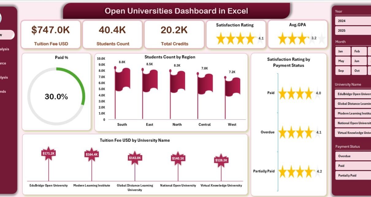
1️⃣ Overview Page — The Summary Hub
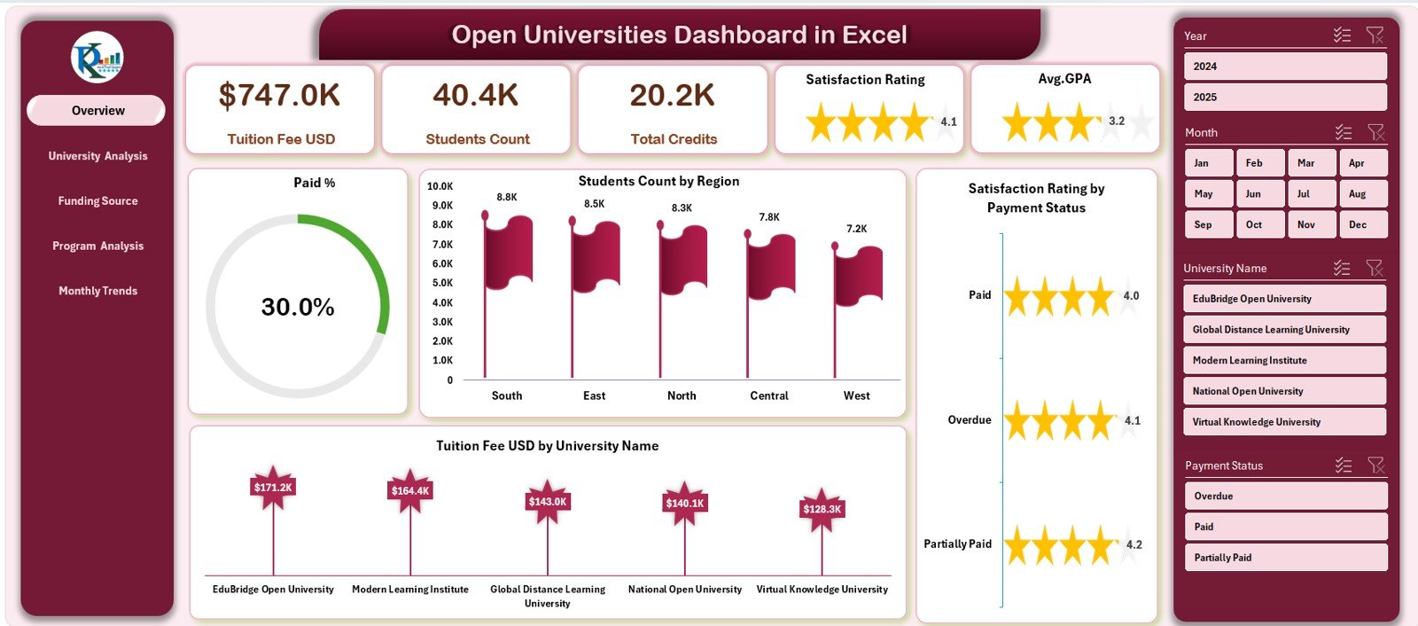
The Overview Page acts as the dashboard’s central summary section. It offers a high-level snapshot of university operations.
🔹 Key Components:
-
Cards Section:
Displays core KPIs such as total students, tuition fee revenue, satisfaction score, and payment completion percentage. -
Charts Included:
-
Paid %
-
Student Count by Region
-
Satisfaction Rating by Payment Status
-
Tuition Fee (USD) by University Name
-
A page navigator on the left side provides easy access to other analytical pages. This layout ensures users can move between pages without confusion.
Click to Purchases Open Universities Dashboard in Excel
2️⃣ University Analysis Page — Performance by Institution
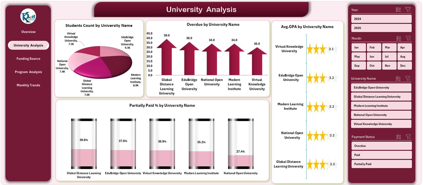
This page focuses on how individual universities perform in key financial and academic metrics.
📊 Visuals Included:
-
Student Count by University Name
-
Overdue Amounts by University Name
-
Partially Paid % by University Name
-
Average GPA by University Name
By comparing these charts, administrators can see which institutions are performing well and which need financial or academic support.
3️⃣ Funding Source Analysis Page — Understanding Financial Flows
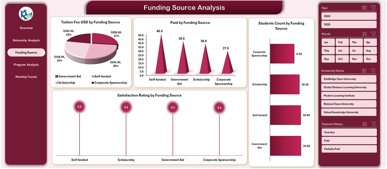
The Funding Source Analysis Page evaluates how different funding models affect university operations.
💰 Charts Displayed:
-
Tuition Fee (USD) by Funding Source
-
Paid Amount by Funding Source
-
Student Count by Funding Source
-
Satisfaction Rating by Funding Source
This helps stakeholders identify which funding types contribute most to enrollment and student satisfaction.
4️⃣ Program Analysis Page — Academic Insights by Program
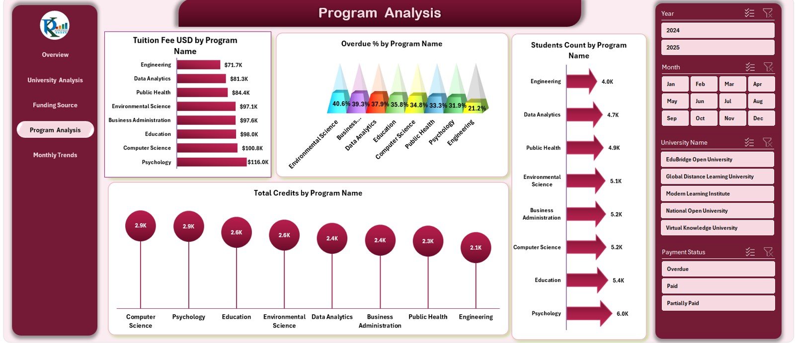
The Program Analysis Page highlights how each program performs financially and academically.
📚 Charts Included:
-
Tuition Fee (USD) by Program Name
-
Overdue % by Program Name
-
Student Count by Program Name
-
Total Credits by Program Name
This section supports curriculum planning and helps identify high-performing or under-enrolled programs.
5️⃣ Monthly Trends Page — Tracking Time-Based Patterns
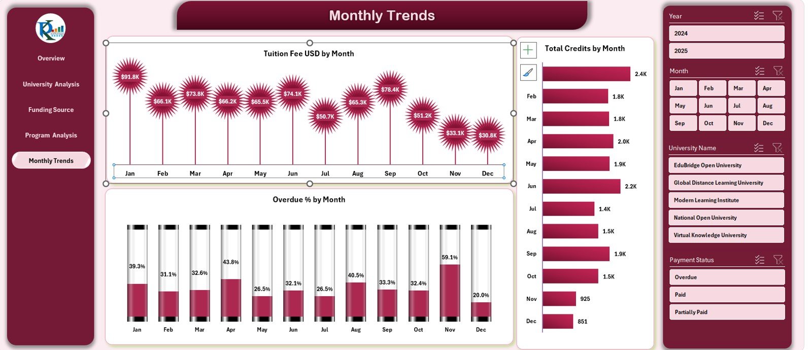
This page visualizes the performance of the university system across months.
📅 Charts Included:
-
Tuition Fee (USD) by Month
-
Total Credits by Month
-
Overdue % by Month
With these visuals, administrators can monitor enrollment cycles, tuition payment patterns, and credit completion rates.
🧾 Support and Data Sheets
The Data Sheet stores raw information, while the Support Sheet manages slicers and data validation. Together, they make the dashboard dynamic, reliable, and easy to update.
Click to Purchases Open Universities Dashboard in Excel
🎯 Key KPIs Tracked in the Dashboard
The Open Universities Dashboard monitors a wide range of performance indicators, such as:
-
Total Students Enrolled
-
Tuition Fees Collected (USD)
-
Overdue %
-
Paid %
-
Satisfaction Rating %
-
Average GPA
-
Credits Completed
-
Students by Funding Source
-
Students by Region
Each metric offers valuable insight into how open universities operate and perform over time.
🌟 Advantages of Using the Open Universities Dashboard in Excel
Implementing this dashboard can transform how educational institutions manage and visualize data.
✅ 1. Centralized View of All Metrics
All university, program, and funding data are available in one place — saving time and reducing manual reporting.
✅ 2. Real-Time Insights
With slicers and dynamic charts, users can instantly switch between months, universities, and funding categories.
✅ 3. Improved Financial Oversight
Easily monitor tuition revenue, overdue payments, and funding efficiency across multiple programs.
✅ 4. Enhanced Academic Analysis
Compare GPA averages and satisfaction ratings to identify successful programs and teaching strategies.
✅ 5. Strategic Decision-Making
The dashboard highlights trends and problem areas, helping leaders make data-driven policy decisions.
✅ 6. Cost-Effective Tool
Built entirely in Excel, it requires no specialized software or training.
✅ 7. Customizable and Scalable
You can add more KPIs, pages, or visuals as your university system grows.
🔄 Opportunities for Improvement
Although this dashboard is highly functional, several enhancements can make it even better:
-
Automate Data Input:
Connect Excel to databases or LMS systems for real-time data imports. -
Add Power BI Integration:
Create a cloud-based version for better sharing and visualization. -
Include Predictive Analytics:
Use trendlines or forecasting models to predict tuition growth or student retention. -
Expand Reporting Capabilities:
Add printable summary pages or auto-generated PDF reports. -
Integrate Feedback Mechanisms:
Link student survey data for deeper satisfaction insights.
💡 Best Practices for Using the Open Universities Dashboard
To maximize value and maintain accuracy, follow these best practices:
1️⃣ Keep Data Consistent
Ensure that input data (student count, payments, satisfaction) follows consistent formats each month.
2️⃣ Use Dropdown Filters
Leverage slicers and dropdowns to quickly analyze specific time periods or universities.
3️⃣ Update Regularly
Refresh the dashboard monthly to track progress and avoid outdated insights.
4️⃣ Protect Formulas
Lock cells with formulas and charts to prevent accidental edits.
5️⃣ Maintain a Backup
Keep archived copies to compare historical performance.
6️⃣ Visualize Effectively
Use contrasting colors for KPI cards (e.g., green for good performance, red for poor).
7️⃣ Train Stakeholders
Educate staff on how to interpret metrics and apply data-driven insights in decision-making.
Click to Purchases Open Universities Dashboard in Excel
🧠 How to Use the Open Universities Dashboard Step-by-Step
-
Open the Excel File:
Explore all five analysis pages plus the Home page for navigation. -
Review the KPI Definitions:
Understand how metrics such as Paid %, GPA, or Overdue % are calculated. -
Enter Data in the Data Sheet:
Fill in monthly tuition, student, and satisfaction details. -
Switch to the Dashboard Page:
Choose a month and view updated results instantly. -
Drill Down by Category:
Use slicers to view data by region, program, or funding source. -
Analyze Trends:
Visit the Monthly Trends page to monitor progress across the year. -
Update Monthly:
Keep inputs current for accurate analytics and reporting.
📊 Use Cases Across the Education Sector
The Open Universities Dashboard in Excel benefits many stakeholders:
-
University Administrators: For monitoring finances and academic results.
-
Government Education Boards: To assess funding efficiency.
-
Program Directors: To analyze course popularity and student satisfaction.
-
Financial Departments: To control overdue and paid amounts.
-
Data Analysts: To track overall institutional performance and growth.
📈 Key Insights You Can Gain
By using this dashboard, institutions can discover:
-
Which universities collect tuition on time.
-
Which funding sources are most reliable.
-
How satisfaction scores vary by payment status.
-
Which programs attract the most students.
-
How GPA trends change across months.
These insights empower leaders to plan future budgets, enhance teaching strategies, and improve overall student experience.
🧾 Benefits for University Management
-
Holistic Visibility: Combines financial, academic, and operational data.
-
Performance Benchmarking: Compare institutions and programs side by side.
-
Strategic Resource Allocation: Direct funding where it creates the most impact.
-
Accountability: Promotes data-based transparency among departments.
💬 Why Excel Is the Best Platform for This Dashboard
Excel remains one of the most reliable tools for dashboard development:
-
Widely Available: No additional software needed.
-
Easy Customization: Add or modify KPIs easily.
-
Powerful Analytics: Supports pivot tables, slicers, and dynamic charts.
-
Cross-Compatibility: Works seamlessly on Windows, Mac, and web versions.
For open universities operating with limited budgets, Excel provides the perfect balance of functionality and affordability.
🏁 Conclusion
The Open Universities Dashboard in Excel is a complete solution for educational performance monitoring. It simplifies data collection, visualizes key trends, and supports evidence-based management decisions.
From tuition revenue to academic outcomes, every metric becomes visible and actionable. Whether you manage one institution or an entire network of open universities, this Excel dashboard empowers you to measure progress, improve efficiency, and enhance student satisfaction.
Click to Purchases Open Universities Dashboard in Excel
❓ Frequently Asked Questions (FAQs)
1️⃣ What is an Open Universities Dashboard in Excel?
It’s a performance-tracking tool built in Excel to monitor tuition, student counts, satisfaction, and GPA for open universities.
2️⃣ How do I update data?
Enter new monthly figures in the Data Sheet; the dashboard updates automatically.
3️⃣ Can I add more programs or universities?
Yes, you can expand the dataset or add visuals easily using Excel’s pivot charts.
4️⃣ Is it suitable for government institutions?
Absolutely. It works perfectly for both public and private universities.
5️⃣ Do I need advanced Excel skills?
No. The dashboard is beginner-friendly and uses dropdowns, slicers, and pre-built charts.
6️⃣ Can it track historical data?
Yes. The Monthly Trends page displays year-long comparisons.
7️⃣ Can I customize the KPIs?
Yes. Add or modify KPIs in the dataset or KPI Definition section.
Click to Purchases Open Universities Dashboard in Excel
Visit our YouTube channel to learn step-by-step video tutorials