In today’s competitive world, companies that embrace diversity and inclusion (D&I) outperform those that don’t. A diverse workforce brings unique perspectives, creativity, and innovation, while inclusion ensures that everyone feels valued and respected.
However, managing and analyzing D&I data manually can be overwhelming. Organizations often struggle to track employee demographics, satisfaction, promotion rates, and pay equity in one place. That’s where the Diversity & Inclusion Dashboard in Excel comes in — a ready-to-use, visual analytics tool that helps HR leaders and executives monitor diversity metrics efficiently.
This dashboard not only simplifies data management but also transforms raw data into meaningful insights for decision-making. Built entirely in Microsoft Excel, it provides interactive charts, slicers, and metrics to evaluate diversity, inclusion, and engagement across departments, regions, and employee categories.
Click to Purchases Diversity & Inclusion Dashboard in Excel
What Is a Diversity & Inclusion Dashboard in Excel?
A Diversity & Inclusion Dashboard in Excel is an analytical tool that consolidates employee data to track key indicators like representation, pay equity, retention, promotions, and satisfaction across various diversity dimensions such as gender, age, ethnicity, and region.
It empowers organizations to:
-
Monitor workforce composition in real time.
-
Identify gaps in representation and inclusion.
-
Evaluate progress toward equity goals.
-
Improve HR strategies based on measurable data.
This Excel-based dashboard acts as a centralized performance report for human resources, DEI officers, and leadership teams. Unlike manual reports, this template uses automation, dynamic slicers, and charts to give you instant insights.
Key Features of the Diversity & Inclusion Dashboard
The Diversity & Inclusion Dashboard in Excel is designed with a user-friendly interface and multiple interactive pages. Here’s what makes it stand out:
🔹 Page Navigator
Located on the left side of the dashboard, the Page Navigator allows users to easily switch between analytical sections. With a single click, users can move from the overview page to detailed department, region, ethnicity, or employment trend analysis.
🔹 Multi-Page Dashboard Structure
This dashboard includes five key analytical pages, each focusing on a specific area of diversity and inclusion. Let’s explore them in detail.
1️⃣ Overview Page – The Big Picture
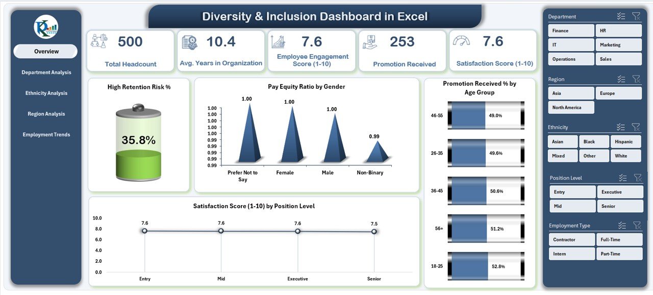
The Overview Page serves as the main control center of the dashboard. It displays a comprehensive summary of all major diversity and inclusion KPIs.
Key Highlights:
-
Right-Side Slicer: Allows filtering by department, region, gender, or other attributes.
-
Five KPI Cards: These cards display quick stats such as total employees, retention rate, and pay equity ratios.
Interactive Charts:
- High Retention Risk % – Identifies areas where employee attrition risk is high.
- Pay Equity Ratio by Gender – Ensures pay fairness between male and female employees.
- Promotion Received % by Age Group – Shows promotion distribution across different age brackets.
- Satisfaction Score (1–10) by Position Level – Measures happiness and engagement across levels.
This page acts as the executive summary — perfect for leadership meetings or quarterly HR reviews.
Click to Purchases Diversity & Inclusion Dashboard in Excel
2️⃣ Department Analysis – Understanding Workforce Balance
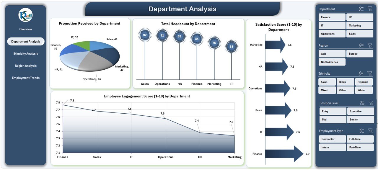
The Department Analysis Page helps organizations identify diversity gaps and performance levels across departments.
Charts on This Page:
-
Promotion Received by Department – Shows fairness in promotion practices.
-
Total Headcount by Department – Tracks workforce representation in each department.
-
Satisfaction Score (1–10) by Department – Measures how satisfied employees are in different teams.
-
Employee Engagement Score (1–10) – Reveals team morale and engagement levels.
By analyzing these visuals, HR professionals can pinpoint departments that need better engagement strategies or equitable promotion practices.
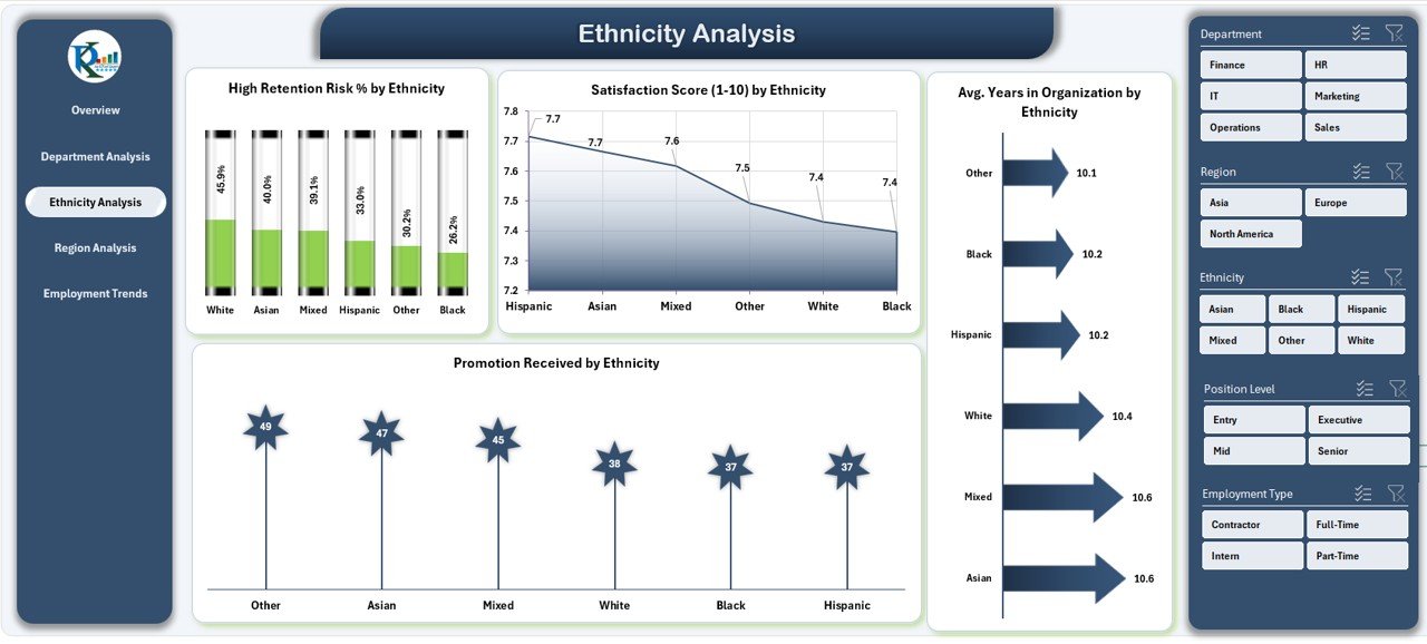
3️⃣ Ethnicity Analysis – Measuring Representation and Equity
The Ethnicity Analysis Page focuses on workforce representation and experiences among different ethnic groups.
Key Insights:
-
High Retention Risk % by Ethnicity – Identifies groups at risk of leaving.
-
Satisfaction Score (1–10) by Ethnicity – Measures perceived fairness and inclusion.
-
Average Years in Organization by Department – Compares experience levels across teams.
-
Promotion Received by Ethnicity – Shows fairness in career advancement opportunities.
This section enables leaders to build data-driven inclusion programs, ensuring all ethnic groups have equal opportunities for success.
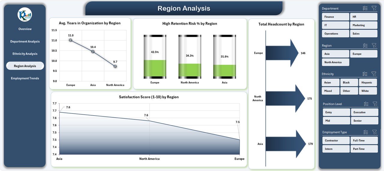
4️⃣ Region Analysis – Tracking Diversity Across Locations
Workplace diversity can vary significantly across regions. The Region Analysis Page highlights how inclusion metrics differ by geography.
Charts on This Page:
-
Average Years in Organization by Region – Evaluates employee loyalty across locations.
-
High Retention Risk % by Region – Identifies regions with potential turnover risks.
-
Total Headcount by Region – Shows workforce size and gender distribution per region.
-
Satisfaction Score (1–10) by Region – Monitors employee happiness geographically.
This insight helps HR teams tailor diversity strategies region-wise to maintain balance and improve inclusion in global teams.
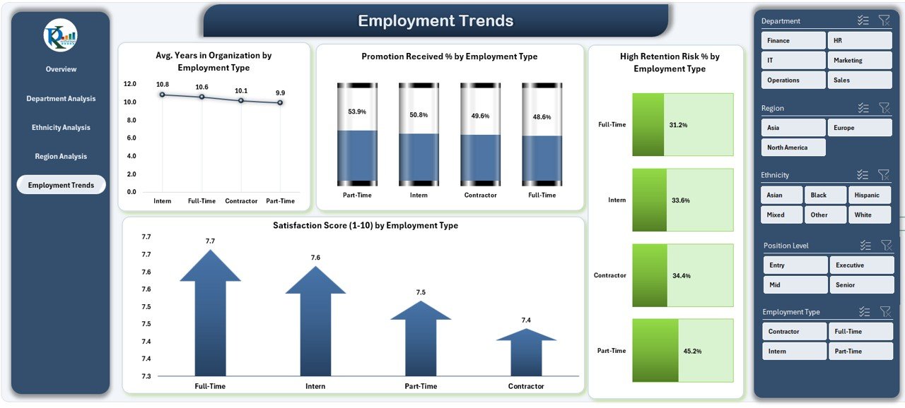
5️⃣ Employment Trends – Monitoring Employee Performance and Engagement
The Employment Trends Page focuses on individual employee metrics to identify growth opportunities and retention risks.
Insights You’ll See:
-
Average Years in Organization by Employee Name – Measures loyalty and tenure.
-
High Retention Risk % by Employee Name – Detects employees likely to leave soon.
-
Promotion Received % by Employee Name – Tracks promotion frequency.
-
Satisfaction Score (1–10) by Employee Name – Evaluates individual job satisfaction.
With these detailed insights, HR managers can conduct personalized engagement discussions, improving employee experience and reducing turnover.
Click to Purchases Diversity & Inclusion Dashboard in Excel
Advantages of the Diversity & Inclusion Dashboard in Excel
Implementing this dashboard offers multiple benefits for HR teams and leadership.
✅ 1. Comprehensive Workforce Insights
The dashboard consolidates all key D&I data in one place, eliminating manual tracking.
✅ 2. Enhanced Decision-Making
With real-time metrics and visuals, HR leaders can make faster, more accurate decisions about inclusion programs.
✅ 3. Promotes Fairness and Transparency
By displaying pay equity, promotions, and satisfaction metrics, the dashboard fosters a culture of openness and accountability.
✅ 4. Supports Strategic Planning
It helps align organizational diversity goals with hiring, training, and retention strategies.
✅ 5. Saves Time and Resources
Automated charts and slicers minimize reporting time, allowing HR to focus on action instead of analysis.
✅ 6. Improves Employee Engagement
Tracking satisfaction and engagement scores encourages proactive interventions for employee well-being.
Opportunities for Improvement
While this Excel-based dashboard is powerful, there are ways to make it even better:
-
Integrate Power BI or Google Data Studio for advanced visualization.
-
Automate Data Refresh by connecting it to HR databases or cloud platforms.
-
Add Predictive Analytics to forecast retention or satisfaction trends.
-
Include Custom Alerts for high retention risk or low engagement scores.
-
Develop Department-Specific Dashboards for deeper insights.
These improvements can make the dashboard more dynamic and scalable for large organizations.
Best Practices for Using the Diversity & Inclusion Dashboard
To get the most value from this dashboard, organizations should follow a few best practices.
1️⃣ Keep Data Updated
Regularly update employee data, satisfaction surveys, and pay records to ensure accuracy.
2️⃣ Use Interactive Filters
Take advantage of slicers to view insights by department, gender, age, or location.
3️⃣ Focus on Actionable Insights
Don’t just monitor data — take action based on trends and patterns.
4️⃣ Encourage Leadership Involvement
Share dashboard insights with department heads and executives to promote accountability.
5️⃣ Train HR Teams
Ensure HR professionals know how to interpret charts and metrics effectively.
6️⃣ Benchmark Against Industry Standards
Compare your diversity metrics with industry data to gauge progress.
7️⃣ Review Monthly or Quarterly
Establish a routine to review D&I metrics regularly to track improvement over time.
How This Dashboard Supports HR Strategy
The Diversity & Inclusion Dashboard in Excel plays a critical role in shaping HR strategy. By combining analytics with inclusivity, it allows organizations to:
-
Detect patterns in employee retention and satisfaction.
-
Create balanced hiring and promotion policies.
-
Identify departments or regions needing diversity focus.
-
Build transparent and equitable workplaces.
-
Strengthen the organization’s employer brand.
When employees see fairness in opportunity and pay, they feel more engaged and committed, directly improving performance and reducing turnover.
Real-World Applications of the Dashboard
Here’s how different industries can benefit:
🏢 Corporate Sector
Monitor gender ratios, leadership diversity, and salary equity.
🏥 Healthcare
Track inclusion among medical staff, nurses, and administrators.
🏫 Education
Evaluate faculty diversity, student engagement, and pay equity.
🏗 Manufacturing
Analyze workforce composition across plants and regions.
💼 Government Organizations
Ensure compliance with diversity regulations and transparency standards.
💻 Tech Companies
Track representation of women, minorities, and underrepresented groups in technical roles.
The flexibility of Excel makes it easy to customize this dashboard for any industry.
Step-by-Step Implementation Process
To use this dashboard effectively, follow these steps:
1️⃣ Collect Data – Gather data on employee demographics, promotions, and satisfaction.
2️⃣ Input Data into Excel – Update the Data Sheet in the template.
3️⃣ Navigate Pages – Use the left-side navigator to explore different analysis pages.
4️⃣ Apply Filters – Use slicers to filter by department, region, gender, or age.
5️⃣ Review Insights – Analyze charts and KPI cards for trends.
6️⃣ Take Action – Use findings to improve inclusion strategies.
Why Excel Is Ideal for Diversity & Inclusion Dashboards
Many organizations already use Excel, making it an ideal platform for D&I analytics.
Benefits of Using Excel:
-
Easy to deploy and customize.
-
No coding or special software required.
-
Supports dynamic charts and slicers.
-
Integrates seamlessly with HR systems.
-
Allows exporting to Power BI for advanced visualization.
With Excel, even small HR teams can create professional dashboards without technical expertise.
Conclusion – Building a Culture of Inclusion Through Data
The Diversity & Inclusion Dashboard in Excel is more than a reporting tool — it’s a strategic asset. By visualizing key metrics like pay equity, retention, and engagement, organizations can turn diversity goals into measurable outcomes.
This dashboard enables HR leaders to make data-driven decisions, uncover hidden gaps, and build a workplace that values every individual. With proper use, it becomes a foundation for fostering equality, transparency, and long-term employee satisfaction.
If you’re ready to take your inclusion strategy to the next level, download the Diversity & Inclusion Dashboard in Excel today and start transforming your data into meaningful change.
🟨 Frequently Asked Questions (FAQs)
1️⃣ What is a Diversity & Inclusion Dashboard in Excel?
It’s an Excel-based analytics tool that tracks and visualizes key D&I metrics like pay equity, promotions, satisfaction, and representation across departments and demographics.
2️⃣ Who should use this dashboard?
HR teams, DEI officers, executives, and managers can use it to monitor workforce diversity, detect gaps, and improve inclusion strategies.
3️⃣ What are the main KPIs tracked in this dashboard?
Key metrics include retention risk %, pay equity ratio, promotion rate, satisfaction score, and engagement score.
4️⃣ Can I customize the dashboard for my organization?
Yes, the Excel template is fully editable. You can add new KPIs, charts, or filters as per your organization’s needs.
5️⃣ How often should I update the data?
It’s best to update the data monthly or quarterly to keep insights accurate and actionable.
6️⃣ What makes this dashboard better than manual reports?
It automates complex calculations, saves time, and provides instant visual insights through interactive charts and slicers.
7️⃣ Can small organizations use it?
Absolutely! It’s designed for organizations of all sizes and doesn’t require any advanced technical knowledge.
Visit our YouTube channel to learn step-by-step video tutorials