In today’s energy-driven economy, power generation companies handle complex data daily. From fuel costs and plant types to energy output and profitability, every metric plays a role in operational efficiency and sustainability.
Managing all these variables manually is time-consuming and error-prone. That’s where the Power Generation Dashboard in Excel steps in — a powerful, easy-to-use solution that converts raw energy data into clear, visual insights.
This article explores everything you need to know about the Power Generation Dashboard in Excel — its structure, features, advantages, and best practices to get the most from it.
Click to Purchases Power Generation Dashboard in Excel
What Is a Power Generation Dashboard in Excel?
A Power Generation Dashboard in Excel is a dynamic analytical tool designed to monitor, evaluate, and visualize all major aspects of energy production and financial performance in one place.
It brings together key indicators such as:
-
Total energy generated (MWh)
-
Fuel and operating costs
-
Downtime hours
-
Revenue and profitability
-
Performance by department, plant type, and fuel source
With this dashboard, energy managers can quickly assess plant efficiency, identify cost-saving opportunities, and track month-to-month performance trends — all within Excel’s familiar environment.
Why Choose Excel for Power Generation Analytics?
Excel remains one of the most flexible platforms for building data dashboards. It requires no additional software and allows customization for any organization’s needs.
Here’s why energy professionals prefer Excel dashboards:
-
Ease of Use: No coding or advanced technical skills needed.
-
Customizable Layout: Tailor visuals, charts, and data views as required.
-
Automation Ready: Use formulas, pivot tables, and slicers to create dynamic, real-time insights.
-
Cost-Effective: Avoid the high licensing costs of BI tools while achieving similar functionality.
-
Compatibility: Easily integrates with other systems through data import/export features.
Key Features of the Power Generation Dashboard in Excel
The Power Generation Dashboard provides an all-in-one analytical environment for performance monitoring.
📌 Page Navigator
Located on the left side, the Page Navigator allows smooth movement between dashboard pages. This intuitive interface ensures quick access to each analysis section without scrolling through multiple sheets.
🧩 Dashboard Pages
The Excel file includes five interactive pages, each focusing on a different analytical dimension of power generation.
Let’s explore each page in detail.
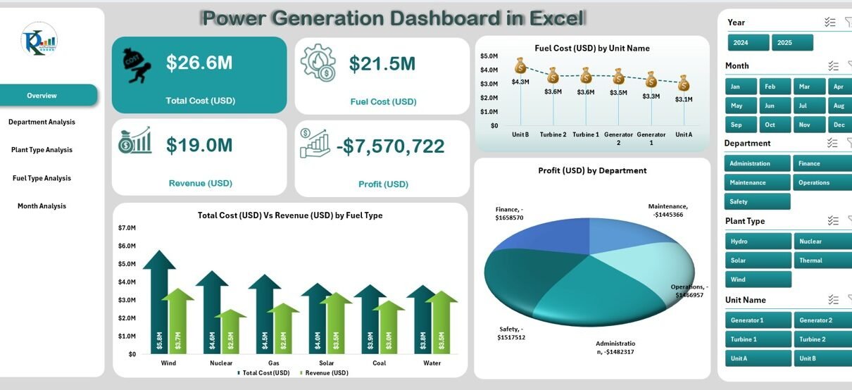
1️⃣ Overview Page — A Complete Snapshot of Power Operations
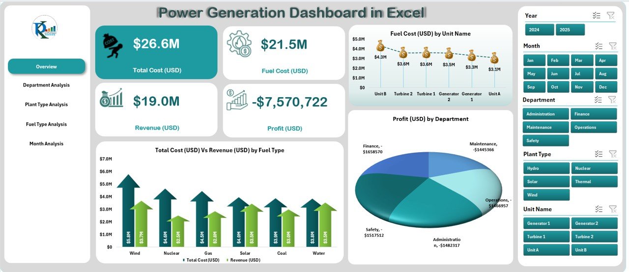
The Overview Page serves as the main dashboard hub. It provides high-level insights into total costs, revenues, and profitability.
Key Highlights
-
Four performance cards display key financial metrics such as total cost, total revenue, total profit, and operating cost.
Three dynamic charts visualize:
- Total Cost vs. Revenue by Fuel Type
- Fuel Cost by Unit Name
- Profit by Department
Why It Matters
This overview helps executives instantly see whether operations are profitable, which departments perform best, and how different fuel sources affect total costs.
2️⃣ Department Analysis — Compare Efficiency Across Units
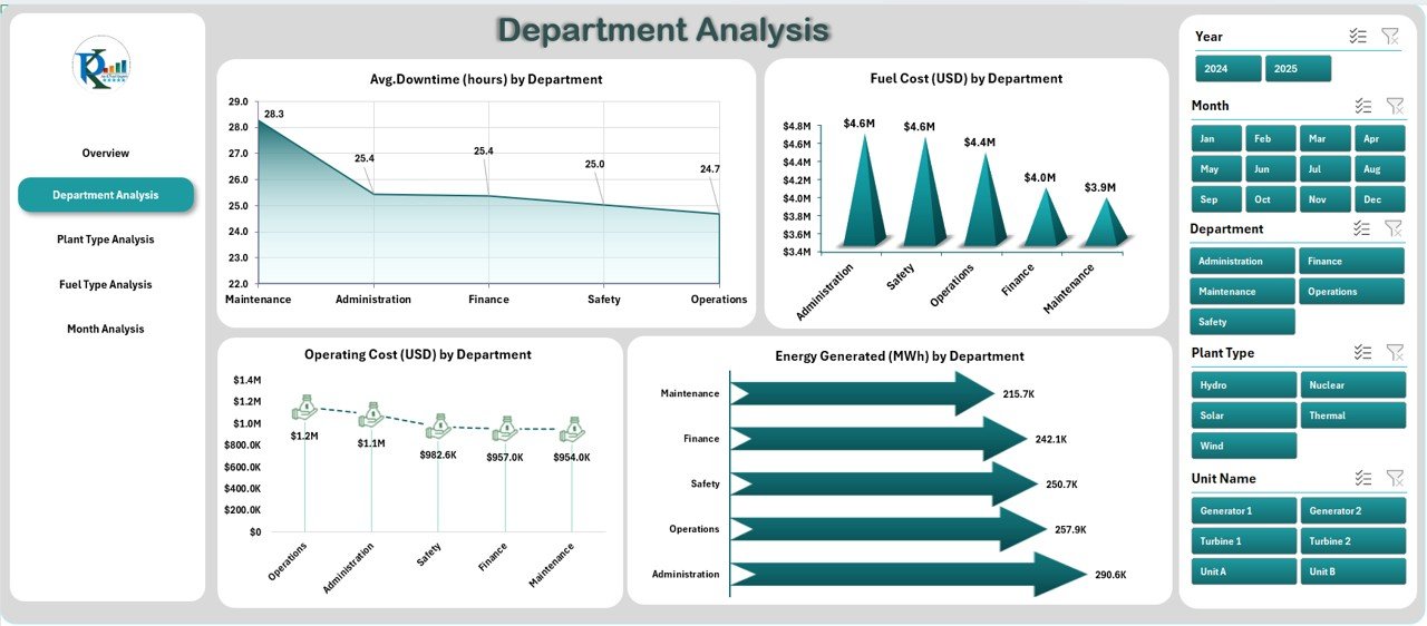
The Department Analysis Page provides an in-depth look at performance by department.
Charts and Metrics Included
-
Average Downtime (Hours) by Department
-
Fuel Cost (USD) by Department
-
Operating Cost (USD) by Department
-
Energy Generated (MWh) by Department
Insights You Can Draw
-
Identify departments with excessive downtime.
-
Compare energy output and cost efficiency.
-
Find improvement areas for maintenance or scheduling.
By analyzing cost and production at the departmental level, decision-makers can align strategies to boost productivity and reduce waste.
3️⃣ Plant Type Analysis — Evaluate the Cost-to-Revenue Balance
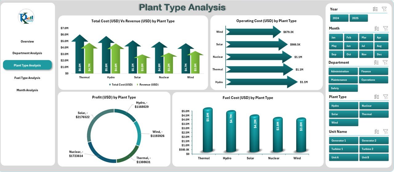
Different plant types (thermal, hydro, solar, wind, etc.) contribute differently to total output and profitability. The Plant Type Analysis Page lets you compare them visually.
Click to Purchases Power Generation Dashboard in Excel
Charts Included
-
Total Cost vs. Revenue by Plant Type
-
Operating Cost by Plant Type
-
Profit by Plant Type
-
Fuel Cost by Plant Type
How This Helps
This view helps management understand which type of power plant offers the highest ROI and which requires cost optimization. For instance, solar plants might show higher upfront costs but long-term profitability, while thermal plants may need fuel efficiency improvements.
4️⃣ Fuel Type Analysis — Track Energy Economics by Source
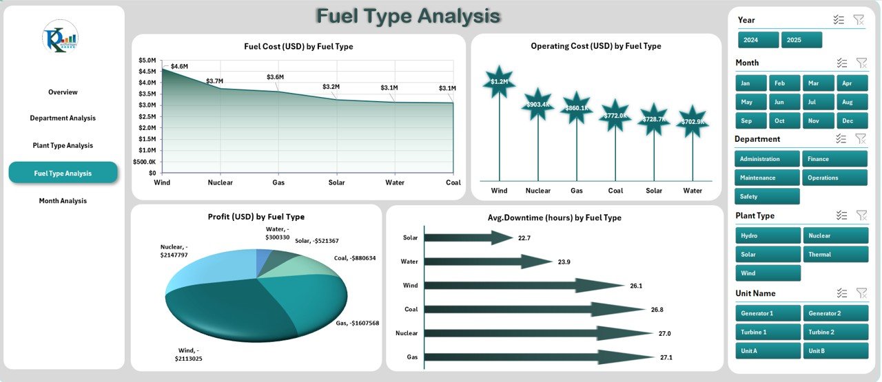
Fuel is one of the largest cost drivers in power generation. The Fuel Type Analysis Page enables data-driven fuel management.
Charts Available
-
Fuel Cost (USD) by Fuel Type
-
Operating Cost (USD) by Fuel Type
-
Profit (USD) by Fuel Type
-
Average Downtime (Hours) by Fuel Type
Why It’s Useful
This page helps identify which fuels deliver optimal performance and which ones are driving up costs or downtime. It’s particularly helpful for companies that use a mix of coal, gas, hydro, and renewables.
For example, by visualizing fuel costs and related downtime, operators can prioritize sustainable and cost-effective options.
5️⃣ Month Analysis — Understand Trends Over Time
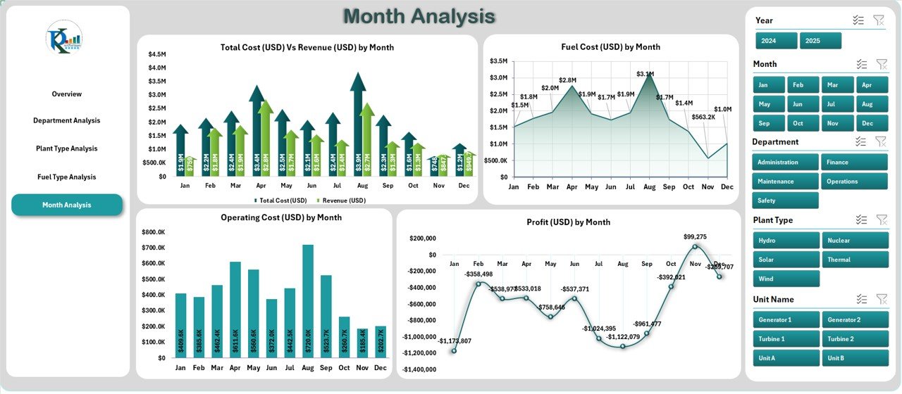
The Month Analysis Page allows users to analyze performance over the entire year.
Charts Included
-
Total Cost vs. Revenue by Month
-
Operating Cost by Month
-
Profit by Month
-
Fuel Cost by Month
Benefits of Monthly Analysis
-
Detect seasonal fluctuations in fuel consumption or generation output.
-
Monitor the impact of maintenance schedules on monthly performance.
-
Track monthly profitability trends to forecast future financial outcomes.
By comparing month-to-month variations, managers can make proactive adjustments to optimize production and resource allocation.
📊 Support Sheets — Behind-the-Scenes Power
Every dashboard relies on a structured data foundation.
Data Sheet
The Data Sheet stores all raw data, such as cost, generation, and revenue figures. It acts as the backbone of the dashboard, feeding data into visual charts and KPIs through formulas and pivot tables.
This structure allows easy updates — simply replace old data with new monthly inputs to refresh the dashboard automatically.
⚡ Advantages of the Power Generation Dashboard in Excel
Let’s explore the major benefits this dashboard delivers to energy organizations.
✅ 1. Centralized Data Visualization
It brings all power generation data — costs, revenues, downtime, and energy output — into one place, allowing comprehensive analysis.
✅ 2. Improved Decision-Making
Real-time visual reports make it easier to spot trends and anomalies, empowering leaders to take immediate action.
✅ 3. Time Efficiency
Automated formulas and pivot charts minimize manual work, saving hours of report preparation every month.
✅ 4. Cost Optimization
By comparing costs and profits across fuel types and departments, managers can identify areas for budget optimization.
✅ 5. Performance Transparency
Each department’s performance is clearly visible, ensuring accountability and encouraging continuous improvement.
✅ 6. Scalability and Customization
Users can easily expand the dashboard by adding new metrics, charts, or plant categories as the organization grows.
🧠 How to Use the Power Generation Dashboard Effectively
To get the most out of this Excel dashboard, follow these simple steps:
-
Input Data: Update the Data Sheet regularly with accurate cost, generation, and downtime data.
-
Navigate Pages: Use the left-side page navigator to explore Overview, Department, Plant Type, Fuel Type, and Month Analysis pages.
-
Analyze Trends: Compare Actual vs. Target performance to identify improvement areas.
-
Interpret Charts: Review visual trends for quick insight into profitability and efficiency.
-
Take Action: Use insights to guide maintenance schedules, fuel sourcing, and operational strategies.
🧭 Best Practices for Using the Power Generation Dashboard
Following best practices ensures that your dashboard remains accurate, reliable, and actionable.
🔹 1. Maintain Data Accuracy
Always cross-verify source data before uploading it to the dashboard. Inaccurate data can lead to wrong decisions.
🔹 2. Refresh Data Regularly
Update your Data Sheet monthly or weekly depending on reporting needs to maintain real-time accuracy.
🔹 3. Use Consistent Units
Ensure all departments use the same measurement units for cost and energy output to avoid discrepancies.
🔹 4. Apply Conditional Formatting
Highlight key metrics like profit margins or downtime with colors or icons to enhance quick interpretation.
🔹 5. Keep Design Clean and Intuitive
Avoid cluttered visuals. Use readable fonts and well-labeled charts for professional presentation.
🔹 6. Protect Formulas and Layout
Lock important cells or use worksheet protection to prevent accidental overwriting.
🔹 7. Review KPIs Periodically
Reassess your KPIs every quarter to ensure they align with your organization’s evolving goals.
🔍 Tips to Customize the Power Generation Dashboard
You can tailor the dashboard further to fit specific operational goals:
-
Add Filters: Include dropdowns to filter by region, plant, or department.
-
Insert Trendlines: Use Excel’s trendline feature to project future performance.
-
Integrate with Power Query: Automate data import from external files or databases.
-
Add KPI Targets: Display benchmarks alongside actual performance for better comparison.
-
Include Forecasting: Use Excel formulas like FORECAST.LINEAR to predict upcoming cost or generation trends.
🌱 The Role of Dashboards in Modern Energy Management
In the renewable-driven future, efficient energy management depends heavily on data analytics. Dashboards like this bridge the gap between operations and strategy.
They provide visibility into:
-
Resource allocation
-
Plant reliability
-
Energy sustainability
-
Cost efficiency
By embracing a data-driven approach, organizations can achieve sustainable power generation while maximizing profits and reducing environmental impact.
Click to Purchases Power Generation Dashboard in Excel
🧩 Integrating the Dashboard with Other Systems
While Excel offers immense flexibility, combining it with other tools amplifies its impact:
-
Power BI: For advanced visualizations and online sharing.
-
ERP Systems: For financial data synchronization.
-
SCADA Systems: For real-time operational metrics.
-
Cloud Storage: For centralized, secure data access.
Integrating Excel dashboards with these systems creates a comprehensive analytics ecosystem that supports informed, strategic decisions.
🏁 Conclusion
The Power Generation Dashboard in Excel is more than just a spreadsheet — it’s a complete data intelligence solution for energy professionals.
With clear visuals, dynamic analysis, and real-time performance tracking, this dashboard empowers organizations to make confident, data-driven decisions.
Whether you’re managing multiple plants or monitoring energy costs, this dashboard offers the clarity and control you need to stay ahead in the evolving energy landscape.
❓ Frequently Asked Questions (FAQs)
1. What is a Power Generation Dashboard used for?
It’s used to monitor energy production, fuel costs, revenues, and performance across different departments and plants, helping decision-makers optimize operations.
2. Can I customize the Power Generation Dashboard?
Yes. You can modify charts, add KPIs, or integrate external data sources to fit your company’s specific requirements.
3. How often should I update the data?
You should update data monthly or weekly depending on how often performance metrics change.
4. Do I need advanced Excel skills to use it?
Not at all. The dashboard is designed with easy navigation, dropdowns, and automated calculations, making it user-friendly for everyone.
5. Is this dashboard suitable for renewable energy plants?
Yes. It supports multiple fuel types including solar, wind, hydro, and thermal, making it ideal for both conventional and renewable power plants.
6. Can I share the dashboard with my team?
Absolutely. Excel dashboards can be shared via OneDrive or SharePoint for collaborative use.
7. What makes this dashboard different from other tools?
It offers affordability, flexibility, and simplicity while delivering enterprise-grade analytics — all within the familiar Excel environment.
Visit our YouTube channel to learn step-by-step video tutorials