The travel and tourism industry thrives on numbers — bookings, costs, profits, satisfaction scores, and much more. But when this data scatters across multiple sheets, reports, or systems, decision-making becomes guesswork. That’s where the Travel & Tourism Dashboard in Excel comes in.
This ready-to-use and customizable Excel dashboard transforms raw data into actionable insights. Whether you manage a travel agency, tour operator, or hospitality chain, this dashboard helps you visualize performance, track key metrics, and make confident decisions — all in one dynamic file.
In this article, you’ll learn everything about the Travel & Tourism Dashboard in Excel — its structure, features, advantages, best practices, and answers to common questions.
Click to buy Travel & Tourism Dashboard in Excel
What Is a Travel & Tourism Dashboard in Excel?
A Travel & Tourism Dashboard in Excel is an analytical tool designed to consolidate travel-related data from multiple sources into a single visual report. It helps business owners, travel consultants, and managers track essential Key Performance Indicators (KPIs) such as bookings, revenue, customer satisfaction, and profit margins.
Unlike complex BI software, this Excel-based solution is simple to use, affordable, and requires no technical expertise. You can filter, slice, and analyze data interactively without writing a single line of code.
Structure of the Dashboard
The Travel & Tourism Dashboard in Excel includes several key worksheets, each offering a unique view of performance. Let’s explore them one by one.
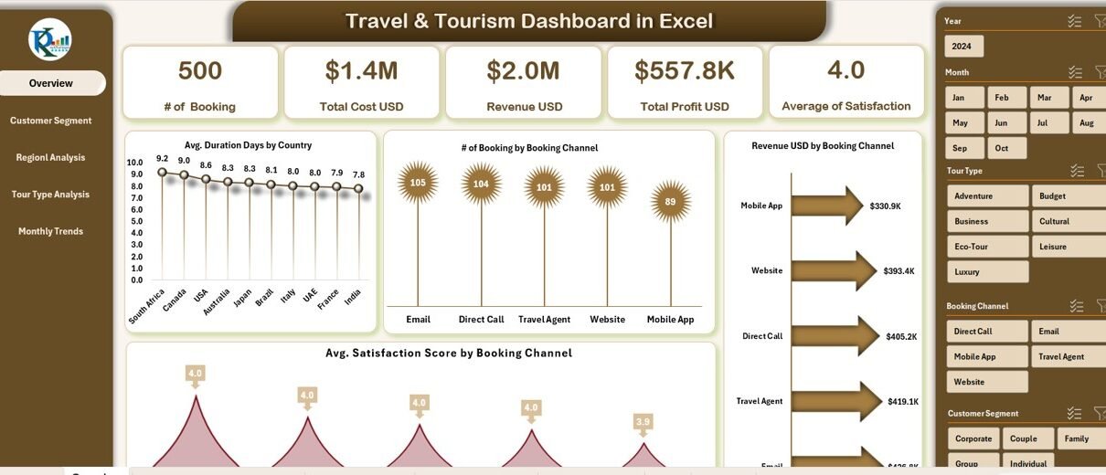
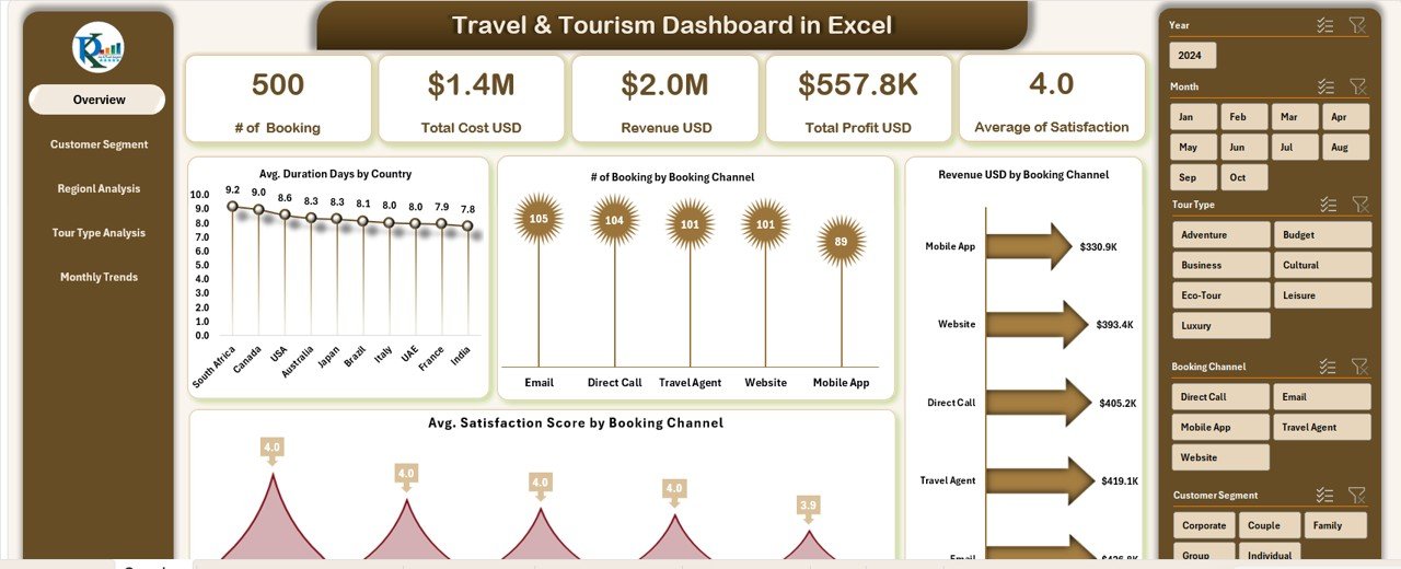
Overview Sheet Tab
The Overview sheet acts as the main page of the dashboard, summarizing all the critical performance indicators at a glance.
Cards Display:
This section shows high-level KPIs through well-designed cards such as:
-
# of Bookings – Total confirmed bookings for the selected period.
-
Total Cost (USD) – The sum of all estimated costs across tours or packages.
-
Total Actual Costs (USD) – The real-time expenses incurred during operations.
-
Revenue (USD) – The total income generated from bookings.
-
Total Profit (USD) – Calculated as Revenue minus Actual Cost.
These cards allow managers to get an instant overview of financial health.
Charts Display:
Below the cards, you’ll find several insightful visualizations:
-
Average Duration (Days) by Country – Measures how long travelers stay in each destination.
-
# of Bookings by Booking Channel – Compares performance across online, agency, or direct channels.
-
Average Satisfaction Score by Booking Channel – Evaluates customer experience by channel type.
-
Revenue (USD) by Booking Channel – Identifies the most profitable sales channels.
Together, these visuals reveal which regions, platforms, or travel packages perform best.
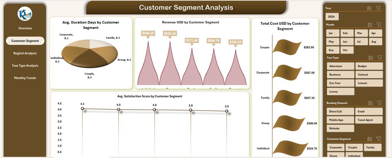
Customer Segment Analysis Sheet
Understanding customers is key to success in tourism. This page focuses entirely on segmentation.
Metrics and Visuals:
-
Average Duration (Days) by Customer Segment – Highlights which customer groups prefer longer stays.
-
Total Estimated Hours by Client Name – Tracks project or service duration per client.
-
Total Estimated Cost (USD) by Client Name – Monitors budget utilization by customer.
-
Average Client Satisfaction Score by Client Name – Reflects the overall service quality experienced by clients.
This data helps travel agencies identify loyal customers, optimize services, and tailor offerings to high-value segments.
Click to buy Travel & Tourism Dashboard in Excel
Department Analysis Sheet
The Department Analysis page evaluates internal team or departmental performance.
Charts Include:
-
Total Cases by Department – Displays the workload or service requests handled.
-
Revenue (USD) by Customer Segment – Reveals which departments generate the most revenue.
-
Average Satisfaction Score by Customer Segment – Measures service quality levels.
-
Total Cost (USD) by Customer Segment – Assesses cost efficiency across segments.
By comparing revenue and cost at the department level, managers can identify productivity gaps and reallocate resources effectively.
Click to buy Travel & Tourism Dashboard in Excel
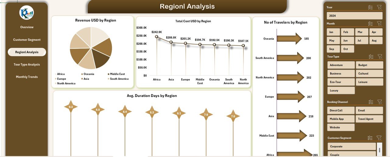
Regional Analysis Sheet
Geography plays a critical role in tourism analytics. This sheet visualizes performance by region.
Visual Insights:
-
Revenue (USD) by Region – Shows where most income originates.
-
Average Duration (Days) by Region – Indicates average stay lengths per location.
-
Number of Travelers by Region – Tracks visitor volume and demand across areas.
This helps agencies focus marketing and partnership efforts on high-growth destinations.
Click to buy Travel & Tourism Dashboard in Excel
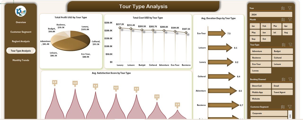
Tour Type Analysis Sheet
Tour type segmentation allows travel companies to understand which offerings drive the most success.
Key Charts:
-
Total Profit (USD) by Tour Type – Compares profitability across adventure, luxury, cultural, or business tours.
-
Total Cost (USD) by Tour Type – Tracks expenditure patterns.
-
Average Satisfaction Score by Tour Type – Monitors traveler happiness levels.
-
Average Duration (Days) by Tour Type – Helps optimize tour packages for ideal length.
With this insight, companies can redesign or price tours strategically.
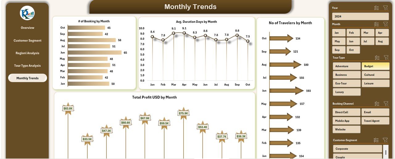
Monthly Trends Sheet
This sheet visualizes trends over time — essential for performance tracking and forecasting.
Metrics:
-
# of Bookings by Month – Detects seasonal spikes or dips.
-
Average Duration (Days) by Month – Helps plan resources and logistics.
-
Number of Travelers by Month – Shows customer inflow trends.
-
Total Profit (USD) by Month – Tracks profitability month by month.
This time-series view supports budgeting, resource planning, and promotional campaigns.
Click to buy Travel & Tourism Dashboard in Excel
Data Sheet Tab
The Data Sheet acts as the foundation of the dashboard. It stores all input data, including booking details, client names, costs, satisfaction scores, and more.
Users can easily update or add new data entries without affecting formulas or charts, ensuring flexibility and scalability.
Key Features of the Travel & Tourism Dashboard in Excel
This Excel-based dashboard isn’t just about charts — it’s a complete performance management solution.
Here are its standout features:
-
Dynamic Filters and Slicers: Instantly filter data by month, country, customer segment, or region.
-
Automated Calculations: All KPIs, including profit, satisfaction, and revenue, update automatically.
-
Visual Storytelling: Clean, colorful charts make insights easy to grasp at a glance.
-
Pivot-Ready Data Structure: Enables deep-dive analysis without extra formatting.
-
Fully Customizable: Add new KPIs, departments, or regions with minimal effort.
-
User-Friendly Design: No coding, macros, or Power BI required — 100% Excel-based.
-
Decision-Driven Insights: Transforms raw data into meaningful trends that drive smarter actions.
How the Dashboard Helps Travel Businesses
The Travel & Tourism Dashboard in Excel empowers organizations in multiple ways:
-
Improved Decision-Making: Managers can quickly identify profitable channels, popular destinations, and top-performing teams.
-
Enhanced Customer Experience: Satisfaction tracking highlights areas needing attention.
-
Optimized Resource Allocation: Department-wise cost analysis helps allocate funds more effectively.
-
Better Forecasting: Monthly trend analysis provides clarity for future campaigns.
-
Higher Transparency: A single dashboard ensures all stakeholders access consistent, reliable data.
Advantages of Using a Travel & Tourism Dashboard in Excel
- 1. Centralized Data Access
- All performance data sits in one place — no need to open multiple reports or files. This saves time and ensures accuracy.
- 2. Cost-Effective Solution
- Unlike expensive BI software, Excel offers powerful analytics capabilities at zero extra cost.
- 3. Easy to Customize
- You can modify chart types, colors, or KPIs easily without technical help.
- 4. Real-Time Monitoring
- Track bookings, costs, and profits instantly using slicers and drop-downs.
- 5. Improved Team Collaboration
- Teams can update data together and view the same dashboard, ensuring everyone works on aligned goals.
- 6. High Flexibility
- Whether you’re a small travel agency or a large operator, this dashboard adapts to your size and complexity.
Best Practices for the Travel & Tourism Dashboard in Excel
Follow these proven strategies to maximize your dashboard’s impact:
-
Maintain Clean Data: Ensure that all input data in the Data Sheet uses consistent formats (dates, currencies, names).
-
Update Regularly: Refresh your dashboard at least weekly to maintain real-time accuracy.
-
Use Drop-Down Filters: Simplify user navigation and avoid manual data sorting.
-
Visual Balance: Avoid overcrowding charts; keep your dashboard visually appealing and readable.
-
Highlight Key Insights: Use color coding to emphasize KPIs like profits or satisfaction scores.
-
Set Performance Targets: Compare actuals vs. targets to monitor success rates.
-
Backup Your File: Keep a copy of the dashboard before making structural changes.
-
Use Dynamic Ranges: Employ Excel tables or named ranges to automatically expand your data range when adding new records.
These practices ensure smooth operation and long-term reliability.
Real-World Applications
This Excel-based dashboard can serve various stakeholders across the tourism ecosystem:
-
Travel Agencies: Monitor sales channels and client profitability.
-
Hospitality Groups: Track guest satisfaction and occupancy costs.
-
Corporate Travel Teams: Evaluate vendor performance and travel budgets.
-
Tour Operators: Manage profit margins, tour types, and seasonal demand.
-
Government Tourism Boards: Analyze traveler demographics and regional performance trends.
Conclusion
The Travel & Tourism Dashboard in Excel is more than just a spreadsheet — it’s your digital command center for smarter decision-making.
By bringing together booking data, customer satisfaction, revenue, and profit analytics, it helps travel professionals act swiftly, reduce costs, and maximize returns.
Whether you’re managing international tours or local getaways, this Excel dashboard simplifies analytics and drives measurable growth.
Frequently Asked Questions (FAQs)
- 1. What is the purpose of a Travel & Tourism Dashboard in Excel?
- It helps businesses track and visualize key travel metrics such as bookings, revenue, customer satisfaction, and profit in one interactive Excel file.
- 2. Who can use this dashboard?
- Any travel agency, tour operator, or hospitality professional can use it to analyze operations, improve services, and monitor financial performance.
- 3. Do I need Excel expertise to use it?
- No, it’s designed for beginners. You only need basic Excel knowledge to update data and use slicers or drop-downs.
- 4. Can I customize KPIs or charts?
- Absolutely. You can add or remove KPIs, change chart types, or modify layouts according to your needs.
- 5. How often should I update the dashboard?
- It’s best to refresh your data weekly or monthly to ensure you’re making decisions based on current information.
- 6. Is it compatible with Google Sheets or Power BI?
- Yes, you can import the same dataset into Google Sheets or Power BI if you prefer cloud-based or advanced visualization platforms.
- 7. Can small businesses benefit from it?
- Yes. Even small travel companies can save time, reduce errors, and gain insights without investing in costly analytics software.
- Visit our YouTube channel to learn step-by-step video tutorials
Watch the step-by-step video tutorial:
Click to buy Travel & Tourism Dashboard in Excel