In today’s fast-moving digital landscape, advertising has become more data-driven than ever. Companies spend millions of dollars across different marketing channels—Google Ads, Meta Ads, LinkedIn, YouTube, and more. But how do you know whether this money brings actual results? How efficiently is your advertising budget being used?
That’s where the Ad Spend Efficiency KPI Dashboard in Power BI comes in.
This ready-to-use analytical solution helps marketers, analysts, and decision-makers track, visualize, and optimize advertising performance using clear Key Performance Indicators (KPIs).
Built using Microsoft Power BI, this dashboard turns complex marketing data into actionable insights — allowing you to measure cost-effectiveness, identify wasteful spend, and improve ROI across all campaigns.
Click to Purchases Ad Spend Efficiency KPI Dashboard in Power BI
What Is an Ad Spend Efficiency KPI Dashboard in Power BI?
An Ad Spend Efficiency KPI Dashboard in Power BI is a dynamic, interactive tool designed to evaluate how effectively your ad budget converts into business outcomes.
It tracks and compares KPIs like:
-
Cost per Click (CPC)
-
Cost per Lead (CPL)
-
Return on Ad Spend (ROAS)
-
Conversion Rate
-
Customer Acquisition Cost (CAC)
-
and other marketing efficiency metrics
By consolidating campaign data into visual reports, this dashboard allows marketing teams to analyze spend trends, compare performance over time, and take faster, data-backed actions.
Whether you manage multiple ad platforms or a single campaign, this dashboard ensures your team focuses on performance, not spreadsheets.
Key Features of the Ad Spend Efficiency KPI Dashboard in Power BI
This dashboard is built to make ad analytics easy, transparent, and insightful. Let’s explore its main features step-by-step.
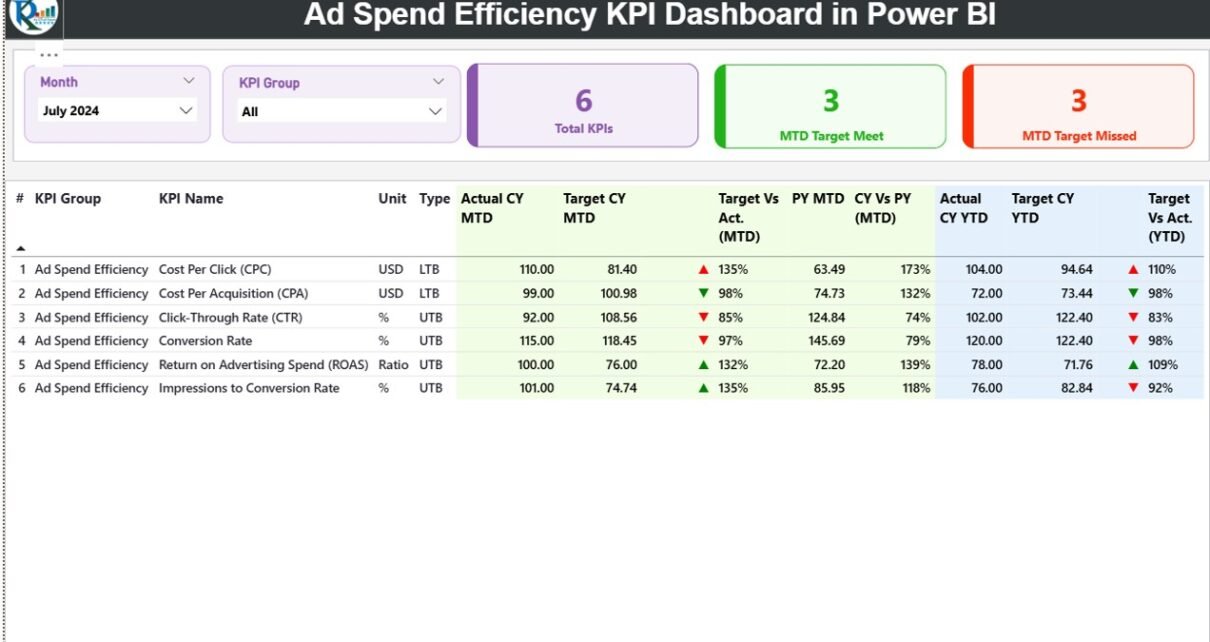
1. Summary Page
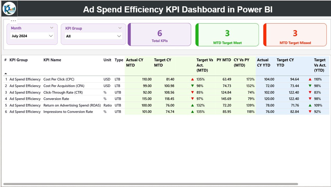
The Summary Page is the dashboard’s heart — offering a snapshot of every key metric in one place.
Here’s what you’ll find:
-
Slicers for Month and KPI Group to quickly filter results.
-
Cards that display:
-
Total KPIs Count
-
Month-to-Date (MTD) Target Met Count
-
MTD Target Missed Count
-
Below that, a detailed KPI table shows each metric’s progress:
-
KPI Number & Name – For easy identification
-
KPI Group – Category like “Digital Ads,” “Social Media,” or “Search Campaigns”
-
Unit – Measurement (%, USD, etc.)
-
Type – Whether “Lower the Better (LTB)” or “Upper the Better (UTB)”
-
Actual CY MTD & Target CY MTD – Compare this month’s actuals vs. targets
-
Visual Indicators (▲▼) – Red and green icons that instantly show if performance meets targets
-
Target vs. Actual (%) – Quick ratio of actual vs. target numbers
-
Previous Year Comparisons (PY MTD / PY YTD) – Track growth or decline vs. last year
This page provides instant clarity — no need to dig through raw Excel sheets.
2. KPI Trend Page
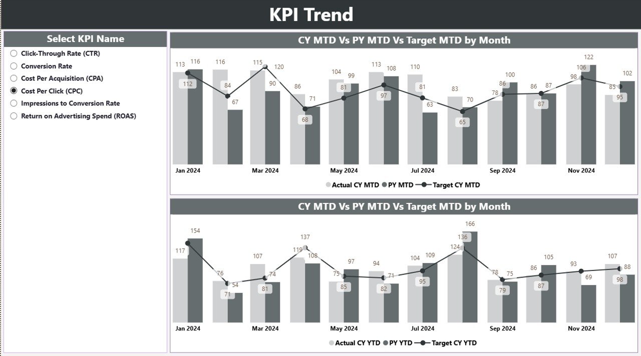
The KPI Trend Page helps visualize how your performance moves over time.
It contains combo charts that show:
-
Current Year (CY) Actuals
-
Previous Year (PY) Actuals
-
Targets for both MTD and YTD metrics
A KPI slicer on the left side allows users to focus on a specific metric — for example, “Cost per Conversion” or “ROAS.”
This page helps you identify patterns, trends, and anomalies quickly. If your ad spend efficiency drops in a specific month, you can pinpoint why and fix it fast.
3. KPI Definition Page (Drill-Through Page)
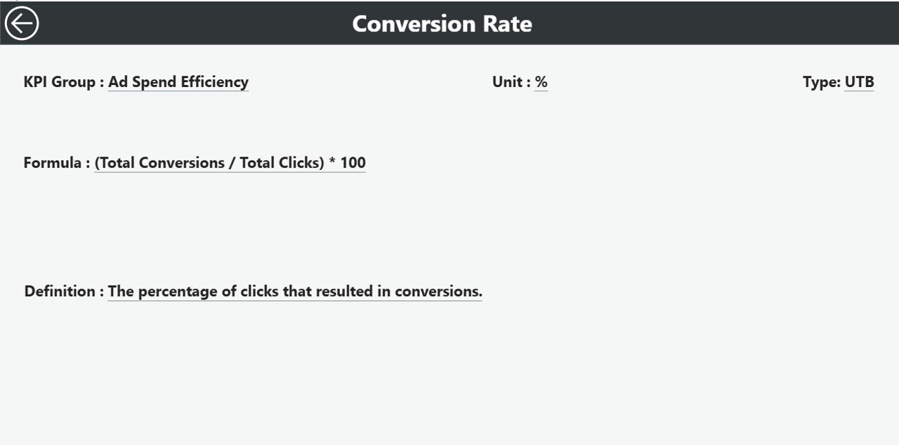
The KPI Definition Page gives users deeper insights into how each KPI is calculated and what it means.
From the Summary Page, users can drill through into this hidden page to see:
-
KPI Formula
-
Definition
-
Type (LTB or UTB)
This makes the dashboard self-explanatory — even new users can understand what each KPI represents and how it contributes to the company’s marketing efficiency.
A Back Button at the top left allows users to return easily to the Summary Page.
4. Excel Data Integration
The dashboard pulls live data from an Excel file, making it simple to maintain and update.
The Excel file includes three tabs:
-
Input_Actual – Record actual KPI values by month (MTD and YTD).
-
Input_Target – Record target KPI values by month (MTD and YTD).
-
KPI Definition – Define each KPI’s number, name, group, unit, formula, and type (LTB/UTB).
Because Power BI automatically refreshes data connections, you can update the Excel file anytime — and see instant changes in the dashboard visuals.
Click to Purchases Ad Spend Efficiency KPI Dashboard in Power BI
Why Ad Spend Efficiency Matters in Modern Marketing
Advertising without efficiency is like driving a car with the fuel leaking. You may move forward, but you waste resources along the way.
Let’s look at why measuring ad spend efficiency is so important:
-
💰 Better ROI Tracking: Know exactly which campaigns generate profit.
-
🧠 Smarter Decision-Making: Allocate budgets where they perform best.
-
⚡ Faster Optimization: Identify low-performing ads before wasting more money.
-
📈 Continuous Improvement: Use year-over-year comparisons to refine your strategy.
-
🔍 Transparency: Everyone—from marketing managers to CFOs—can see clear performance metrics.
Advantages of Using an Ad Spend Efficiency KPI Dashboard
The benefits of using this Power BI dashboard go far beyond visualization. Here’s how it transforms marketing performance:
1. Centralized Performance Monitoring
You can bring all campaign data into one interface. No more switching between Google Ads, Meta Ads, and Excel reports.
2. Real-Time Insights
Because Power BI refreshes data dynamically, your team always has access to real-time performance trends.
3. Easy-to-Understand Visuals
Charts, cards, and icons help anyone quickly interpret results—even without analytical expertise.
4. Time-Saving Automation
With automated calculations for MTD and YTD values, manual tracking is no longer necessary.
5. Enhanced Collaboration
Marketing, finance, and management teams can all view the same metrics, reducing confusion and improving coordination.
6. Historical Comparison
Side-by-side comparisons between current and previous years highlight progress and performance shifts.
How to Use the Ad Spend Efficiency KPI Dashboard Effectively
1. Start with Clean Data
Ensure your Excel data source is accurate and updated regularly. Even the best dashboard can’t compensate for poor data.
2. Define Clear KPI Targets
Before uploading, set realistic MTD and YTD goals for each KPI (like “Target CPC = $1.50”).
3. Use Filters Wisely
Leverage slicers to focus on specific months or KPI groups. This makes your analysis faster and more relevant.
4. Monitor Icons and Percentages
Green upward arrows mean performance is on track; red downward arrows indicate issues. Act quickly on underperforming KPIs.
5. Analyze Trends Monthly
Regularly check the KPI Trend page to spot patterns early and adjust your ad strategies before performance drops.
Best Practices for the Ad Spend Efficiency KPI Dashboard in Power BI
To get the most value from your dashboard, follow these proven best practices:
1. Standardize Data Entry
Maintain consistent formats for dates, currency, and KPI names across your Excel sheets. This prevents Power BI from breaking links or misreading fields.
2. Refresh Data Frequently
Schedule automatic data refreshes (daily or weekly) so your visuals stay current.
3. Validate KPIs Regularly
Review KPI formulas and definitions quarterly to ensure they still align with your marketing goals.
4. Secure Access Permissions
Use Power BI’s user roles to grant view-only access to executives and edit access to analysts. This keeps your data safe.
5. Visual Clarity
Keep your visuals minimal and color-coded:
-
Green = Target Met
-
Red = Target Missed
-
Blue = Information or Neutral
This makes it easy to interpret metrics at a glance.
6. Track ROI Consistently
Always include ROAS (Return on Ad Spend) as a key KPI. It’s one of the most accurate indicators of marketing efficiency.
Real-World Applications of Ad Spend Efficiency Dashboards
Organizations across industries use dashboards like this one to optimize performance.
Here are a few practical use cases:
-
E-commerce Businesses: Track paid ad performance across multiple channels and identify the most profitable campaigns.
-
Marketing Agencies: Monitor client ad spend and deliver transparent performance reports.
-
Startups: Keep tight control of limited marketing budgets and quickly scale successful campaigns.
-
Enterprises: Integrate Power BI with CRM and ERP data for unified financial and marketing analytics.
How Power BI Enhances Ad Spend Analysis
Power BI provides features that make marketing analysis both advanced and accessible:
-
Interactive Filters and Drill-Throughs: Focus on key insights in seconds.
-
Dynamic Visuals: Update instantly when data changes.
-
Cross-Platform Access: View your dashboard on desktop, web, or mobile.
-
Integration Ready: Connect with Google Analytics, Facebook Ads, and Excel simultaneously.
In essence, Power BI turns your ad performance into a visual story — one that guides every marketing dollar toward measurable impact.
Opportunities for Improvement
Even though the dashboard is powerful, continuous enhancement ensures long-term success. Consider these improvements:
-
🔧 Automate Data Imports: Replace manual Excel updates with automated Power BI dataflows or API integrations.
-
📊 Add Campaign-Level Filters: Drill down by channel, campaign, or audience segment for deeper insights.
-
🕒 Include Real-Time Spend Alerts: Use Power BI’s Data Alerts to get notified when KPIs cross thresholds.
-
💬 Add Sentiment Analysis: Combine performance metrics with social sentiment to see the bigger picture.
-
🌐 Integrate with Google Data Studio: Cross-compare Power BI visuals with Google Ads analytics for validation.
Conclusion
The Ad Spend Efficiency KPI Dashboard in Power BI is more than a reporting tool — it’s a strategic decision-making platform.
By connecting your advertising data with clear visuals, defined KPIs, and automatic trend comparisons, it empowers teams to:
-
Track ad efficiency in real time
-
Optimize spend distribution
-
Improve ROI across every channel
Whether you’re a marketer, agency, or business leader, this dashboard helps you spend smarter — not more.
Frequently Asked Questions (FAQs)
1. What is the purpose of an Ad Spend Efficiency Dashboard?
The purpose is to measure how effectively your advertising budget drives desired outcomes such as leads, sales, or awareness.
2. What KPIs should I include in this dashboard?
You can include Cost per Click (CPC), Cost per Lead (CPL), Conversion Rate, Return on Ad Spend (ROAS), and Customer Acquisition Cost (CAC).
3. Can I connect live data instead of Excel?
Yes. Power BI allows you to connect live APIs, SQL databases, or cloud-based platforms like Google Ads and Meta Ads for real-time tracking.
4. How often should I refresh my data?
It’s best to refresh your dashboard daily or weekly depending on your campaign activity.
5. Is Power BI suitable for non-technical users?
Absolutely. Power BI dashboards are intuitive, interactive, and easy to navigate—even for beginners.
6. How can this dashboard improve ROI?
By highlighting high-performing and underperforming campaigns, it helps reallocate budgets toward the most effective channels, improving ROI.
7. Can I customize the KPIs?
Yes. You can modify, add, or remove KPIs within the Excel source or Power BI data model according to your needs.
8. What is the difference between MTD and YTD analysis?
-
MTD (Month-to-Date) shows performance within the current month.
-
YTD (Year-to-Date) shows cumulative performance from the start of the year.
9. How can I share this dashboard with my team?
You can publish it to Power BI Service and share access links or embed it into Microsoft Teams or your internal portal.
10. Who should use this dashboard?
Marketing teams, business analysts, finance professionals, and decision-makers who manage advertising budgets and want data-driven insights.
Visit our YouTube channel to learn step-by-step video tutorials