In today’s fast-paced creative industry, managing design performance goes far beyond just producing beautiful visuals. Every graphic design studio, whether large or small, needs clear performance insights to measure productivity, quality, and efficiency. That’s where a Graphic Design KPI Dashboard in Excel comes in — a powerful tool that helps track key performance indicators (KPIs), monitor progress, and make data-driven decisions for creative success.
This article explores everything you need to know about this ready-to-use dashboard — its structure, features, benefits, and best practices to make the most of it.
Click to buy Graphic Design KPI Dashboard in Excel
What Is a Graphic Design KPI Dashboard in Excel?
A Graphic Design KPI Dashboard in Excel is a structured performance-tracking tool that consolidates all critical design metrics in one place. It provides an overview of creative team performance, client project status, budget utilization, and delivery timelines — all visualized through dynamic charts, KPIs, and trends.
Unlike typical reports, this dashboard uses interactive dropdowns, slicers, and conditional formatting to instantly analyze performance across months, projects, or departments. It is ideal for design agencies, freelancers, and in-house teams that want real-time insight into their work efficiency.
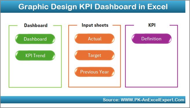
Structure of the Graphic Design KPI Dashboard
This Excel-based KPI Dashboard is built on seven functional worksheets, each serving a unique analytical purpose. Let’s explore them one by one.
Summary Page
This is the index sheet that acts as the navigation hub for the dashboard. It contains six buttons to jump directly to key sections like Dashboard, Trend Analysis, Targets, and KPI Definitions.
It simplifies user experience, allowing even non-technical users to navigate the dashboard effortlessly.
Click to buy Graphic Design KPI Dashboard in Excel
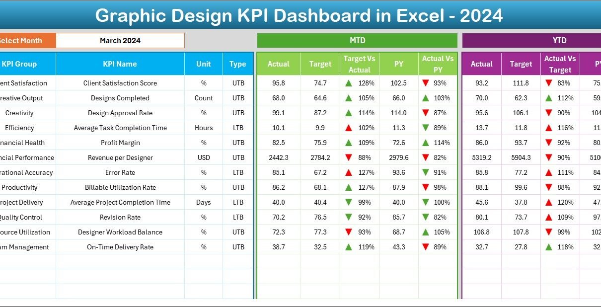
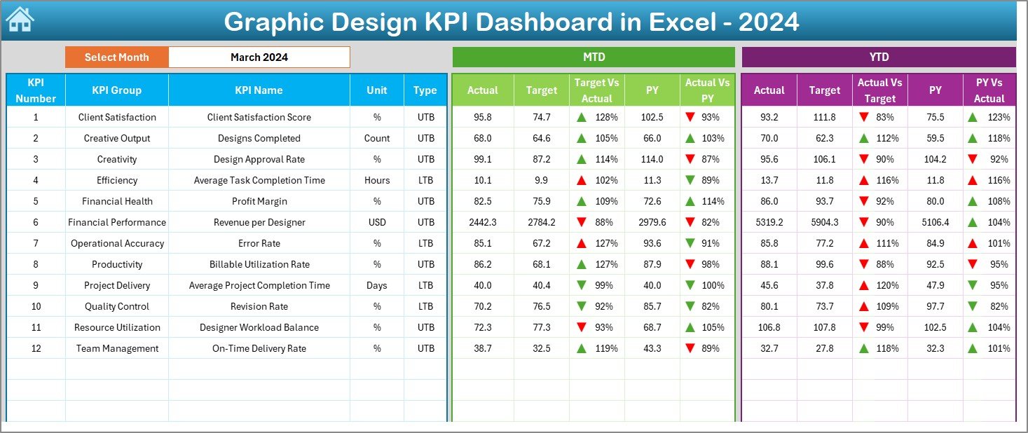
Dashboard Sheet Tab
This is the main analytical interface where you can view all KPI metrics visually.
Key highlights include:
- Dynamic Month Selector (Cell D3): Choose any month to update all charts and tables automatically.
- Performance Comparison: View Month-to-Date (MTD) and Year-to-Date (YTD) values for Actuals, Targets, and Previous Year data.
- Conditional Formatting: Arrows and color codes (green for growth, red for decline) quickly indicate whether KPIs are meeting expectations.
- Comprehensive Overview: Displays critical KPIs such as project completion rate, design error rate, client satisfaction, and creative utilization.
This sheet provides both snapshot and comparative analysis, helping you assess current performance and historical improvement in a single view.
Click to buy Graphic Design KPI Dashboard in Excel
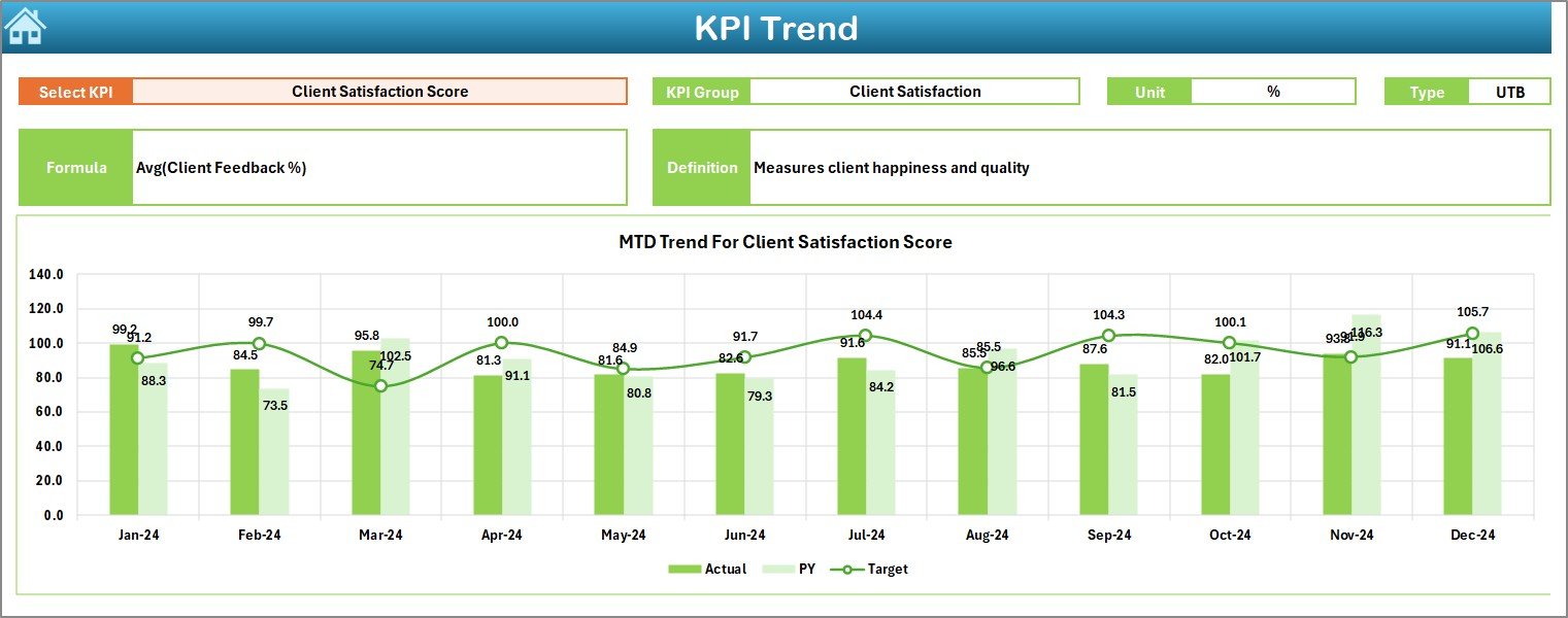
Trend Sheet Tab
The Trend Sheet allows you to analyze performance movement over time.
Key elements:
- KPI Selector (Cell C3): Choose any KPI from the dropdown to view its detailed trend.
- KPI Details: Shows KPI Group, Unit, Formula, and Type (Upper-the-Better or Lower-the-Better).
- Trend Charts: Displays both MTD and YTD trends for Actual, Target, and Previous Year metrics.
This sheet is vital for tracking continuous performance — whether it’s design turnaround time, revision requests, or project profitability.
Click to buy Graphic Design KPI Dashboard in Excel
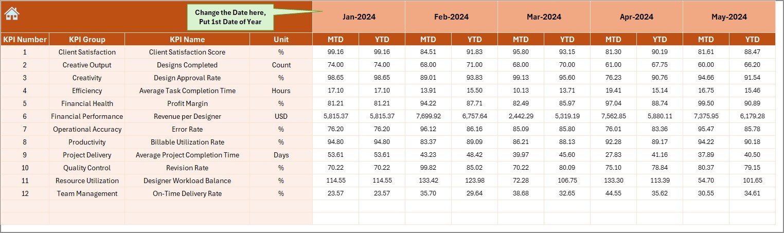
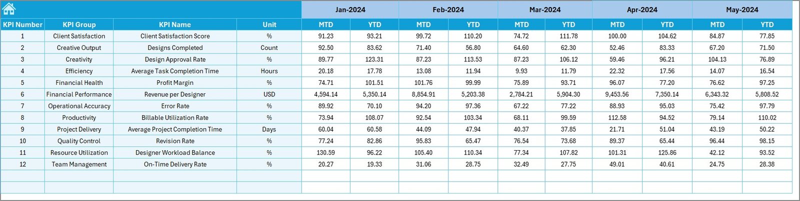
Actual Numbers Input Sheet
This is the data entry sheet where users input MTD and YTD actual numbers.
Features:
- Month Selection (Cell E1): Define the starting month of the year for accurate tracking.
- Manual Entry Fields: Enter real numbers gathered from ongoing design operations, client reports, or project management tools.
By updating this sheet monthly, you maintain an up-to-date view of your creative performance metrics.
Target Sheet Tab
Every KPI dashboard needs benchmark goals. The Target Sheet helps define them.
Here, you enter MTD and YTD target values for every KPI and month.
For instance:
- Design Project Completion Rate: 95%
- Average Design Review Time: 2 Days
- Client Satisfaction Score: 4.5 / 5
Having clear targets helps you measure gaps and improvement areas efficiently.
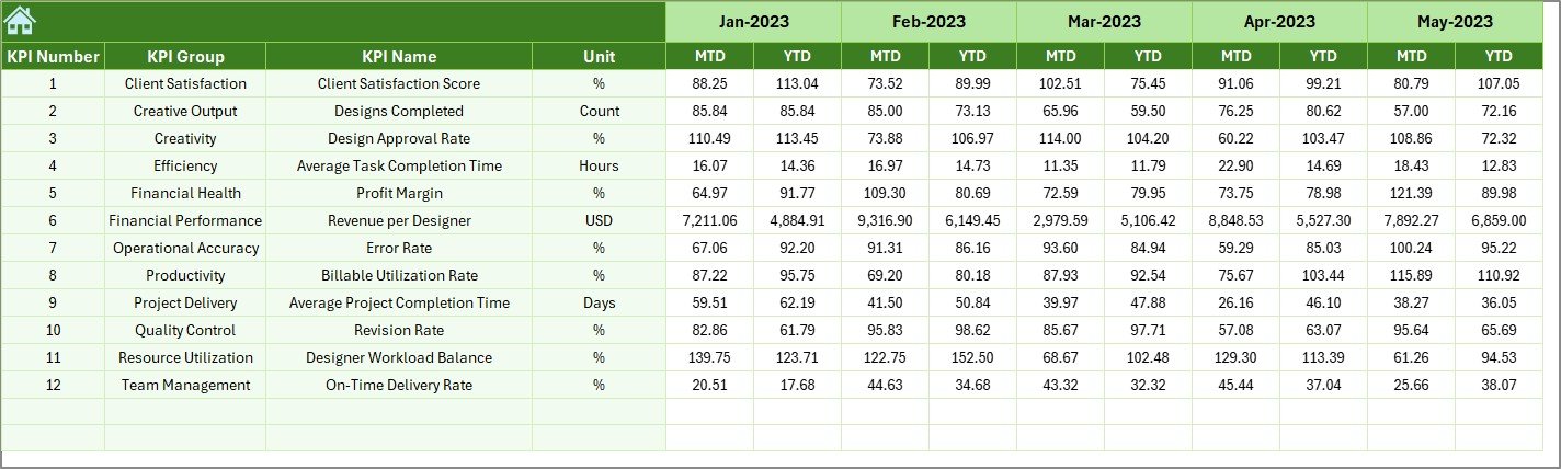
Previous Year Numbers Sheet Tab
The Previous Year sheet stores last year’s data for all KPIs, providing a solid reference point for comparison.
When you compare this year’s MTD and YTD metrics with last year’s performance, you can easily identify trends and long-term progress.
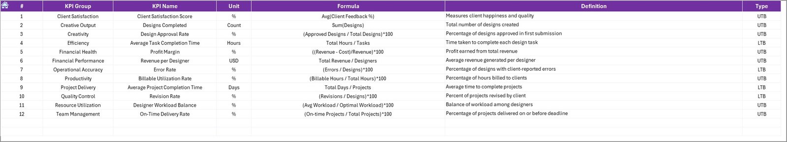
KPI Definition Sheet Tab
This sheet contains the core KPI metadata, including:
- KPI Group
- KPI Name
- Unit
- Formula
- Definition
This documentation ensures clarity for every stakeholder. Whether you’re a creative director, team lead, or data analyst, everyone understands exactly how each KPI is calculated and interpreted.
Advantages of Graphic Design KPI Dashboard in Excel
Implementing a Graphic Design KPI Dashboard offers multiple benefits for both management and creative teams.
Centralized Performance Tracking
All performance data resides in one Excel file — accessible, editable, and easy to interpret. No more switching between tools or reports.
Real-Time Visibility
Dynamic dropdowns and slicers update all visuals instantly, giving real-time insights into performance changes every month.
Data-Driven Decision Making
The dashboard helps managers make informed decisions backed by metrics rather than intuition. For example, identifying which designer or project is causing delivery delays.
Improved Productivity
By tracking time utilization, project status, and revisions, teams can find and fix bottlenecks to enhance efficiency.
Enhanced Client Satisfaction
Consistent performance tracking ensures on-time delivery, quality design work, and happy clients — crucial for repeat business.
Easy Customization
Since it’s Excel-based, you can easily modify KPIs, formulas, or visuals to suit your studio’s unique requirements.
How the Dashboard Supports Strategic Decision-Making
A KPI dashboard bridges the gap between creative output and business objectives. Here’s how it drives strategy:
- Performance Benchmarking: Compare monthly, quarterly, and yearly results to identify growth patterns.
- Resource Allocation: Analyze which designers or departments need more support or tools.
- Cost Efficiency: Identify areas where budget exceeds projections and optimize costs.
- Timely Delivery: Monitor turnaround time and design cycle duration to maintain client trust.
With such insights, a design manager can create a balanced workload, maintain quality, and deliver consistent value.
Best Practices for the Graphic Design KPI Dashboard
To maximize the benefits of this Excel template, follow these tried-and-tested practices:
Define Clear and Measurable KPIs
Select metrics that truly align with your organization’s creative goals. Avoid vague indicators like “good quality design.” Instead, use specific ones like “Client Revision Rate ≤ 2 per Project.”
Maintain Data Accuracy
Ensure data entry consistency across months. Regularly validate Actual, Target, and Previous Year numbers to maintain reliable insights.
Use Conditional Formatting Intelligently
Highlight key trends through arrows, traffic lights, or bars. Visual signals make data easier to read at a glance.
Automate Whenever Possible
Leverage Excel functions like INDEX-MATCH, SUMIFS, and OFFSET along with VBA macros to minimize manual effort.
Keep It Simple and Visual
Avoid clutter. Focus on 8-10 core KPIs that capture the essence of performance. Simplicity increases adoption and understanding.
Regularly Review and Update
Review KPI definitions quarterly to reflect evolving project goals and design priorities.
How to Use the Graphic Design KPI Dashboard
To start using the template effectively, follow these simple steps:
Download the Template from NextGenTemplates.com.
Open the Summary Page and use buttons to explore each sheet.
Enter Actual Data for the current month in the Actual Numbers Input sheet.
Set Monthly Targets in the Target Sheet tab.
Add Previous Year Data for comparison.
Use Dashboard & Trend Sheets to view updated visuals.
Interpret the Results to improve workflow and client satisfaction.
By following this process monthly, you can build an insightful performance history that guides future growth.
Why Excel Is Ideal for KPI Dashboards
While tools like Power BI or Tableau are great for advanced analytics, Excel remains the most accessible and flexible platform.
Here’s why Excel excels for KPI dashboards:
- Universally available and easy to share
- Compatible with both Windows and Mac
- Supports formulas, macros, and pivot analytics
- Allows offline usage
- Easy to customize layout and visuals
For most small to medium design agencies, Excel provides the perfect balance between functionality and simplicity.
Conclusion
The Graphic Design KPI Dashboard in Excel is not just a reporting tool — it’s a performance compass for creative teams. By consolidating metrics like project completion rate, revision ratio, client satisfaction, and cost efficiency, it turns raw data into actionable insights.
With dynamic charts, conditional formatting, and month-wise analysis, you can easily monitor progress and enhance both creativity and profitability.
Whether you’re a freelance designer managing multiple clients or a creative director leading a team, this dashboard empowers you to stay organized, transparent, and data-driven.
Frequently Asked Questions (FAQs)
- What is the purpose of a Graphic Design KPI Dashboard?
It helps design teams track productivity, efficiency, and quality through measurable KPIs. It ensures creative work aligns with deadlines, budgets, and client expectations.
- Can I customize the KPIs in this Excel Dashboard?
Yes. You can easily modify KPI names, formulas, and units in the KPI Definition sheet to suit your organization’s unique goals.
- Do I need advanced Excel skills to use this dashboard?
Not necessarily. The dashboard is beginner-friendly, featuring dropdowns and automated calculations. However, basic Excel knowledge helps in making modifications.
- How often should I update the dashboard?
You should update the Actual Numbers Input sheet monthly to ensure accurate performance tracking.
- Can this dashboard handle multiple projects or designers?
Absolutely. The dashboard can be extended by adding project or designer fields to filter performance metrics accordingly.
- Is this dashboard compatible with Mac and Windows?
Yes, it works seamlessly on both platforms. Just ensure macros and pivot tables are enabled for best performance.
Visit our YouTube channel to learn step-by-step video tutorials
Watch the step-by-step video tutorial:
Click to buy Graphic Design KPI Dashboard in Excel