Space missions are among the most complex undertakings of humankind. From launching satellites and monitoring spacecraft to analyzing mission performance and resource utilization, every detail matters. Managing this immense flow of information requires precision, visibility, and real-time insights.
The Space Mission Operations KPI Dashboard in Power BI brings all mission performance indicators together in one powerful analytical interface. This ready-to-use solution helps space agencies, research centers, and private space companies track operations, assess performance, and ensure every mission milestone stays on target.
Built with Microsoft Power BI and linked to an Excel data source, this dashboard combines clarity, automation, and visualization to make data-driven decisions easier than ever.
Click to buy Space Mission Operations KPI Dashboard in Power BI
What Is a Space Mission Operations KPI Dashboard?
A Space Mission Operations KPI Dashboard is an analytical system designed to monitor key metrics across space exploration programs. It provides decision-makers with a consolidated view of performance indicators such as satellite uptime, mission success rates, propulsion efficiency, communication signal quality, and operational cost effectiveness.
This dashboard transforms raw operational data into actionable insights through charts, KPI cards, and trend visuals. By integrating multiple data points in one interface, mission control teams can detect anomalies, improve accuracy, and optimize performance at every stage—from pre-launch testing to in-orbit operations.
Key Features of the Space Mission Operations KPI Dashboard in Power BI
This dashboard is built with an intuitive three-page structure that covers summary views, trend analysis, and detailed KPI documentation.
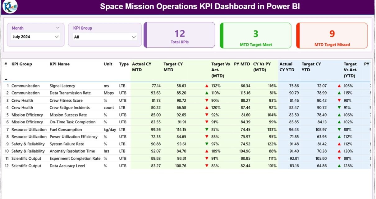
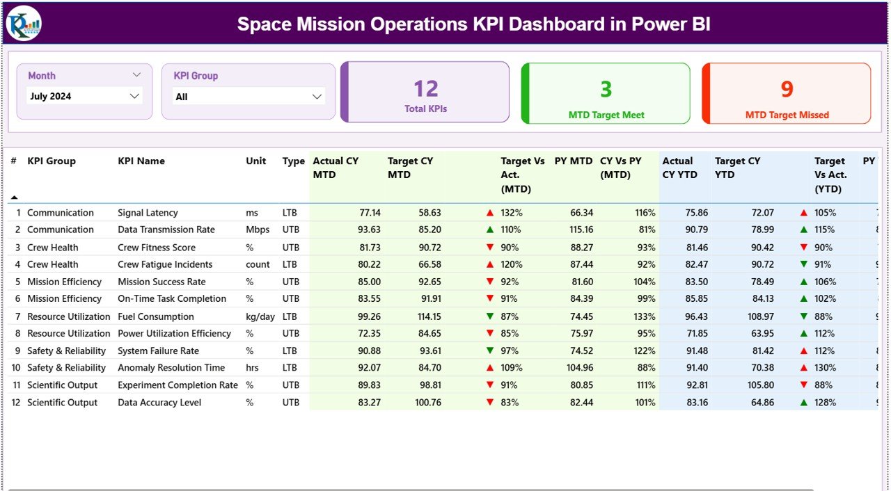
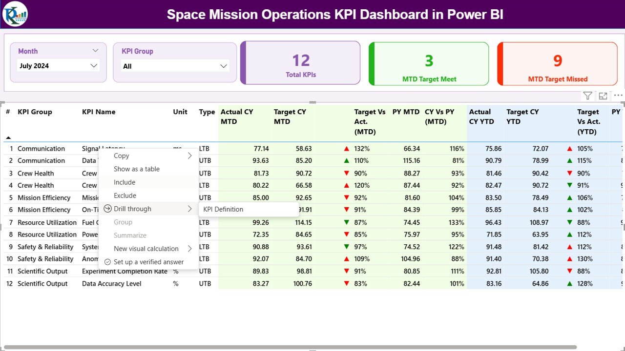
Summary Page
The Summary Page serves as the command center of your mission analytics. It displays mission health, performance trends, and achievement scores in one glance.
Features include:
- Month and KPI Group Slicers: Filter mission data by time period or operational category.
- Performance Cards:
- Total KPIs Count — total active performance indicators tracked.
- MTD Target Met Count — number of KPIs meeting monthly targets.
- MTD Target Missed Count — number of KPIs falling short.
- Detailed KPI Table:
Each KPI is listed with information such as: - KPI Number and Group
- KPI Name and Unit of Measurement
- Type (LTB – Lower the Better, or UTB – Upper the Better)
- Actual vs Target (MTD and YTD)
- Icons (▲ green for success, ▼ red for underperformance)
- Target vs Actual Percentage and Previous Year Comparisons
This table lets teams instantly identify performance gaps and analyze mission efficiency month-to-month and year-to-date.
Click to buy Space Mission Operations KPI Dashboard in Power BI
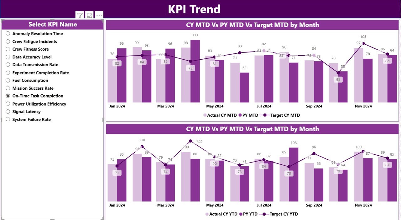
KPI Trend Page
The KPI Trend Page provides visual insight into how each mission parameter evolves over time.
- It features two combo charts that display Actual vs Target performance for both MTD and YTD data.
- A KPI Name slicer on the left lets users select any metric for deep-dive analysis.
These charts are ideal for mission analysts and engineers to visualize trajectory performance, resource utilization, or communication signal quality changes over multiple months.
For instance, if propulsion efficiency dips or data transmission lag increases, the trend page instantly shows where and when the variation began.
Click to buy Space Mission Operations KPI Dashboard in Power BI
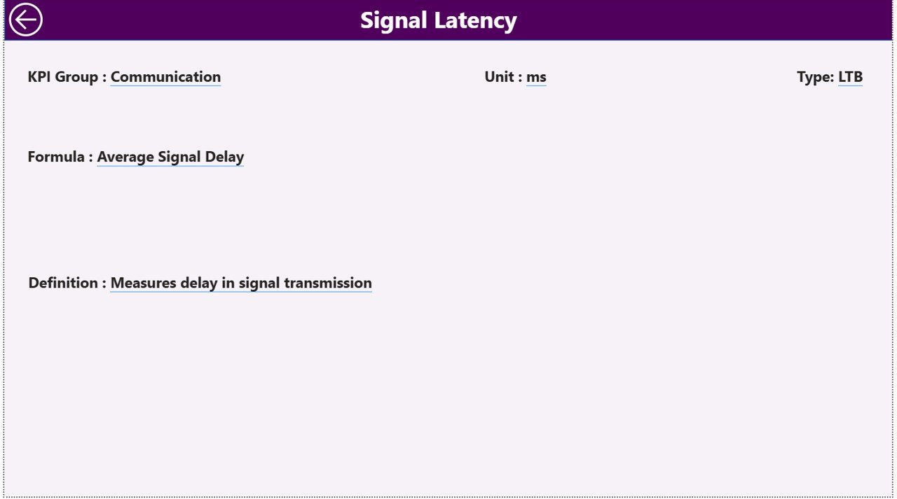
KPI Definition Page
Transparency is critical in any space operation. The KPI Definition Page serves as a detailed reference sheet for each indicator.
Here, you can drill through from the summary page to view:
- KPI Number
- Group and Name
- Formula used for calculation
- Definition and Purpose
- Type (LTB or UTB)
This page ensures everyone—from scientists to project managers—understands exactly what each KPI measures and how it contributes to mission success.
A simple Back button on the top left allows users to return to the main summary page seamlessly.
Excel Data Source and Structure
The dashboard connects directly to an Excel workbook, making it easy to update mission data without modifying the Power BI model.
The Excel file contains three essential worksheets:
Input_Actual Sheet
Record all real performance data here.
Columns include:
- KPI Name
- Month (use first date of each month)
- MTD (Month-to-Date) Values
- YTD (Year-to-Date) Values
Input_Target Sheet
Input planned or target figures for every KPI.
This allows Power BI to automatically calculate performance ratios and visualize variance across time.
KPI Definition Sheet
Define all performance indicators.
Include:
- KPI Number
- Group
- KPI Name
- Unit
- Formula
- Definition
- Type (LTB or UTB)
By maintaining these sheets regularly, analysts can refresh Power BI to instantly update the entire dashboard with accurate, real-time mission data.
Why Space Agencies Need KPI Dashboards
Space missions involve massive data streams—from fuel metrics and trajectory alignment to astronaut health and system diagnostics. Traditional reporting methods make it difficult to track everything in real time.
A KPI dashboard solves this challenge by offering:
- Centralized visibility into performance.
- Automated comparisons between actual results and targets.
- Real-time insights for mission-critical decisions.
- Visual storytelling that simplifies complex datasets.
When you analyze metrics visually, even non-technical stakeholders can interpret mission outcomes quickly and accurately.
Advantages of Space Mission Operations KPI Dashboard in Power BI
- Real-Time Monitoring
Monitor mission metrics such as launch readiness, satellite communication, or ground-station response times in real time.
- Data-Driven Decision Making
Power BI helps mission control teams make precise, evidence-based decisions without guesswork.
- Centralized Information
All mission parameters, from propulsion data to communication logs, are integrated into one source of truth.
- Automated Alerts
Icons and conditional formatting highlight anomalies instantly, helping engineers act before small issues escalate.
- Historical Trend Analysis
Compare performance across multiple missions or time frames using MTD and YTD visualizations.
- Easy Integration
Connect seamlessly with Excel, APIs, or telemetry data sources to keep the dashboard always current.
- Collaboration and Transparency
Scientists, analysts, and administrators can collaborate using shared dashboards and common KPI definitions.
How Power BI Empowers Space Operations
Power BI is not just a visualization tool—it’s a mission analytics enabler.
It transforms vast mission datasets into clear, interactive visuals that empower decision-makers.
Benefits of using Power BI include:
- Interactive filters for dynamic exploration
- Mobile and desktop accessibility
- Secure data sharing and governance
- Automated data refresh
- AI-assisted insights for anomaly detection
By pairing Power BI with accurate KPI data, space organizations can improve performance predictability and mission success rates.
Best Practices for Using the Space Mission Operations KPI Dashboard
- Keep KPI Definitions Clear
- Ensure that every metric has a precise definition, calculation formula, and data source to avoid confusion.
- Automate Data Updates
- Use Power BI’s scheduled refresh to pull data automatically from Excel or databases.
- Visualize the Most Impactful KPIs
- Prioritize high-impact indicators such as mission success rate, system uptime, and communication delays.
- Use Conditional Formatting Wisely
- Color codes and icons (▲▼) help identify issues instantly—keep them consistent across pages.
- Enable Drill-Through Analysis
- Use the hidden KPI Definition page to let users explore KPI details directly from the summary table.
- Maintain Historical Records
Do not overwrite data. Keep historical logs for accurate trend comparisons and forecasting.
- Share Dashboards Securely
Control access via Power BI service roles to protect mission data while encouraging collaboration.
- Review Monthly
Evaluate MTD and YTD results every month to ensure continuous improvement.
How This Dashboard Supports Decision-Making
This dashboard empowers mission control teams to make strategic decisions faster.
With a single click, leaders can:
- Identify underperforming KPIs.
- Compare actual results with targets.
- Allocate resources more efficiently.
- Predict future performance trends.
- Ensure safety and reliability in mission operations.
Power BI’s interactivity allows instant “what-if” analyses that simulate mission outcomes under different conditions—crucial for high-risk operations.
Conclusion
The Space Mission Operations KPI Dashboard in Power BI revolutionizes how space agencies analyze and manage performance. It turns complex, scattered datasets into a unified visual intelligence platform.
By combining the power of Excel data sources and Power BI analytics, organizations gain full control over mission health, performance metrics, and long-term planning.
Whether monitoring a satellite constellation, a Mars rover, or an orbital experiment, this dashboard provides clarity, accuracy, and foresight—helping ensure every mission achieves its objective safely and efficiently.
Frequently Asked Questions (FAQs)
- What is the main purpose of the Space Mission Operations KPI Dashboard?
It provides real-time insights into all key mission performance indicators, allowing teams to monitor success rates, operational efficiency, and resource utilization.
- Who can use this dashboard?
It’s ideal for space agencies, aerospace startups, research institutions, and defense organizations managing multiple missions.
- How does Power BI improve mission monitoring?
Power BI visualizes large datasets in real time, enabling quick decision-making through intuitive dashboards and interactive reports.
- What kind of data do I need to use this dashboard?
You’ll need mission performance data such as actual and target metrics for each KPI—stored in Excel or a database.
- Can I customize the KPIs?
Yes. You can define your own KPIs in the KPI Definition sheet and refresh Power BI to reflect the new indicators instantly.
- Does the dashboard support year-over-year analysis?
Absolutely. It includes both MTD (Month-to-Date) and YTD (Year-to-Date) comparisons with previous year data for precise performance tracking.
- Is this dashboard suitable for private space companies?
Yes. Private satellite operators and launch service providers can use it to track efficiency, cost, and mission reliability.
- Can the dashboard integrate with real telemetry systems?
Yes, Power BI can connect with APIs or databases to fetch live telemetry data, making the dashboard near real-time.
Visit our YouTube channel to learn step-by-step video tutorials
Watch the step-by-step video tutorial:
Click to buy Space Mission Operations KPI Dashboard in Power BI