The academic publishing world grows faster every year. Research institutions produce thousands of manuscripts, peer reviews, journal articles, and citations across many disciplines. Because the competition keeps increasing, publishers must track several performance indicators to measure quality, speed, growth, and influence. However, manual reporting slows down editorial teams, hides trends, and creates confusion.
A Academic Publishing KPI Dashboard in Power BI transforms the entire reporting system. It shows clear insights, highlights performance gaps, and helps editors and publishers make quick data-driven decisions. This dashboard tracks submissions, acceptance rate, review timelines, journal impact, author engagement, production speed, and more.
In this article, you will learn what this dashboard is, how it works, and why every academic publisher should use it. You will also understand the dashboard pages, Excel data structure, advantages, best practices, and frequently asked questions.
Click to Purchases Academic Publishing KPI Dashboard in Power BI
What Is an Academic Publishing KPI Dashboard in Power BI?
An Academic Publishing KPI Dashboard in Power BI is a ready-to-use analytical reporting tool that tracks key performance indicators (KPIs) of academic journals and publishing workflows. It gets data directly from an Excel file and converts it into meaningful visuals that help publishers measure productivity, efficiency, quality, and growth.
Because the academic publishing process includes many stages—submission, peer review, revision, acceptance, editing, formatting, and publication—teams need a simple and clear reporting structure. A Power BI dashboard solves this challenge by offering automated updates, easy navigation, and interactive charts.
This dashboard includes three powerful pages:
-
Summary Page
-
KPI Trend Page
-
KPI Definition Page
Each of these pages helps teams track overall performance, understand trends, and review KPI formulas clearly.
Why Do Academic Publishers Need KPI Dashboards?
Academic publishing involves several stakeholders—authors, reviewers, editors, academic committees, and research institutions. Because modern journals must publish high-quality research within strict timelines, publishers need strong visibility across the entire workflow.
Academic publishers need KPI dashboards because they help:
-
Track manuscript submissions and acceptance trends
-
Monitor peer review timelines
-
Evaluate editorial workload
-
Measure production turnaround
-
Identify journal performance strengths
-
Compare month-to-date and year-to-date progress
-
Highlight missed targets instantly
-
Support strategic decisions during editorial board meetings
Since Power BI provides interactive filters and dynamic visuals, editorial teams understand performance faster and make smarter decisions.
Key Features of the Academic Publishing KPI Dashboard in Power BI
Let’s explore the dashboard’s detailed structure and functionality. It includes three main pages, each designed to provide unique insights.
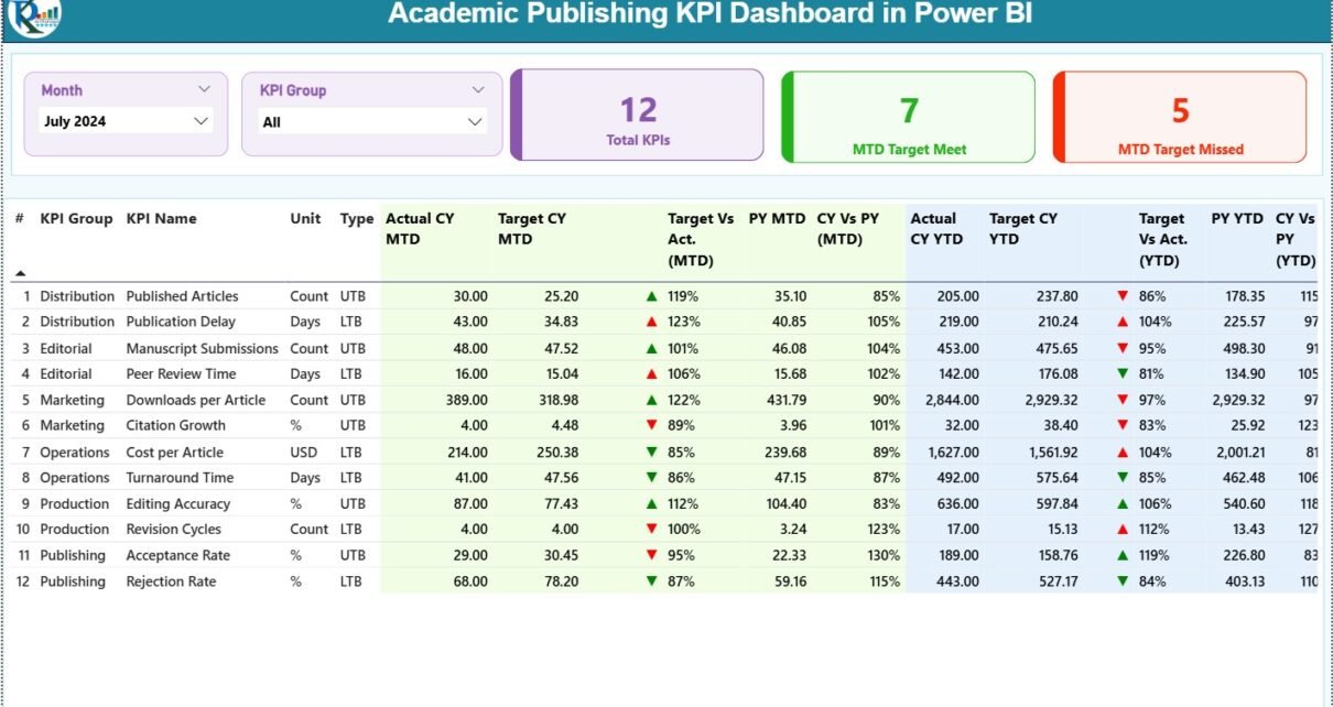
1. Summary Page – The Complete Editorial KPI Overview
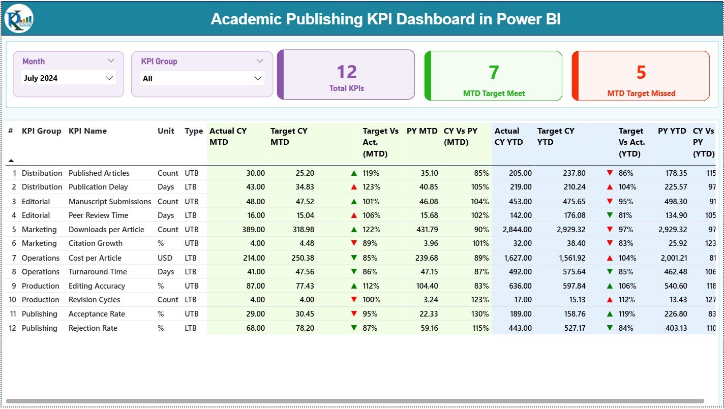
The Summary Page is the main landing page where users get a complete overview of publishing performance. It includes slicers, KPI cards, and a detailed KPI table.
✔ Month and KPI Group Slicers
On the top of the page, users can filter data by:
-
Month
-
KPI Group
These slicers instantly update all visuals to show the selected period or category.
✔ Three KPI Cards for Quick Highlights
These cards show the overall performance at a glance:
-
Total KPIs Count
-
MTD Target Met Count
-
MTD Target Missed Count
This helps editorial managers understand how well the publishing process performs.
✔ Detailed KPI Table With All Publishing Metrics
Below the cards, users see a comprehensive table that displays all KPI details. This includes:
-
KPI Number – Sequential index
-
KPI Group – Category (Submission, Review, Production, Impact etc.)
-
KPI Name – KPI label
-
Unit – Days, %, Count etc.
-
Type – LTB (Lower the Better) or UTB (Upper the Better)
-
Actual CY MTD – Current Year Month-to-Date actual values
-
Target CY MTD – Month-to-Date targets
-
MTD Icon – ▲ or ▼ representing performance (green/red)
-
Target vs Actual (MTD) – Formula: Actual / Target
-
PY MTD – Previous Year MTD values
-
CY vs PY (MTD) – Formula: CY / PY
-
Actual CY YTD – Current Year Year-to-Date actual values
-
Target CY YTD – YTD targets
-
YTD Icon – ▲ or ▼ performance indicator
-
Target vs Actual (YTD) – Formula: Actual / Target
-
PY YTD – Previous Year YTD data
-
CY vs PY (YTD) – Formula: CY / PY
Because academic teams depend on accuracy, this table becomes their most important performance snapshot.
Click to Purchases Academic Publishing KPI Dashboard in Power BI
2. KPI Trend Page – Tracking Monthly and Yearly Performance

The KPI Trend Page helps users understand how each KPI evolves over time. This page includes two combo charts and a slicer for selecting a KPI.
✔ KPI Selector
Users select a KPI from the slicer, and the charts update instantly.
✔ Trend Charts for MTD and YTD
The dashboard shows:
-
Actual CY
-
Actual PY
-
Target values
These trend charts help publishers identify:
-
Submission patterns
-
Review delays
-
Production bottlenecks
-
Impact score variations
-
Seasonal publishing cycles
Because trends reveal more than static numbers, this page becomes essential for strategic planning.
3. KPI Definition Page – Clear Understanding of Editorial KPIs
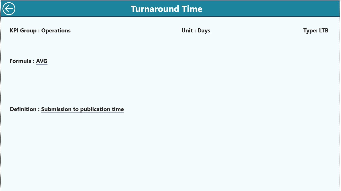
This drill-through page explains each KPI in detail. It is hidden from the main navigation but accessible through drill-through action.
It includes:
-
KPI Number
-
KPI Group
-
KPI Name
-
Unit
-
Formula
-
Definition
-
Type (LTB or UTB)
This page ensures transparency and consistency across reporting teams. Anyone reviewing the dashboard understands exactly how each KPI is calculated.
Excel Data Structure for the Academic Publishing Dashboard
The dashboard uses an easy-to-manage Excel file as its data source. Users update data in three worksheets:
1. Input_Actual Sheet
This sheet captures actual KPI performance for each month.
Columns include:
-
KPI Name
-
Month (first day of the month)
-
MTD Actual
-
YTD Actual
Teams update this sheet every month with fresh numbers.
2. Input_Target Sheet
This sheet contains targets for each KPI.
Columns include:
-
KPI Name
-
Month
-
MTD Target
-
YTD Target
Targets help track performance and identify gaps.
3. KPI Definition Sheet
This page stores:
-
KPI Number
-
KPI Group
-
KPI Name
-
Unit
-
Formula
-
Definition
-
Type (LTB / UTB)
Because Power BI pulls this information directly, the dashboard always shows accurate definitions.
Click to Purchases Academic Publishing KPI Dashboard in Power BI
Why the Academic Publishing Industry Needs This Dashboard
Academic publishing is fast-paced. Journals compete based on speed, quality, and impact. Authors choose journals that provide clarity and quick feedback. Reviewers expect streamlined processes. Editorial teams need actionable data to make improvements.
This dashboard helps publishers meet these expectations because it:
-
Tracks submission and acceptance trends
-
Shows peer review timelines
-
Highlights delays
-
Monitors editorial productivity
-
Improves transparency during board reviews
-
Simplifies reporting for research institutions
-
Strengthens the journal’s strategic direction
Because Power BI offers automated insights, journals stay competitive and efficient.
Advantages of the Academic Publishing KPI Dashboard in Power BI
This dashboard offers many benefits that improve editorial operations and strategic planning.
1. Real-Time Visibility
Teams view MTD and YTD numbers instantly without manual calculations.
2. Faster Decision-Making
Clear visuals and KPI cards help editors identify issues immediately.
3. More Accurate Reporting
Data flows from structured Excel sheets, reducing errors.
4. Better Journal Quality
KPIs like review time, submission quality, and acceptance trend indicate overall journal health.
5. Stronger Editorial Accountability
Each KPI shows where delays happen and how teams perform.
6. Transparent Board Presentations
Power BI visuals help journals present performance confidently to committees, reviewers, and academic boards.
7. Predictive Insights
Trends help estimate workload for upcoming months.
8. More Efficient Peer Review
Tracking review completion timelines helps improve reviewer assignments.
9. Improved Author Satisfaction
Authors appreciate faster processing and clarity on timelines.
10. Strategic Growth Support
Journals use the dashboard to identify growing research areas, increasing submissions, or declining impact metrics.
Click to Purchases Academic Publishing KPI Dashboard in Power BI
Best Practices for Using the Academic Publishing KPI Dashboard
To get the most value from the dashboard, teams should follow certain best practices.
1. Update Data Monthly
Fresh data ensures accurate trend analysis.
2. Keep KPI Definitions Simple
Clear definitions help teams understand and use KPIs correctly.
3. Use Filters Regularly
Slicers help compare different KPI groups and months.
4. Focus on Actionable KPIs
Track metrics that truly influence operations, such as review time, acceptance rate, and production turnaround.
5. Review Trends, Not Just Numbers
Trends reveal deeper insights that daily numbers cannot show.
6. Engage the Editorial Board
Involve board members in KPI reviews for more informed decisions.
7. Ensure Data Accuracy
Cross-check actual and target sheets to maintain clean datasets.
8. Document KPI Formulas
A clear formula prevents misunderstanding during audits or reviews.
9. Train New Team Members
Provide guidance on how to use slicers, drill-through, and trend charts.
10. Regularly Revisit KPI Relevance
Academic publishing changes, so KPI sets may need periodic updates.
How the Dashboard Improves Publishing Timelines
Publishing speed is one of the most important metrics for authors. Slow timelines discourage submissions. The dashboard helps journals identify delays and streamline processes.
It allows teams to:
-
Track review turnaround
-
Measure editorial decision time
-
Monitor production bottlenecks
-
Identify seasonal peaks in submissions
-
Align workload with team capacity
Because each publishing stage becomes measurable, journals work faster and more efficiently.
How the Dashboard Supports Journal Impact Growth
Journal impact grows when:
-
High-quality submissions increase
-
Review quality improves
-
Publication timelines shorten
-
Reader engagement rises
The dashboard helps achieve all these goals by showing:
-
Acceptance trends
-
Revision quality
-
Reviewer performance
-
Content throughput
-
Citation impact KPIs (if added)
Because teams understand performance clearly, they make decisions that strengthen the journal’s academic reputation.
Conclusion
The Academic Publishing KPI Dashboard in Power BI provides a complete and smart way for journals to track performance, improve processes, and support strategic decisions. Since it captures actuals, targets, trends, and KPI definitions in one place, editorial teams gain complete visibility across the publishing cycle.
With features like MTD/YTD comparison, variance indicators, interactive trends, and drill-through definitions, publishers no longer struggle with manual reporting. Instead, they focus on improving quality, reducing delays, and enhancing author and reviewer experience.
When academic publishers use real-time insights, they build stronger journals and create a powerful academic impact.
Click to Purchases Academic Publishing KPI Dashboard in Power BI
Frequently Asked Questions (FAQs)
1. What is an Academic Publishing KPI Dashboard in Power BI?
It is a reporting dashboard that tracks submission, review, acceptance, production, and impact metrics for academic journals.
2. Who can use this dashboard?
Editors, reviewers, journal managers, academic boards, and production teams.
3. Does the dashboard require coding knowledge?
No. Power BI is user-friendly and does not require programming skills for basic use.
4. How often should data be updated?
Monthly updates work best because KPIs depend on MTD and YTD values.
5. Can KPI definitions be modified?
Yes. You can edit the KPI Definition sheet in Excel.
6. Does the dashboard show year-over-year comparisons?
Yes, it compares Current Year vs Previous Year for both MTD and YTD.
7. What industries benefit from this dashboard?
Academic journals, research publishers, university presses, and scientific societies.
8. Can we add more KPIs?
Yes. You can expand KPI lists in the Excel file.
9. Does the dashboard support drill-through features?
Yes. Users can drill into KPI definitions for clarity.
10. How does the Trend page help?
It shows performance patterns that help predict workload and identify delays.
Click to Purchases Academic Publishing KPI Dashboard in Power BI
Visit our YouTube channel to learn step-by-step video tutorials


