Adventure tourism continues to grow rapidly across the world. Travelers now look for trekking, rafting, wildlife safaris, mountain biking, scuba diving, and many other thrilling experiences. However, as demand increases, competition also becomes intense. Therefore, tour operators must track performance carefully and act fast.
So, how can you monitor bookings, revenue, safety metrics, occupancy, and customer satisfaction in one place?
The answer lies in the Adventure Tourism KPI Dashboard in Power BI.
In this detailed guide, you will learn:
-
What an Adventure Tourism KPI Dashboard in Power BI is
-
Why adventure tour operators need it
-
Dashboard structure and features
-
How Excel data connects to Power BI
-
Advantages of using this dashboard
-
Best practices for implementation
-
Frequently asked questions
Let’s dive in.
Click to Purchases Adventure Tourism KPI Dashboard in Power BI
What Is an Adventure Tourism KPI Dashboard in Power BI?
An Adventure Tourism KPI Dashboard in Power BI is a ready-to-use analytics solution designed to monitor key performance indicators for adventure tourism businesses.
Instead of reviewing multiple spreadsheets, you can:
-
Track bookings and cancellations
-
Monitor revenue and profitability
-
Compare current performance with targets
-
Analyze month-to-date (MTD) and year-to-date (YTD) results
-
Compare current year vs previous year
Moreover, the dashboard connects to an Excel file where you enter actual and target values. As a result, you maintain flexibility while enjoying interactive Power BI visuals.
Why Do Adventure Tourism Businesses Need a KPI Dashboard?
Adventure tourism involves complex operations. You manage guides, vehicles, equipment, safety standards, seasonal demand, and customer expectations. Therefore, you need clear and real-time visibility.
Without a structured KPI system:
-
You miss revenue trends
-
You react late to target gaps
-
You struggle to compare year-over-year growth
-
You lose control over operational efficiency
However, when you use a Power BI KPI dashboard:
-
You centralize all performance data
-
You make faster decisions
-
You improve accountability
-
You increase profitability
In short, this dashboard transforms raw data into clear insights.
How Is the Adventure Tourism KPI Dashboard Structured?
This dashboard includes 3 well-designed pages inside the Power BI Desktop file. Each page serves a specific purpose.
Click to Purchases Adventure Tourism KPI Dashboard in Power BI
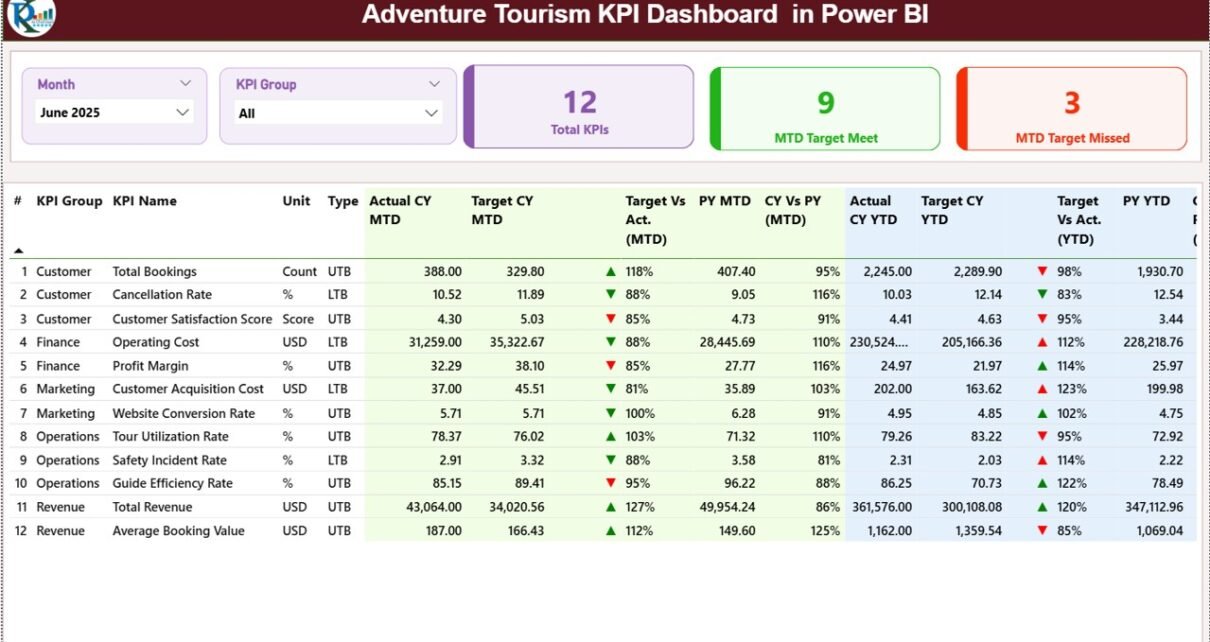
1️⃣ What Does the Summary Page Show?
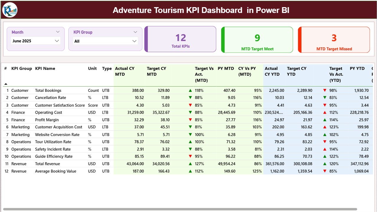
The Summary Page acts as the main control center of the dashboard.
Top Section: Interactive Slicers
At the top, you will find:
-
Month slicer
-
KPI Group slicer
Therefore, you can filter the entire dashboard instantly by selecting a specific month or KPI category.
KPI Cards: Quick Performance Snapshot
Just below the slicers, you see three important KPI cards:
-
Total KPIs Count
-
MTD Target Meet Count
-
MTD Target Missed Count
These cards immediately show whether your business performs well or not.
Detailed KPI Table: Complete Performance View
Below the cards, the dashboard displays a structured table with detailed metrics.
It includes:
-
KPI Number – Sequence number of the KPI
-
KPI Group – Category of the KPI
-
KPI Name – Name of the metric
-
Unit – Measurement unit (%, Number, INR, etc.)
-
Type – LTB (Lower the Better) or UTB (Upper the Better)
What Do MTD Metrics Show?
MTD (Month-to-Date) section includes:
-
Actual CY MTD – Current year actual value
-
Target CY MTD – Current year target value
-
MTD Icon – ▲ (Green) or ▼ (Red) status indicator
-
Target vs Actual (MTD) – Actual ÷ Target
-
PY MTD – Previous year MTD value
-
CY vs PY (MTD) – Current year ÷ Previous year
Therefore, you quickly understand performance gaps and growth trends.
What Do YTD Metrics Show?
YTD (Year-to-Date) section includes:
-
Actual CY YTD
-
Target CY YTD
-
YTD Icon
-
Target vs Actual (YTD)
-
PY YTD
-
CY vs PY (YTD)
As a result, you monitor long-term progress and not just monthly numbers.
Click to Purchases Adventure Tourism KPI Dashboard in Power BI
2️⃣ What Does the KPI Trend Page Show?
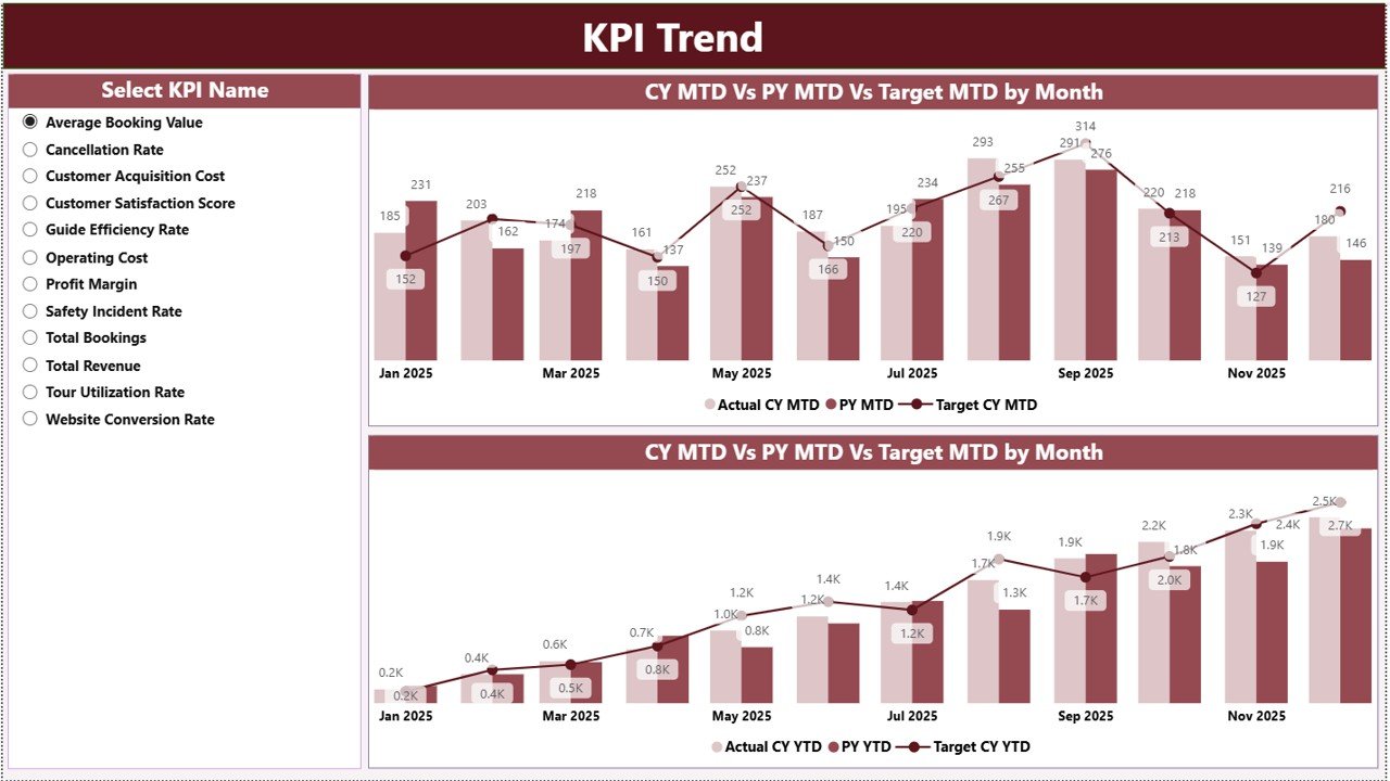
The KPI Trend Page focuses on visual analysis.
Here, you see:
-
Two combo charts
-
Current year vs previous year comparison
-
MTD and YTD trend analysis
On the left side, you get a slicer to select a KPI name. Once you select a KPI, the charts update instantly.
Therefore, you can:
-
Analyze seasonal trends
-
Identify performance dips
-
Compare target vs actual visually
-
Detect growth patterns
This page helps managers take proactive action.
3️⃣ What Is the KPI Definition Page?
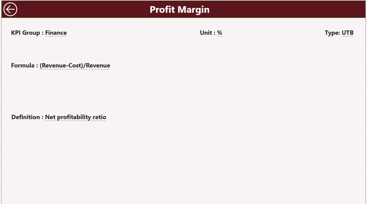
The KPI Definition Page works as a drill-through page.
Although it remains hidden, you can access it from the summary page.
Here, you can view:
-
KPI Number
-
KPI Group
-
KPI Name
-
Unit
-
Formula
-
KPI Definition
-
Type (LTB or UTB)
Therefore, team members understand how each KPI works.
To return to the main page, you simply click the Back button located at the top left corner.
How Does Excel Data Connect to the Dashboard?
The dashboard uses an Excel file as the data source. This design gives you flexibility and control.
You must maintain three worksheets:
1️⃣ Input_Actual Sheet
In this sheet, you enter:
-
KPI Name
-
Month (first date of the month)
-
MTD value
-
YTD value
Therefore, you only update numbers. Power BI handles the calculations and visuals.
2️⃣ Input_Target Sheet
In this sheet, you enter:
-
KPI Name
-
Month (first date of the month)
-
Target MTD
-
Target YTD
Thus, you set performance expectations clearly.
3️⃣ KPI Definition Sheet
Here, you maintain:
-
KPI Number
-
KPI Group
-
KPI Name
-
Unit
-
Formula
-
Definition
-
Type (LTB or UTB)
Because of this structure, your dashboard remains standardized and professional.
What Are the Advantages of Adventure Tourism KPI Dashboard in Power BI?
Now let us explore the major benefits.
1️⃣ Centralized Performance Tracking
You see all KPIs in one place. Therefore, you eliminate scattered spreadsheets.
2️⃣ Real-Time Decision Making
As soon as you update Excel, Power BI refreshes data. Consequently, you make faster decisions.
3️⃣ Clear Target Monitoring
Green ▲ and red ▼ icons instantly show performance status. Thus, you identify gaps quickly.
4️⃣ Strong Year-over-Year Comparison
You compare current year with previous year easily. As a result, you measure growth accurately.
5️⃣ Interactive Analysis
With slicers and drill-through options, you explore data deeply.
6️⃣ Improved Accountability
When you assign KPIs to departments, managers take ownership. Therefore, performance improves.
Which KPIs Should You Track in Adventure Tourism?
Although KPI selection depends on business type, you can track:
-
Total Bookings
-
Revenue per Tour
-
Cancellation Rate (LTB)
-
Occupancy Rate (UTB)
-
Customer Satisfaction Score
-
Safety Incident Rate (LTB)
-
Guide Utilization Rate
-
Cost per Booking
-
Average Ticket Value
-
Repeat Customer Rate
When you track these metrics, you gain full visibility.
Click to Purchases Adventure Tourism KPI Dashboard in Power BI
Best Practices for the Adventure Tourism KPI Dashboard in Power BI
To get maximum benefit, follow these best practices.
1️⃣ Define Clear KPIs
First, align KPIs with business goals. Do not track unnecessary metrics.
2️⃣ Maintain Accurate Data
Update Excel sheets regularly. Also, verify numbers before refresh.
3️⃣ Review Dashboard Monthly
Although you can check daily, conduct formal monthly reviews with your team.
4️⃣ Use KPI Groups Wisely
Create groups like:
-
Financial KPIs
-
Operational KPIs
-
Safety KPIs
-
Marketing KPIs
Therefore, analysis becomes structured.
5️⃣ Train Your Team
Ensure managers understand:
-
KPI formulas
-
LTB vs UTB
-
Target calculation logic
As a result, interpretation becomes consistent.
6️⃣ Compare MTD and YTD Together
Do not rely only on monthly data. Always compare YTD performance to ensure strategic alignment.
How Does This Dashboard Improve Business Growth?
This dashboard does more than reporting. It drives growth.
Because:
-
You detect underperforming tours early
-
You optimize pricing strategies
-
You reduce cancellations
-
You improve customer experience
-
You increase revenue per booking
Consequently, your adventure tourism business becomes stronger and more profitable.
Conclusion
Adventure tourism demands speed, accuracy, and control. Therefore, you cannot depend on manual tracking anymore.
The Adventure Tourism KPI Dashboard in Power BI gives you:
-
Clear performance visibility
-
Strong MTD and YTD analysis
-
Target vs actual monitoring
-
Year-over-year comparison
-
Structured KPI management
When you implement this dashboard correctly, you gain control over your operations and boost profitability.
If you want to manage adventure tours professionally and grow sustainably, this dashboard becomes an essential tool.
Click to Purchases Adventure Tourism KPI Dashboard in Power BI
Frequently Asked Questions (FAQs)
1️⃣ What is an Adventure Tourism KPI Dashboard in Power BI?
It is an interactive Power BI dashboard that tracks key performance indicators for adventure tourism businesses using Excel as a data source.
2️⃣ What does LTB and UTB mean?
LTB means Lower the Better (e.g., cancellation rate).
UTB means Upper the Better (e.g., revenue, bookings).
3️⃣ How often should I update the dashboard?
You should update it monthly. However, you can update it weekly if needed.
4️⃣ Do I need advanced Power BI skills to use it?
No. You only update Excel sheets. The dashboard calculates and displays metrics automatically.
5️⃣ Can I customize KPIs?
Yes. You can modify KPI definitions and add new metrics in the Excel file.
6️⃣ Why should I track both MTD and YTD?
MTD shows short-term performance. YTD shows long-term progress. Therefore, you need both for balanced decision-making.
Click to Purchases Adventure Tourism KPI Dashboard in Power BI
Visit our YouTube channel to learn step-by-step video tutorials