Agriculture and Farm Dashboard in Power BI
Agriculture and Farm Dashboard in Power BI is a powerful, ready-to-use analytical solution designed for modern farming businesses that want to track revenue, crop yield, operating costs, profit margins, and seasonal performance across multiple regions and crops in one centralized interactive report. Instead of relying on scattered spreadsheets and disconnected reports, this Power BI dashboard template brings all your critical agricultural metrics together in beautifully designed visual pages that update dynamically with your data.
This dashboard includes 5 interactive analysis pages, tracks 5 critical KPIs, and provides detailed charts covering crop-level profitability, regional comparisons, seasonal trends, and operational efficiency. Whether you manage a small family farm or a large-scale commercial agriculture operation, this template transforms raw farm data into actionable insights.
Key Features of Agriculture and Farm Dashboard in Power BI
This Power BI dashboard delivers a comprehensive farm analytics experience with the following capabilities:
- 5 Interactive Dashboard Pages — Overview, Crop Analysis, Regional View, Season Trends, and Operations covering every aspect of farm management.
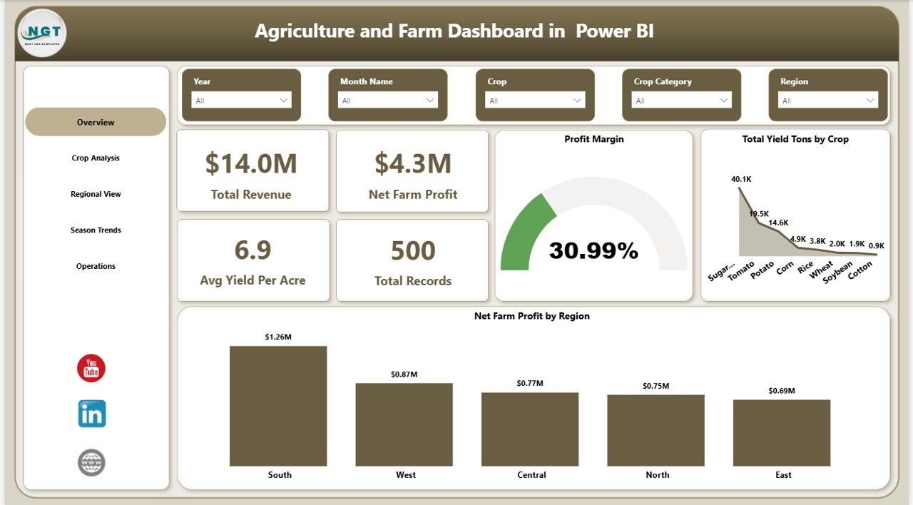
- 5 High-Level KPI Cards — Total Revenue, Net Farm Profit, Avg Yield Per Acre, Total Records, and Profit Margin displayed on the Overview page.
- 15+ Professional Charts — Visual analysis of yield by crop, revenue by region, profit by irrigation, revenue by season, yield by soil type, and revenue by buyer type.
- Dynamic Slicers — Filter by Region, Crop, Season, Irrigation Type, Soil Type, and Buyer Type across all pages.
- Crop-Level Profitability Analysis — Compare revenue vs cost by crop, analyze yield per acre, and identify top-performing crops.
- Regional and Seasonal Insights — Understand geographic and time-based performance patterns for better planning.
Dashboard Pages Explanation
1. Overview Page
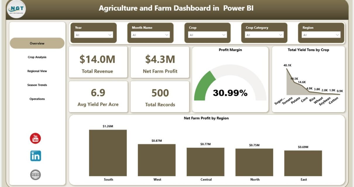
The Overview Page serves as the central command center of the dashboard. At the top, you will find 5 KPI cards displaying Total Revenue, Net Farm Profit, Avg Yield Per Acre, Total Records, and Profit Margin. These cards provide an instant snapshot of your overall farm performance. Below the KPI cards, the page features charts showing Total Yield Tons by Crop and Net Farm Profit by Region. Multiple slicers are available to filter the data and view a customized dashboard quickly.
Click to buy Agriculture and Farm Dashboard in Power BI
Overview Page2. Crop Analysis
The Crop Analysis page provides a deep dive into crop-level performance. This page includes charts showing Total Yield Tons by Crop Category, which helps you understand which crop categories produce the highest volume. The Avg Yield Per Acre by Crop chart reveals which individual crops deliver the best efficiency per acre of farmland. The Total Revenue and Total Operating Cost by Crop chart allows you to directly compare income against expenses for each crop, making it easy to identify your most and least profitable crops.
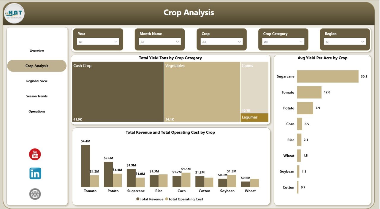 Crop Analysis
3. Regional View
The Regional View page focuses on geographic performance analysis. The Total Revenue by Region chart helps you identify which farming regions generate the most income. The Net Farm Profit by Irrigation chart shows how different irrigation methods impact profitability across your operations. The Total Area Acres by Region chart displays the land distribution across regions, helping you understand which areas have the largest cultivated footprint and whether that correlates with higher revenue.
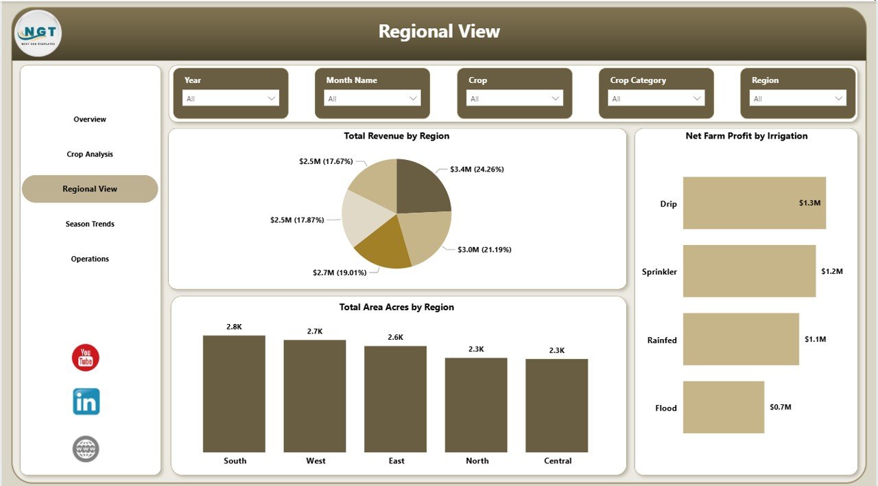 Regional View
4. Season Trends
The Season Trends page analyzes seasonal patterns in your farming data. The Total Revenue by Season chart shows which growing seasons contribute the most to your overall income. The Harvest Success Rate by Season chart tracks how successfully crops are harvested in each season, providing insight into operational efficiency. The Total Yield Tons by Month Name chart displays monthly yield distribution, helping you understand peak production periods and plan labor and resources accordingly.Agriculture and Farm Dashboard in Power BI
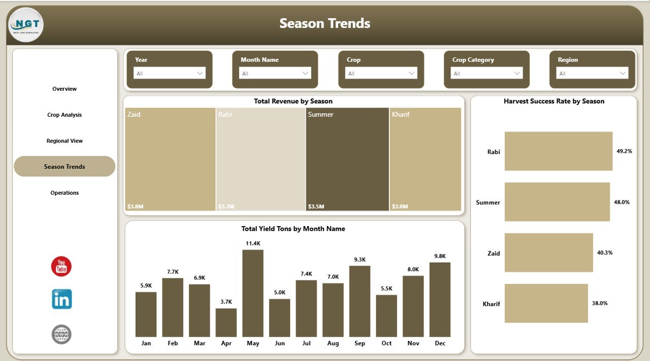 Season Trends
5. Operations
The Operations page focuses on operational efficiency and resource optimization. The Avg Yield Per Acre by Soil Type chart helps you understand how different soil conditions impact crop productivity, allowing you to make smarter planting decisions. The Total Records by Month Name chart shows the distribution of farming records across months, indicating peak activity periods. The Total Revenue by Buyer Type chart reveals which buyer segments contribute the most to your revenue, helping you optimize sales strategies and buyer relationships.Agriculture and Farm Dashboard in Power BI
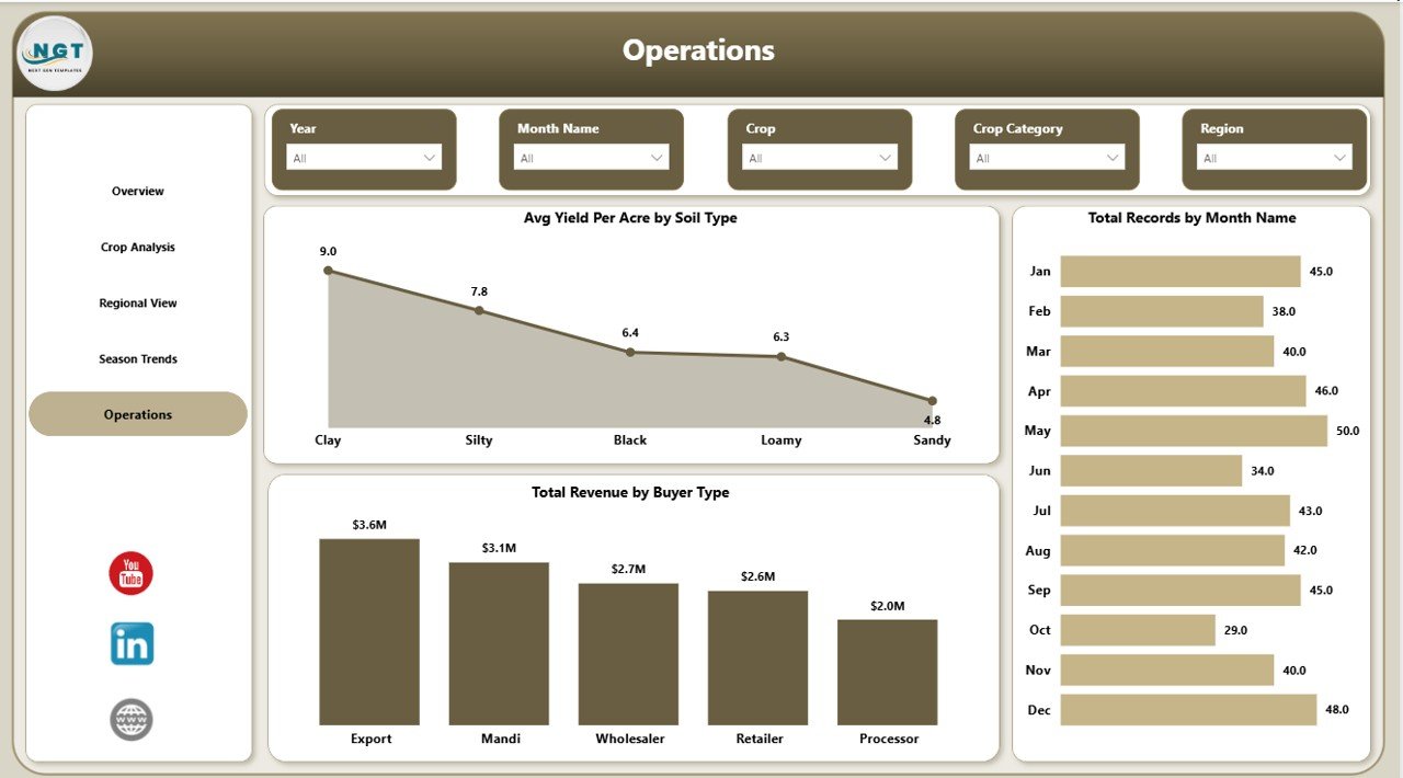 Operations
Advantages of Agriculture and Farm Dashboard in Power BI
- Centralized Farm Analytics — All your critical farm data in one interactive Power BI report instead of scattered spreadsheets.
- Data-Driven Decision Making — Replace guesswork with clear visual insights backed by your actual farm data.
- Time Savings — No need to manually create charts or compile reports. Simply refresh and all visuals update automatically.
- Multi-Dimensional Analysis — Analyze performance across crops, regions, seasons, soil types, irrigation methods, and buyer types simultaneously.
- Scalable for Any Farm Size — Works equally well for small family farms and large multi-region agricultural operations.
- Professional Reporting — Use the dashboard in team meetings, investor presentations, and strategic planning sessions with confidence.Agriculture and Farm Dashboard in Power BI
Opportunities for Improvement
- Adding a cost breakdown page with detailed expense categories like labor, fertilizer, equipment, and transportation would provide deeper financial analysis.
- Including a year-over-year comparison feature would help track long-term growth and identify multi-year trends.
- A weather impact overlay connecting weather data to yield performance could add another layer of analytical depth.
- Integration with live data sources through Power BI Service would enable real-time monitoring without manual refresh.
Best Practices
- Keep your data consistent — use the same column format and naming conventions as the sample data for seamless refresh.
- Refresh the dashboard regularly, especially during harvest season, to keep your insights current and actionable.
- Use slicers strategically — start with the Overview page for a high-level view, then drill down into specific pages for detailed analysis.
- Share the dashboard with your team by publishing to Power BI Service so everyone can access the latest farm performance data.
- Compare your results with previous seasons to identify improvement areas and set realistic targets for the next cycle.
Explore Relevant Templates
Agriculture and Farm Dashboard in Excel — Same agricultural analytics in a Microsoft Excel format with pivot tables and slicers for users who prefer Excel.
Agriculture and Farm Dashboard in HTML — Browser-based agriculture dashboard with light/dark theme toggle and CSV upload functionality.
Vertical Farming Dashboard in Power BI — Advanced vertical farming analytics with crop type analysis, country comparison, and growth system evaluation.
Crop Advisory Platforms Dashboard in Power BI — Analyze advisory effectiveness, crop profitability, and cost savings from agricultural advisory services.
Agriculture Dashboard in Power BI — A similar agriculture analytics solution with cost vs revenue analysis, crop vs soil optimization, and monthly trend tracking.
Frequently Asked Questions
What KPIs does the Agriculture and Farm Dashboard in Power BI track?
The Agriculture and Farm Dashboard in Power BI tracks 5 key performance indicators: Total Revenue, Net Farm Profit, Avg Yield Per Acre, Total Records, and Profit Margin. It also provides detailed analysis across crops, regions, seasons, soil types, irrigation methods, and buyer types across 5 interactive pages.
Do I need advanced Power BI skills to use this dashboard?
No. Simply open the .pbix file in Power BI Desktop, replace the sample data with your own farm records, and click Refresh. All charts, KPI cards, and slicers update automatically without requiring any DAX formulas or data modeling knowledge.
Can I customize the crops, regions, and seasons in this dashboard?
Yes. The dashboard is fully data-driven. When you update the data source with your own crop names, regions, seasons, and other fields, the dashboard adapts automatically to reflect your unique farm data.
What is the best Power BI dashboard template for agriculture and farming?
The Agriculture and Farm Dashboard in Power BI by NextGenTemplates is one of the best options available. It includes 5 interactive pages covering overview, crop analysis, regional view, season trends, and operations — providing comprehensive farm analytics in one report.
How do I track farm revenue and crop yield in Power BI?
Import your farming data into the Agriculture and Farm Dashboard .pbix file, and the dashboard automatically generates charts showing revenue by region, yield by crop, profit margins, and seasonal trends across all 5 analysis pages.
Is this template compatible with Excel data sources?
Yes. The Power BI dashboard can connect directly to Excel files. Simply point the data connection to your Excel workbook and click Refresh. For a native Excel version, check out the Agriculture and Farm Dashboard in Excel.
Conclusion
The Agriculture and Farm Dashboard in Power BI is a must-have analytics tool for anyone serious about improving farm performance through data. With 5 interactive pages, 5 KPI cards, 15+ charts, and dynamic slicers, this dashboard gives you complete visibility into your agricultural operations — from crop-level profitability to regional performance and seasonal trends. Stop relying on scattered spreadsheets and start making data-driven farming decisions today.
Click here to Purchase Agriculture and Farm Dashboard in Power BI
Visit our YouTube channel to learn step-by-step video tutorials
👉 Youtube.com/@PK-AnExcelExpert
Click to buy Agriculture and Farm Dashboard in Power BI