The airline industry runs on fast decisions, accurate data, and real-time visibility. However, many teams still jump between multiple spreadsheets, raw data tables, and endless reports. This slows down decision-making and hides the insights that matter the most. Because of this, management struggles to understand performance, cost behavior, customer trends, or seasonal patterns.
An Airlines Dashboard in Excel solves these problems. It converts scattered aviation data into clear visuals that help you understand your business within seconds. You track cost, revenue, aircraft performance, customer behavior, and promotional impact from one place. Since the dashboard uses a structured data sheet, you also refresh the entire file with a single click.
In this detailed guide, you will explore what an Airlines Dashboard in Excel is, how it works, and how each page supports better decisions across your airline operations.
Click to Purchases Airlines Dashboard in Excel
What Is an Airlines Dashboard in Excel?
An Airlines Dashboard in Excel is a ready-to-use analytical template designed for flight operations, finance teams, airport management, and aviation analysts. It organizes your aviation data into interactive visuals so you track trends, compare performance, and make timely decisions.
This dashboard includes:
-
A side navigation panel for jumping easily across pages
-
Interactive charts that allow you to compare cost, sales, revenue, and feedback
-
Dynamic slicers to filter by airline, aircraft, customer type, flight type, seat class, month, or promo category
-
Well-structured data sheets that drive every visual
You use this dashboard daily to check delays, analyze cost-to-revenue ratio, understand seat class behaviors, monitor promotions, and study aircraft performance.
Why Do Airlines Need a Dashboard in Excel?
Airlines deal with massive data every day. You get information from reservations, aircraft operations, customer feedback, fuel usage, seating capacity, pricing, and many other sources. When teams track these manually, they lose time and accuracy.
An Airlines Dashboard in Excel helps because:
-
It turns complex data into clean insights
-
It supports quick decisions
-
It reduces reporting time
-
It improves accuracy
-
It promotes data-driven culture
You get everything organized into five detailed analysis pages, each focused on a specific business area.
Key Features of the Airlines Dashboard in Excel
This dashboard comes with a structured layout that makes analysis simple and meaningful. It includes five analysis pages, an index-style navigation pane, and a master data sheet.
✔ Page Navigator
You get a navigation menu on the left side of the dashboard. It helps you switch between different pages without scrolling or searching. This design improves the user experience and keeps your analysis organized.
Pages in the Airlines Dashboard
Click to Purchases Airlines Dashboard in Excel
This dashboard contains five interactive pages. Each one gives a unique view of the business and helps you analyze performance from different angles.
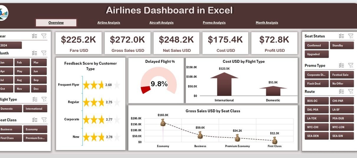
1. Overview Page – What Does It Show?
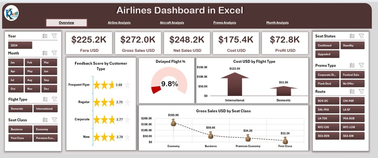
The Overview Page works as the home screen of the dashboard. You get a quick snapshot of overall airline performance. On this page, the right-side panel displays key metrics and charts.
You get:
-
Five KPI Cards, such as:
-
Total Gross Sales
-
Total Cost
-
Profit
-
Seat Class Sales
-
Customer Feedback Score
-
-
Four powerful charts:
✔ Feedback Score by Customer Type
✔ Delayed Flight Percentage
✔ Cost (USD) by Flight Type
✔ Gross Sales (USD) by Seat Class
These visuals give you a strong understanding of performance before you dive into deeper analysis.
For example:
If delayed flights increase, you check flight type or aircraft type to understand the cause.
If cost rises in premium flights, you compare the trend with aircraft analysis.
This page sets the tone for fast decision-making.
2. Airline Analysis – How Each Airline Performs
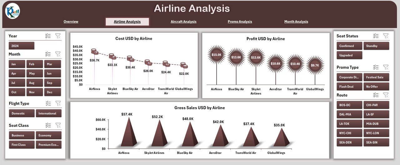
The Airline Analysis Page helps you compare performance across different airlines or airline groups.
On the right-side panel, you get three charts:
-
Cost USD by Airline
-
Profit USD by Airline
-
Gross Sales USD by Airline
This page works well when your dashboard includes partner airlines, multiple carriers in your network, or seasonal charters.
You use this page to answer questions like:
-
Which airline generates the highest sales?
-
Which one gives the best profit margin?
-
Which airline contributes the most to cost?
This helps financial teams and commercial planners take timely decisions.
3. Aircraft Analysis – How Different Aircraft Types Perform
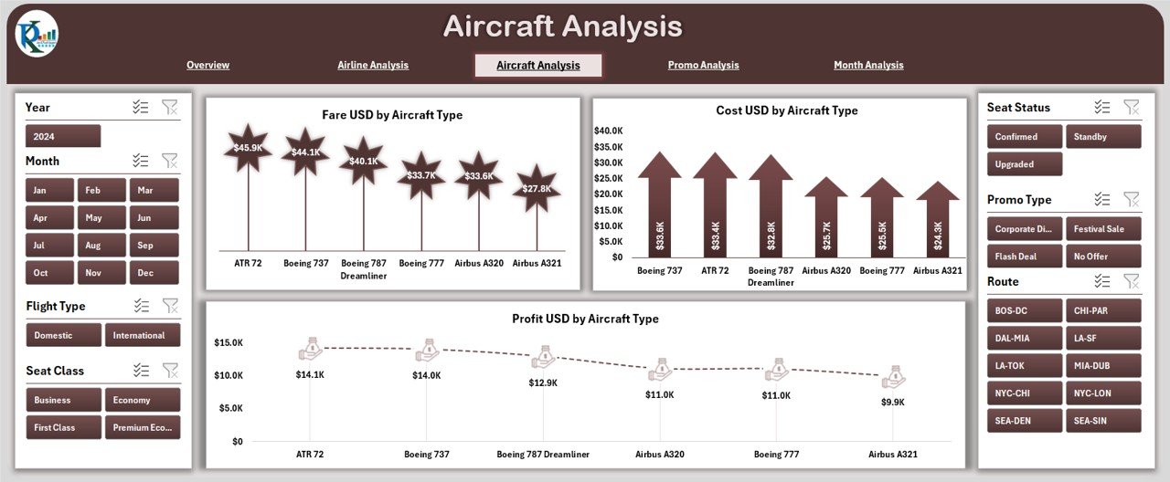
Aircraft type plays a major role in cost, fare structure, fuel usage, and customer experience. The Aircraft Analysis Page focuses on these important aircraft insights.
You get three key charts:
-
Fare USD by Aircraft Type
-
Cost USD by Aircraft Type
-
Profit USD by Aircraft Type
This page helps you understand:
-
Which aircraft types generate higher revenue
-
Which models have higher maintenance or fuel cost
-
Which aircraft deliver the best profit
For example, if wide-body aircraft increase cost but generate higher profit, you continue using them on long-haul routes. If narrow-body aircraft give stable profit, you use them more frequently on busy short routes.
This page supports fleet decisions, route planning, and long-term aircraft strategy.
4. Promo Analysis – How Promotions Impact Performance
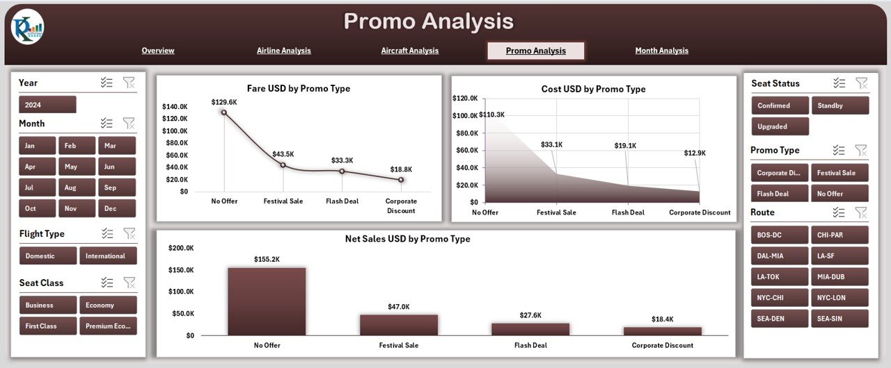
Airlines run promotions to fill seats, increase customer engagement, and boost revenue during slow seasons. The Promo Analysis Page helps you measure the impact of every promotion type.
You get three important charts:
-
Fare USD by Promo Type
-
Cost USD by Promo Type
-
Net Sales USD by Promo Type
This helps you answer questions such as:
-
Which promo brings the highest fare revenue?
-
Which promo type increases cost?
-
Which promo strategy gives better net sales?
If you see a promotion with high cost and very low return, you revise or remove it.
If one promo brings high net sales, you use it more frequently during peak months.
This page helps your marketing and sales team make better promotional decisions.
Click to Purchases Airlines Dashboard in Excel
5. Month Analysis – How Performance Changes Over Time
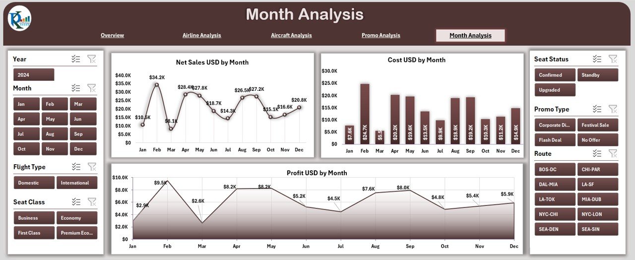
The Month Analysis Page helps you study seasonality, monthly demand, cost patterns, and revenue cycles.
You get three charts on the right-side panel:
-
Net Sales USD by Month
-
Cost USD by Month
-
Profit USD by Month
This page answers important questions:
-
Which month shows the highest sales?
-
Which period records higher cost?
-
Which month delivers the best profit?
For example:
If December shows highest sales but also highest cost, you check promotional activities or aircraft type usage in that month.
If July shows best profit margin, you study flight type, seat class, and customer type performances.
This page gives clear visibility of seasonality and helps you plan routes, pricing, and promotions.
Supporting Sheets in the Dashboard
✔ Data Sheet
The Data Sheet contains all raw data used for calculations and visuals. It includes:
-
Flight information
-
Seat class
-
Customer type
-
Aircraft type
-
Promo details
-
Monthly data
-
Cost and revenue values
-
Feedback score
-
Flight delay information
You update this sheet regularly, and the entire dashboard updates automatically.
Advantages of the Airlines Dashboard in Excel
1. You make faster decisions
The dashboard brings every insight into one place. You check profits, cost, delays, and seat class behavior within seconds and make faster decisions.
2. You improve customer satisfaction
You track feedback score by customer type and understand what customers prefer. This helps you improve service quality.
3. You optimize flights and aircraft usage
The dashboard shows which aircraft types or flight types perform better. You use this insight to assign aircraft smartly across routes.
4. You manage costs effectively
You compare cost by airline, month, aircraft type, and seat class. This helps you plan operations without increasing cost.
5. You improve promotional strategy
The promo analysis page shows the return on each promotion. You identify profitable promotions and remove weak ones.
6. You understand monthly trends
Seasonal insights help you plan flights, allocate aircraft, adjust pricing, and manage workforce efficiently.
7. You simplify reporting
Every chart and KPI appears clean and simple, so you save time and avoid manual reporting errors.
Best Practices for Using the Airlines Dashboard in Excel
1. Update the Data Sheet regularly
Fresh data gives accurate insights. You should update data for flights, sales, cost, and promotions every week or month.
2. Use filters effectively
The slicers help you analyze different scenarios. Use them to compare airlines, aircraft types, or months.
3. Review monthly performance consistently
Seasonality plays a big role in aviation. Track it closely and plan ahead.
4. Monitor cost-to-revenue ratio
Always look at both cost and net sales together. This shows the true performance of your flights.
5. Keep the dashboard structure clean
Do not add unnecessary visuals. Use only meaningful charts to maintain clarity.
6. Compare seat classes and customer types
Passenger behavior changes often. Compare seat class and customer type to identify trends.
7. Track promotions closely
Review promo analysis to understand which promotional campaigns work best.
8. Use insights for route planning
Use aircraft and monthly analysis to plan profitable flight routes.
Conclusion
The Airlines Dashboard in Excel gives you a complete view of your aviation performance. You track aircraft cost, monthly behavior, seat class sales, customer feedback, promotions, and airline comparison from one place. Since the dashboard uses interactive visuals and a strong data structure, you enjoy accurate analysis without spending hours on reports.
Whether you work in airline finance, operations, customer service, planning, or sales, this dashboard helps you make smart and timely decisions. You manage cost, improve profit, enhance customer experience, and plan routes efficiently.
Frequently Asked Questions (FAQs)
1. Who can use the Airlines Dashboard in Excel?
Finance analysts, airline managers, operations teams, marketing teams, customer service teams, planners, and data analysts can use it.
2. Do I need advanced Excel skills to use this dashboard?
No. You only need basic Excel knowledge. The dashboard updates automatically when you refresh data.
3. Can I customize the dashboard?
Yes. You can change colors, chart types, page layout, and formulas based on your requirement.
4. How often should I update the Data Sheet?
You should update it weekly or monthly depending on your reporting schedule.
5. Does the dashboard support multiple airlines?
Yes. The Airline Analysis page is designed to compare different airlines.
6. Can I use this dashboard for route planning?
Yes. The aircraft and monthly analysis pages help you identify profitable periods and suitable aircraft types.
7. Does the dashboard help track customer feedback?
Yes. The Overview Page includes feedback score analysis by customer type.
Visit our YouTube channel to learn step-by-step video tutorials
Click to Purchases Airlines Dashboard in Excel