Airlines operate in one of the most competitive and fast-changing industries in the world. Every day, thousands of flights take off and land across continents, carrying millions of passengers. Because of this scale, airlines produce huge amounts of operational, financial, and customer-related data. However, leaders cannot rely on scattered spreadsheets or manual reports to manage such complex operations. They need a simple, fast, and real-time way to monitor performance.
An Airlines Dashboard in Power BI solves this challenge. It transforms raw aviation data into clean, interactive visuals that help decision-makers understand trends, track KPIs, and respond quickly to issues. In this guide, you will learn everything about an Airlines Dashboard in Power BI, its features, benefits, best practices, and how it can bring clarity to airline operations.
Click to Purchases Airlines Dashboard in Power BI
What Is an Airlines Dashboard in Power BI?
An Airlines Dashboard in Power BI is a ready-to-use business intelligence solution that displays all essential airline KPIs on one screen. It gives a real-time view of flight operations, costs, customer feedback, aircraft performance, promotions, and monthly trends. Because it uses Microsoft Power BI, the dashboard shows insights through charts, slicers, tables, KPIs cards, and trend lines.
Airline managers can use this dashboard to check delayed flights, track expenses, measure sales, study aircraft types, and monitor customer satisfaction. Most importantly, the dashboard helps teams act faster because all data sits in one place.
Why Do Airlines Need a Power BI Dashboard?
Airlines deal with several challenges every day, including:
-
Delayed or canceled flights
-
High fuel and operational costs
-
Changing customer preferences
-
Complex aircraft maintenance
-
Seasonal travel trends
-
Competitive pricing
-
Safety and regulatory requirements
Because of these challenges, airlines need a dashboard that gives:
-
A real-time view of operations
-
Quick access to performance metrics
-
Accurate analysis of costs and profits
-
Insights about customer feedback
-
A breakdown of performance by airline, aircraft, and promo type
A Power BI dashboard brings all this information together. Moreover, teams can check the dashboard from any device and make fast decisions.
Key Features of the Airlines Dashboard in Power BI
We created a powerful Airlines Dashboard with five pages, each designed for deep analysis. Let’s explore each page in detail.
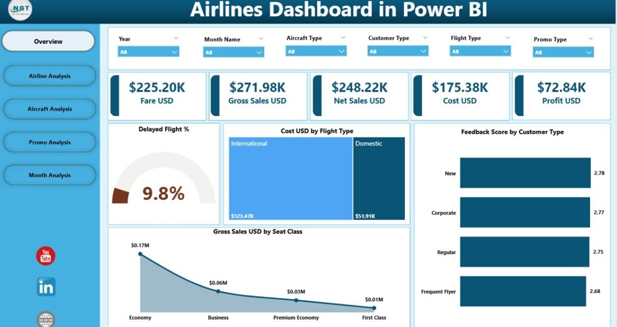
1. Overview Page: How Does the Dashboard Give a Quick Summary?
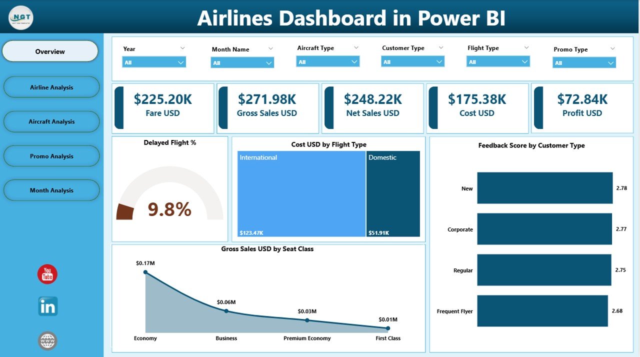
The Overview Page is the main screen of the Airlines Dashboard. It displays all major KPIs for quick understanding. It includes:
Four KPI Cards
These cards highlight the most important numbers:
-
Delayed Flight %
-
Cost (USD) by Flight Type
-
Feedback Score by Customer Type
-
Gross Sales (USD) by Seat Class
These KPI cards help managers understand the big picture instantly.
Important Charts
The page includes four charts that explain:
-
How many flights got delayed
-
How costs are distributed across flight types
-
How different customer groups rate their experience
-
How seat class influences gross sales
With these insights, leaders get a clear picture of performance without diving into the detailed pages.
Click to Purchases Airlines Dashboard in Power BI
2. Airline Analysis: How Do Airlines Perform Individually?
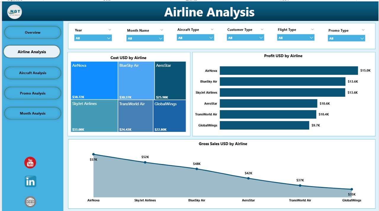
The Airline Analysis Page helps compare the performance of different airlines. It includes three key visuals:
-
Cost (USD) by Airline
-
Gross Sales (USD) by Airline
-
Profit (USD) by Airline
This page helps answer questions such as:
-
Which airline generates the highest sales?
-
Which airline has high costs but low profits?
-
Which airline performs best across all KPIs?
When airlines operate multiple brands or partner airlines, this page becomes extremely valuable.
3. Aircraft Analysis: Which Aircraft Types Perform Best?
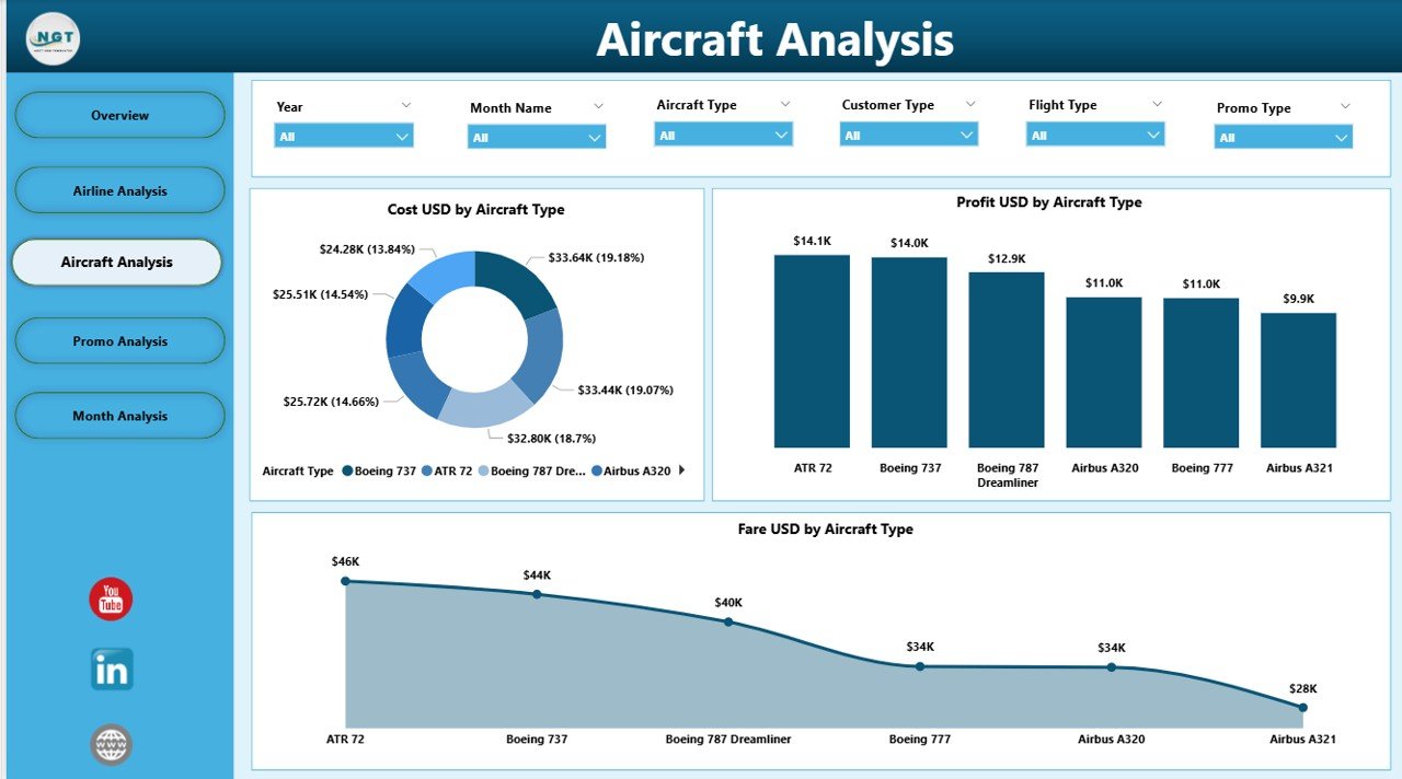
Different aircraft types have different fuel consumption, maintenance needs, seating capacity, and operational costs. Because of these differences, managers must know which aircraft deliver the highest performance.
The Aircraft Analysis Page includes:
-
Cost (USD) by Aircraft Type
-
Profit (USD) by Aircraft Type
-
Fare (USD) by Aircraft Type
This page helps airlines understand:
-
Which aircraft type costs the most to operate
-
Which aircraft brings the highest profits
-
Which aircraft type offers better fare value
These insights help in fleet planning, aircraft maintenance, and route allocation.
4. Promo Analysis: Which Promotions Work Best?
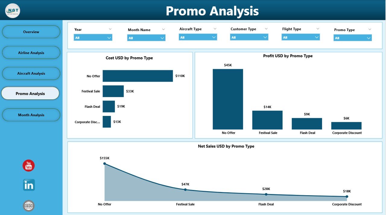
Airlines run multiple promotions to attract customers. Some promos increase sales, while others may reduce profits. Because of this, the Promo Analysis Page is extremely important.
This page includes:
-
Cost (USD) by Promo Type
-
Profit (USD) by Promo Type
-
Net Sales (USD) by Promo Type
Managers can quickly check:
-
Which promo attracts more customers
-
What type of promo increases profits
-
Which promotion costs too much
-
How promo strategies influence sales
As a result, airlines can optimize marketing and run smarter campaigns.
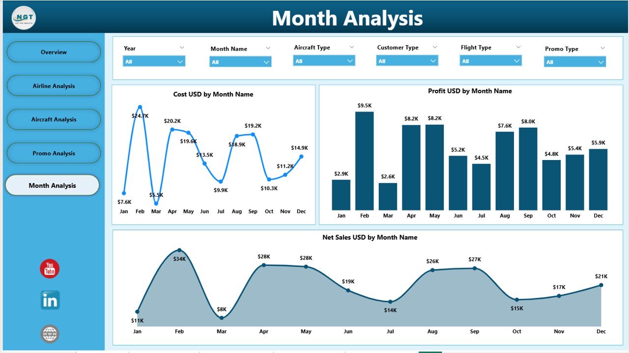
5. Monthly Trends: How Do KPIs Change Every Month?
Airline performance changes month to month due to:
-
Holidays
-
Seasonal travel peaks
-
Fuel price changes
-
Weather conditions
-
Business vs. leisure travel demand
The Monthly Trends Page includes:
-
Cost (USD) by Month
-
Profit (USD) by Month
-
Net Sales (USD) by Month
It helps airlines understand:
-
Peak seasons
-
Low-demand periods
-
Monthly variability
-
Sales and cost patterns
Teams can use this information for forecasting and budgeting.
Why Should Airlines Use Power BI for Their Dashboard?
Airlines choose Power BI because it offers several benefits:
✔ Real-time insights
Data refreshes automatically and shows updated results.
✔ Interactive visuals
Users can click, filter, and explore data.
✔ Easy integration
Power BI connects with Excel, databases, APIs, and cloud systems.
✔ Fast decision-making
Clear insights help teams act quickly.
✔ Customization
Dashboards can be adjusted based on business needs.
✔ Cost-effective
Compared to enterprise BI tools, Power BI is more affordable.
Advantages of Using an Airlines Dashboard in Power BI
An Airlines Dashboard provides several advantages that help improve operations, customer experience, and profitability.
1. Faster Decision-Making
Managers access real-time insights and take immediate action.
2. Clear Visibility of KPIs
All performance indicators sit in one place for easy tracking.
3. Better Customer Experience
Customer feedback and seat class analysis help airlines improve services.
4. Improved Operational Efficiency
The dashboard highlights flight delays, costs, and aircraft performance.
5. Profit Optimization
By tracking costs, sales, and promotions, airlines can improve their profit margin.
6. Better Resource Allocation
Airlines allocate aircraft, crew, and budget more effectively.
7. Strong Competitive Advantage
Access to faster, clearer insights helps airlines stay ahead of competitors.
What KPIs Should Airlines Track in Power BI?
Airlines must track several KPIs to improve performance. Some of the most important include:
-
On-time performance
-
Delayed flight ratio
-
Cost per flight
-
Revenue per seat
-
Gross sales
-
Customer satisfaction score
-
Profit margin
-
Aircraft utilization
-
Load factor
-
Promo ROI
The dashboard displays these KPIs visually, making analysis simple.
How Does an Airlines Dashboard Improve Customer Experience?
Click to Purchases Airlines Dashboard in Power BI
Customer satisfaction is a core part of airline success. The dashboard improves customer experience by:
-
Showing feedback scores by customer type
-
Highlighting service issues
-
Tracking seat class performance
-
Identifying poor-performing routes
-
Helping airlines design better promotions
Because of this, airlines can create a better flying experience.
Best Practices for Using an Airlines Dashboard in Power BI
To get the best results, airlines must follow certain best practices.
1. Use Clean and Accurate Data
A dashboard is only useful when the data is correct.
2. Update Data Frequently
Regular refreshes ensure real-time decision-making.
3. Keep Visuals Simple
Use clear charts and avoid clutter.
4. Use Filters and Slicers
Allow users to explore data by month, airline, aircraft type, and more.
5. Automate the Data Flow
Connect Power BI to live data sources to save manual effort.
6. Focus on Actionable Insights
Highlight KPIs that drive decisions, not vanity metrics.
7. Review Dashboard Performance
Check loading speed and file size for smooth usage.
8. Protect Sensitive Data
Use Power BI row-level security (RLS) where needed.
9. Train Teams
Ensure users understand how to read, filter, and analyze the dashboard.
10. Continuously Improve the Dashboard
Add new KPIs and pages as business needs evolve.
Conclusion
An Airlines Dashboard in Power BI empowers airlines with real-time insights, clear data visualization, and powerful decision-making support. It simplifies complex aviation data and helps managers understand costs, sales, delays, aircraft performance, and customer satisfaction. With its five-page structure—Overview, Airline Analysis, Aircraft Analysis, Promo Analysis, and Monthly Trends—the dashboard becomes a complete solution for modern airline management.
Power BI makes it easier for organizations to analyze performance, optimize operations, improve customer experience, and increase profitability. When airlines use the dashboard smartly, they gain a strong competitive edge.
Frequently Asked Questions
1. What is an Airlines Dashboard in Power BI?
It is a visual analytics tool that tracks airline performance metrics such as delays, costs, profits, customer feedback, and monthly trends using Power BI visuals.
2. Who can use an Airlines Dashboard?
Airline managers, finance teams, marketing teams, operations managers, customer service leaders, data analysts, and aviation consultants can use the dashboard.
3. Why should airlines use Power BI?
Power BI offers real-time insights, interactive visuals, easy integration, automation, and cost-effective reporting compared to traditional tools.
4. What KPIs can airlines track in this dashboard?
KPIs include delayed flights, costs, revenue, profit, customer feedback, aircraft type performance, and promo effectiveness.
5. Can the dashboard work with Excel data?
Yes. Power BI connects easily with Excel, making it ideal for aviation teams who manage data in spreadsheets.
6. Can the dashboard be customized?
Absolutely. You can add more KPIs, pages, data sources, visuals, and filters based on your airline’s needs.
7. Does the dashboard support real-time data?
Yes, if connected to a live database or API, it can update automatically.
Visit our YouTube channel to learn step-by-step video tutorials
