Managing airport operations involves handling thousands of flights, multiple airlines, regional traffic patterns, baggage handling issues, and frequent delays. However, when data remains scattered across spreadsheets or systems, decision-making becomes slow and unclear. That is exactly why an Airports Dashboard in Excel becomes a powerful and practical solution.
In this detailed guide, you will learn what an Airports Dashboard in Excel is, how it works, why airports and aviation teams need it, and how each dashboard page supports data-driven decisions. Moreover, you will explore its advantages, best practices, and frequently asked questions. By the end of this article, you will clearly understand how this ready-to-use Excel dashboard helps improve airport performance, reduce delays, and enhance operational visibility.
Click to Purchases Airports Dashboard in Excel
What Is an Airports Dashboard in Excel?
An Airports Dashboard in Excel is an interactive, visual reporting tool designed to track and analyze key airport performance metrics using structured data and pivot-based charts.
Instead of reviewing raw flight logs or complex reports, this dashboard converts airport data into easy-to-understand visuals such as charts, cards, and slicer-driven views. As a result, airport managers, operations teams, and analysts can monitor performance instantly.
Because the dashboard is built in Excel, it offers flexibility, familiarity, and easy customization without the need for advanced software.
Why Do Airports Need a Dashboard in Excel?
Airport operations involve continuous monitoring of flights, airlines, regions, and airport codes. However, without a centralized dashboard, teams face several challenges.
Common issues include:
-
Difficulty tracking flight volumes across airlines and regions
-
Limited visibility into baggage issues
-
Lack of clarity on delay patterns
-
Time-consuming manual reporting
-
Poor comparison across months and locations
Therefore, an Airports Dashboard in Excel solves these challenges by presenting all critical metrics in one structured file. Consequently, teams make faster and more confident decisions.
Key Features of the Airports Dashboard in Excel
This Airports Dashboard in Excel comes as a ready-to-use solution with well-structured analytical pages and intuitive navigation.
Page Navigator for Easy Access
The dashboard includes a Page Navigator located on the left side of the workbook. This feature allows users to move quickly between different analysis pages with a single click.
As a result, users avoid scrolling or searching through worksheets.
How Many Pages Are Available in the Airports Dashboard?
The Airports Dashboard in Excel contains 5 analytical pages, each designed to answer a specific business question. Additionally, it includes a support sheet and a data sheet to maintain structure and scalability.
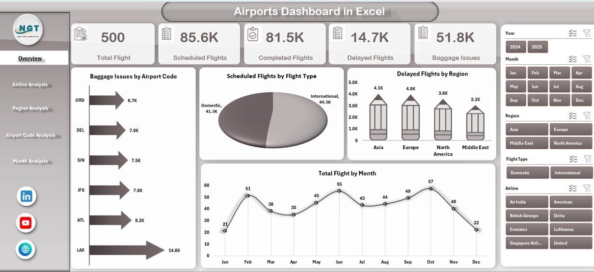
What Does the Overview Page Show in the Airports Dashboard?
Overview Page – High-Level Airport Performance

The Overview Page acts as the main control center of the dashboard.
On this page:
-
A right-side slicer allows filtering data easily
-
Five KPI cards summarize key metrics instantly
-
Four insightful charts highlight overall performance trends
Charts Available on the Overview Page
-
Baggage Issues by Airport Code
This chart helps identify which airport codes experience the most baggage-related issues. -
Scheduled Flight by Flight Type
This visual shows how scheduled flights split across different flight types. -
Delayed Flight by Region
This chart highlights regional delay patterns and operational bottlenecks. -
Total Flight by Month
This monthly trend chart helps identify seasonal peaks and traffic variations.
Because all charts are pivot-based, users can filter results dynamically using slicers.
Click to Purchases Airports Dashboard in Excel
How Does Airline Analysis Help Airport Decision-Making?
Airline Analysis Page – Airline-Wise Performance Tracking
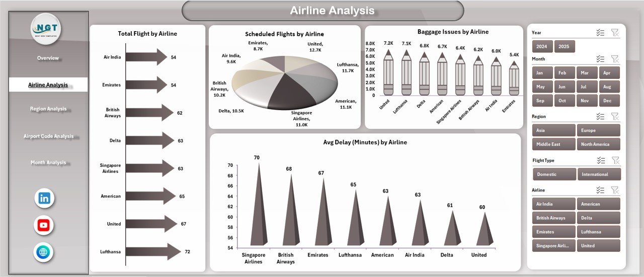
The Airline Analysis Page focuses on evaluating airline performance within the airport ecosystem.
On this page:
-
A right-side slicer enables airline-level filtering
-
Four airline-specific charts provide comparative insights
Charts Included in Airline Analysis
-
Total Flight by Airline
Shows total flight volume handled by each airline. -
Scheduled Flight by Airline
Highlights planned operations for each airline. -
Baggage Issues by Airline
Helps identify airlines contributing to higher baggage complaints. -
Average Delay by Airline
Reveals delay trends and service quality differences.
Therefore, airport authorities can engage airlines using factual, performance-driven insights.
Why Is Region Analysis Important in an Airports Dashboard?
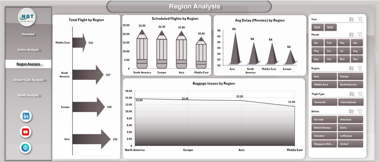
Region Analysis Page – Regional Performance Visibility
The Region Analysis Page evaluates airport operations from a geographical perspective.
On this page:
-
A right-side slicer enables region-level filtering
-
Four charts show region-based comparisons
Charts Available in Region Analysis
-
Total Flight by Region
Displays total flight distribution across regions. -
Scheduled Flight by Region
Highlights planned traffic by geographical area. -
Baggage Issues by Region
Identifies regions with frequent baggage handling problems. -
Average Delay by Region
Helps understand delay patterns caused by regional factors.
As a result, airport planners can optimize resources and schedules region-wise.
How Does Airport Code Analysis Improve Operational Control?
Airport Code Analysis Page – Airport-Level Insights
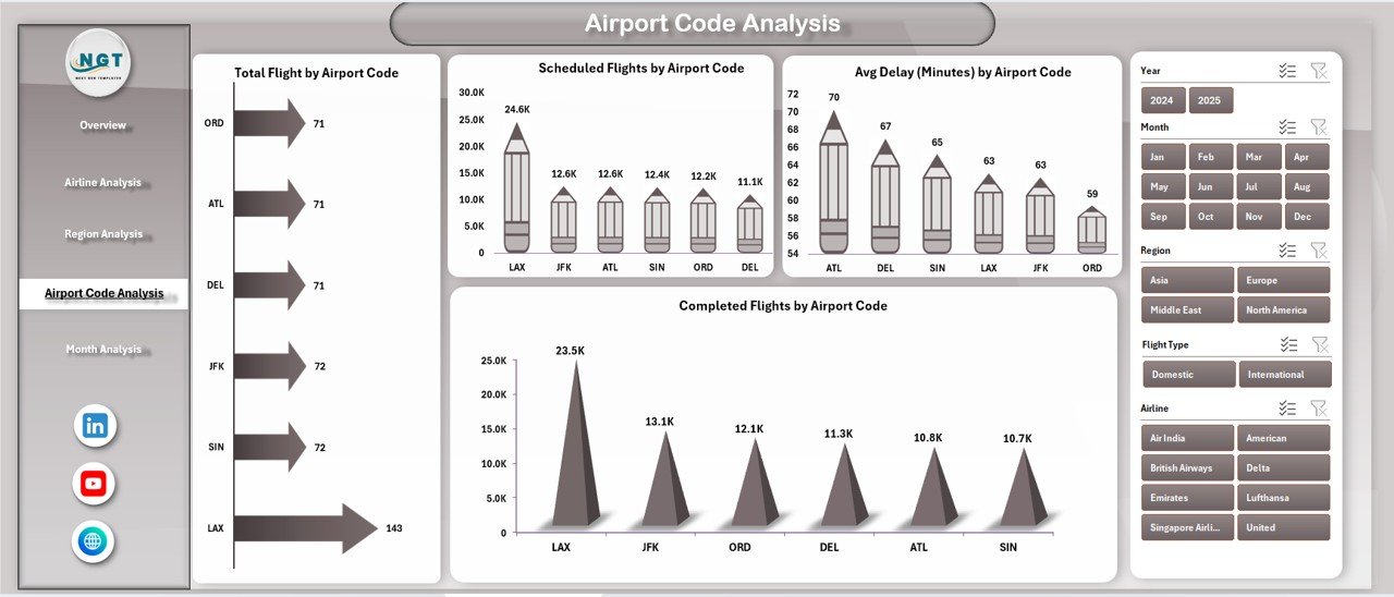
The Airport Code Analysis Page focuses on performance at the airport code level.
On this page:
-
A right-side slicer allows airport code selection
-
Four charts provide detailed operational insights
Charts Included in Airport Code Analysis
-
Total Flight by Airport Code
Shows flight volume handled by each airport code. -
Scheduled Flight by Airport Code
Highlights planned operations per airport. -
Completed Flight by Airport Code
Displays execution efficiency across locations. -
Average Delay by Airport Code
Helps identify airports requiring process improvement.
Therefore, airport authorities can prioritize investments and operational improvements more effectively.
Click to Purchases Airports Dashboard in Excel
What Insights Does the Month Analysis Page Provide?
Month Analysis Page – Time-Based Performance Trends

The Month Analysis Page focuses on seasonal and time-based trends.
On this page:
-
A right-side slicer enables month selection
-
Three monthly trend charts reveal performance patterns
Charts Available in Month Analysis
-
Scheduled Flight by Month
Helps identify peak scheduling periods. -
Baggage Issues by Month
Reveals seasonal baggage handling challenges. -
Delayed Flight by Month
Highlights months with higher operational stress.
Consequently, planning teams can anticipate issues before they occur.
What Is the Role of the Support Sheet?
The Support Sheet works behind the scenes to maintain dashboard stability.
It typically includes:
-
Helper columns
-
Calculated fields
-
Lookup values
-
Pivot-ready structures
Because of this separation, users avoid accidental formula changes.
Why Is the Data Sheet Critical in the Airports Dashboard?
Data Sheet – The Backbone of the Dashboard
The Data Sheet stores all raw airport data used in the dashboard.
It usually includes:
-
Flight details
-
Airline information
-
Airport codes
-
Regions
-
Flight status
-
Baggage issues
-
Delay metrics
-
Date and month fields
Since all visuals rely on this sheet, users can update the dashboard simply by adding new records.
Advantages of an Airports Dashboard in Excel
Using an Airports Dashboard in Excel offers several strong benefits.
Key Advantages
-
Centralizes all airport performance data
-
Reduces manual reporting effort
-
Improves visibility across airlines and regions
-
Enables quick month-over-month comparisons
-
Supports pivot-based analysis without complex tools
-
Enhances data-driven decision-making
-
Works offline without cloud dependency
-
Easy to customize for different airports
Therefore, Excel remains a powerful and accessible analytics platform.
Who Can Use an Airports Dashboard in Excel?
This dashboard suits multiple roles across the aviation ecosystem.
Ideal Users
-
Airport Operations Managers
-
Airline Operations Teams
-
Aviation Analysts
-
Ground Handling Teams
-
Airport Authorities
-
Planning and Strategy Teams
-
Excel and BI Professionals
Because the dashboard uses familiar Excel features, adoption remains quick.
Best Practices for the Airports Dashboard in Excel
To get the maximum value from the dashboard, follow these best practices.
Data Best Practices
-
Maintain consistent airport codes and airline names
-
Avoid manual edits in pivot areas
-
Refresh pivot tables after data updates
-
Validate data before uploading
Dashboard Usage Best Practices
-
Use slicers instead of filters
-
Review monthly trends regularly
-
Compare airline performance side by side
-
Monitor baggage issues weekly
-
Track delay trends before peak seasons
By following these practices, you ensure accuracy and reliability.
How Does This Dashboard Support Business Decisions?
Click to Purchases Airports Dashboard in Excel
An Airports Dashboard in Excel supports decision-making by transforming raw data into insights.
It helps answer questions like:
-
Which airline causes the most delays?
-
Which region faces baggage issues?
-
Which airport code underperforms?
-
Which month requires more staffing?
-
How do scheduled and completed flights compare?
As a result, leadership teams move from assumptions to facts.
How Is This Airports Dashboard Different from Standard Reports?
Unlike static reports, this dashboard:
-
Updates dynamically
-
Supports interactive filtering
-
Shows trends visually
-
Reduces interpretation errors
-
Encourages exploration
Therefore, it delivers far more value than traditional spreadsheets.
Conclusion: Why Choose an Airports Dashboard in Excel?
An Airports Dashboard in Excel is a smart, practical, and cost-effective solution for airport performance tracking. It brings clarity to complex flight data while remaining flexible and easy to use.
With five well-designed analytical pages, interactive slicers, and pivot-based charts, this dashboard empowers airport teams to monitor performance, identify issues, and improve operations confidently.
If you want a structured, professional, and ready-to-use airport analytics solution, this dashboard is an excellent choice.
Frequently Asked Questions (FAQs)
What is an Airports Dashboard in Excel used for?
An Airports Dashboard in Excel tracks flights, airlines, regions, baggage issues, and delays using visual charts and slicers.
Can I update the dashboard with new data?
Yes. You only need to add new records to the Data Sheet and refresh pivot tables.
Does this dashboard require advanced Excel skills?
No. Basic Excel knowledge is enough to use and customize the dashboard.
Are all charts created using pivot tables?
Yes. All visuals rely on pivot tables and pivot charts.
Can I customize this dashboard for my airport?
Yes. You can add KPIs, modify charts, or include additional analysis pages easily.
Is this dashboard suitable for monthly and yearly analysis?
Yes. The Month Analysis page supports time-based trend analysis.
Visit our YouTube channel to learn step-by-step video tutorials
Click to Purchases Airports Dashboard in Excel