Alternative medicine has become a major part of modern healthcare. People now choose therapies such as acupuncture, chiropractic care, naturopathy, Ayurveda, homeopathy, reiki, and massage therapy not only for wellness, but also for pain management, recovery, and long-term health support. Because of this growing demand, clinics and wellness centers must manage more appointments, more practitioners, more treatment types, and more patient expectations than ever before.
However, many alternative medicine businesses still track performance using scattered spreadsheets, manual reports, or disconnected systems. As a result, clinic owners and managers struggle to answer simple but critical questions:
Click to Purchases Alternative Medicine Dashboard in Power BI
-
Which clinic location generates the highest revenue?
-
Which practitioner brings the best satisfaction scores?
-
Which treatment type drives repeat visits and longer sessions?
-
Which months create peak demand and higher costs?
-
Which patients need follow-ups, and how does that impact revenue?
That is exactly why an Alternative Medicine Dashboard in Power BI becomes a game-changer.
This article explains what an Alternative Medicine Dashboard in Power BI is, why it matters, how it works, what insights you can generate, and how to follow best practices while using it. Additionally, you will also learn how the dashboard pages are structured and how each page supports better decisions.
What Is an Alternative Medicine Dashboard in Power BI?
An Alternative Medicine Dashboard in Power BI is an interactive reporting system that converts your clinic data into visual insights. Instead of reading long reports, you monitor performance through charts, KPIs, and slicers that update instantly based on filters.
Because Power BI works with different data sources, you can connect your appointment records, billing, treatment costs, follow-up status, satisfaction ratings, and session duration data into one clean model. Then, you can build a dashboard that tells a clear story about clinic performance.
Most importantly, the dashboard supports fast decision-making. So, you waste less time searching for numbers and you spend more time improving operations, patient experience, and profitability.
Why Do Alternative Medicine Clinics Need a Dashboard?
Alternative medicine clinics work differently than many traditional healthcare setups. You often deal with:
-
Mixed service pricing (packages, memberships, sessions)
-
Practitioner-based performance differences
-
Seasonal demand patterns
-
Follow-up dependent revenue
-
Patient satisfaction driving referrals
-
Treatment cost variations
So, if you do not track all of this properly, growth becomes messy. Moreover, you may lose repeat patients, mismanage scheduling, and increase costs without knowing the reason.
An Alternative Medicine Dashboard in Power BI helps because it allows you to:
-
Track revenue and patient volume in one place
-
Compare locations and practitioners quickly
-
Identify which services create the best outcomes
-
Improve follow-up rates using visible metrics
-
Plan staffing and inventory using month trends
-
Make decisions using facts, not guesses
What Data Do You Need for an Alternative Medicine Dashboard in Power BI?
Before building the dashboard, you should understand what data makes it powerful. While each clinic can add more fields, the most common data usually includes:
Core Clinic Data (Recommended)
-
Appointment Date and Month
-
Clinic Location
-
Practitioner Name
-
Treatment Type
-
Appointment Type (New / Follow-up / Consultation)
-
New Patient Flag (Yes/No)
-
Follow-up Required Flag (Yes/No)
-
Session Duration (Minutes)
-
Treatment Cost
-
Revenue / Charges
-
Patient Satisfaction Rating (1–5 or 1–10)
Because these fields cover patients, services, revenue, cost, and experience, you can build meaningful charts across different pages.
What Are the Key Features of the Alternative Medicine Dashboard in Power BI?
Your Alternative Medicine Dashboard in Power BI includes 5 pages in the Power BI Desktop file. Each page focuses on a specific type of analysis. Additionally, every page includes slicers (filters) so users can drill down by location, practitioner, treatment type, month, appointment type, and more.
Dashboard Pages Included
-
Overview Page
-
Clinic Location Analysis
-
Practitioner Name Analysis
-
Treatment Type Analysis
-
Month Analysis
Now, let’s explore each page and understand what it shows and why it matters.
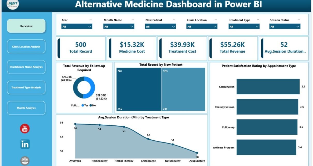
1) Overview Page: What Does the Overview Dashboard Show?
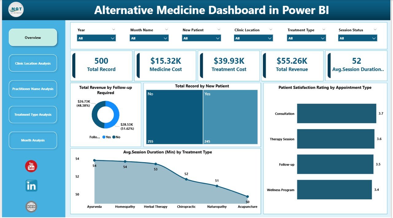
The Overview Page acts as the command center of the full dashboard. It summarizes your clinic’s performance at a glance. Because managers need quick insights daily, this page focuses on key numbers and high-level charts.
Slicers Available on This Page
You can add slicers such as:
-
Month
-
Clinic Location
-
Practitioner Name
-
Treatment Type
-
Appointment Type
-
New Patient (Yes/No)
-
Follow-up Required (Yes/No)
As you change slicers, every visual updates instantly. Therefore, users can analyze performance for any segment in seconds.
Key KPI Cards (5 Cards)
Click to Purchases Alternative Medicine Dashboard in Power BI
This page includes 5 KPI cards. These cards highlight important clinic metrics such as:
-
Total Revenue
-
Total Records (Total Appointments / Visits)
-
New Patient Count
-
Average Satisfaction Rating
-
Average Session Duration
Even if you open the dashboard for just one minute, these cards tell you the health of operations immediately.
Overview Charts (As Provided)
The overview page includes charts such as:
-
Total Revenue by Follow-up Required
-
Total Record by New Patient
-
Patient Satisfaction Rating by Appointment Type
-
Avg. Session Duration by Treatment Type
Why These Charts Matter
-
When you track revenue by follow-up requirement, you see how much revenue depends on continued care. Therefore, you can improve follow-up scheduling and retention.
-
When you track records by new patients, you understand growth and marketing effectiveness.
-
When you compare satisfaction by appointment type, you quickly identify service gaps. For example, if follow-ups score lower, you can improve practitioner consistency.
-
When you check average duration by treatment type, you can plan scheduling blocks better, which improves utilization.
2) Clinic Location Analysis: Which Location Performs Best?
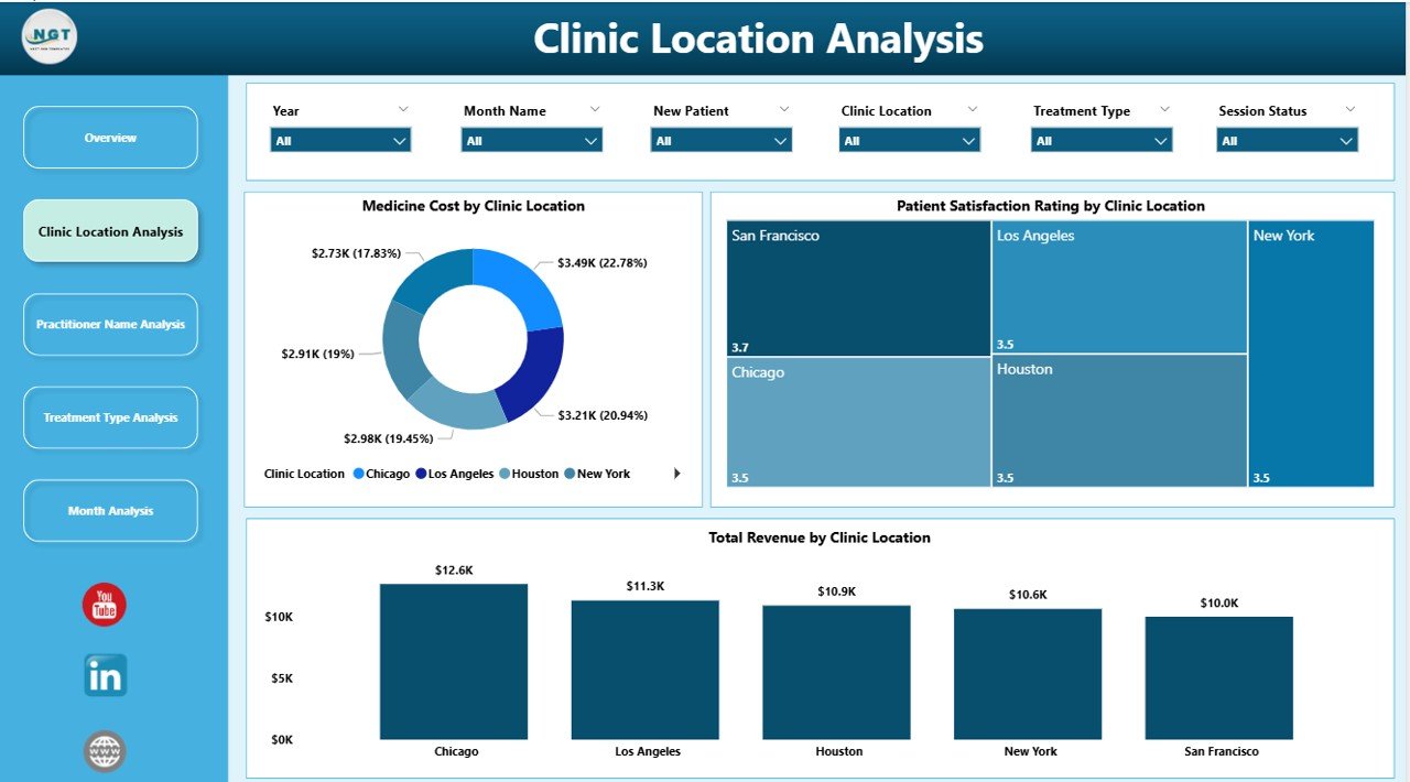
If you operate multiple branches, location decisions affect revenue, staffing, and cost control. That is why the Clinic Location Analysis page focuses entirely on comparing locations.
What This Page Helps You Answer
-
Which clinic location generates the highest revenue?
-
Which clinic location has the most appointments?
-
Which location delivers the best satisfaction ratings?
-
Which location needs operational improvements?
Charts Included (3 Charts)
This page includes these visuals:
-
Total Revenue by Clinic Location
-
Total Record by Clinic Location
-
Patient Satisfaction Rating by Clinic Location
How to Use This Page
-
First, filter the dashboard by month or treatment type.
-
Then, compare locations side-by-side.
-
After that, identify which location needs action.
For example:
-
If a location has high appointments but low satisfaction, you may need training or service changes.
-
If a location has high satisfaction but low records, then you may need marketing support.
-
If a location has high revenue but low records, then premium packages may drive it, which can guide pricing decisions.
3) Practitioner Name Analysis: Who Are Your Top Performers?
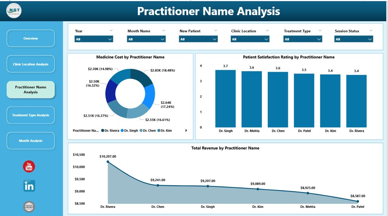
In alternative medicine, practitioner skill and patient trust matter a lot. Because of this, practitioner-level analysis becomes essential for clinic growth.
The Practitioner Name Analysis page shows performance by practitioner so you can measure both financial and service quality outcomes.
What This Page Helps You Answer
-
Which practitioner generates the highest revenue?
-
Which practitioner handles the most visits?
-
Which practitioner receives the best satisfaction ratings?
-
Which practitioner needs coaching or workload adjustment?
Charts Included (3 Charts)
This page includes:
-
Total Revenue by Practitioner Name
-
Total Record by Practitioner Name
-
Patient Satisfaction Rating by Practitioner Name
-
Click to Purchases Alternative Medicine Dashboard in Power BI
Note: Your written text repeats “Total Revenue by Practitioner Name” twice. However, a strong setup uses Revenue, Records, and Satisfaction to give a complete picture.
How This Page Improves Management
-
If one practitioner shows high revenue and high satisfaction, you can replicate their practices across the team.
-
If another practitioner shows high records but low satisfaction, then you can review session quality, patient communication, or follow-up planning.
-
If a practitioner shows low records but high satisfaction, you can improve their appointment allocation and marketing visibility.
Because these insights stay visual, you can act faster and avoid guess-based decisions.
4) Treatment Type Analysis: Which Services Drive Revenue and Cost?
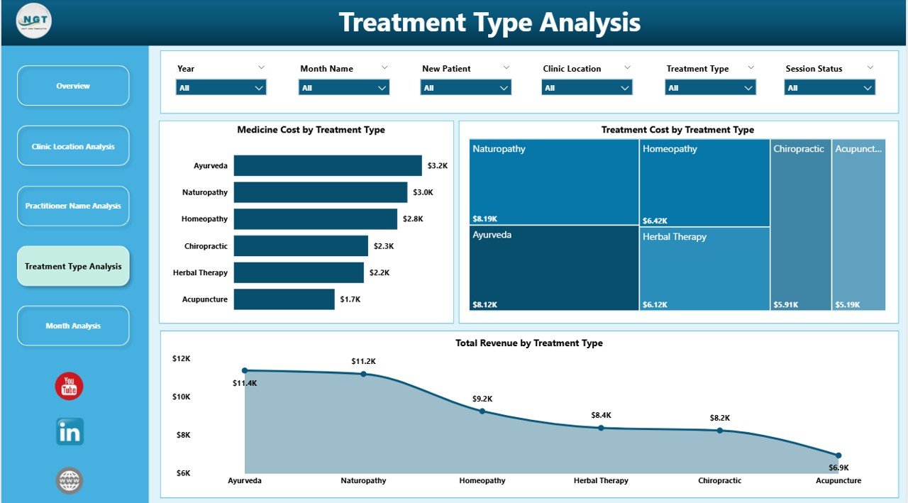
Alternative medicine clinics often offer multiple treatments. However, not every treatment produces the same revenue, time usage, and cost level. Therefore, the Treatment Type Analysis page becomes critical for service planning.
What This Page Helps You Answer
-
Which treatment type generates the most revenue?
-
Which treatment type costs the most to deliver?
-
Which treatments should you promote more?
-
Which treatments create longer sessions and affect scheduling?
Charts Included (3 Charts)
This page includes:
-
Total Revenue by Treatment Type
-
Treatment Cost by Treatment Type
-
Total Record by Treatment Type (recommended for balance)
Your notes mention “Total Revenue by Treatment Type” twice. However, replacing one with Total Records by Treatment Type makes the analysis more useful.
How This Page Supports Better Decisions
-
If a treatment has high revenue and low cost, it becomes a high-profit service. So, you can promote it more.
-
If a treatment has high cost and low revenue, you can review pricing, supplier costs, or time efficiency.
-
If a treatment has high records but moderate revenue, you can create packages to increase revenue per session.
Because this page connects revenue with cost, it supports smarter service strategy.
5) Month Analysis: What Trends Change Over Time?
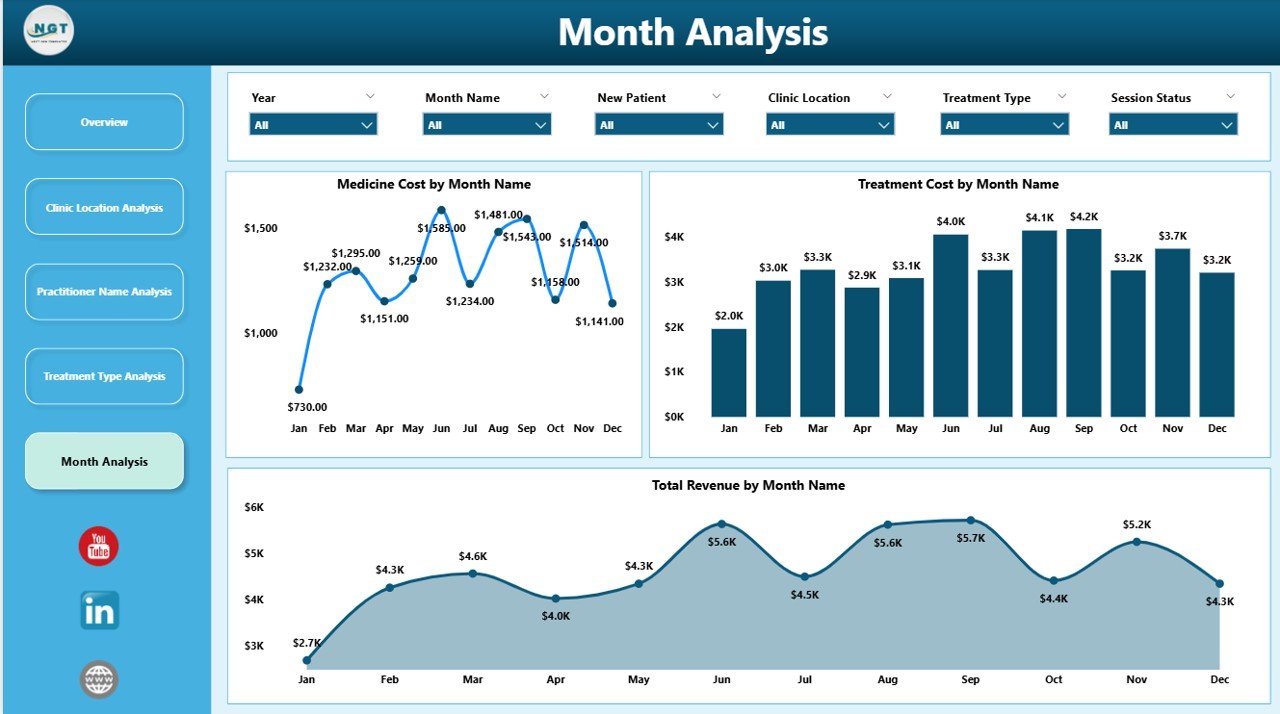
Even the best clinics face seasonal changes. For example, some months bring higher wellness demand while others slow down. Therefore, monthly analysis helps with forecasting, staffing, and budget planning.
The Month Analysis page focuses on time-based patterns so you can understand what changes and why.
What This Page Helps You Answer
-
Which months generate peak revenue?
-
Which months create higher treatment costs?
-
Which months show lower performance so you can plan promotions?
Charts Included (3 Charts)
This page includes:
-
Total Revenue by Month
-
Treatment Cost by Month
-
Total Records by Month (recommended for trend clarity)
Your notes repeat “Total Revenue by Month” twice. However, using Total Records by Month instead improves decision-making.
Why Month Analysis Helps
-
If revenue peaks in certain months, you can schedule more staff and open more slots.
-
If cost increases in certain months, you can plan inventory earlier and negotiate supplier terms.
-
If appointments drop in certain months, you can run promotions and partnerships.
Because Power BI makes month analysis visual, you can spot patterns instantly.
Advantages of an Alternative Medicine Dashboard in Power BI
A dashboard should not just look good. It should create real business improvement. Here are the key advantages of using an Alternative Medicine Dashboard in Power BI:
1) You Save Time on Reporting
You stop building manual weekly reports. Instead, you refresh data and review updated visuals in seconds.
2) You Improve Revenue Tracking
You track revenue by location, practitioner, treatment type, and follow-up needs. Therefore, you can grow revenue with clear focus.
3) You Boost Patient Retention
When you track follow-up required cases and outcomes, you improve retention. As a result, patients return more often and trust increases.
4) You Improve Patient Experience
You track satisfaction ratings by appointment type, location, and practitioner. So, you fix service issues quickly.
5) You Control Costs Better
You track treatment cost by type and month. Therefore, you identify waste and reduce unnecessary expenses.
6) You Make Smarter Staffing Decisions
Because you monitor session duration and total records, you can schedule staff more effectively.
7) You Support Growth Across Multiple Clinics
When you compare locations side-by-side, you see what works best. Then, you replicate the winning strategy across branches.
Best Practices for the Alternative Medicine Dashboard in Power BI
A dashboard becomes powerful only when you build and use it correctly. So, follow these best practices to get the best results.
1) Keep Your Data Clean and Structured
-
Use consistent spellings for clinic locations and treatment types
-
Avoid blank practitioner names
-
Store dates in proper date format
-
Keep revenue and cost as numeric values
Because clean data creates accurate reports, you avoid wrong conclusions.
2) Use Clear Naming for Fields and Measures
Instead of confusing names, use easy names like:
-
Total Revenue
-
Total Visits
-
Avg Satisfaction
-
Avg Session Duration
-
Follow-up Required Count
When names stay clear, users understand reports faster.
3) Build Standard Filters (Slicers) Across Pages
Use the same slicers on each page, such as:
-
Month
-
Location
-
Practitioner
-
Treatment Type
-
Appointment Type
As a result, users get a smooth experience and do not feel lost.
4) Focus on a Few Strong KPIs
Too many KPIs create confusion. So, focus on what matters:
-
Revenue
-
Visits
-
Satisfaction
-
Session duration
-
Cost
Then, add more only when you need it.
5) Use Consistent Visual Formatting
-
Keep the same colors for similar metrics
-
Use the same chart types across pages
-
Keep headings consistent
-
Use readable labels and titles
Because consistency improves readability, your dashboard becomes easier to use.
6) Add Drill-Down and Tooltips for Deeper Insight
When you add drill-down:
-
Users can click on a month and open deeper trends
-
Users can click on a location and view practitioner details
Also, tooltips can show extra data without clutter.
7) Refresh Data on a Fixed Schedule
If you refresh data weekly or daily, reports stay reliable. Therefore, decision-makers trust the numbers.
8) Track Follow-up Performance as a Core Metric
Follow-up drives alternative medicine growth. So, always track:
-
Follow-up required count
-
Follow-up completed rate
-
Revenue impact of follow-up
When you treat follow-ups as a KPI, you improve retention and revenue.
How to Use This Dashboard in Real Life (Step-by-Step)
Click to Purchases Alternative Medicine Dashboard in Power BI
Even if you are new to Power BI, you can use this dashboard easily:
-
Load your clinic dataset into Power BI Desktop
-
Validate your data types (date, number, text)
-
Build relationships if you use multiple tables
-
Create measures for revenue, cost, average rating, duration
-
Design the 5 pages using the charts described above
-
Add slicers for quick filtering
-
Test filters to confirm visuals update correctly
-
Publish to Power BI Service if you want online sharing
-
Share with team members based on roles and access needs
Because Power BI supports interactive reporting, every user can explore insights without needing Excel formulas.
Conclusion
An Alternative Medicine Dashboard in Power BI helps clinics and wellness centers track revenue, cost, patient satisfaction, session duration, and clinic performance across multiple dimensions. Moreover, it brings all key metrics into one visual system, which improves decision-making and saves time.
With the 5-page structure—Overview, Clinic Location Analysis, Practitioner Name Analysis, Treatment Type Analysis, and Month Analysis—you can understand performance from every angle. Therefore, you can boost revenue, improve patient experience, plan staffing better, and grow with confidence.
If you want to manage an alternative medicine business professionally, then you should not depend on manual reporting. Instead, use Power BI dashboards to turn your clinic data into real action.
Frequently Asked Questions (FAQs)
What is an Alternative Medicine Dashboard in Power BI used for?
An Alternative Medicine Dashboard in Power BI helps clinics track revenue, appointments, follow-ups, satisfaction ratings, costs, and session duration using interactive visuals and filters.
Can I use this dashboard for a single clinic location?
Yes. Even if you have one clinic, you can still track practitioner performance, treatment trends, monthly patterns, and patient satisfaction effectively.
Which KPIs should I track in an alternative medicine clinic dashboard?
You should track:
-
Total revenue
-
Total visits
-
New patient count
-
Follow-up required count
-
Average satisfaction rating
-
Average session duration
-
Treatment cost
How does this dashboard improve patient retention?
The dashboard highlights follow-up requirements and related revenue impact. Therefore, you can focus on scheduling and completing follow-ups, which improves retention.
Do I need coding skills to use Power BI dashboards?
No. You can build and use dashboards with drag-and-drop visuals. However, learning simple DAX measures helps you create stronger KPIs.
How often should I refresh the data in Power BI?
It depends on your operations. Most clinics refresh daily or weekly. However, if you manage high volume, daily refresh works best.
Can I share this dashboard with my team?
Yes. You can share it through Power BI Service. Moreover, you can control access based on roles so the right people see the right data.
Which chart types work best for this dashboard?
Bar charts, column charts, line charts, and cards work best. These visuals stay easy to understand and work well with Power BI slicers.
Can I add more pages to this dashboard later?
Yes. You can expand it anytime. For example, you can add:
-
Patient demographics analysis
-
Package and membership analysis
-
Marketing referral source analysis
-
Repeat visit analysis
How do I ensure the dashboard stays accurate?
Keep your data clean, use consistent naming, validate measures, and refresh on schedule. Additionally, you should review outliers monthly to ensure quality.
Visit our YouTube channel to learn step-by-step video tutorials