Introduction
The API Development Dashboard in Excel is a comprehensive, ready-to-use tool designed to help teams effectively track, analyze, and visualize API metrics. By simply updating your data in the Data sheet and refreshing from the Excel Ribbon, the entire dashboard updates instantly, providing meaningful insights through dynamic charts and slicers.
Key Features of API Development Dashboard in Excel
- Interactive dashboard with multiple sheet tabs for focused analysis.
- Easy data updating through a centralized Data sheet.
- Various chart types including 3D column charts, line charts, bar charts, and stylish visualizations.
- Multiple slicers for filtering insights quickly and intuitively.
- Dynamic pivot tables powering charts, allowing for seamless data refresh.
- Capability to track API metrics such as performance, quality, cost, and monthly trends.
Dashboard Pages Explanation
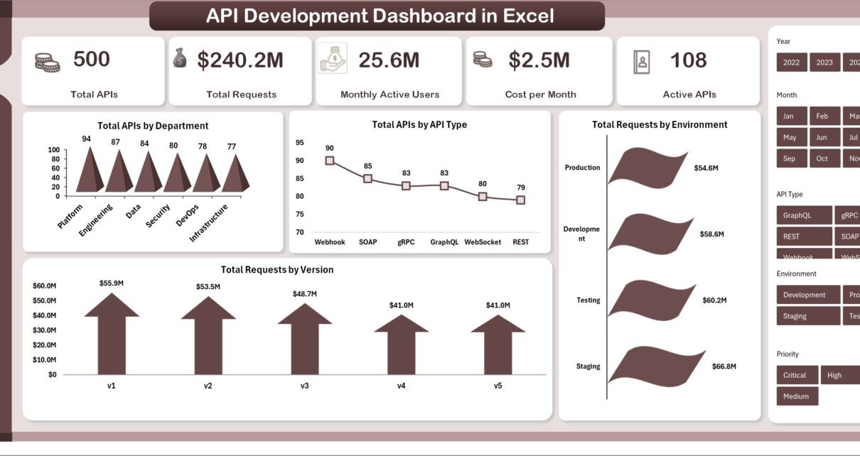
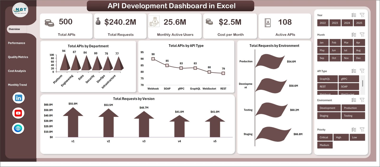
1. Overview Sheet Tab
This sheet provides a high-level snapshot of your API ecosystem. At the top, key cards summarize vital statistics for quick reference. Multiple slicers are integrated for filtering the data reflected in charts.
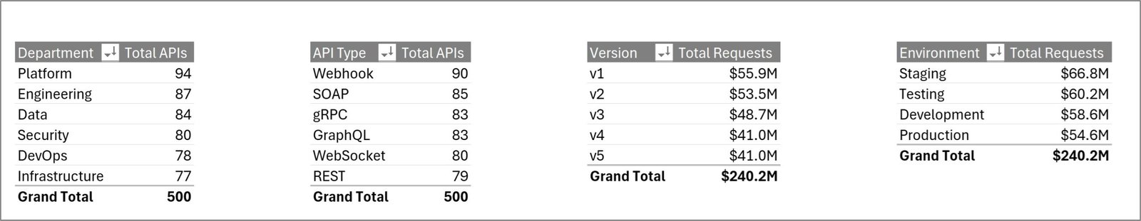
- Total APIs by Department (3D Column Chart): Visualizes the distribution of APIs across different departments to highlight contribution and ownership.
- Total APIs by API Type (Line Chart): Tracks the count of APIs segmented by types, indicating trends over time or categories.
- Total Requests by Environment (Bar Chart): Displays request volumes across various environments, such as development, staging, and production.
- Total Requests by Version by Ops Manager: Provides insights into how API versions are performing under different operations managers.
API Development Dashboard in Excel
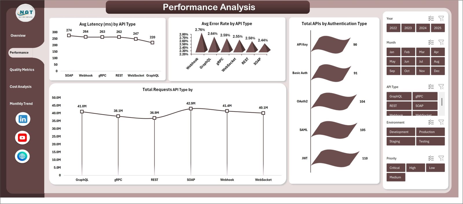
2. Performance Analysis Sheet Tab
This sheet offers detailed performance metrics with visualizations designed to identify latency, errors, and traffic by API types and authentication methods.
- Avg Latency (ms) by API Type (Line Chart): Tracks average response times, helping to identify slower APIs.
- Avg Error Rate by API Type (3D Column Chart): Highlights APIs with higher error rates to focus troubleshooting efforts.
- Total Requests by API Type (Column Chart): Displays volume of requests to understand usage patterns by API type.
- Total APIs by Authentication Type (Bar Chart): Breaks down APIs by their authentication mechanism to review security implementations.
Performance Analysis Sheet Tab
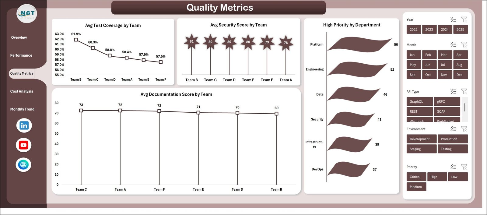
3. Quality Metrics Sheet Tab
This sheet assesses the quality with various charts showcasing test coverage, security, priority issues, and documentation evaluation by team or region.
- Avg Test Coverage by Team (Line Chart): Shows average testing coverage to gauge testing effectiveness per team.
- Avg Security Score by Team Region (Stylish Column Chart): Visualizes security compliance scores categorized by geographic regions.
- High Priority by Department (Bar Chart): Identifies departments with the most high-priority issues needing attention.
- Avg Documentation Score by Team (Line Chart): Measures documentation quality to ensure comprehensive API specs and guides.
Quality Metrics Sheet Tab
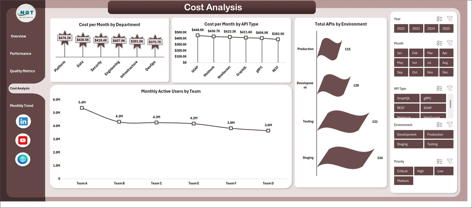
4. Cost Analysis Sheet Tab
This tab helps monitor cost-related metrics by department, API types, user activity, and environment allocation.
- Cost per Month by Department (Stylish Column Chart): Breaks down monthly costs by department to track budget adherence.
- Cost per Month by API Type (Line Chart): Displays cost trends associated with different API types.
- Monthly Active Users by Team (Line Chart): Tracks active user engagement per team to understand usage impact.
- Total APIs by Environment (Bar Chart): Measures API distribution across environments supporting cost allocation.
Cost Analysis Sheet Tab
5. Monthly Trends Sheet Tab
Focuses on identifying monthly fluctuations in API counts, priority issues, and latency to support trend analysis.
- Total APIs by Month (Stylish Column Chart): Visualizes growth or decline in APIs month over month.
- High Priority by Month (3D Column Chart): Tracks monthly high-priority issues to spot spikes in critical problems.
- Avg Latency (ms) by Month (Bar Chart): Monitors latency trends to detect performance degradations over time.
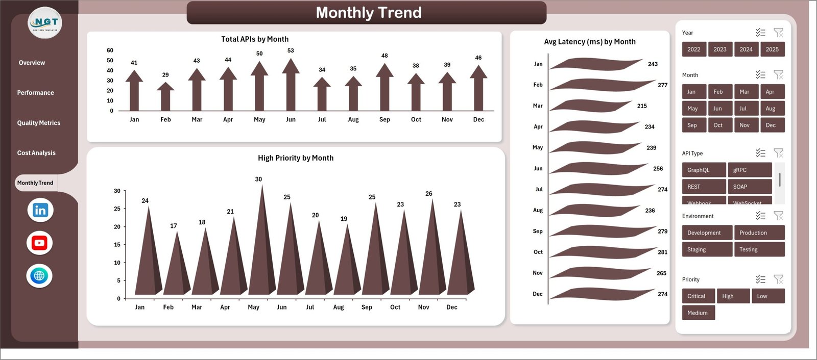
Monthly Trends Sheet Tab
6. Data Sheet Tab
This is the central data repository. All data must be added here in the prescribed format. The dashboards depend entirely on this sheet’s accuracy and structure.

Data Sheet tab
7. Support Sheet
This sheet houses multiple pivot tables that drive the entire dashboard dynamically. After updating data in the Data sheet, clicking ‘Refresh All’ in the Data tab of Excel Ribbon recalculates all pivot tables and charts. Typically, this sheet is kept hidden for clarity.
Support sheet tab
Advantages of API Development Dashboard in Excel
- User-Friendly Interface: Familiar Excel environment allows easy adoption by all team members.
- Centralized Data Management: Single Data sheet reduces errors and simplifies updates.
- Dynamic Visualization: Various charts and slicers help reveal insights quickly.
- Cost-Effective: No need for expensive third-party BI tools.
- Customizable: Easily adaptable to different API metrics and organizational needs.
Opportunities for Improvement
- Integrate VBA automation for even smoother data refreshing and alerts.
- Add drill-down capabilities for deep dives into API performance details.
- Include more granular role-based access controls for sensitive data protection.
- Enable export options to various formats like PDF or CSV directly from the dashboard.
Best Practices
- Regularly update data in the Data sheet to keep dashboard insights accurate.
- Use slicers thoughtfully to analyze specific segments without overwhelming the visuals.
- Keep the Support sheet hidden but backed up for pivot table health.
- Validate data inputs to avoid discrepancies in charts.
- Leverage the dashboard to drive regular API review meetings and decisions.
FAQs
How do I update the data in the API Development Dashboard in Excel?
Simply enter or modify your data in the Data sheet tab following the existing format, then click ‘Refresh All’ under the Data tab in the Excel Ribbon to update all pivot tables and charts.
Can I customize the dashboard charts?
Yes, the dashboard is fully customizable. You can edit or add charts and pivot tables as needed using Excel’s features.
Is this dashboard suitable for large datasets?
While Excel can handle moderate-sized datasets effectively, extremely large datasets might slow performance. For very large data, consider using dedicated BI tools or databases integrated with Excel.
Can I share this dashboard with my team?
Yes, the file can be shared via email or shared drives. Ensure everyone understands how to refresh data and avoid simultaneous edits.
Conclusion
The API Development Dashboard in Excel serves as a powerful and accessible tool to monitor and analyze API health and usage across various dimensions. Its intuitive design, dynamic charts, and straightforward data management make it an excellent choice for API teams looking to optimize performance, quality, and cost management without investing in complex software. Get started by updating your data sheet and experience real-time insights at your fingertips!
Learn more about Excel BI tools from Microsoft Excel Support.
Visit our YouTube channel to watch the demo: Youtube.com/@NextGenTemplates