Modern businesses run on APIs. Every mobile app, SaaS product, fintech solution, and e-commerce platform depends on APIs. However, many teams still track API performance in scattered Excel sheets. As a result, leaders struggle to measure uptime, response time, error rate, and deployment success.
So, how can you track API performance in one structured and visual system?
The answer is simple.
You need an API Development KPI Dashboard in Power BI.
Click to Purchases API Development KPI Dashboard in Power BI
This ready-to-use dashboard captures data from Excel and transforms it into dynamic visuals, KPI indicators, MTD and YTD comparisons, and previous year benchmarking. Therefore, API teams can monitor performance, improve stability, and make faster decisions.
In this detailed guide, you will learn:
-
What an API Development KPI Dashboard in Power BI is
-
Why API teams need it
-
A complete explanation of all 3 dashboard pages
-
How the Excel data structure works
-
Advantages of API Development KPI Dashboard in Power BI
-
Best Practices for the API Development KPI Dashboard
-
Frequently Asked Questions with Answers
Let us explore everything step by step.
What Is an API Development KPI Dashboard in Power BI?
An API Development KPI Dashboard in Power BI is a structured performance monitoring solution designed for API teams, DevOps engineers, and technology leaders.
It helps you:
-
Track API availability and uptime
-
Monitor response time and latency
-
Measure deployment success rate
-
Compare Actual vs Target performance
-
Analyze Month-to-Date (MTD) and Year-to-Date (YTD) metrics
-
Benchmark current performance against previous year
Instead of checking multiple reports, you get everything in one interactive Power BI file.
Moreover, since the dashboard connects with Excel, you can easily update data without changing the report structure.
Why Do API Teams Need a KPI Dashboard?
Click to Purchases API Development KPI Dashboard in Power BI
API environments change quickly. New features launch every month. Traffic increases every quarter. Meanwhile, customers expect zero downtime.
However, without structured monitoring:
-
Teams miss performance bottlenecks
-
Leaders fail to track SLA compliance
-
Error rates increase unnoticed
-
Deployment failures create production risks
Therefore, you must track API KPIs consistently.
A Power BI dashboard solves this problem because:
-
It centralizes all metrics
-
It shows performance visually
-
It highlights target gaps instantly
-
It supports drill-through analysis
As a result, decision-makers gain clarity and confidence.
What Are the Key Features of the API Development KPI Dashboard in Power BI?
This dashboard includes 3 powerful pages. Each page plays a specific role in performance tracking.
Let us understand them one by one.
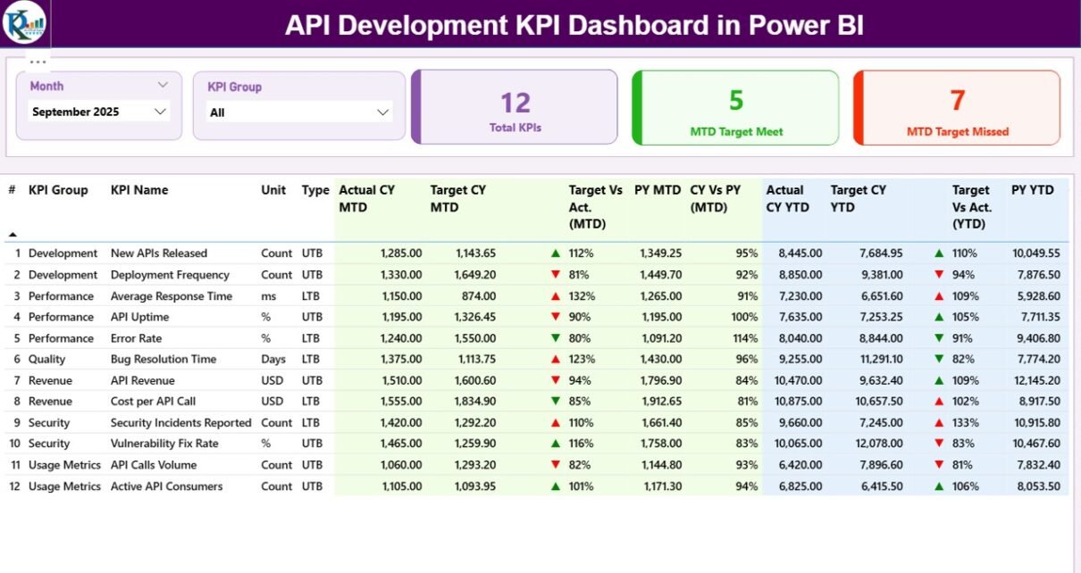
1️⃣ What Does the Summary Page Show?
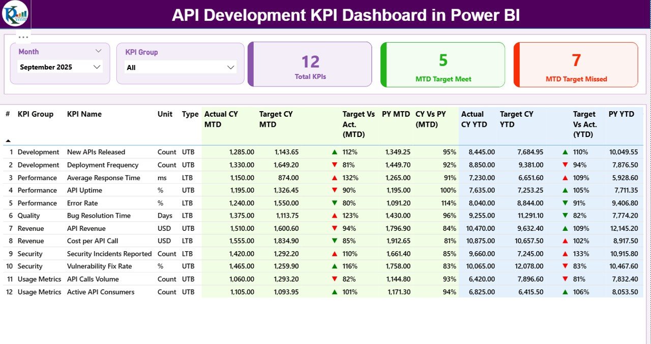
The Summary Page acts as the main control center.
Here, you can see:
Top Section – Interactive Slicers
-
Month Slicer – Select reporting month
-
KPI Group Slicer – Filter by API category
Because of these slicers, you can instantly analyze specific KPI groups such as:
-
Performance
-
Reliability
-
Security
-
Deployment
-
Scalability
KPI Cards – Quick Performance Overview
The dashboard shows three important KPI cards:
-
Total KPIs Count
-
MTD Target Meet Count
-
MTD Target Missed Count
These cards provide instant performance status. Therefore, leaders can quickly identify whether the API ecosystem performs well.
Detailed KPI Table – Complete Metric Breakdown
Below the KPI cards, you will see a structured table containing:
-
KPI Number
-
KPI Group
-
KPI Name
-
Unit
-
Type (LTB or UTB)
-
Actual CY MTD
-
Target CY MTD
-
MTD Icon (▲ / ▼ with color indicators)
-
Target vs Actual (MTD %)
-
PY MTD
-
CY vs PY (MTD %)
-
Actual CY YTD
-
Target CY YTD
-
YTD Icon
-
Target vs Actual (YTD %)
-
PY YTD
-
CY vs PY (YTD %)
This table gives complete clarity.
What Do LTB and UTB Mean?
-
LTB (Lower the Better) → Example: Error Rate %, Downtime Hours
-
UTB (Upper the Better) → Example: Uptime %, Deployment Success Rate
Because different KPIs behave differently, this classification ensures accurate performance indication.
How Does Target vs Actual (MTD) Work?
Click to Purchases API Development KPI Dashboard in Power BI
The dashboard calculates:
If the result exceeds 100% for UTB KPI, the dashboard shows a green ▲ icon.
However, if the result falls below target, it shows a red ▼ icon.
Therefore, performance becomes easy to interpret.
How Does CY vs PY (MTD) Work?
The formula:
This comparison helps you measure growth or decline.
Similarly, the dashboard calculates YTD comparisons.
2️⃣ What Does the KPI Trend Page Show?
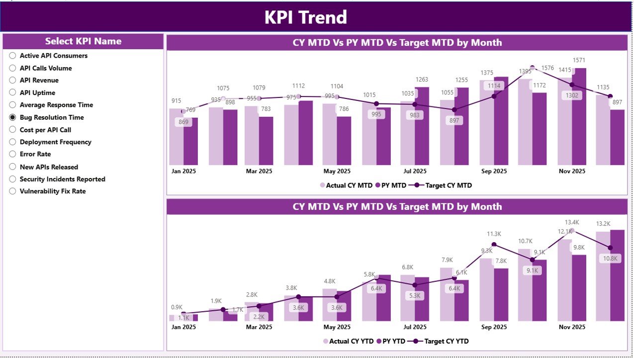
The KPI Trend Page focuses on visual analysis.
On this page, you will see:
-
2 Combo Charts
-
MTD Trend
-
YTD Trend
-
Each chart displays:
-
Current Year Actual
-
Previous Year Actual
-
Target Values
Additionally, the page includes a KPI Name slicer on the left side.
Therefore, you can select any KPI and instantly analyze its trend.
Why Are Combo Charts Important?
Combo charts help you:
-
Compare actual vs target
-
Monitor improvement trend
-
Identify seasonal performance
-
Detect performance gaps
For example:
If API Response Time increases month by month, you can act quickly.
Thus, trend analysis prevents future issues.
3️⃣ What Is the KPI Definition Page?
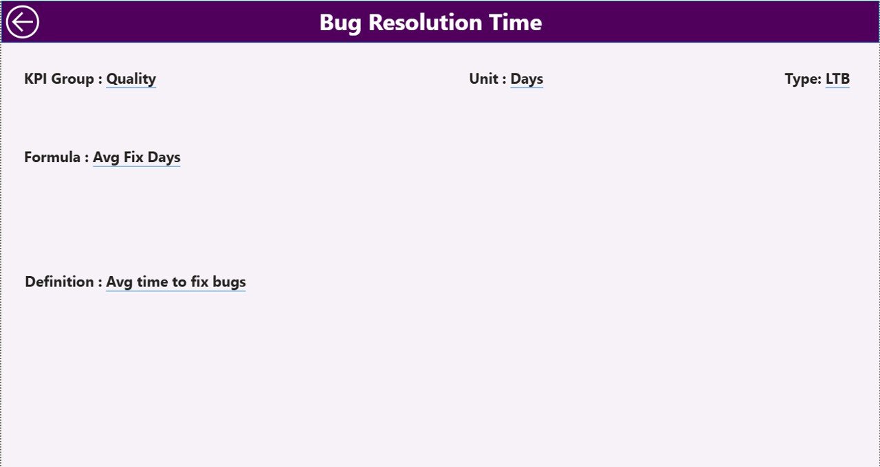
The KPI Definition Page works as a drill-through page.
It remains hidden by default.
From the Summary Page, you can drill through to see:
-
KPI Formula
-
KPI Definition
-
KPI Group
-
KPI Type
This feature ensures clarity.
Because sometimes stakeholders ask:
“How did you calculate this KPI?”
Now you can answer instantly.
To return to the main page, simply click the back button on the top left corner.
How Does the Excel Data Source Work?
The dashboard uses an Excel file as the data source.
This file contains 3 worksheets.
Let us understand each one.
1️⃣ Input_Actual Sheet
Here, you fill:
-
KPI Name
-
Month (first date of month)
-
MTD Value
-
YTD Value
2️⃣ Input_Target Sheet
This sheet contains:
-
KPI Name
-
Month (first date of month)
-
MTD Target
-
YTD Target
3️⃣ KPI Definition Sheet
This sheet includes:
-
KPI Number
-
KPI Group
-
KPI Name
-
Unit
-
Formula
-
Definition
-
Type (LTB or UTB)
Because of this structure, the dashboard becomes scalable.
You can add new KPIs easily.
What KPIs Should You Track in API Development?
Click to Purchases API Development KPI Dashboard in Power BI
Although every organization differs, most API teams track:
-
API Uptime %
-
Average Response Time (ms)
-
Error Rate %
-
API Throughput
-
Deployment Success Rate %
-
Incident Resolution Time
-
SLA Compliance %
-
Security Vulnerabilities
-
Failed Requests Count
-
API Version Adoption Rate
Therefore, this dashboard supports both technical and business metrics.
Advantages of API Development KPI Dashboard in Power BI
Now let us explore the key advantages.
1️⃣ Centralized Performance Monitoring
You no longer depend on multiple reports.
Instead, you get:
-
One structured dashboard
-
One data source
-
One version of truth
2️⃣ Faster Decision-Making
Because KPI cards highlight target gaps instantly, leaders can act faster.
3️⃣ Clear Visual Indicators
The ▲ and ▼ icons reduce confusion.
Even non-technical stakeholders can understand performance status.
4️⃣ Historical Benchmarking
You can compare:
-
Current Year vs Previous Year
-
MTD vs YTD
-
Target vs Actual
Thus, you track growth consistently.
5️⃣ Scalable Structure
Since the dashboard connects with Excel:
-
You can add KPIs
-
You can update monthly data
-
You can expand groups
Without changing visuals.
6️⃣ Improved Accountability
Because each KPI shows target comparison, teams stay accountable.
Best Practices for the API Development KPI Dashboard
If you want maximum results, follow these best practices.
1️⃣ Define Clear KPI Ownership
Assign KPI owners.
For example:
-
DevOps Team → Uptime & Deployment
-
Backend Team → Response Time
-
Security Team → Vulnerability Metrics
2️⃣ Update Data Consistently
Update Excel sheets monthly.
Otherwise, trend analysis becomes inaccurate.
3️⃣ Review KPI Targets Quarterly
Business goals change.
Therefore, adjust targets quarterly.
4️⃣ Use KPI Groups Strategically
Group KPIs into:
-
Performance
-
Reliability
-
Security
-
Scalability
-
Compliance
This improves filtering and reporting.
5️⃣ Monitor Leading Indicators
Do not track only outcome metrics.
Also track early warning signals such as:
-
Increasing response time
-
Growing error rate
6️⃣ Conduct Monthly KPI Review Meetings
Use the dashboard during performance meetings.
This encourages data-driven discussion.
How Does This Dashboard Improve API Governance?
API governance requires transparency.
This dashboard supports governance because:
-
It tracks SLA compliance
-
It monitors incident trends
-
It compares yearly growth
-
It highlights underperformance
Therefore, CTOs and Engineering Heads gain complete visibility.
Who Should Use the API Development KPI Dashboard?
This dashboard benefits:
-
API Development Teams
-
DevOps Engineers
-
CTOs
-
Product Managers
-
SaaS Companies
-
Fintech Firms
-
E-commerce Platforms
If your business depends on APIs, you need structured monitoring.
How Can You Implement This Dashboard Successfully?
Follow these steps:
-
Define KPI list
-
Create KPI Definition sheet
-
Enter actual and target values monthly
-
Connect Excel to Power BI
-
Refresh dashboard
-
Review insights
Within minutes, you will get actionable insights.
Conclusion
API performance determines business success.
However, without structured tracking, teams miss growth opportunities.
The API Development KPI Dashboard in Power BI provides:
-
Clear KPI tracking
-
MTD and YTD comparison
-
Target vs Actual monitoring
-
Previous year benchmarking
-
Visual indicators
-
Drill-through definitions
Therefore, instead of reacting to problems, you can manage API performance proactively.
If you want clarity, control, and confidence in your API operations, this dashboard gives you the perfect solution.
Frequently Asked Questions with Answers
1️⃣ What is an API Development KPI Dashboard in Power BI?
It is a structured dashboard that tracks API performance metrics using Power BI visuals and Excel data.
2️⃣ Can I customize KPIs in this dashboard?
Yes. You can modify the KPI Definition sheet and add new KPIs easily.
3️⃣ How often should I update the data?
You should update actual and target values monthly.
4️⃣ What does LTB and UTB mean?
LTB means Lower the Better.
UTB means Upper the Better.
5️⃣ Can I compare current performance with previous year?
Yes. The dashboard calculates CY vs PY for both MTD and YTD.
6️⃣ Do I need advanced Power BI skills to use this dashboard?
No. You only need to update Excel data and refresh the report.
7️⃣ Why should API teams track MTD and YTD separately?
Because MTD shows short-term progress, while YTD shows long-term trend.
8️⃣ Is this dashboard suitable for large enterprises?
Yes. Since the structure is scalable, enterprises can manage hundreds of APIs.
Visit our YouTube channel to learn step-by-step video tutorials