Aquaculture plays a vital role in the global food industry. As demand for seafood continues to grow, aquaculture businesses must manage production, monitor environmental conditions, track diseases, and analyze profitability efficiently. However, many farms still rely on scattered spreadsheets and manual reports. As a result, managers struggle to monitor performance and make timely decisions.
Therefore, businesses increasingly use data-driven dashboards to centralize information and improve operational efficiency. One powerful solution is the Aquaculture Dashboard in Excel.
Click to Purchases Aquaculture Dashboard in Excel
The Aquaculture Dashboard in Excel is a ready-to-use analytical tool that helps aquaculture businesses track production, monitor fish health, analyze costs, and evaluate revenue performance. Moreover, it transforms complex data into clear visual insights that support better decision-making.
In this article, you will learn everything about the Aquaculture Dashboard in Excel, including its structure, features, benefits, best practices, and frequently asked questions.
What Is an Aquaculture Dashboard in Excel?
An Aquaculture Dashboard in Excel is an interactive reporting system built in Microsoft Excel that helps aquaculture farms track key performance indicators (KPIs) and operational metrics in one centralized interface.
Instead of manually analyzing multiple spreadsheets, the dashboard collects data from a structured dataset and converts it into visual charts and insights.
This dashboard typically tracks metrics such as:
-
Total production batches
-
Mortality rates
-
Disease cases
-
Production costs
-
Revenue performance
-
Profit margins
-
Environmental health indicators
Because Excel provides flexible analytics features, aquaculture businesses can easily filter and analyze data using slicers, pivot tables, and charts.
Consequently, managers gain a clear understanding of their farm’s performance and can quickly identify areas that need improvement.
Why Do Aquaculture Farms Need a Dashboard?
Aquaculture farms operate in a complex environment where production, environmental conditions, and market prices constantly change. Therefore, farm managers must monitor several factors simultaneously.
Without a structured system, managing aquaculture data becomes difficult.
However, a well-designed Excel dashboard solves this problem by presenting all critical information in one place.
Aquaculture farms need dashboards for several reasons:
-
Monitor production performance
-
Track disease outbreaks
-
Analyze revenue and profit trends
-
Compare farming methods
-
Evaluate feed performance
-
Monitor environmental health
-
Improve decision-making
As a result, businesses can operate more efficiently and reduce risks.
Key Features of the Aquaculture Dashboard in Excel
The Aquaculture Dashboard in Excel includes several powerful features that help aquaculture managers analyze their data effectively.
1. Page Navigator
The dashboard includes a Page Navigator located on the left side of the interface.
This navigation panel allows users to quickly switch between different analytical pages.
Instead of scrolling through multiple sheets, users can simply click the navigation buttons to access the required analysis.
This feature significantly improves usability and efficiency.
Click to Purchases Aquaculture Dashboard in Excel
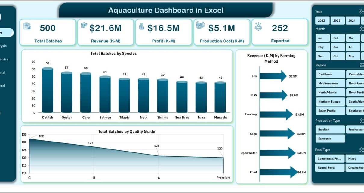
2. Overview Page
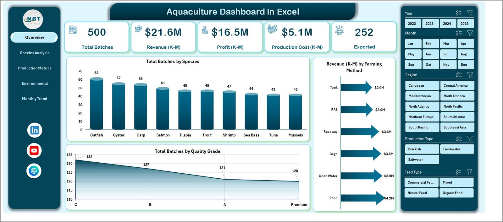
The Overview Page acts as the central dashboard of the system. It provides a quick summary of aquaculture performance.
On this page, users can see a right-side slicer panel that allows filtering data by different categories.
The overview page contains:
KPI Cards
Four KPI cards display key metrics such as:
-
Total Batches
-
Total Revenue
-
Average Mortality Rate
-
Total Profit
These cards provide a quick snapshot of the farm’s overall performance.
Charts on Overview Page
The overview page also includes the following visual charts:
-
Total Batches by Species
This chart shows how many production batches belong to each species. -
Revenue by Farming Method
This chart compares revenue generated from different farming methods. -
Total Batches by Quality Grade
This chart helps evaluate production quality levels.
These visuals help managers quickly understand operational performance.
Species Analysis Page
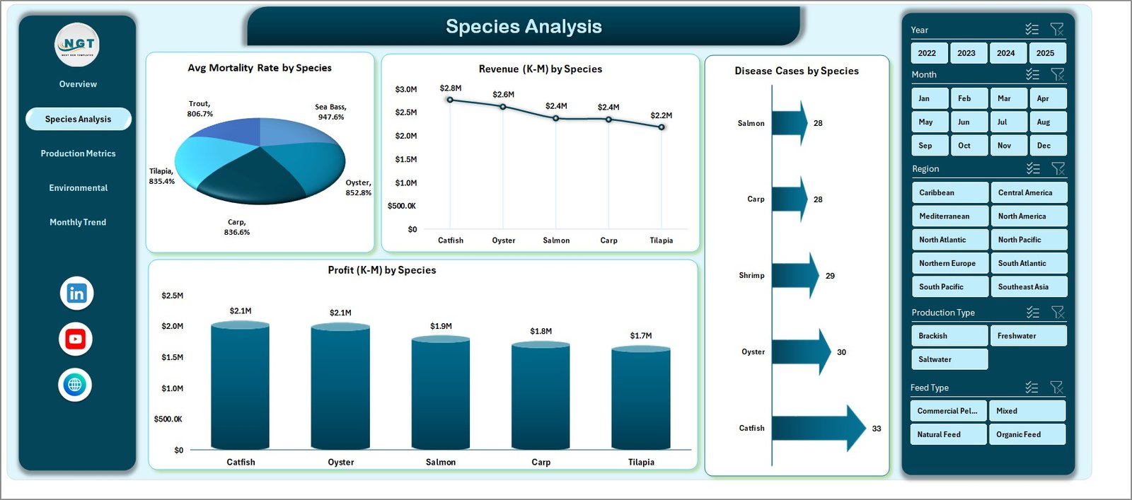
The Species Analysis Page focuses on analyzing performance by species.
Since aquaculture farms often grow multiple species, managers must compare production outcomes for each species.
The page includes a right-side slicer panel for filtering.
Charts Available on Species Analysis Page
The page includes four important charts:
-
Average Mortality Rate by Species
This chart helps identify species with higher mortality rates. -
Revenue by Species
This visualization shows which species generate the highest revenue. -
Disease Cases by Species
Managers can easily track disease occurrences by species. -
Profit by Species
This chart helps evaluate the profitability of each species.
Therefore, farm owners can quickly identify the most profitable species and optimize production planning.
Click to Purchases Aquaculture Dashboard in Excel
Production Metrics Page
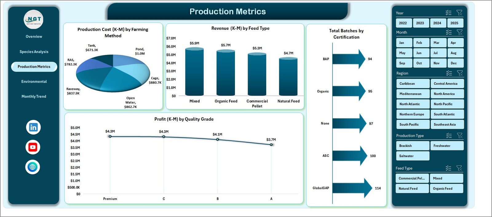
The Production Metrics Page focuses on production efficiency and cost management.
Aquaculture farms must carefully monitor production costs, feed usage, and certification standards.
This page provides insights into these areas.
Charts on Production Metrics Page
The production metrics page includes the following charts:
-
Production Cost by Farming Method
This chart compares production costs across different farming methods. -
Revenue by Feed Type
This chart helps evaluate which feed type generates better revenue outcomes. -
Total Batches by Certification
This visual shows how many batches meet certification standards. -
Profit by Quality Grade
This chart highlights profitability based on product quality.
As a result, managers can control costs and improve operational efficiency.
Environmental Health Page
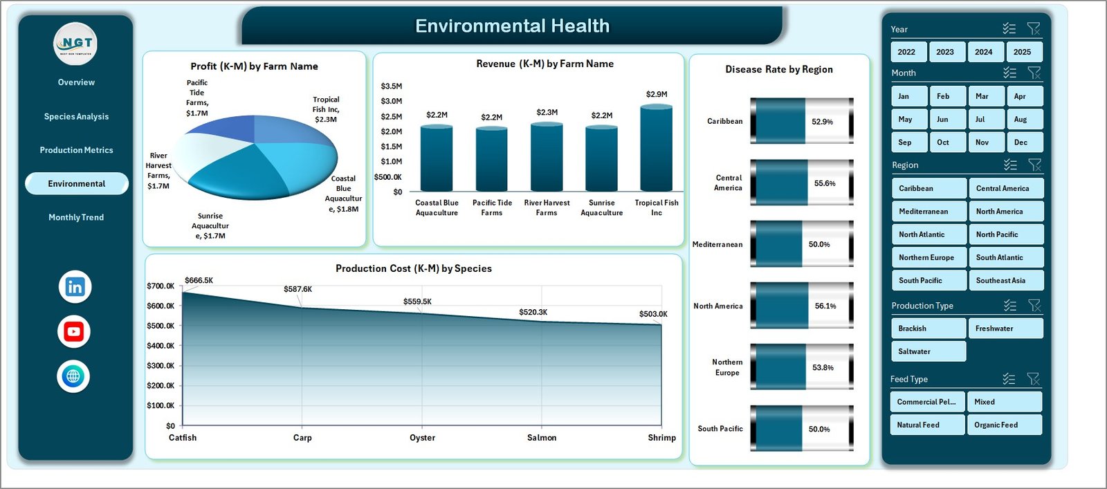
Environmental health plays a critical role in aquaculture success.
Poor water conditions or disease outbreaks can significantly impact production.
Therefore, monitoring environmental indicators becomes essential.
The Environmental Health Page provides insights into these conditions.
Charts Included on Environmental Health Page
This page includes four analytical charts:
-
Production Cost by Species
This chart helps evaluate species-related cost variations. -
Profit by Farm Name
Managers can compare profitability across farms. -
Revenue by Farm Name
This chart identifies top-performing farms. -
Disease Rate by Region
This chart helps monitor disease patterns across regions.
Consequently, businesses can detect environmental risks early.
Month Analysis Page
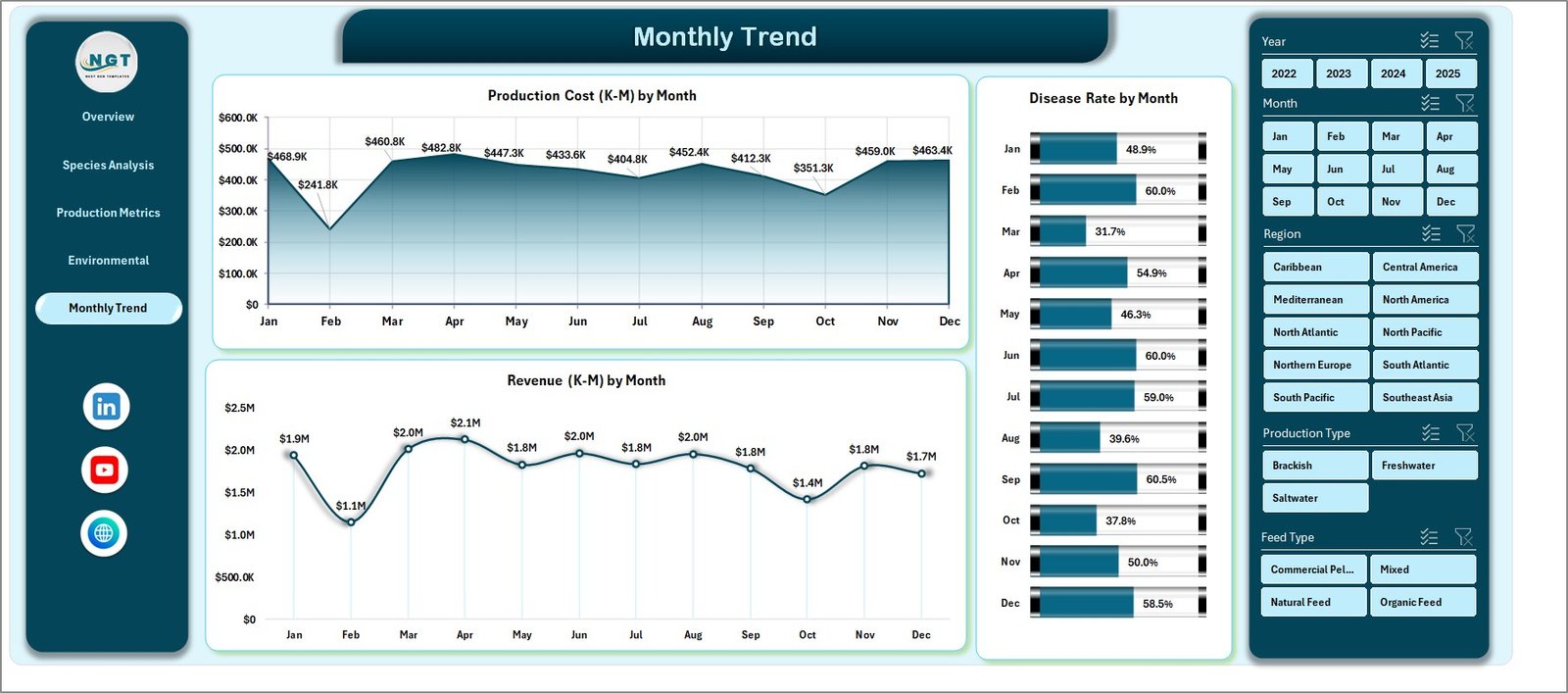
Seasonal trends significantly affect aquaculture production.
Therefore, monthly performance analysis becomes essential.
The Month Analysis Page focuses on time-based insights.
Charts on Month Analysis Page
This page includes the following charts:
-
Production Cost by Month
-
Disease Rate by Month
-
Revenue by Month
These charts help managers identify seasonal patterns.
For example:
-
Higher disease rates in certain months
-
Revenue fluctuations due to seasonal demand
-
Cost increases during specific production cycles
As a result, businesses can plan production more effectively.
Data Sheet and Support Sheets
Click to Purchases Aquaculture Dashboard in Excel
The dashboard relies on structured datasets to generate insights.
Data Sheet
The Data Sheet stores all operational data related to aquaculture production.
Typical fields include:
-
Batch ID
-
Species
-
Farming Method
-
Feed Type
-
Farm Name
-
Region
-
Quality Grade
-
Production Cost
-
Revenue
-
Mortality Rate
-
Disease Cases
-
Certification Status
-
Month
-
Profit
This structured dataset enables pivot tables and charts to generate meaningful insights.
Support Sheets
Support sheets contain configuration tables, lookup values, and calculation formulas that support the dashboard.
These sheets typically include:
-
KPI calculation formulas
-
Species lookup tables
-
Feed type categories
-
Certification classifications
-
Environmental thresholds
Therefore, the dashboard remains flexible and scalable.
Advantages of Aquaculture Dashboard in Excel
The Aquaculture Dashboard in Excel provides several benefits for aquaculture businesses.
1. Centralized Data Management
The dashboard stores all operational data in one place. Therefore, managers can easily access information without searching through multiple files.
2. Better Decision-Making
Visual charts allow managers to quickly identify trends and issues.
Consequently, decision-making becomes faster and more accurate.
3. Improved Production Monitoring
The dashboard tracks production batches, mortality rates, and disease cases.
Therefore, managers can monitor farm performance more effectively.
4. Cost and Profit Analysis
The system analyzes production costs and revenue.
As a result, businesses can optimize profitability.
5. Easy Customization
Since the dashboard uses Excel, users can easily modify charts, filters, and metrics.
Therefore, the solution remains flexible for different aquaculture operations.
Best Practices for the Aquaculture Dashboard
To maximize the benefits of the dashboard, organizations should follow several best practices.
Maintain Accurate Data
Always update production data regularly.
Accurate data ensures reliable insights.
Use Standardized Data Entry
Use consistent formats for species names, regions, and feed types.
Standardization improves reporting accuracy.
Update the Dashboard Frequently
Update the dataset weekly or monthly.
Regular updates ensure the dashboard reflects current conditions.
Monitor Key KPIs
Focus on important indicators such as:
-
Mortality rates
-
Disease cases
-
Production costs
-
Revenue trends
Tracking these KPIs helps maintain operational efficiency.
Train Staff to Use the Dashboard
Ensure that farm managers understand how to use filters, slicers, and charts.
Proper training improves the effectiveness of the dashboard.
Conclusion
Click to Purchases Aquaculture Dashboard in Excel
Aquaculture businesses must manage large volumes of operational data, including production batches, feed performance, environmental conditions, and financial results.
However, manual reporting often creates confusion and delays.
Therefore, organizations increasingly adopt data-driven dashboards to monitor performance and improve decision-making.
The Aquaculture Dashboard in Excel provides a powerful solution for aquaculture farms to centralize data, analyze performance, and monitor key metrics.
With features such as interactive slicers, analytical charts, and multiple analysis pages, the dashboard offers a complete view of aquaculture operations.
As a result, managers can identify trends, optimize production strategies, and improve profitability.
Ultimately, using this dashboard allows aquaculture businesses to operate more efficiently and sustainably.
Frequently Asked Questions (FAQs)
What is an Aquaculture Dashboard?
An Aquaculture Dashboard is a data visualization tool that helps aquaculture businesses monitor production, revenue, costs, and environmental conditions.
It converts raw data into charts and insights for easier decision-making.
Why should aquaculture farms use Excel dashboards?
Aquaculture farms should use Excel dashboards because they provide a cost-effective and flexible way to analyze farm performance.
Moreover, Excel dashboards allow easy customization and data filtering.
What data is required for an Aquaculture Dashboard?
Typical data includes:
-
Batch ID
-
Species
-
Farming method
-
Feed type
-
Production cost
-
Revenue
-
Mortality rate
-
Disease cases
-
Farm location
-
Quality grade
This information helps generate meaningful analytics.
Can small aquaculture farms use this dashboard?
Yes. Small farms can also use the dashboard.
Since Excel is widely available, even small aquaculture businesses can implement the system easily.
Can the dashboard support multiple farms?
Yes. The dashboard can track multiple farms.
Users can analyze performance by farm name, region, species, or production method.
Visit our YouTube channel to learn step-by-step video tutorials