The astrology industry has grown rapidly in the digital era. Millions of people use astrology apps every day to check their daily horoscope, explore zodiac compatibility, receive personalized predictions, and access spiritual guidance. Because smartphones have become the primary platform for digital services, astrology applications have experienced massive growth in downloads, subscriptions, and user engagement.
However, managing data from astrology applications can become complicated. App developers, marketers, and product managers need to track multiple metrics such as user engagement, subscription revenue, ad revenue, in-app purchases, and platform performance. When this information spreads across multiple reports and spreadsheets, decision-making becomes difficult.
Click to Purchases Astrology Apps Dashboard in Power BI
Therefore, businesses increasingly rely on interactive dashboards to transform complex app data into clear and actionable insights. One powerful solution is the Astrology Apps Dashboard in Power BI.
The Astrology Apps Dashboard in Power BI is a ready-to-use business intelligence solution designed to analyze astrology application performance using interactive visuals, KPIs, and filters. Because Power BI automatically processes data and updates visualizations, businesses can monitor key metrics and identify trends quickly.
In this article, you will learn everything about the Astrology Apps Dashboard in Power BI, including its structure, features, advantages, best practices, and frequently asked questions.
What Is an Astrology Apps Dashboard in Power BI?
An Astrology Apps Dashboard in Power BI is an interactive analytics tool that visualizes astrology application data using charts, KPIs, and filters. It converts raw app data into meaningful insights so businesses can track performance and optimize their strategies.
This dashboard usually tracks important metrics such as:
-
Total number of users
-
Subscription types
-
App platform usage
-
Ad revenue
-
In-app purchases
-
Feature usage
-
Monthly performance trends
-
Zodiac sign activity
Because Power BI connects multiple data sources and transforms them into dynamic visuals, users can analyze large datasets easily. Moreover, decision-makers can quickly identify patterns and make data-driven decisions.
Why Do Astrology App Businesses Need a Dashboard?
Astrology app companies generate massive amounts of data every day. They track user behavior, revenue streams, feature usage, and engagement levels. Without a structured reporting system, businesses struggle to understand their performance.
A Power BI dashboard solves this problem by centralizing all app analytics in one place.
Here are some reasons why astrology app companies use dashboards:
1. Monitor User Engagement
Businesses need to understand how users interact with features such as horoscope predictions, compatibility reports, and tarot readings.
2. Track Revenue Streams
Apps generate revenue from subscriptions, advertisements, and in-app purchases. A dashboard helps monitor each revenue source clearly.
3. Improve Product Strategy
Analytics helps teams identify popular features and improve the user experience.
4. Optimize Marketing Campaigns
Marketers can analyze which platforms, regions, or features generate the most revenue.
5. Make Data-Driven Decisions
Executives can use visual insights to make faster and smarter business decisions.
Therefore, a dashboard becomes an essential tool for any astrology app business.
Key Features of the Astrology Apps Dashboard in Power BI
The Astrology Apps Dashboard in Power BI includes multiple analytical pages that provide a complete view of application performance. Each page focuses on a specific area of analytics.
The dashboard contains five interactive pages.
Click to Purchases Astrology Apps Dashboard in Power BI
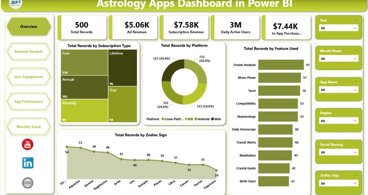
1. Overview Page – What Does the Main Dashboard Show?
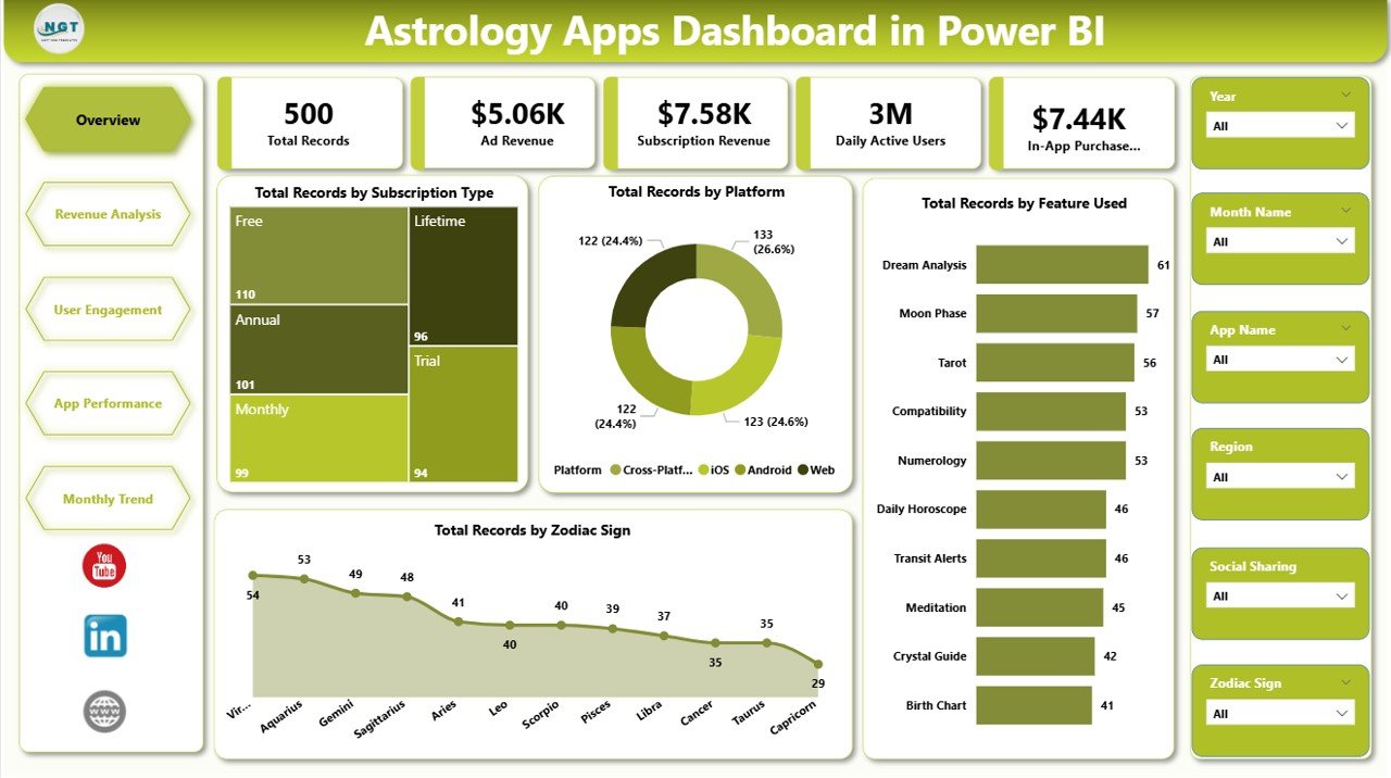
The Overview Page serves as the main summary page of the dashboard. It displays high-level insights about the astrology application.
This page contains interactive slicers, which allow users to filter data quickly.
KPI Cards Included
The overview page includes the following KPI cards:
-
Total Records by Subscription Type
-
Total Records by Platform
-
Total Records by Feature Used
-
Total Records by Zodiac Sign
These KPI cards help users understand key performance indicators instantly.
For example:
-
Businesses can see which subscription plans attract the most users.
-
Product teams can analyze which platform generates the most engagement.
-
Developers can evaluate which astrology features users prefer.
Because this page summarizes the entire dataset, it helps managers understand overall performance quickly.
2. Revenue Analysis – How Does the App Generate Revenue?
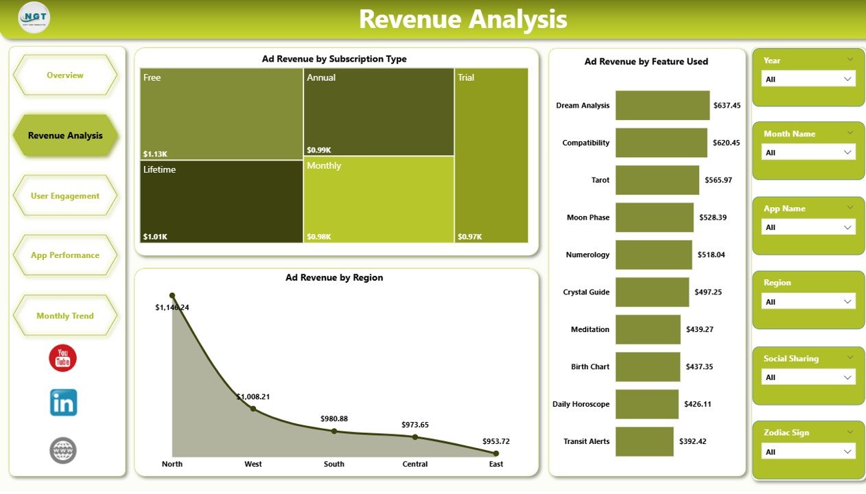
Revenue plays a critical role in the success of astrology applications. Therefore, businesses must track every revenue stream carefully.
The Revenue Analysis Page focuses on advertisement revenue and revenue drivers.
This page includes interactive slicers that allow users to filter the data by different categories.
Charts Included
The revenue analysis page includes the following charts:
-
Ad Revenue by Subscription Type
-
Ad Revenue by Feature Used
-
Ad Revenue by Region
These visualizations help businesses answer important questions such as:
-
Which subscription plan generates the highest advertising revenue?
-
Which astrology feature drives the most ad engagement?
-
Which regions generate the most revenue?
Because Power BI updates visuals instantly, teams can monitor revenue trends continuously.
Click to Purchases Astrology Apps Dashboard in Power BI
3. User Engagement – How Active Are the Users?
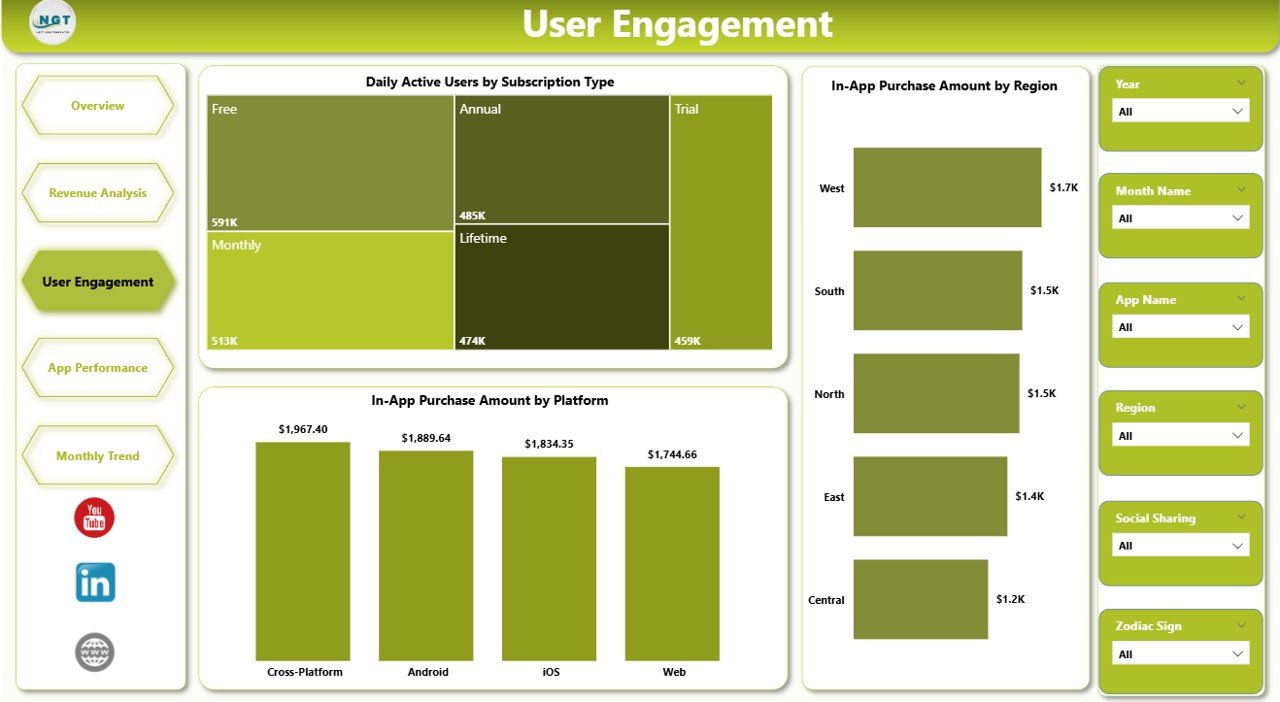
User engagement determines the long-term success of any mobile application. If users interact with the app frequently, businesses can generate higher revenue and stronger brand loyalty.
The User Engagement Page focuses on activity and purchase behavior.
Charts Included
This page contains the following charts:
-
Daily Active Users by Subscription Type
-
In-App Purchase Amount by Region
-
In-App Purchase Amount by Platform
These insights help businesses understand user behavior.
For example:
-
If daily active users increase, the app experiences higher engagement.
-
If in-app purchases grow in a specific region, companies can expand marketing efforts there.
-
If a platform generates higher revenue, developers can prioritize that platform.
Therefore, this page plays a key role in analyzing customer engagement.
4. App Performance – How Well Does Each App Perform?
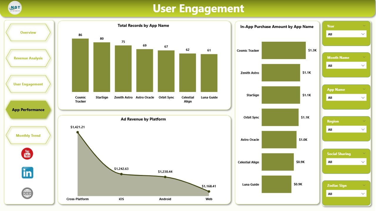
Many companies operate multiple astrology apps or multiple versions of the same app. Therefore, businesses must compare app performance carefully.
The App Performance Page focuses on analyzing different astrology apps and their financial results.
Click to Purchases Astrology Apps Dashboard in Power BI
Charts Included
This page includes the following charts:
-
Total Records by App Name
-
In-App Purchase Amount by App Name
-
Ad Revenue by Platform
These charts help businesses compare app performance easily.
For example:
-
Teams can identify which app generates the highest revenue.
-
Developers can evaluate which platform performs best.
-
Product managers can analyze which app attracts more users.
Because this page compares performance metrics, it helps businesses optimize their product strategy.
5. Month Analysis – What Are the Monthly Trends?
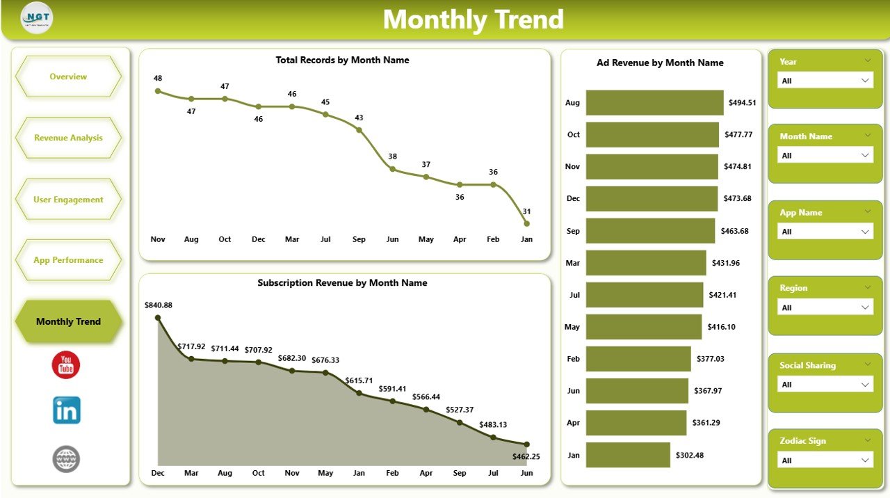
Tracking monthly trends helps companies understand growth patterns and seasonal behavior.
The Month Analysis Page focuses on time-based analytics.
Charts Included
This page contains the following charts:
-
Total Records by Month
-
Ad Revenue by Month
-
Subscription Revenue by Month
These visualizations help companies analyze:
-
Monthly user growth
-
Seasonal engagement patterns
-
Revenue trends over time
For example, astrology apps often see increased engagement during specific events such as:
-
New Year predictions
-
Lunar or solar eclipses
-
Major astrological events
Therefore, businesses can prepare marketing campaigns during these periods.
Advantages of Astrology Apps Dashboard in Power BI
Using a Power BI dashboard provides several benefits for astrology app businesses.
1. Centralized Data Analysis
The dashboard collects all important metrics in one place. As a result, users do not need to analyze multiple spreadsheets.
2. Real-Time Insights
Power BI updates visuals automatically when new data arrives. Therefore, businesses can monitor performance in real time.
3. Better Decision Making
Visual analytics helps managers identify trends quickly. Consequently, they can make faster decisions.
4. Improved Revenue Tracking
Businesses can track revenue from subscriptions, advertisements, and in-app purchases easily.
5. Enhanced User Behavior Analysis
Teams can analyze feature usage and engagement patterns.
6. Interactive Data Exploration
Filters and slicers allow users to explore data from different perspectives.
7. Scalable Analytics
Power BI supports large datasets. Therefore, the dashboard can handle growing app data easily.
Best Practices for the Astrology Apps Dashboard in Power BI
Creating a powerful dashboard requires proper planning and design. Therefore, organizations should follow best practices.
1. Define Clear KPIs
First, identify key performance indicators such as revenue, engagement, and feature usage.
2. Use Interactive Filters
Slicers help users filter data easily. Therefore, always include filters for region, subscription type, and platform.
3. Avoid Too Many Charts
Too many visuals can confuse users. Instead, focus on the most important metrics.
4. Maintain Clean Design
Use simple layouts and consistent colors. This improves readability.
5. Update Data Regularly
Fresh data ensures accurate insights. Therefore, schedule regular data updates.
6. Focus on Business Goals
Every chart should support a business objective such as increasing engagement or improving revenue.
7. Optimize Dashboard Performance
Large datasets may slow down dashboards. Therefore, optimize data models and queries.
Who Can Use the Astrology Apps Dashboard in Power BI?
Click to Purchases Astrology Apps Dashboard in Power BI
Many professionals benefit from this dashboard.
App Developers
Developers analyze feature performance and improve app functionality.
Product Managers
Managers track user behavior and optimize product strategy.
Marketing Teams
Marketers analyze campaign effectiveness and user acquisition.
Business Executives
Executives monitor revenue and overall app performance.
Data Analysts
Analysts explore user trends and build predictive insights.
Therefore, this dashboard supports multiple roles within an organization.
How Does Power BI Improve Mobile App Analytics?
Power BI provides powerful analytics features that improve mobile app monitoring.
Interactive Visualizations
Charts, graphs, and KPIs make data easy to understand.
Data Integration
Power BI connects multiple data sources such as databases, spreadsheets, and APIs.
Automated Reporting
Scheduled refresh ensures dashboards stay updated.
Customizable Reports
Users can create personalized reports based on their requirements.
Because of these capabilities, Power BI has become one of the most popular analytics platforms.
Future of Analytics for Astrology Apps
The astrology app industry continues to evolve rapidly. Therefore, data analytics will play an increasingly important role.
Future analytics may include:
-
AI-driven horoscope recommendations
-
Predictive user engagement models
-
Personalized astrology insights
-
Behavior-based subscription offers
-
Advanced marketing analytics
As technology evolves, businesses will rely more on dashboards and business intelligence tools.
Conclusion
The Astrology Apps Dashboard in Power BI provides a powerful solution for analyzing astrology application data. It transforms raw app data into meaningful visual insights that help businesses understand user behavior, track revenue streams, and optimize product strategies.
Because the dashboard includes multiple analytical pages such as Overview, Revenue Analysis, User Engagement, App Performance, and Month Analysis, organizations gain a complete view of their application performance.
Moreover, Power BI’s interactive visualizations, real-time analytics, and scalable architecture make it an ideal platform for mobile app analytics.
Therefore, astrology app companies can use this dashboard to monitor growth, improve engagement, and increase revenue.
Frequently Asked Questions (FAQs)
What is an Astrology Apps Dashboard in Power BI?
An Astrology Apps Dashboard in Power BI is a data visualization tool that analyzes astrology application performance using charts, KPIs, and filters.
What metrics does the dashboard track?
The dashboard tracks metrics such as:
-
Subscription types
-
Platform usage
-
Feature usage
-
Ad revenue
-
In-app purchases
-
User engagement
-
Monthly trends
Why should businesses use Power BI for app analytics?
Power BI provides interactive dashboards, real-time insights, and advanced data visualization capabilities. Therefore, businesses can analyze data efficiently.
Can this dashboard support multiple astrology apps?
Yes. The dashboard includes app-level analysis that allows businesses to compare multiple apps.
Is Power BI suitable for large datasets?
Yes. Power BI supports large datasets and advanced data modeling. Therefore, it works well for mobile app analytics.
Visit our YouTube channel to learn step-by-step video tutorials