In today’s fast-moving industrial and manufacturing environment, automation units play a critical role in productivity, quality, and cost control. However, automation without measurement creates blind spots. Therefore, organizations increasingly rely on an Automation Units KPI Dashboard in Power BI to track performance, compare targets, and make faster, data-driven decisions.
This detailed guide explains what an Automation Units KPI Dashboard in Power BI is, how it works, why it matters, and how businesses can use it effectively. Moreover, this article walks through the dashboard structure, data flow, advantages, best practices, and common questions so that you can clearly understand its real-world value.
Click to buy Automation Units KPI Dashboard in Power BI
What Is an Automation Units KPI Dashboard in Power BI?
An Automation Units KPI Dashboard in Power BI is a centralized analytical tool that visually tracks key performance indicators related to automation units. Instead of checking multiple Excel files or manual reports, decision-makers can monitor automation efficiency, output, reliability, and goal achievement from a single interactive dashboard.
Because the dashboard runs on Power BI, it offers dynamic slicers, rich visuals, and fast performance. At the same time, it keeps data entry simple by using Excel as the data source. As a result, both technical and non-technical users can manage automation KPIs with ease.
Why Do Automation Units Need KPI Dashboards?
Automation systems generate large volumes of operational data. However, raw numbers do not create insights on their own. Therefore, organizations need structured KPI dashboards to convert data into actionable intelligence.
Here is why KPI dashboards matter for automation units:
- They provide real-time visibility into automation performance
- They highlight target achievement and gaps clearly
- They enable month-to-date (MTD) and year-to-date (YTD) tracking
- They support historical comparisons with previous years
- They improve decision speed and accuracy
Because of these benefits, automation managers, plant heads, and leadership teams increasingly depend on KPI dashboards.
How Does the Automation Units KPI Dashboard in Power BI Work?
The Automation Units KPI Dashboard in Power BI follows a simple yet powerful data flow. First, users enter data into Excel. Then, Power BI processes that data and presents it visually.
Data Flow Overview
- Excel Data Entry
Users fill actual and target values in structured Excel sheets. - Power BI Data Model
Power BI connects to Excel and calculates KPIs. - Interactive Dashboard Pages
Users analyze data using slicers, tables, cards, and charts.
Because of this approach, the dashboard remains flexible, scalable, and easy to maintain.
Dashboard Structure: What Pages Does It Include?
The Automation Units KPI Dashboard in Power BI includes three well-structured pages. Each page serves a specific analytical purpose while maintaining a consistent design.
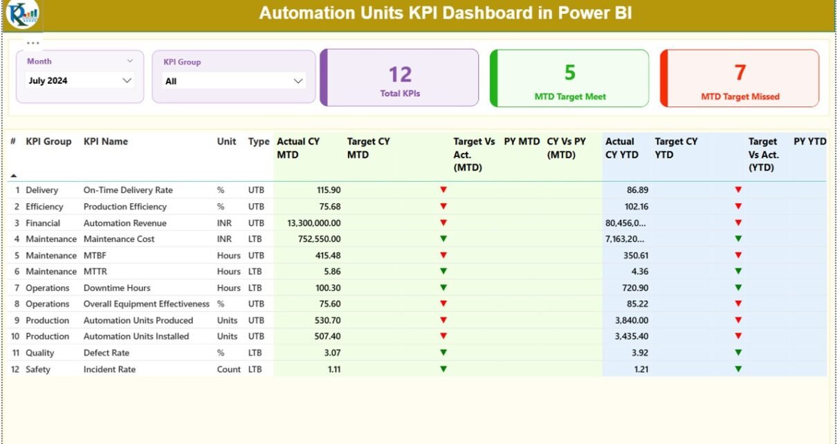
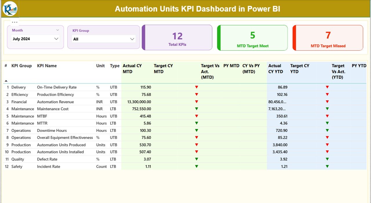
Summary Page: How Can You Monitor All KPIs at Once?
The Summary Page acts as the control center of the dashboard. Here, users get a complete snapshot of automation performance across all KPIs.
Key Elements of the Summary Page
Interactive Slicers
- Month Slicer: Filter data by month instantly
- KPI Group Slicer: Focus on specific KPI categories
These slicers allow users to drill into relevant data without changing reports.
KPI Cards
The page displays three high-impact cards at the top:
- Total KPIs Count
- MTD Target Met Count
- MTD Target Missed Count
Because these cards update dynamically, users instantly see performance status.
Detailed KPI Table: What Information Does It Show?
Below the cards, the dashboard displays a detailed KPI table with rich insights.
Table Columns Explained Clearly
- KPI Number – Sequential identifier for each KPI
- KPI Group – Category or group of the KPI
- KPI Name – Name of the performance indicator
- Unit – Measurement unit (%, hours, count, etc.)
- Type – UTB (Upper the Better) or LTB (Lower the Better)
MTD Performance Metrics
- Actual CY MTD – Current Year actual month-to-date value
- Target CY MTD – Current Year target month-to-date value
- MTD Icon – ▲ or ▼ icons showing performance status
- Target vs Actual (MTD) – Actual ÷ Target percentage
- PY MTD – Previous Year month-to-date value
- CY vs PY (MTD) – Current vs Previous Year comparison
YTD Performance Metrics
- Actual CY YTD – Current Year actual year-to-date value
- Target CY YTD – Current Year target year-to-date value
- YTD Icon – Performance indicator icons
- Target vs Actual (YTD) – Actual ÷ Target percentage
- PY YTD – Previous Year year-to-date value
- CY vs PY (YTD) – Year-over-year comparison
Because of this structure, users can analyze performance at both monthly and yearly levels without switching pages.
Click to buy Automation Units KPI Dashboard in Power BI
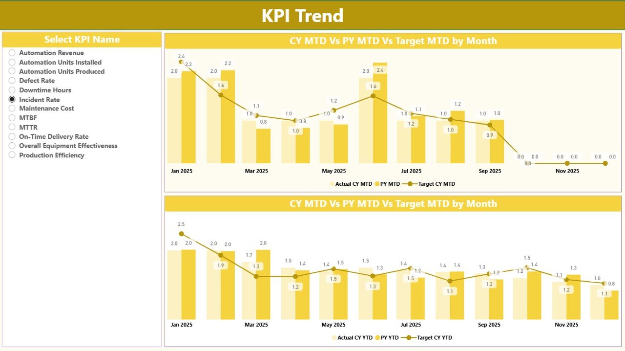
KPI Trend Page: How Do Trends Change Over Time?
The KPI Trend Page focuses on performance trends rather than snapshots. This page helps users understand how automation KPIs evolve over time.
Key Features of the KPI Trend Page
- KPI Name Slicer on the left for focused analysis
- Two Combo Charts for MTD and YTD trends
Each combo chart shows:
- Current Year Actual values
- Previous Year Actual values
- Target values
Because combo charts combine bars and lines, users can easily compare performance against targets and historical data.
Click to buy Automation Units KPI Dashboard in Power BI
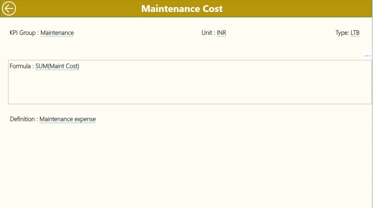
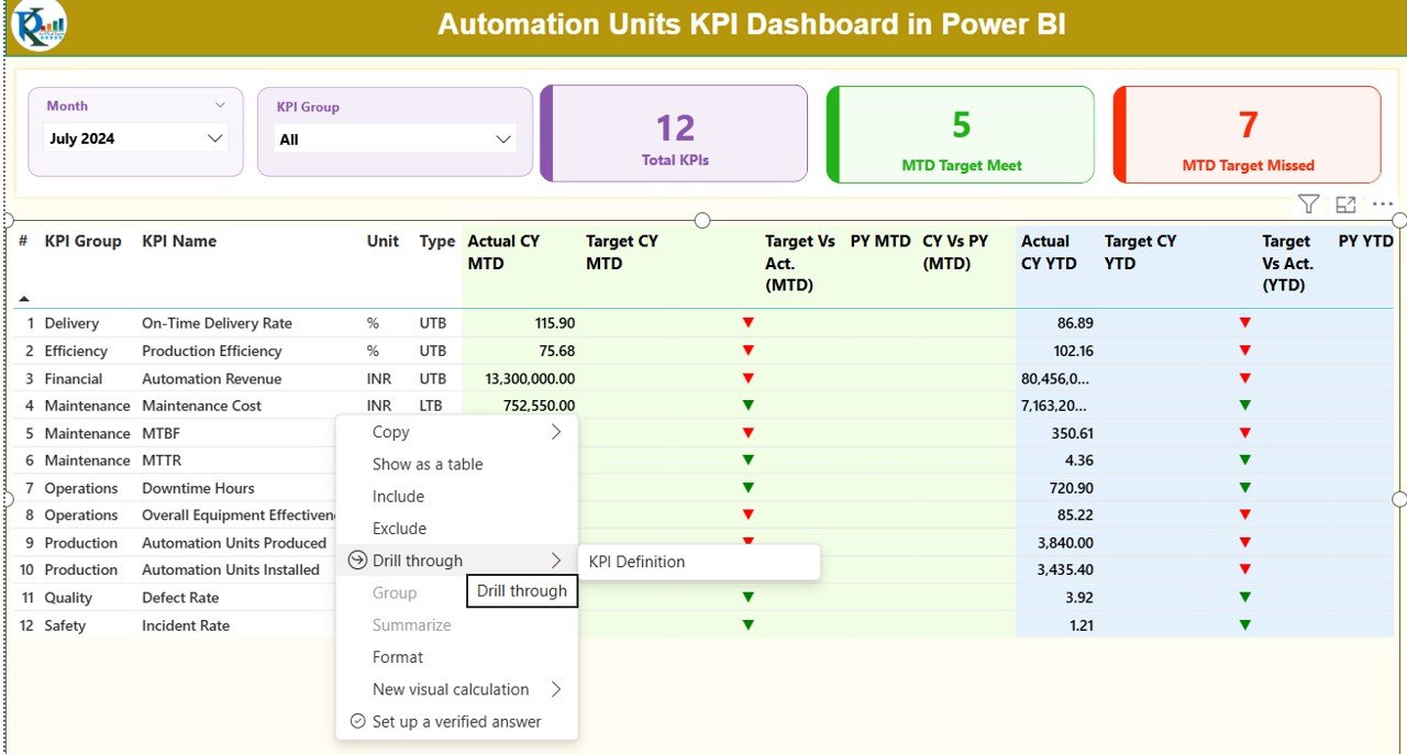
KPI Definition Page: Where Can Users See KPI Details?
The KPI Definition Page acts as a drill-through reference page. Although hidden by default, it plays a crucial role in clarity and governance.
What Does This Page Include?
- KPI Formula
- KPI Definition
- Measurement Unit
- KPI Type (UTB or LTB)
From the Summary Page, users can drill through to view definitions. Moreover, the Back Button on the top-left corner allows instant navigation back to the main page.
Click to buy Automation Units KPI Dashboard in Power BI
Excel Data Source: How Do Users Enter Data?
The Automation Units KPI Dashboard in Power BI uses Excel as its data source. This design choice keeps data entry simple and accessible.
Excel Workbook Structure
The Excel file includes three worksheets:
Input_Actual Sheet
Users enter actual performance data here:
- KPI Name
- Month (first date of the month)
- MTD Actual value
- YTD Actual value
Click to buy Automation Units KPI Dashboard in Power BI
Input_Target Sheet
Users define targets in this sheet:
- KPI Name
- Month (first date of the month)
- MTD Target value
- YTD Target value
KPI Definition Sheet
This sheet stores master KPI information:
- KPI Number
- KPI Group
- KPI Name
- Unit
- Formula
- Definition
- Type (LTB or UTB)
Because of this structure, Power BI automatically refreshes insights whenever users update Excel.
Advantages of Automation Units KPI Dashboard in Power BI
Using an Automation Units KPI Dashboard in Power BI offers several practical benefits.
Key Advantages Explained
- Centralized KPI Monitoring
All automation metrics appear in one place. - Clear Target Tracking
MTD and YTD comparisons show performance gaps instantly. - Improved Decision-Making
Visual insights support faster actions. - User-Friendly Data Entry
Excel-based inputs reduce complexity. - Scalable Design
Teams can add new KPIs easily. - Historical Performance Analysis
Year-over-year trends reveal improvement areas.
Who Can Benefit from This Dashboard?
The Automation Units KPI Dashboard in Power BI supports a wide range of roles:
- Automation Managers
- Plant Managers
- Operations Heads
- Continuous Improvement Teams
- Data Analysts
- Senior Leadership
Because it balances technical depth with visual clarity, it fits both operational and strategic needs.
Best Practices for the Automation Units KPI Dashboard in Power BI
To maximize value, organizations should follow proven best practices.
Best Practices You Should Follow
- Standardize KPI definitions before implementation
- Maintain consistent KPI units and formats
- Update Excel data regularly
- Review targets periodically
- Use KPI Groups for logical categorization
- Train users on drill-through and slicers
- Validate data before refreshing Power BI
By following these practices, teams ensure accuracy, trust, and long-term usability.
How Does This Dashboard Support Better Automation Performance?
The dashboard supports improvement by:
- Identifying underperforming KPIs quickly
- Highlighting trends before issues escalate
- Aligning automation goals with business targets
- Encouraging accountability through transparency
Because of this, organizations move from reactive reporting to proactive performance management.
Conclusion: Why Should You Use an Automation Units KPI Dashboard in Power BI?
An Automation Units KPI Dashboard in Power BI transforms raw automation data into meaningful insights. Instead of relying on static reports, organizations gain interactive views of performance, targets, and trends. Moreover, the Excel-driven data model ensures ease of use, while Power BI delivers powerful analytics.
If your goal involves improving automation efficiency, meeting targets consistently, and enabling data-driven decisions, this dashboard becomes an essential tool for your organization.
Frequently Asked Questions (FAQs)
What is the main purpose of an Automation Units KPI Dashboard in Power BI?
The dashboard tracks automation KPIs, compares actuals against targets, and highlights trends for better decision-making.
Can non-technical users maintain this dashboard?
Yes. Because data entry happens in Excel, non-technical users can easily manage inputs.
How often should the dashboard data be updated?
Ideally, teams should update data monthly or as per operational cycles.
Does the dashboard support both MTD and YTD analysis?
Yes. It provides detailed MTD and YTD performance comparisons.
Can organizations customize KPIs in this dashboard?
Yes. Users can add, remove, or modify KPIs by updating the KPI Definition sheet.
Is this dashboard suitable for large automation environments?
Yes. The scalable design supports multiple KPI groups and growing datasets.
Visit our YouTube channel to learn step-by-step video tutorials
Watch the step-by-step video tutorial:
Click to buy Automation Units KPI Dashboard in Power BI