Brand Consulting Dashboard in Excel is a pivot-driven analytics workbook that empowers brand consultants, marketing agency owners, and strategy professionals to visualize their entire consulting operations at a glance. Built with 5 interactive dashboard pages plus a Data Sheet and Support Sheet, this template covers everything from high-level KPIs like Total Project Fee, Total Cost, and Net Profit to detailed service analysis, regional insights, consultant performance, and project tracking. Whether you manage a boutique consulting firm or lead brand strategy at a large agency, this dashboard gives you the data clarity needed to make informed decisions and drive measurable results for your clients.
Click to buy Brand Consulting Dashboard in Excel
Key Features of Brand Consulting Dashboard in Excel
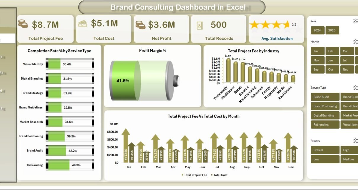
This Excel dashboard template is packed with features designed specifically for brand consulting professionals. It includes 5 fully interactive analysis pages that cover the entire consulting lifecycle from service-level performance to project phase profitability. The overview page displays 5 high-level KPI cards: Total Project Fee, Total Cost, Net Profit, Total Records, and Avg. Satisfaction, giving you instant visibility into your consulting business health.
The template features 15+ dynamic charts and visualizations powered by pivot tables that update automatically when you refresh the data. You can drill down using slicer filters by service type, region, consultant, time period, and more. The entire dashboard runs on a pivot-driven architecture — meaning you simply update the Data Sheet with your own records, click Refresh All in the Excel Ribbon, and every chart across all 5 pages updates instantly. No VBA, no macros, no formulas to maintain.
The professional design features a consistent color scheme and well-organized layouts across all pages. The Data Sheet provides a structured format for entering consulting engagement records, while the Support Sheet contains all the pivot tables that power the dashboard. You can hide the Support Sheet to keep your workbook clean for client presentations. Explore more Excel Dashboard Templates from NextGenTemplates.
Dashboard Pages Explanation
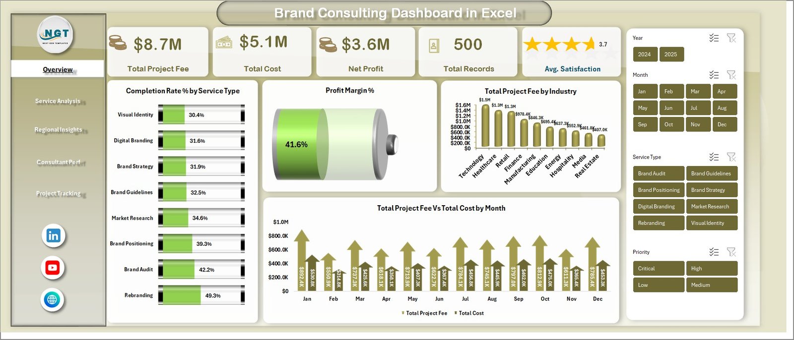
1 — Overview Page
The overview page serves as the command center of the Brand Consulting Dashboard. At the top, you will find 5 high-level KPI cards displaying Total Project Fee, Total Cost, Net Profit, Total Records, and Avg. Satisfaction. These cards provide instant visibility into the overall health of your consulting business. Below the KPI cards, four interactive charts deliver deeper insights: Completion Rate % by Service Type shows how efficiently different service categories are being delivered, Profit Margin % reveals the profitability across your consulting portfolio, Total Project Fee by Industry breaks down revenue by client industry, and Total Project Fee vs Total Cost by Month provides a monthly comparison of revenue against costs. Multiple slicer filters let you quickly filter the entire dashboard by any dimension.
Brand Consulting Dashboard in Excel – Overview Page2 — Service Analysis
The service analysis page provides a comprehensive breakdown of consulting performance by service type and priority. It features four key visualizations: Total Records by Service Type shows the volume of projects across different consulting services such as brand strategy, brand identity, market research, and brand audit. Total Records by Priority reveals how projects are distributed across urgency levels. Avg. Satisfaction by Service Type highlights which service categories receive the highest client satisfaction ratings. Total Project Fee vs Total Cost by Service Type provides a side-by-side comparison of revenue and costs for each service offering, making it easy to identify the most profitable services.
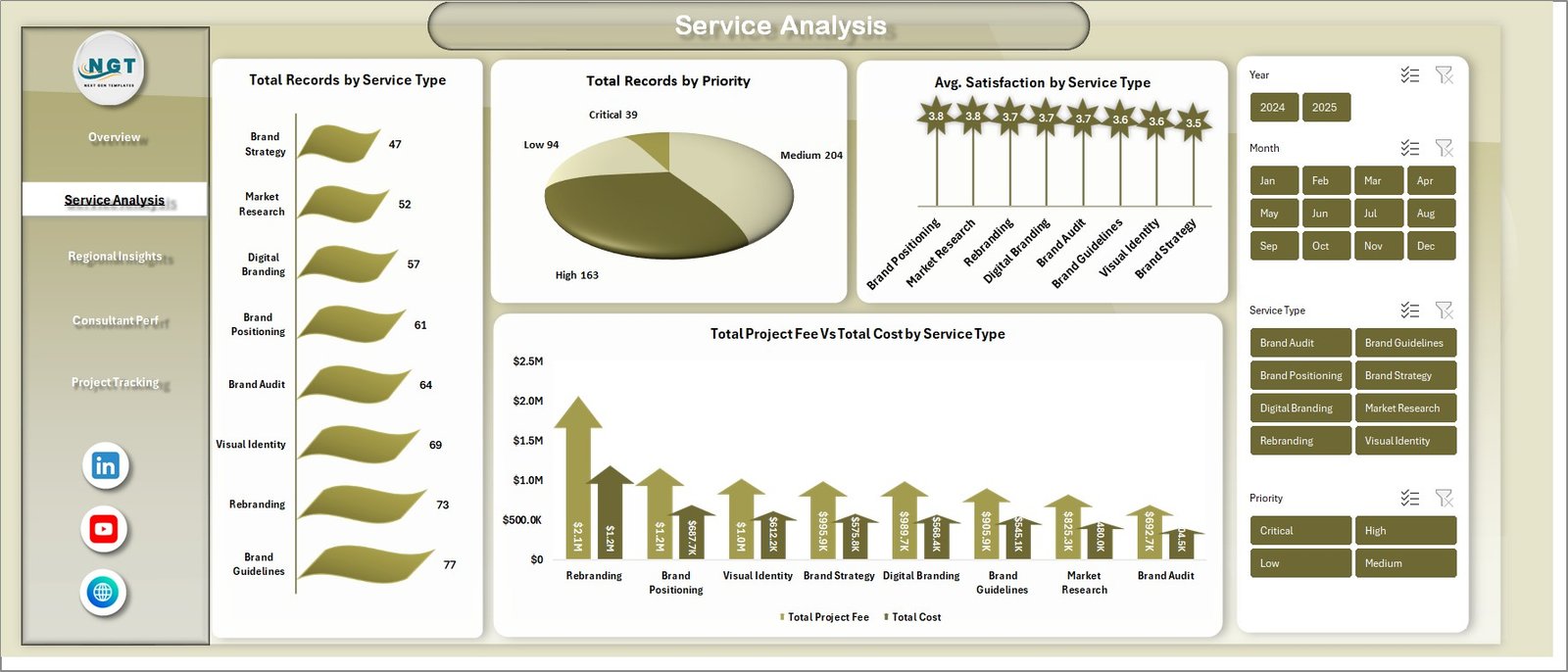 Service Analysis Page
3 — Regional Insights
The regional insights page delivers geographic performance analysis across all consulting regions. It includes four visualizations: Total Hours by Service Type breaks down the time investment across different consulting services to identify where consultant hours are concentrated. Total Project Fee by Region shows revenue distribution across geographic territories, helping you spot high-performing and underperforming markets. Total Records by Region provides a volume comparison of consulting engagements by location. Avg. Satisfaction by Region reveals regional differences in client satisfaction, enabling targeted quality improvements.
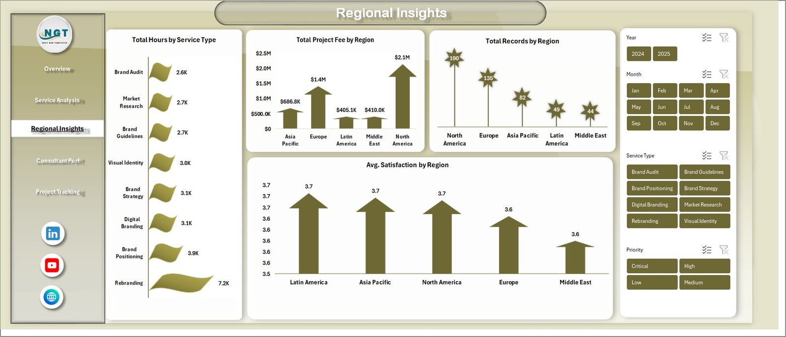 Regional Insights Page
4 — Consultant Performance
The consultant performance page tracks individual team member productivity and output across the organization. It features three key visualizations: Total Deliverables by Region shows how project deliverables are distributed across geographic areas, helping managers understand workload balance. Total Hours by Consultant provides a direct comparison of hours logged by each team member, making it easy to identify top performers and underutilized resources. Avg. Satisfaction by Consultant reveals which consultants consistently deliver the highest client satisfaction scores, supporting performance reviews and resource allocation decisions.
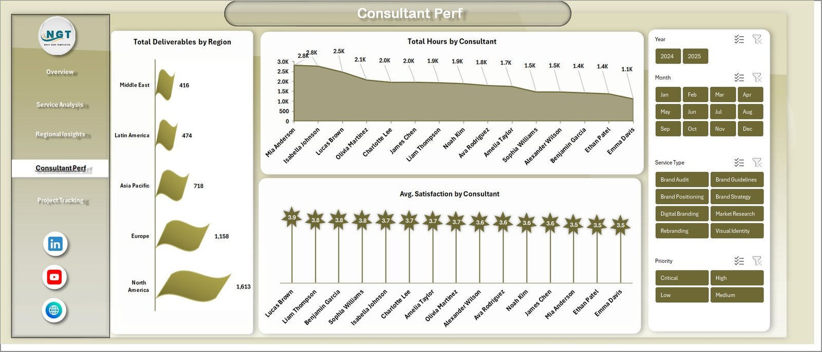 Consultant Performance Page
5 — Project Tracking
The project tracking page monitors the lifecycle of consulting projects from initiation through completion. It includes three focused visualizations: Total Records by Consultant shows the number of projects assigned to each team member, helping balance workloads. Total Project Fee by Project Phase reveals where revenue concentrates across different phases such as discovery, strategy development, execution, and review. Net Profit by Project Phase provides critical profitability insights by showing which phases generate the most profit after costs, enabling better pricing and resource allocation strategies.
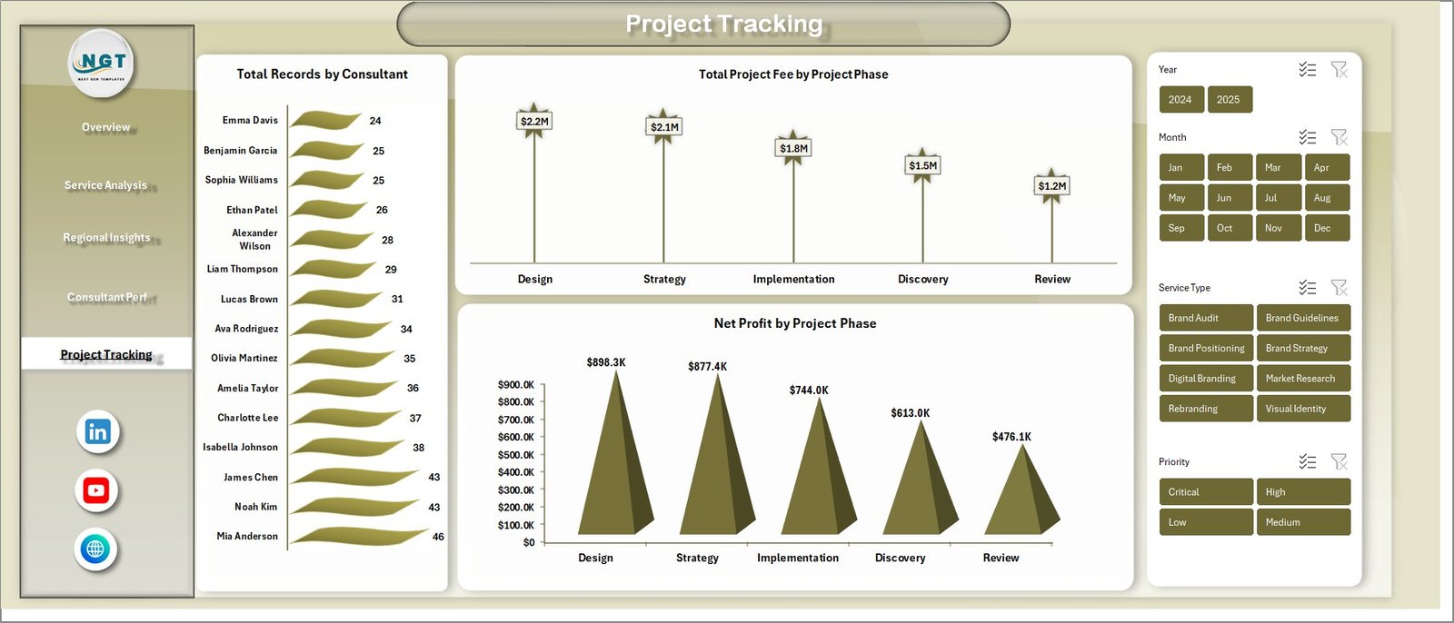 Project Tracking Page
6 — Data Sheet Tab
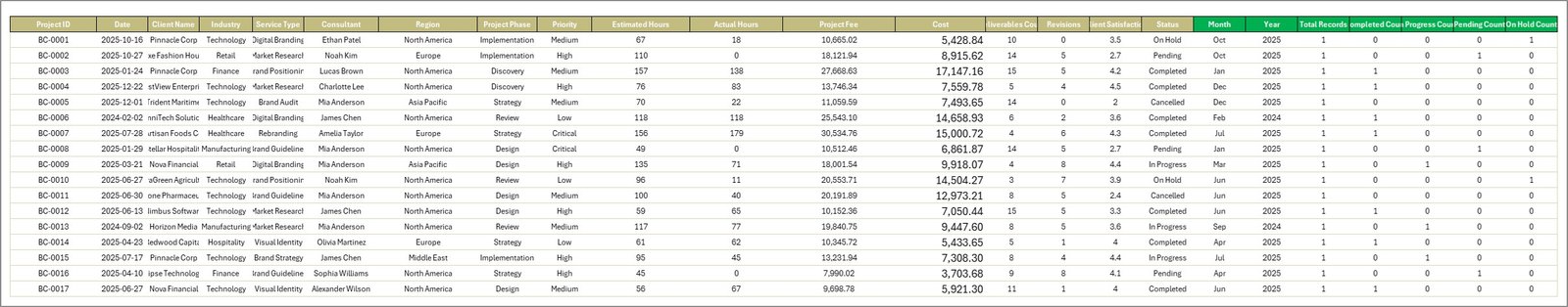
The Data Sheet is where you enter all your consulting engagement data. It comes pre-loaded with sample records in a structured column format. To use the dashboard with your own data, simply replace the sample records with your actual consulting engagement data, maintaining the same column structure. Each row represents a consulting project or engagement with fields for client details, service type, region, consultant, project phase, fees, costs, hours, deliverables, satisfaction scores, and other relevant metrics.
 Data Sheet Tab
7 — Support Sheet
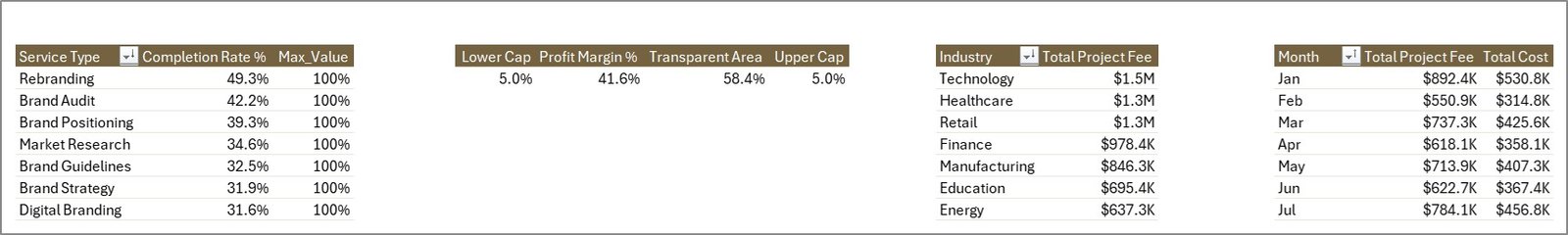
The Support Sheet contains multiple pivot tables that power the entire dashboard dynamically. These pivot tables aggregate and summarize the raw data from the Data Sheet to feed all charts and KPI cards across the 5 dashboard pages. After updating the data in the Data Sheet, go to the Data tab in the Excel Ribbon and click on Refresh All. All the pivots will be refreshed and all the charts will be refreshed automatically. You can keep this sheet hidden by right-clicking the tab and selecting Hide to maintain a clean workbook for presentations.
 Support Sheet Tab
Advantages of Brand Consulting Dashboard in Excel
The Brand Consulting Dashboard in Excel offers several distinct advantages for consulting professionals. First, its pivot-driven architecture means zero manual formula maintenance — all calculations update automatically when you refresh the data source. Second, the 5 KPI cards on the overview page (Total Project Fee, Total Cost, Net Profit, Total Records, and Avg. Satisfaction) give instant business health visibility without navigating through multiple sheets.
Third, the slicer filters enable real-time data exploration across all dimensions without any coding or complex filtering. Fourth, the separation of Data Sheet, Support Sheet, and Dashboard pages follows Excel best practices, keeping raw data, calculations, and visualizations cleanly organized. Fifth, the template requires no VBA or macros, making it compatible with all Excel versions from 2016 onward and safe for corporate environments that restrict macro-enabled files.
Additionally, this dashboard covers both operational metrics (hours, deliverables, completion rates) and financial metrics (project fees, costs, net profit, profit margins) in a single workbook, eliminating the need for separate reporting tools. The consultant performance and regional insights pages add people and geography dimensions that are essential for consulting firms managing distributed teams.
Opportunities for Improvement
While the Brand Consulting Dashboard is comprehensive, there are areas where users might want to extend its capabilities. Adding a dedicated client-level analysis page could provide deeper segmentation by individual clients or client tiers. Including a time-based trend page with year-over-year or quarter-over-quarter comparisons would help track long-term performance trajectories.
Users who manage very large consulting portfolios with hundreds of projects might benefit from Power Query integration for automated data loading from external sources. A conditional formatting layer on the KPI cards to highlight values above or below targets could add at-a-glance alert functionality.
Best Practices
To get the most out of the Brand Consulting Dashboard, update your Data Sheet regularly — ideally weekly — and always click Refresh All in the Data tab after updating. This ensures all 5 dashboard pages reflect current performance. Use the slicer filters strategically during team meetings to focus discussions on specific service types, regions, or consultants.
When replacing sample data, maintain the exact same column structure and data format to ensure all pivot tables function correctly. If you need to add new service types, regions, or project phases, the pivot tables will automatically pick them up on the next refresh. For team management, review the Consultant Performance page monthly to balance workloads and the Project Tracking page to monitor phase-level profitability. Keep the Support Sheet hidden during presentations to maintain a professional appearance.
Explore Relevant Templates
If you are looking for more specialized dashboard templates, NextGenTemplates offers a wide range of options:
- E-commerce Dashboard in HTML — Track online store performance, sales analytics, and customer metrics
- Customer Satisfaction Dashboard in HTML — Monitor NPS scores, customer feedback, and satisfaction trends
- Employee Turnover Dashboard in HTML — Visualize employee attrition trends and workforce demographics
Frequently Asked Questions
What is the best Excel dashboard template for brand consulting?
The Brand Consulting Dashboard in Excel from NextGenTemplates is the best Excel dashboard template for brand consulting professionals. It includes 5 interactive analysis pages covering Overview, Service Analysis, Regional Insights, Consultant Performance, and Project Tracking, plus a Data Sheet and Support Sheet with pivot-driven architecture.
What KPIs does the Brand Consulting Dashboard track?
The overview page tracks 5 high-level KPIs: Total Project Fee, Total Cost, Net Profit, Total Records, and Avg. Satisfaction. Across all 5 pages, the dashboard also tracks Completion Rate by Service Type, Profit Margin %, Project Fee by Industry, Fee vs Cost by Month, Records by Priority, Satisfaction by Region, Hours by Consultant, Deliverables by Region, and Net Profit by Project Phase.
Do I need VBA or macros to use this brand consulting dashboard?
No. The Brand Consulting Dashboard in Excel is built entirely on pivot tables and standard Excel charts. No macros or VBA are required. Update the Data Sheet, click Refresh All in the Data tab, and every chart across all 5 pages updates automatically. Works in Excel 2016 and later.
How do I customize this dashboard with my own consulting data?
Go to the Data Sheet tab and replace the sample records with your own consulting engagement data, keeping the same column format. Then navigate to the Data tab in the Excel Ribbon and click Refresh All. All pivot tables in the Support Sheet will refresh and all charts will update across all 5 dashboard pages.
What KPIs should a brand consulting firm track in Excel?
A brand consulting firm should track Total Project Fee, Total Cost, Net Profit, Completion Rate by Service Type, Profit Margin, Client Satisfaction, Consultant Hours, Deliverables by Region, Records by Priority, and Net Profit by Project Phase. The Brand Consulting Dashboard in Excel tracks all of these metrics across 5 dedicated analysis pages.
Can I use this template for a marketing agency with multiple consultants and regions?
Yes. The dashboard includes dedicated pages for Consultant Performance (tracking hours, deliverables, and satisfaction by consultant) and Regional Insights (tracking fees, records, and satisfaction by region). Slicer filters let you isolate data for specific consultants, service types, or regions instantly.
Conclusion
The Brand Consulting Dashboard in Excel is a comprehensive, pivot-driven analytics workbook that gives brand consulting professionals complete visibility into their operations. With 5 interactive analysis pages, 15+ charts, 5 KPI cards, slicer filters, and a pivot-driven architecture that updates automatically, it covers every aspect of consulting management from service performance to project profitability and consultant utilization.
Click here to Purchase Brand Consulting Dashboard in Excel
For step-by-step video tutorials on how to use dashboard templates, visit our YouTube channel:
Click to buy Brand Consulting Dashboard in Excel