Managing bugs quickly and accurately keeps products stable and users happy. However, teams often struggle with scattered data, slow reporting, and unclear priorities. A Bug Resolution KPI Dashboard in Power BI solves these problems by offering a structured, visual, and real-time monitoring system.
This article explains everything you need to know about the dashboard — what it is, how it works, its benefits, best practices, and more. You will also find frequently asked questions at the end.
What Is a Bug Resolution KPI Dashboard in Power BI?
Click to Purchases Bug Resolution KPI Dashboard in Power BI
A Bug Resolution KPI Dashboard in Power BI is a ready-to-use performance monitoring system that tracks how efficiently your team resolves bugs. It captures KPIs such as:
-
Bug detection rate
-
Average bug resolution time
-
Reopened bug count
-
Developer performance
-
Severity-wise resolution times
-
Monthly and yearly comparison metrics
-
Target vs Actual progress
The dashboard pulls data from an Excel file and converts it into interactive visual reports. As a result, you can:
-
View current performance
-
Compare current period vs previous period
-
Track KPI status (green/red arrows)
-
Identify problem areas
-
Improve resolution workflows
-
Make faster decisions
The system includes three key pages: the Summary Page, the KPI Trend Page, and the KPI Definition Page. Each one plays a specific role in helping teams understand bug trends and fix issues quickly.
Why Do You Need a Bug Resolution KPI Dashboard?
Bugs slow down your product and damage user trust. If you track them manually, you lose time, miss patterns, and react late.
A Power BI dashboard gives you:
-
Real-time updates
-
Visual clarity
-
Quick insights
-
Target tracking
-
Complete transparency across teams
It supports engineering teams, QA teams, project managers, and product owners in understanding how the bug lifecycle moves month-to-month and year-to-year.
How Does the Bug Resolution KPI Dashboard Work?
The dashboard uses an Excel file with three sheets:
✔ Input_Actual
You enter actual performance values for each KPI:
-
KPI Name
-
Month
-
MTD (Month-to-Date)
-
YTD (Year-to-Date)
✔ Input_Target
You enter monthly and yearly targets for each KPI.
✔ KPI Definition
You store KPI Number, KPI Name, KPI Group, Unit, Formula, Definition, and Type (UTB or LTB).
Power BI connects to this Excel file and builds:
-
KPI Cards
-
Slicers
-
Tables
-
Combo charts
-
MTD / YTD comparisons
-
Trend visuals
-
Drill-through KPI details
This makes your dashboard dynamic and easy to operate every month.
Key Features of the Bug Resolution KPI Dashboard in Power BI
The dashboard includes three major pages:
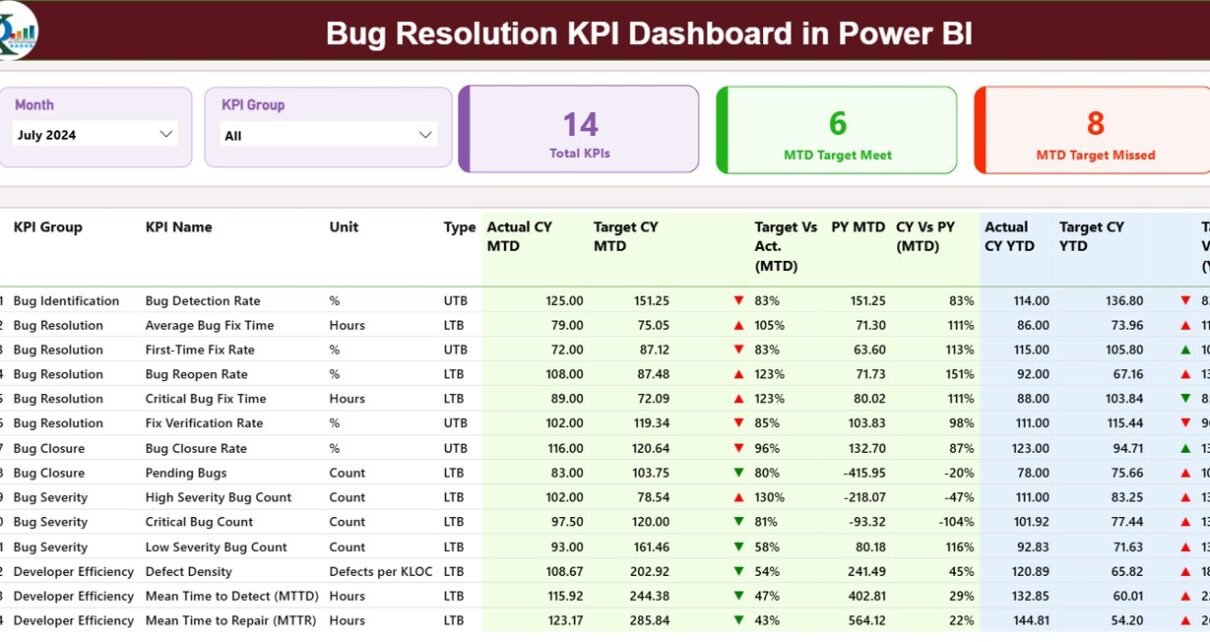
1. Summary Page — What Does It Show?
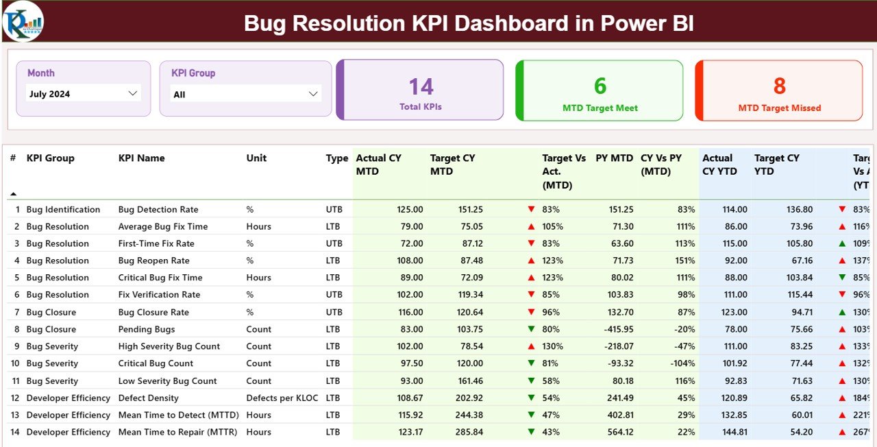
This is the main page of the dashboard. It helps you see the complete view of all KPIs at a glance.
Top Section
You see:
-
Month Slicer
-
KPI Group Slicer
-
Total KPIs Count
-
MTD Target Met Count
-
MTD Target Missed Count
These slicers help you filter the dashboard instantly and focus on the month or group you want to study.
Main KPI Table
The detailed KPI table includes:
-
KPI Number (sequence)
-
KPI Group
-
KPI Name
-
Unit
-
Type (LTB/UTB)
-
Actual CY MTD
-
Target CY MTD
-
MTD Icon (▲ or ▼)
-
Target vs Actual % MTD
-
Previous Year MTD
-
CY vs PY % MTD
-
Actual CY YTD
-
Target CY YTD
-
YTD Icon (▲ or ▼)
-
Target vs Actual % YTD
-
Previous Year YTD
-
CY vs PY % YTD
The icons (▲ green / ▼ red) help you immediately identify if you’re meeting or missing targets.
2. KPI Trend Page — What Trends Can You Monitor?
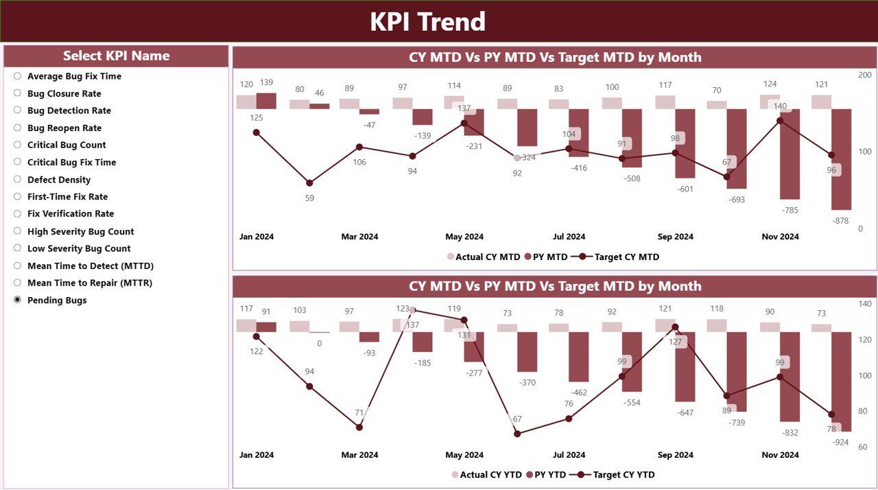
The KPI Trend Page uses two interactive combo charts:
-
MTD Trend Chart (Current Year, Previous Year, Target)
-
YTD Trend Chart (Current Year, Previous Year, Target)
You also get a KPI Slicer on the left. You can choose one KPI and see how it performed month-to-month across CY, PY, and target values.
This page helps you:
-
Identify slowdowns
-
Track seasonal patterns
-
Compare yearly performance
-
Check consistency
3. KPI Definition Page — What Details Can You See?
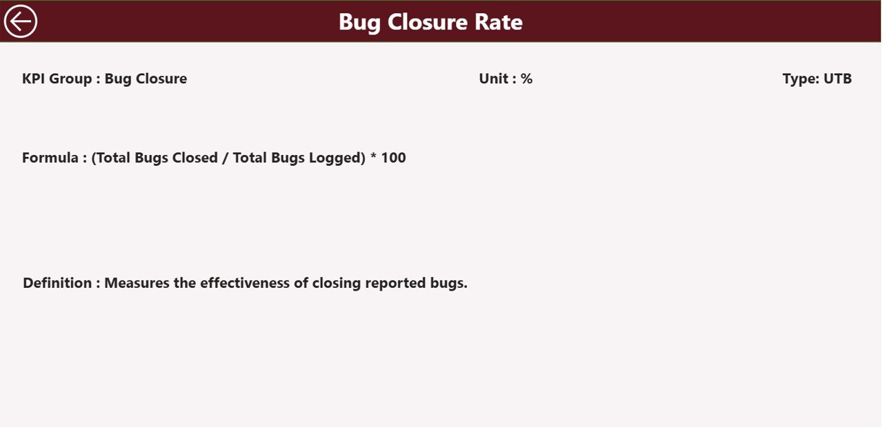
This is a drill-through page, and it stays hidden in the navigation.
You can simply right-click on a KPI from the Summary Page and jump to its details:
-
Formula
-
KPI Definition
-
KPI Group
-
KPI Number
-
Type (UTB/LTB)
A back button at the top-left corner helps you return to the main page.
Advantages of the Bug Resolution KPI Dashboard in Power BI
Here are the major benefits you get:
1. Faster Decision-Making
The dashboard gives instant clarity. You see trends, compare numbers, and identify issues without digging into spreadsheets.
2. Better Team Coordination
Developers, QA testers, leads, and managers work together when they see the same data. It builds transparency and encourages collaboration.
3. Improved Bug Resolution Quality
By tracking KPIs like average resolution time and reopened bugs, you improve quality and reduce recurring issues.
4. Strong Target Monitoring
The dashboard continuously shows:
-
MTD Actual vs MTD Target
-
YTD Actual vs YTD Target
-
CY vs PY comparisons
You quickly notice if performance drifts away from goals.
5. Real-Time Tracking Without Manual Work
You only update the Excel sheet each month. Power BI then handles all calculations, comparisons, icons, and visuals automatically.
6. Highly Customizable
You can add:
-
New KPIs
-
Additional filters
-
Extra trend charts
-
Drill-through details
-
More pages
This makes the system perfect for any software team.
Opportunities for Improvement in Bug Resolution KPI Tracking
Click to Purchases Bug Resolution KPI Dashboard in Power BI
Even though the dashboard provides strong insights, you can improve tracking further with these ideas:
✔ Add severity-based KPIs
Separate bugs into critical, high, medium, and low.
✔ Add resolution SLA tracking
Measure how many bugs meet SLA timelines.
✔ Integrate automated data loading
Connect to Jira, Azure DevOps, or GitHub for real-time updates.
✔ Add developer or team-wise dashboards
Track performance by individual or team.
✔ Monitor reopened bugs separately
High reopened bugs indicate quality issues.
✔ Add comments or notes
Capture reasons behind missed targets.
✔ Add forecast KPIs
Predict future bug trends using Power BI forecasting.
All these enhancements can help teams act even faster.
Best Practices for Using the Bug Resolution KPI Dashboard in Power BI
Follow these practices to get the maximum benefit from this dashboard:
1. Keep Data Clean and Accurate
Use consistent formats in the Excel sheets:
-
KPI Names
-
Dates (use first day of month)
-
Units
-
MTD/YTD values
Clean data ensures correct visualizations.
2. Update the Excel File Monthly
Regular updates keep your dashboard accurate. If you automate updates through data connectors, it speeds up reporting.
3. Use Meaningful KPI Names
Clear KPI names help everyone understand the dashboard easily.
Examples:
-
Average Bug Resolution Time
-
Critical Bug Aging
-
Reopened Bug Count
-
Monthly Bug Detection Trend
4. Review Trends Monthly and Quarterly
Use the KPI Trend Page to understand:
-
Seasonal patterns
-
Long-term improvement
-
Rising problem areas
5. Compare CY vs PY to Understand Growth
Year-over-year comparisons help you track improvement efforts and highlight recurring issues.
6. Involve All Teams
Let developers, testers, leads, and managers use the dashboard. Shared visibility drives better performance.
7. Customize Icons and Conditional Formatting
Use green and red arrows to show progress clearly. Icons make it easier for leadership to read performance quickly.
8. Add Comments for Missed KPIs
Documenting reasons for missed targets helps during reviews and audits.
Conclusion
A Bug Resolution KPI Dashboard in Power BI gives you complete visibility into bug trends, target performance, and year-over-year improvements. It simplifies reporting, saves time, and helps teams act faster. You view KPIs clearly, drill down into details, and track both MTD and YTD progress from a single screen.
With structured data entry, interactive visuals, and smart comparisons, this dashboard becomes a powerful tool for QA teams, software development teams, and project managers. When you follow best practices and keep data updated, your team boosts quality and efficiency.
Frequently Asked Questions (FAQs)
1. What is a Bug Resolution KPI Dashboard?
It is a Power BI dashboard that tracks all bug-related KPIs such as resolution time, reopened bugs, severity trends, and monthly comparisons.
2. Who should use this dashboard?
QA teams, development teams, project managers, engineering managers, and product owners should use this dashboard to track bug resolution efficiency.
3. What are the main pages in the dashboard?
The dashboard includes:
-
Summary Page
-
KPI Trend Page
-
KPI Definition Page
4. How do I update the dashboard?
You only update the Excel sheets (Actual, Target, and KPI Definition). Power BI refreshes visuals automatically.
5. What is MTD and YTD?
-
MTD (Month-To-Date): Performance from the 1st of the month to today.
-
YTD (Year-To-Date): Performance from January to today.
6. Can I add more KPIs?
Yes, simply update the KPI Definition Sheet and input actual/target values for the new KPI.
7. Can I connect this dashboard to Jira or Azure DevOps?
Yes, you can connect Power BI to Jira, Azure DevOps, GitHub, or any bug tracking tool for automated updates.
8. What are UTB and LTB KPIs?
-
UTB (Upper the Better): Higher values are good.
-
LTB (Lower the Better): Lower values are preferred.
9. Can I share the dashboard with my team?
Yes, you can publish it to Power BI Service and share it with team members through secure access.
10. Is this dashboard customizable?
Absolutely. You can add visuals, filters, formulas, color themes, and even new pages.
Visit our YouTube channel to learn step-by-step video tutorials
Click to Purchases Bug Resolution KPI Dashboard in Power BI