Business disruptions can strike at any time. Therefore, organizations must stay prepared, resilient, and data-driven. That is exactly why a Business Continuity Planning KPI Dashboard in Power BI plays a critical role in modern organizations. This dashboard helps leaders track preparedness, response efficiency, and recovery performance using clear, measurable KPIs.
In this in-depth article, you will learn what a Business Continuity Planning KPI Dashboard in Power BI is, why organizations need it, how it works, and how each dashboard page supports better decisions. Moreover, you will explore advantages, opportunities for improvement, best practices, and frequently asked questions. By the end, you will clearly understand how this dashboard strengthens resilience, ensures compliance, and improves operational continuity—without complexity.
Click to buy Business Continuity Planning KPI Dashboard in Power BI
What Is a Business Continuity Planning KPI Dashboard in Power BI?
A Business Continuity Planning KPI Dashboard in Power BI is a ready-to-use, interactive analytics solution designed to monitor, measure, and improve business continuity performance.
Instead of relying on scattered Excel files, static reports, and manual tracking, this dashboard consolidates all critical continuity KPIs into a single Power BI report. As a result, decision-makers gain real-time visibility into preparedness levels, response effectiveness, and recovery trends.
Moreover, the dashboard uses Excel as a structured data source and Power BI for visualization, which ensures flexibility, accuracy, and ease of use. Because of this approach, both technical and non-technical users can adopt the dashboard quickly.
Why Do Organizations Need Business Continuity KPI Tracking?
Unexpected disruptions can cause financial losses, reputational damage, and regulatory issues. Therefore, organizations must track continuity KPIs continuously rather than reactively.
A Business Continuity Planning KPI Dashboard in Power BI helps because:
- It provides early warning signals for gaps in preparedness
- It ensures alignment with continuity objectives and targets
- It supports compliance with ISO 22301 and internal audit requirements
- It improves decision-making during crises
- It creates data-driven accountability across teams
As a result, organizations move from reactive crisis management to proactive continuity planning.
How Does a Business Continuity Planning KPI Dashboard in Power BI Work?
The dashboard follows a simple yet powerful architecture. First, users capture actual and target KPI values in Excel. Then, Power BI processes and visualizes the data using structured models and calculations.
Core Working Flow
- Enter KPI data in Excel
- Define KPI formulas and performance type
- Load Excel data into Power BI
- Analyze performance using slicers, cards, tables, and charts
Because this workflow remains simple, teams can maintain the dashboard without advanced technical skills.
What Are the Key Pages in the Business Continuity Planning KPI Dashboard in Power BI?
This ready-to-use dashboard includes three structured pages, each designed for a specific analytical purpose.
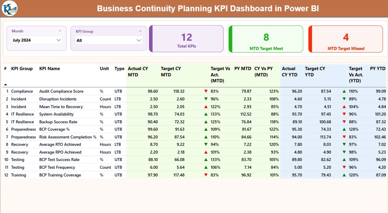
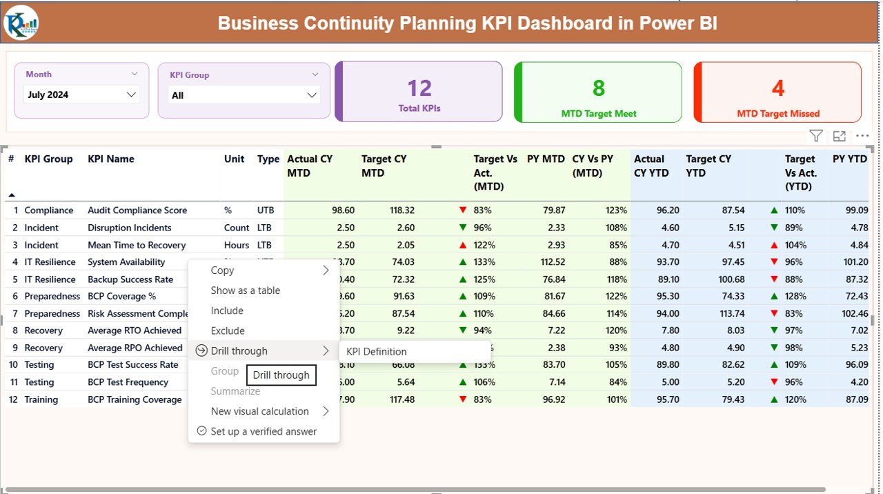
Summary Page
The Summary Page acts as the control center of the dashboard. Therefore, it provides instant visibility into overall continuity performance.
Key Elements on the Summary Page
- Month Slicer – Analyze performance for a selected month
- KPI Group Slicer – Filter KPIs by category
- Total KPIs Card – Displays the total number of tracked KPIs
- MTD Target Meet Card – Shows KPIs that met targets MTD
- MTD Target Missed Card – Highlights KPIs that missed targets
Detailed KPI Table on the Summary Page
The table displays granular KPI-level details, including:
- KPI Number – Unique sequence identifier
- KPI Group – Category of continuity KPIs
- KPI Name – Name of the KPI
- Unit – Measurement unit
- Type (LTB / UTB) – Lower-the-Better or Upper-the-Better
- Actual CY MTD – Current Year Month-to-Date actual
- Target CY MTD – Current Year Month-to-Date target
- MTD Status Icon – ▲ or ▼ with green/red indicator
- Target vs Actual (MTD) – Actual ÷ Target
- Previous Year MTD – Last year’s MTD value
- CY vs PY (MTD) – Current ÷ Previous Year
- Actual CY YTD – Year-to-Date actual
- Target CY YTD – Year-to-Date target
- YTD Status Icon – Performance indicator
- Target vs Actual (YTD) – Actual ÷ Target
- Previous Year YTD – Last year’s YTD value
- CY vs PY (YTD) – Current ÷ Previous Year
Because of this structure, users can identify performance gaps immediately.
Click to buy Business Continuity Planning KPI Dashboard in Power BI
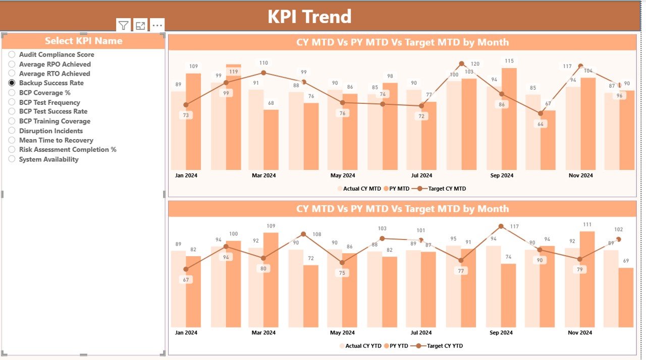
KPI Trend Page
The KPI Trend Page focuses on performance trends over time. Therefore, it helps users understand whether continuity performance improves or declines.
Key Features of the KPI Trend Page
Two Combo Charts
Actual CY vs Target vs PY for MTD
Actual CY vs Target vs PY for YTD
KPI Name Slicer – Analyze one KPI at a time
Because of this setup, users can detect seasonal patterns, improvement trends, and recurring issues.
Click to buy Business Continuity Planning KPI Dashboard in Power BI
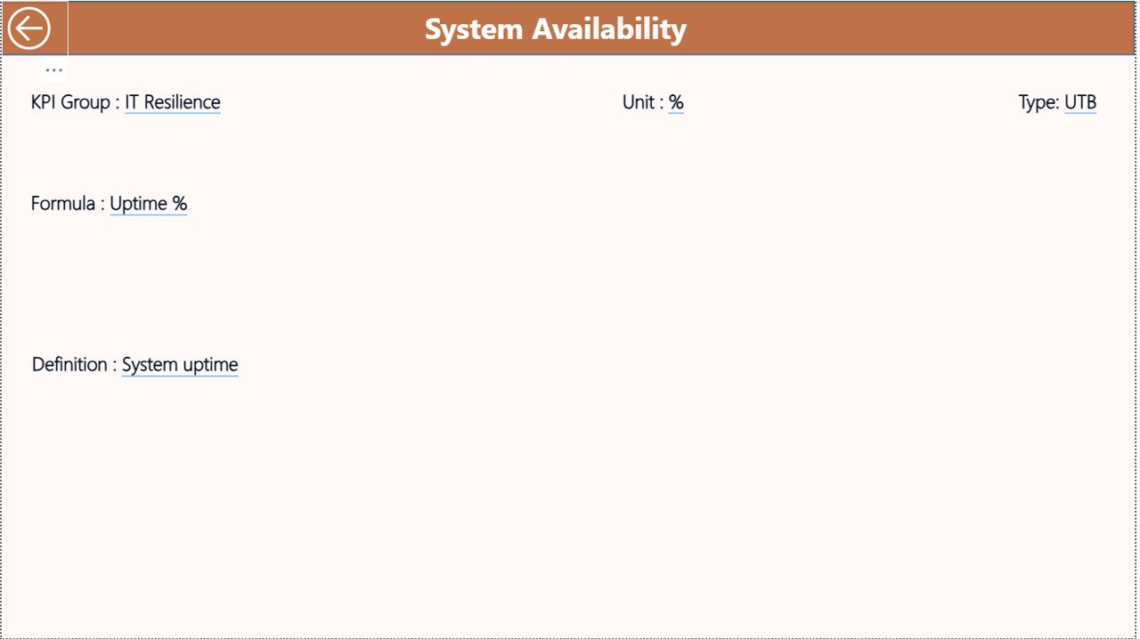
KPI Definition
The KPI Definition Page serves as a drill-through reference page. Therefore, it ensures clarity and consistency across the organization.
What Does the KPI Definition Page Show?
- KPI Formula
- KPI Definition
- Measurement Logic
- KPI Type (LTB or UTB)
Users can drill through from the Summary Page to this hidden page. After reviewing details, they can return using the back button at the top-left corner.
Click to buy Business Continuity Planning KPI Dashboard in Power BI
What Excel Data Is Required for the Dashboard?
The dashboard uses Excel as the data source, which makes maintenance easy and flexible.
Input_Actual Sheet
In this sheet, users enter:
- KPI Name
- Month (first date of the month)
- MTD Actual Value
- YTD Actual Value
Click to buy Business Continuity Planning KPI Dashboard in Power BI
Input_Target Sheet
In this sheet, users enter:
- KPI Name
- Month (first date of the month)
- MTD Target Value
- YTD Target Value
KPI Definition Sheet
In this sheet, users define:
- KPI Number
- KPI Group
- KPI Name
- Unit
- Formula
- Definition
- Type (LTB or UTB)
Because of this structured input model, data quality remains high.
Advantages of Business Continuity Planning KPI Dashboard in Power BI
Using this dashboard delivers significant strategic and operational benefits.
Key Advantages
- Centralized KPI Monitoring
All continuity KPIs stay in one structured dashboard. - MTD & YTD Performance Tracking
Users track short-term and long-term performance together. - Target vs Actual Transparency
Visual indicators highlight risks instantly. - Trend-Based Decision-Making
Historical comparisons reveal improvement opportunities. - Audit & Compliance Readiness
Clear documentation supports internal and external audits. - Excel + Power BI Simplicity
Easy data entry with powerful visualization.
Opportunities for Improvement in Business Continuity KPI Dashboards
Although the dashboard delivers strong value, organizations can enhance it further.
Improvement Opportunities
- Add risk severity scoring for critical KPIs
- Integrate incident management systems for automation
- Include scenario-based stress testing KPIs
- Add department-wise accountability views
- Extend analysis to regional or site-level continuity KPIs
These improvements increase maturity and resilience over time.
Best Practices for the Business Continuity Planning KPI Dashboard in Power BI
Following best practices ensures accuracy, trust, and long-term adoption.
Best Practices
- Define KPIs clearly before implementation
- Use consistent KPI definitions across departments
- Review targets quarterly and update them regularly
- Validate Excel data before refreshing Power BI
- Limit the number of KPIs to what truly matters
- Train users on interpretation, not just navigation
- Review trends monthly, not only during incidents
By following these practices, organizations maximize dashboard value.
Who Can Benefit from a Business Continuity Planning KPI Dashboard in Power BI?
This dashboard supports multiple stakeholders.
Key Users
- Business Continuity Managers
- Risk & Compliance Teams
- Operations Leaders
- IT Disaster Recovery Teams
- Internal Audit Teams
- Senior Management & Executives
Each group gains tailored insights without additional reporting effort.
How Does This Dashboard Improve Decision-Making?
The dashboard converts raw continuity data into actionable intelligence. Therefore, leaders can:
- Identify readiness gaps early
- Prioritize high-risk areas
- Allocate resources effectively
- Track improvement initiatives
- Communicate performance clearly
As a result, decisions become faster, smarter, and more confident.
Why Choose Power BI for Business Continuity KPI Dashboards?
Power BI offers flexibility, scalability, and strong visualization.
Why Power BI Works Best
- Interactive slicers for instant filtering
- Visual KPI indicators for fast interpretation
- Seamless Excel integration
- Secure data access and sharing
- Scalable for growing organizations
Because of these strengths, Power BI remains a preferred choice.
Conclusion
A Business Continuity Planning KPI Dashboard in Power BI transforms continuity management from reactive reporting into proactive performance monitoring. By combining structured Excel data with powerful Power BI visuals, organizations gain clarity, control, and confidence.
Moreover, this dashboard supports preparedness, improves response efficiency, and strengthens recovery planning. When used consistently and aligned with best practices, it becomes a critical tool for operational resilience and strategic continuity planning.
Frequently Asked Questions (FAQs)
What is the main purpose of a Business Continuity KPI Dashboard?
The dashboard tracks preparedness, response, and recovery KPIs to improve organizational resilience.
Can non-technical users maintain this dashboard?
Yes, because Excel handles data entry and Power BI handles visualization.
Does the dashboard support MTD and YTD analysis?
Yes, it supports both Month-to-Date and Year-to-Date performance tracking.
Can organizations customize KPIs?
Yes, users can add or modify KPIs through the Excel definition sheet.
Is this dashboard suitable for audits?
Yes, it provides clear KPI definitions, formulas, and historical comparisons.
How often should KPI data be updated?
Organizations should update data monthly or after major incidents.
Visit our YouTube channel to learn step-by-step video tutorials
Click to buy Business Continuity Planning KPI Dashboard in Power BI
Watch the step-by-step video tutorial: