In today’s fast-paced healthcare environment, cardiology institutes must track performance with precision. Hospitals handle critical heart-related cases every day. Therefore, decision-makers need accurate, real-time insights to improve patient outcomes and operational efficiency. However, many institutes still depend on manual reports and disconnected systems. As a result, delays occur, and performance visibility remains limited.
To solve this challenge, healthcare organizations now adopt data-driven tools. Among them, the Cardiology Institutes KPI Dashboard in Power BI stands out as a powerful solution. It helps professionals monitor KPIs, compare performance, and make faster decisions.
In this detailed guide, you will learn everything about this dashboard, including its structure, features, advantages, best practices, and FAQs.
Click to buy Cardiology Institutes KPI Dashboard in Power BI
What is a Cardiology Institutes KPI Dashboard in Power BI?
A Cardiology Institutes KPI Dashboard in Power BI is an interactive analytics tool that tracks and visualizes key performance indicators related to cardiology departments.
Instead of using multiple Excel sheets, users can monitor all KPIs in one centralized dashboard. Moreover, the system connects with Excel data sources, which makes data updates simple and efficient.
With this dashboard, healthcare professionals can:
- Monitor clinical performance metrics
- Track operational efficiency
- Compare actual vs target values
- Analyze Month-to-Date (MTD) and Year-to-Date (YTD) performance
- Identify trends and improve decision-making
Why Do Cardiology Institutes Need KPI Dashboards?
Healthcare organizations deal with complex operations. Therefore, tracking performance manually creates inefficiencies.
However, when institutes use KPI dashboards:
- They gain real-time insights
- They reduce reporting errors
- They improve patient care quality
- They streamline operations
As a result, decision-makers act faster and more confidently.
Key Features of Cardiology Institutes KPI Dashboard in Power BI
This ready-to-use dashboard includes 3 powerful pages inside Power BI. Each page plays an important role in performance analysis.
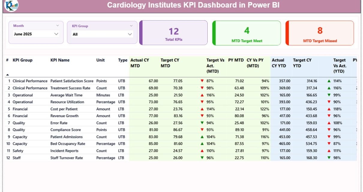
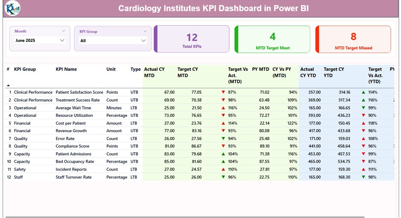
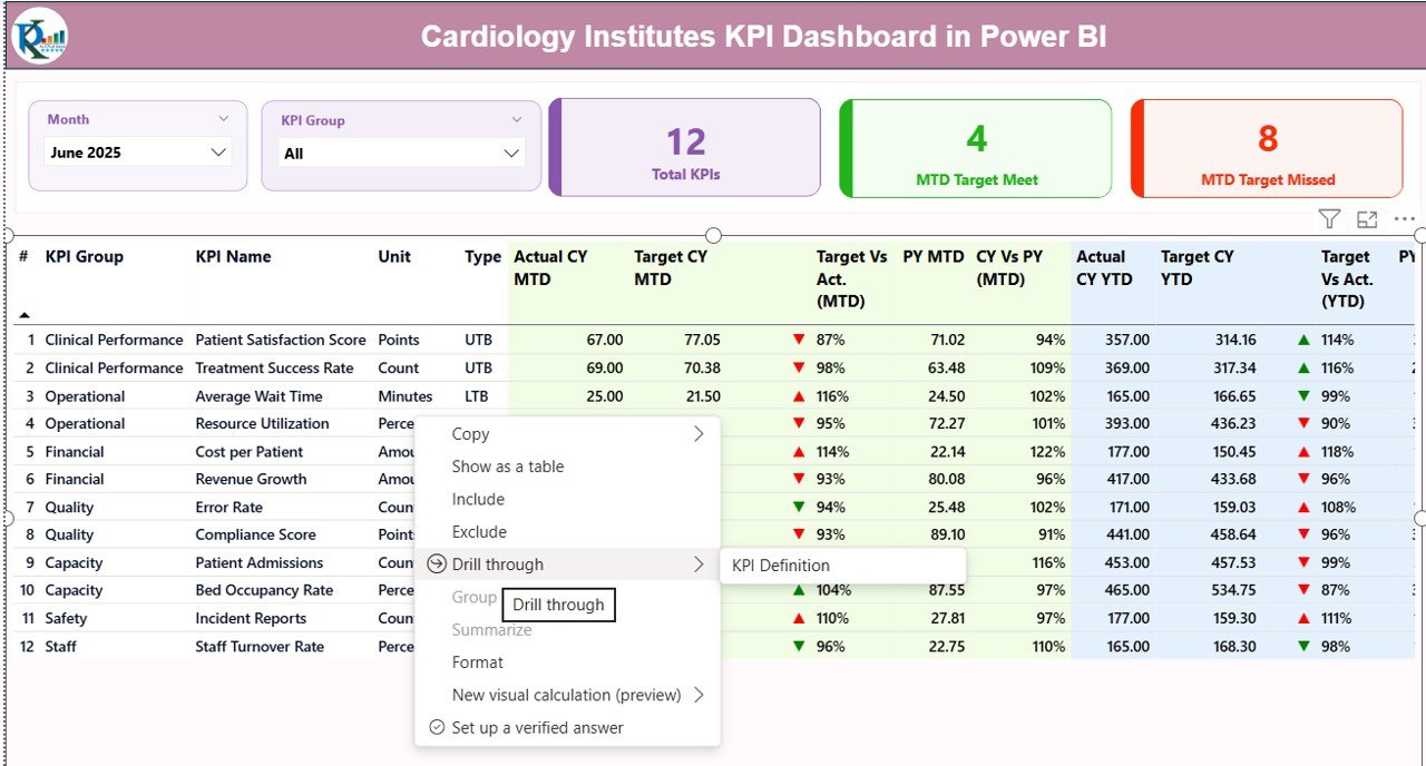
Summary Page – Central Performance Overview 📌
The Summary Page acts as the main control panel. It provides a quick overview of all KPIs.
Key Elements:
- Month Slicer → Select any month dynamically
- KPI Group Slicer → Filter KPIs by category
- KPI Cards:
Total KPIs
MTD Target Achieved
MTD Target Missed
Detailed KPI Table Includes:
- KPI Number → Unique identifier
- KPI Group → Category of KPI
- KPI Name → Performance metric name
- Unit → Measurement unit
- Type → LTB (Lower the Better) or UTB (Upper the Better)
Performance Metrics:
- Actual CY MTD → Current Year MTD values
- Target CY MTD → Target values
- MTD Indicator (▲▼) → Performance status
Green arrow shows good performance
Red arrow shows underperformance
- Target vs Actual (MTD)
- Previous Year MTD (PY MTD)
- CY vs PY (MTD)
Similarly, for YTD:
- Actual CY YTD
- Target CY YTD
- YTD Indicators
- Target vs Actual (YTD)
- Previous Year YTD
- CY vs PY (YTD)
Therefore, users quickly evaluate performance without switching screens.
Click to buy Cardiology Institutes KPI Dashboard in Power BI
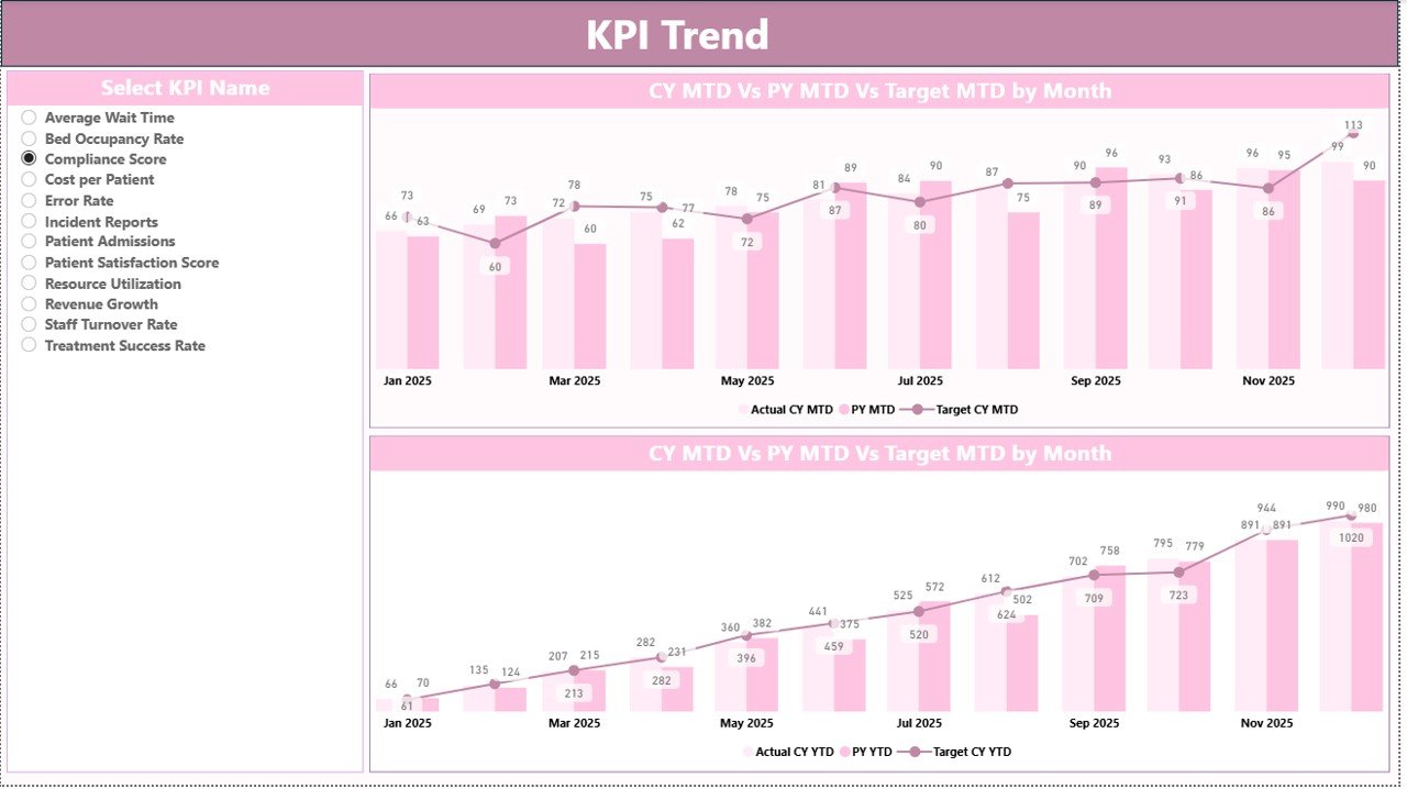
KPI Trend Page – Performance Visualization
The KPI Trend Page helps users analyze trends visually.
Key Features:
- KPI Selection Slicer → Choose any KPI
- Two Combo Charts:
MTD Trend
YTD Trend
Each chart compares:
- Current Year Actual
- Previous Year Values
- Target Values
As a result, users easily identify growth patterns and performance gaps.
Click to buy Cardiology Institutes KPI Dashboard in Power BI
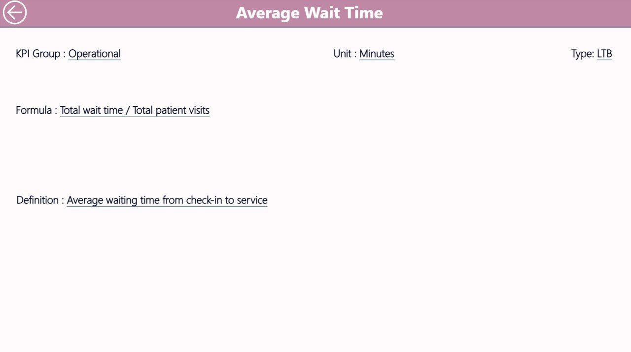
KPI Definition Page – Detailed KPI Insights
This page works as a drill-through page.
Key Benefits:
- Displays KPI formula
- Shows KPI definition
- Explains KPI calculation logic
Moreover, users can navigate from Summary to this page easily.
Back button helps return to the main dashboard instantly
Click to buy Cardiology Institutes KPI Dashboard in Power BI
Excel Data Structure Behind the Dashboard
The dashboard uses Excel as a data source. Therefore, updating data remains simple and flexible.
You need to maintain 3 worksheets:
Input_Actual Sheet
Enter:
- KPI Name
- Month (First date of month)
- MTD Values
- YTD Values
Click to buy Cardiology Institutes KPI Dashboard in Power BI
Input_Target Sheet
Enter:
- KPI Name
- Month
- Target MTD
- Target YTD
KPI Definition Sheet
Define:
- KPI Number
- KPI Group
- KPI Name
- Unit
- Formula
- Definition
- Type (LTB/UTB)
Because of this structured approach, data stays clean and organized.
Advantages of Cardiology Institutes KPI Dashboard in Power BI 🌟
Using this dashboard provides multiple benefits.
Improved Decision-Making
- Leaders access real-time data instantly
- They make faster and smarter decisions
Centralized Data View
- All KPIs appear in one dashboard
- Users avoid switching between files
Time-Saving
- Automated calculations reduce manual work
- Reporting becomes faster
Performance Tracking
- MTD and YTD tracking improves accuracy
- Users compare trends easily
Target Monitoring
- Instant comparison of actual vs target
- Visual indicators highlight performance
Better Transparency
- KPI definitions improve clarity
- Everyone understands performance metrics
How Does This Dashboard Improve Healthcare Performance? 🏥
This dashboard directly impacts healthcare operations.
It Helps In:
- Monitoring patient treatment efficiency
- Reducing delays in diagnosis
- Improving resource allocation
- Enhancing staff performance tracking
Therefore, hospitals deliver better patient care.
Best Practices for Cardiology Institutes KPI Dashboard in Power BI ✅
To maximize the benefits, follow these best practices:
Keep Data Updated Regularly
Always update Excel sheets on time. Otherwise, the dashboard will show outdated insights.
Define KPIs Clearly
Use clear KPI definitions. This step avoids confusion.
Use Relevant KPIs Only
Avoid unnecessary KPIs. Focus on critical performance metrics.
Monitor Trends Frequently
Check MTD and YTD trends regularly. This helps detect issues early.
Train Your Team
Ensure staff understands how to use the dashboard. Proper training improves adoption.
Use Drill-Through Feature
Leverage the KPI definition page for deeper analysis.
Who Can Benefit from This Dashboard?
This dashboard suits multiple healthcare professionals:
- Hospital Administrators
- Cardiology Department Heads
- Healthcare Analysts
- Medical Directors
- Operations Managers
Moreover, even small clinics can use it for performance tracking.
Conclusion
The Cardiology Institutes KPI Dashboard in Power BI transforms healthcare analytics. It simplifies complex data, improves performance tracking, and enables faster decision-making.
Moreover, it provides a centralized view of all KPIs, which helps healthcare professionals focus on patient care and operational excellence.
Therefore, if you want to improve efficiency, reduce reporting time, and enhance performance visibility, this dashboard offers the perfect solution.
Frequently Asked Questions (FAQs)
- What is the main purpose of this dashboard?
This dashboard helps cardiology institutes track and analyze performance using KPIs in real time.
- Do I need advanced Power BI skills to use it?
No. The dashboard is user-friendly. You only need basic Power BI knowledge.
- Can I customize the KPIs?
Yes. You can easily add or modify KPIs based on your requirements.
- What data source does this dashboard use?
It uses Excel files as the primary data source.
- How often should I update the data?
You should update the data monthly or as frequently as needed.
- What is LTB and UTB?
- LTB (Lower the Better) → Lower values indicate better performance
- UTB (Upper the Better) → Higher values indicate better performance
- Can this dashboard work for other departments?
Yes. You can customize it for other healthcare departments as well.
- Does it support trend analysis?
Yes. The KPI Trend page provides MTD and YTD trend charts.
Visit our YouTube channel to learn step-by-step video tutorials
Watch the step-by-step video tutorial:
Click to buy Cardiology Institutes KPI Dashboard in Power BI