Running a catering services business involves far more than preparing great food. You must manage costs, meet delivery timelines, maintain quality, satisfy clients, and track performance daily. However, when data stays scattered across Excel files and manual reports, decision-making becomes slow and risky.
That is exactly where a Catering Services KPI Dashboard in Power BI becomes essential.
This article explains what a Catering Services KPI Dashboard in Power BI is, why it matters, how it works, its key features, advantages, best practices, and frequently asked questions. Moreover, this guide helps catering owners, managers, and analysts understand how to use KPI-driven insights to improve operational efficiency and profitability.
Click to Purchases Catering Services KPI Dashboard in Power BI
What Is a Catering Services KPI Dashboard in Power BI?
A Catering Services KPI Dashboard in Power BI is a centralized, interactive reporting solution designed to track and analyze key performance indicators (KPIs) related to catering operations.
Instead of reviewing multiple spreadsheets, this dashboard displays all important KPIs on a single screen. As a result, decision-makers can instantly see whether performance meets targets or needs improvement.
Moreover, this dashboard uses Excel as a data source, which makes it easy to update and maintain. Once you update the Excel file, Power BI automatically refreshes all visuals.
Why Do Catering Businesses Need a KPI Dashboard?
Catering businesses operate in a fast-moving and competitive environment. Therefore, relying on gut feeling or delayed reports often leads to losses.
A Catering Services KPI Dashboard in Power BI helps you:
-
Monitor operational performance in real time
-
Compare actual results with targets
-
Identify underperforming KPIs quickly
-
Track month-to-date (MTD) and year-to-date (YTD) performance
-
Make data-driven decisions confidently
As a result, catering businesses gain clarity, control, and consistency across operations.
How Does the Catering Services KPI Dashboard in Power BI Work?
The dashboard works by connecting Power BI Desktop to a structured Excel file. This Excel file contains three well-defined worksheets:
-
Input_Actual
-
Input_Target
-
KPI Definition
Once you update these sheets, Power BI calculates all KPIs automatically and updates visuals across all dashboard pages.
Therefore, users do not need advanced technical knowledge to operate the dashboard.
Key Features of the Catering Services KPI Dashboard in Power BICatering Services KPI Dashboard in Power BI
This ready-to-use dashboard includes three powerful pages, each designed for a specific analytical purpose.
What Is Included in the Summary Page of the Dashboard?
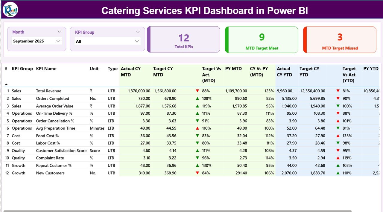
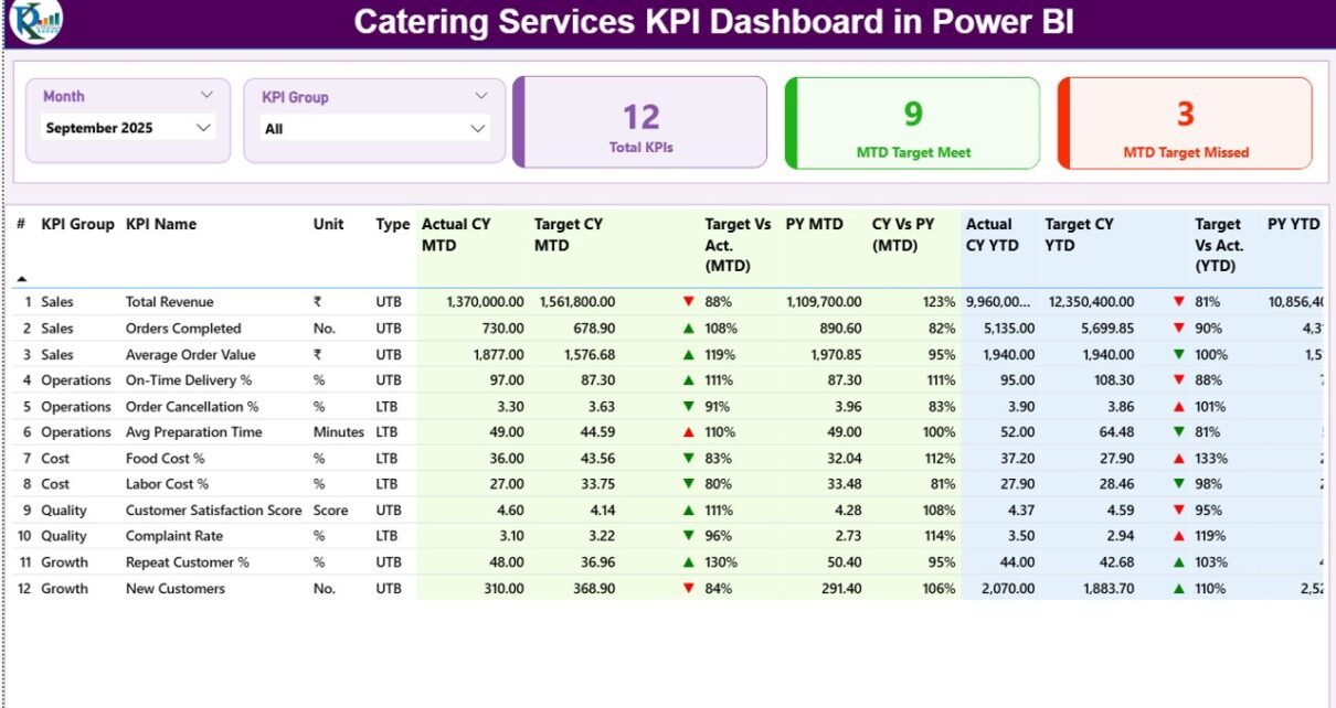
The Summary Page acts as the control center of the dashboard.
Top-Level Filters (Slicers)
At the top of the page, you will find:
-
Month Slicer – Allows you to select a specific month
-
KPI Group Slicer – Filters KPIs by category
Because of these slicers, users can instantly analyze performance by time period or KPI group.
KPI Summary Cards
Just below the slicers, the dashboard displays three KPI cards:
-
Total KPIs Count – Shows the total number of tracked KPIs
-
MTD Target Met Count – Displays how many KPIs achieved their MTD targets
-
MTD Target Missed Count – Shows how many KPIs failed to meet targets
These cards provide a quick performance snapshot at a glance.
Detailed KPI Performance Table
Below the cards, the dashboard displays a comprehensive KPI table that includes:
-
KPI Number – Sequential identifier for each KPI
-
KPI Group – Category or group of the KPI
-
KPI Name – Name of the KPI
-
Unit – Measurement unit (%, hours, cost, count, etc.)
-
Type – UTB (Upper the Better) or LTB (Lower the Better)
MTD Performance Metrics Explained
The table includes detailed Month-to-Date (MTD) performance metrics:
-
Actual CY MTD – Current year actual MTD value
-
Target CY MTD – Target MTD value for the current year
-
MTD Icon – Red ▼ or green ▲ indicator for target achievement
-
Target vs Actual (MTD) – Percentage comparison (Actual ÷ Target)
-
PY MTD – Previous year MTD value
-
CY vs PY (MTD) – Growth comparison between current and previous year
Because of these metrics, users can instantly understand short-term performance.
YTD Performance Metrics Explained
The dashboard also includes Year-to-Date (YTD) analysis:
-
Actual CY YTD – Current year YTD actual value
-
Target CY YTD – Current year YTD target value
-
YTD Icon – Red ▼ or green ▲ indicator for YTD performance
-
Target vs Actual (YTD) – Percentage comparison
-
PY YTD – Previous year YTD value
-
CY vs PY (YTD) – Year-over-year growth comparison
As a result, users can evaluate long-term performance trends easily.
Click to Purchases Catering Services KPI Dashboard in Power BI
What Is the KPI Trend Page and Why Is It Important?
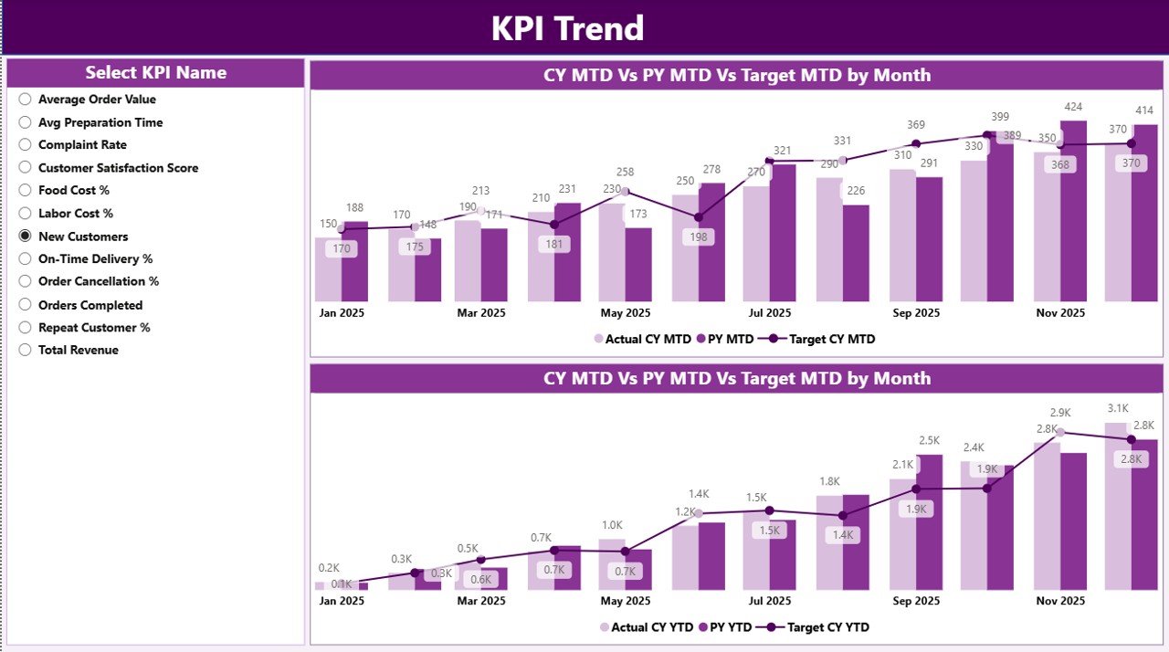
The KPI Trend Page focuses on trend analysis and performance comparison over time.
Key Highlights of the KPI Trend Page
-
Two combo charts display:
-
Actual values (Current Year)
-
Actual values (Previous Year)
-
Target values
-
-
Separate charts for:
-
MTD trends
-
YTD trends
-
-
KPI Name Slicer on the left to analyze individual KPIs
Because of these features, users can identify trends, seasonality, and performance gaps quickly.
What Is the KPI Definition Page?
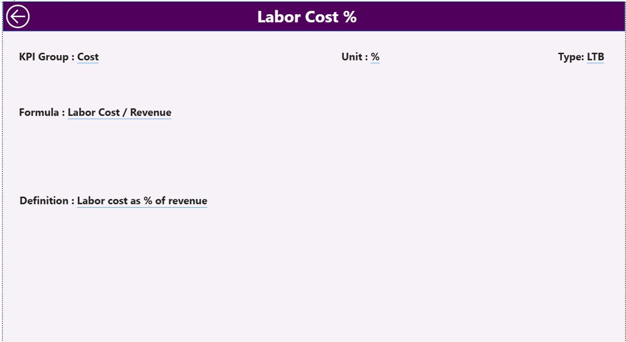
The KPI Definition Page serves as a reference and documentation layer.
Key Characteristics
-
Hidden drill-through page
-
Accessible from the Summary Page
-
Displays:
-
KPI Formula
-
KPI Definition
-
KPI Type (UTB or LTB)
-
This page ensures clarity and consistency across teams.
Moreover, users can easily return to the Summary Page using the Back Button located at the top-left corner.
How Does the Excel Data Source Work?
The dashboard uses an Excel file as its data source. This file contains three structured worksheets.
Input_Actual Sheet Explained
In this sheet, users enter actual performance data:
-
KPI Name
-
Month (use the first date of the month)
-
MTD Actual value
-
YTD Actual value
This sheet captures real operational performance.
Input_Target Sheet Explained
In this sheet, users define performance goals:
-
KPI Name
-
Month (use the first date of the month)
-
MTD Target value
-
YTD Target value
Because targets stay centralized, comparisons become easy and reliable.
KPI Definition Sheet Explained
This sheet defines the structure of KPIs:
-
KPI Number
-
KPI Group
-
KPI Name
-
Unit
-
Formula
-
Definition
-
Type (LTB or UTB)
This sheet ensures standardized KPI interpretation across the organization.
Click to Purchases Catering Services KPI Dashboard in Power BI
Advantages of Catering Services KPI Dashboard in Power BI
Using a Catering Services KPI Dashboard in Power BI offers several business advantages.
1. Centralized Performance Monitoring
You can track all catering KPIs in one place. As a result, decision-making becomes faster and more accurate.
2. Real-Time Insights
Once you update the Excel file, Power BI refreshes the dashboard instantly. Therefore, you always work with the latest data.
3. Improved Target Tracking
MTD and YTD comparisons help you track progress against goals continuously.
4. Visual Performance Indicators
Red and green icons make underperformance and success visible instantly.
5. Better Strategic Planning
Trend analysis enables better forecasting, budgeting, and capacity planning.
6. Easy Scalability
You can add new KPIs, months, or categories without redesigning the dashboard.
Best Practices for the Catering Services KPI Dashboard in Power BI
Following best practices ensures maximum value from the dashboard.
1. Define Clear KPIs
Always select KPIs aligned with catering operations such as cost, delivery time, waste, and customer satisfaction.
2. Maintain Data Accuracy
Ensure timely and accurate updates in Excel input sheets.
3. Use Consistent KPI Definitions
Standardize formulas and definitions across teams using the KPI Definition sheet.
4. Review KPIs Regularly
Monitor KPIs weekly or monthly to identify issues early.
5. Focus on Actionable Metrics
Avoid vanity metrics. Instead, track KPIs that directly impact profitability and service quality.
6. Train Users Properly
Ensure users understand slicers, drill-throughs, and trend analysis features.
Who Can Benefit from This Dashboard?
Click to Purchases Catering Services KPI Dashboard in Power BI
A Catering Services KPI Dashboard in Power BI benefits:
-
Catering business owners
-
Operations managers
-
Finance teams
-
Business analysts
-
Event management companies
-
Corporate catering service providers
Conclusion
A Catering Services KPI Dashboard in Power BI transforms raw catering data into meaningful, actionable insights. Instead of relying on manual reports and guesswork, catering businesses gain full visibility into performance, targets, and trends.
Because this dashboard uses Excel as a data source, it remains simple, flexible, and scalable. Moreover, its structured pages, visual indicators, and trend analysis help teams make faster and smarter decisions.
Ultimately, this dashboard empowers catering businesses to improve efficiency, control costs, and deliver consistent service quality.
Frequently Asked Questions (FAQs)
What is a Catering Services KPI Dashboard in Power BI used for?
A Catering Services KPI Dashboard in Power BI helps track, analyze, and compare catering performance metrics against targets using interactive visuals.
Can beginners use this Power BI dashboard?
Yes, beginners can use it easily because data entry happens in Excel and Power BI handles calculations automatically.
How often should I update the Excel data?
You should update data monthly or weekly depending on business needs to keep insights accurate.
Can I add new KPIs to the dashboard?
Yes, you can add new KPIs by updating the KPI Definition, Input_Actual, and Input_Target sheets.
Does the dashboard support MTD and YTD analysis?
Yes, the dashboard provides detailed MTD and YTD analysis with target and previous year comparisons.
Is this dashboard suitable for large catering businesses?
Yes, the dashboard scales well and supports multiple KPIs, months, and performance groups.
Visit our YouTube channel to learn step-by-step video tutorials