The cement industry runs with complex operations, large-scale production units, heavy logistics movement, and strict quality processes. Because of this complexity, leaders, plant managers, and production teams need clear visibility of key performance indicators (KPIs). However, manual reporting slows teams, hides problems, and reduces decision-making speed.
A Cement Industry Dashboard in Power BI solves these challenges with quick insights, real-time visuals, and structured reporting. It converts raw cement production numbers into meaningful charts, trend lines, and interactive slicers that help users track production, downtime, fuel consumption, dispatch performance, and customer demand.
This article explains everything about this dashboard, how it works, why it matters, and how each page supports users with clear analytics. You will also explore its advantages, best practices, and answers to common questions.
Click to Purchases Cement Industry Dashboard in Power BI
What Is a Cement Industry Dashboard in Power BI?
A Cement Industry Dashboard in Power BI is a ready-to-use analytical reporting solution that tracks production, downtime, fuel usage, dispatch details, customer insights, and product performance across all cement plants. It pulls the data from Excel or any ERP source and turns it into easy visuals.
Teams use this dashboard to:
-
Monitor production performance
-
Track planned and unplanned downtime
-
Analyze fuel consumption
-
Compare customer demand patterns
-
Review product performance
-
Identify monthly trends across plants
-
Improve operational efficiency
Because Power BI offers slicers, filtering options, and drill-through analysis, users understand the performance quickly and take corrective actions on time.
Why Do Cement Companies Need a Power BI Dashboard?
Cement production involves several interconnected processes. For example, clinker production impacts cement output, downtime impacts overall productivity, fuel cost impacts profitability, and customer demand drives sales volume. When teams try to monitor all this in manual Excel files, they lose clarity.
A Cement Industry Dashboard in Power BI helps teams:
-
Track all KPIs in one place
-
Identify bottlenecks fast
-
Improve production planning
-
Reduce downtime
-
Optimize fuel consumption
-
Increase dispatch accuracy
-
Make decisions with data, not assumptions
Because of these benefits, more cement companies now move from manual dashboards to automated Power BI reporting.
Key Features of the Cement Industry Dashboard in Power BI
Click to Purchases Cement Industry Dashboard in Power BI
This Power BI dashboard includes five structured pages, each focusing on a different part of cement operations. You can use slicers to filter the entire report by Month, Product Type, Customer Type, and Plant.
Let’s explore each page in detail.
1. Overview Page – How Does It Help?

The Overview Page gives a complete snapshot of the cement operations. Users see the most important KPIs on one screen, and they understand the performance within seconds. The slicers at the top allow users to select Month, Plant, Customer Type, or Product Type.
KPIs and Visuals on the Overview Page
This page includes:
✔️ Four KPI Cards
-
Total Clinker Production (MT)
-
Total Cement Production (MT)
-
Total Planned Downtime (Min)
-
Total Unplanned Downtime (Min)
These cards provide instant visibility of the operational health.
✔️ Four Detailed Charts
-
Planned Downtime Min % by Customer Type
-
Fuel Consumption MT by Plant
-
Dispatch Quantity MT by Shift
-
Unplanned Downtime Min by Product Type
These visuals help teams track downtime reasons, fuel consumption behavior, and dispatch performance across shifts.
Why This Page Matters
Users understand major trends fast, identify plant-level issues, compare consumption patterns, and take early action. Because the page works with slicers, they explore multiple scenarios without manual calculations.
2. Customer Analysis – What Can Users Learn?
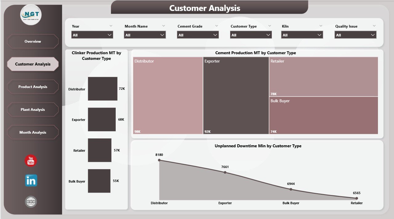
The Customer Analysis Page focuses on customer-driven production and downtime patterns. Every cement company deals with multiple customer types, such as:
-
Retail
-
Bulk buyers
-
Infrastructure companies
-
Contractors
-
Government projects
Each group impacts production planning and dispatch decisions. This page highlights those patterns.
Key Charts on the Customer Analysis Page
-
Clinker Production MT by Customer Type
-
Cement Production MT by Customer Type
-
Unplanned Downtime Min by Customer Type
What Insights Can Users Gain?
Click to Purchases Cement Industry Dashboard in Power BI
Users understand:
-
Which customer type drives the highest production
-
How demand varies across segments
-
Whether a customer group causes more pressure on production
-
How downtime impacts customer commitments
Because this page provides clear segmentation, managers take better decisions for pricing, contract planning, and production allocation.
3. Product Analysis – Why Is It Important?
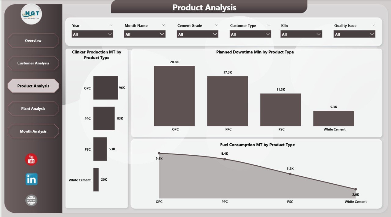
Cement companies produce several product types such as OPC, PPC, PSC, white cement, and blended cement. Each product type has different production requirements, downtime behavior, and fuel usage patterns. The Product Analysis Page helps users understand performance across products.
Charts on the Product Analysis Page
-
Clinker Production MT by Product Type
-
Planned Downtime Min by Product Type
-
Fuel Consumption MT by Product Type
Key Insights From This Page
Users see:
-
Which product type consumes more fuel
-
Which product type faces more planned downtime
-
How product-wise production performs
-
Which product line offers better stability
Because managers want to optimize costs and improve margin, this page becomes a major decision tool.
4. Plant Analysis – How Does It Support Multi-Plant Operations?
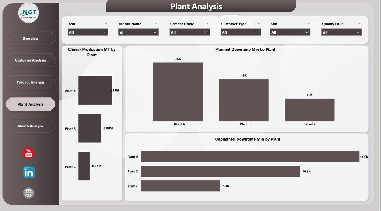
Cement companies usually run multiple plants in different regions. Each plant has different machinery, workforce strength, fuel usage, and shift patterns. The Plant Analysis Page helps teams compare performance across these plants.
Charts on the Plant Analysis Page
-
Clinker Production MT by Plant
-
Planned Downtime Min by Plant
-
Unplanned Downtime Min by Plant
Insights This Page Offers
Users understand:
-
Which plant performs the best
-
Which plant has frequent breakdowns
-
How downtime impacts productivity
-
How each plant uses fuel resources
Because of these insights, management improves maintenance planning, resource allocation, and performance benchmarking.
5. Monthly Trends – Why Are Trends Important?

The Monthly Trends Page shows how production and downtime change every month. Trend analysis helps users understand seasonal demand, plant stability, and cost variations.
Charts on the Monthly Trends Page
-
Clinker Production MT by Month
-
Planned Downtime Min by Month
-
Fuel Consumption MT by Month
What Users Learn From This Page
Users track:
-
Monthly production growth
-
Seasonal changes in plant performance
-
Increasing or decreasing downtime patterns
-
Monthly shifts in fuel consumption
Because trend data guides future planning, companies reduce risks and improve forecasting accuracy.
What Are the Advantages of the Cement Industry Dashboard in Power BI?
This dashboard offers many benefits to plant managers, production teams, and business leaders.
1. Clear Operational Visibility
Users see all KPIs in one place. They understand performance quickly without checking multiple files.
2. Faster Decision-Making
The dashboard updates instantly. Users spot issues early and respond before delays impact output.
3. Better Resource Optimization
Teams track downtime reasons, fuel consumption, and production efficiency. They allocate resources more effectively.
4. Improved Customer Service
Customer-wise analysis helps teams plan dispatch and production better.
5. Higher Plant Efficiency
Plant-wise comparison identifies best performers and highlights improvement areas.
6. Accurate Trend Forecasting
Monthly insights help managers plan maintenance and production schedules.
7. Reduced Manual Effort
Power BI automates the entire reporting process. Teams spend more time on analysis and less on data preparation.
How Does the Dashboard Improve Decision-Making in the Cement Industry?
Decision-making becomes easier because:
-
Data updates automatically
-
Visuals show clear patterns
-
Users compare plants, products, customers, and months
-
Slicers allow instant filtering
-
Managers explore “What-if” scenarios
When teams rely on real-time visuals, they find gaps early and make corrections quickly.
Best Practices for Using the Cement Industry Dashboard in Power BI
Click to Purchases Cement Industry Dashboard in Power BI
Follow these best practices to get the best results:
1. Maintain Clean and Updated Data
Update the Excel or ERP data frequently. Clean data produces reliable insights.
2. Use Slicers to Explore Multiple Views
Always use the slicers for month, plant, product type, and customer type. This makes your analysis deeper.
3. Monitor Downtime Regularly
Track both planned and unplanned downtime. Even small variations can impact production heavily.
4. Compare Plants and Products Often
Benchmarking helps teams understand best practices and fix issues across plants.
5. Review Monthly Trends
Look at trends before planning shutdowns, fuel purchases, or production shifts.
6. Share Dashboard Insights With Teams
Encourage operations, maintenance, and management teams to use the dashboard every day.
7. Automate Data Refresh
Set up scheduled refresh in Power BI Service to remove manual efforts.
8. Keep Visuals Simple
Use clean visuals so teams understand the message instantly.
Conclusion
The Cement Industry Dashboard in Power BI helps cement manufacturers gain full visibility of production, downtime, fuel consumption, dispatch performance, and customer demand. Because the dashboard provides five powerful pages—Overview, Customer Analysis, Product Analysis, Plant Analysis, and Monthly Trends—teams understand their operations from every angle.
This clarity helps companies increase production efficiency, reduce downtime, optimize fuel usage, and improve decision-making. As a result, the dashboard becomes an essential tool for modern cement plants that want to grow with confidence.
Frequently Asked Questions (FAQs)
1. What is the Cement Industry Dashboard in Power BI?
It is a ready-to-use reporting solution that shows production, downtime, fuel consumption, customer insights, and trends through interactive visuals.
2. Who uses this dashboard?
Plant managers, production teams, quality teams, maintenance departments, logistics teams, and senior management use this dashboard daily.
3. What data sources can connect to this dashboard?
You can connect Excel files, SQL Server, SAP, ERP systems, or any structured data source.
4. How does this dashboard improve plant performance?
It highlights production gaps, downtime issues, and fuel consumption trends. Users fix problems quickly and improve efficiency.
5. Can we customize the visuals?
Yes, you can modify charts, add KPIs, change slicers, and include new metrics based on business needs.
6. Does the dashboard support multiple plants?
Yes, the Plant Analysis page compares the performance of every plant.
7. Why is trend analysis important for cement companies?
Trends help users plan maintenance, identify seasonal patterns, and improve forecasting accuracy.
Visit our YouTube channel to learn step-by-step video tutorials