Managing change in modern organizations never stays simple. Every system update, infrastructure upgrade, or process modification brings cost, risk, and user impact. Because of this, leaders must monitor changes closely and act fast when trends move in the wrong direction. That is exactly where a Change Management Dashboard in Power BI becomes essential.
In this in-depth guide, you will clearly understand what a Change Management Dashboard in Power BI is, why organizations use it, how it works, and which insights it provides. Moreover, this article explains every dashboard page in detail, its advantages, improvement opportunities, and best practices. Finally, you will find frequently asked questions that help you implement the dashboard with confidence.
What Is a Change Management Dashboard in Power BI?
Click to Purchases Change Management Dashboard in Power BI
A Change Management Dashboard in Power BI is an interactive analytical tool designed to track, evaluate, and improve the performance of organizational changes. It transforms raw change request data into easy-to-understand visuals, KPIs, and trends.
Instead of reviewing lengthy reports or scattered spreadsheets, decision-makers use this dashboard to:
-
Monitor change costs and risks
-
Track user satisfaction levels
-
Analyze change requests by category, type, and owner
-
Identify problem areas before they escalate
Because Power BI updates visuals dynamically, the dashboard delivers real-time insights that support faster and smarter decisions.
Why Is Change Management So Important for Organizations?
Change management directly affects operational stability, employee satisfaction, and customer experience. Without proper tracking, even small changes can turn into costly failures.
Common challenges without dashboards
-
Delayed approvals and unclear ownership
-
Rising costs without accountability
-
High-risk changes going unnoticed
-
Declining user satisfaction
-
No visibility into monthly or regional trends
However, when teams use a Change Management Dashboard in Power BI, they gain transparency and control across every stage of the change lifecycle.
How Does a Change Management Dashboard in Power BI Work?
This dashboard works by connecting structured data, usually stored in Excel, SharePoint, or a database, to Power BI. The data includes change request details such as cost, risk level, owner, category, and satisfaction rating.
The process usually follows these steps:
-
Data Collection
Teams record change-related data in a standardized format. -
Data Modeling
Power BI organizes relationships between tables like requests, costs, owners, and timelines. -
Visualization
Charts, slicers, and KPI cards present insights clearly. -
Interactivity
Users filter by region, change type, owner, or month to explore deeper insights.
As a result, stakeholders see one trusted source of truth instead of disconnected reports.
Key Features of the Change Management Dashboard in Power BI
Before diving into each page, it helps to understand the overall strengths of this dashboard.
Click to Purchases Change Management Dashboard in Power BI
Core features include:
-
Interactive slicers for flexible analysis
-
KPI cards for quick performance checks
-
Cost and risk monitoring
-
User satisfaction tracking
-
Trend analysis across months
Because of these features, teams stay informed and proactive at all times.
What Pages Are Included in the Change Management Dashboard in Power BI?
This dashboard contains five well-structured pages, each designed to answer specific business questions.
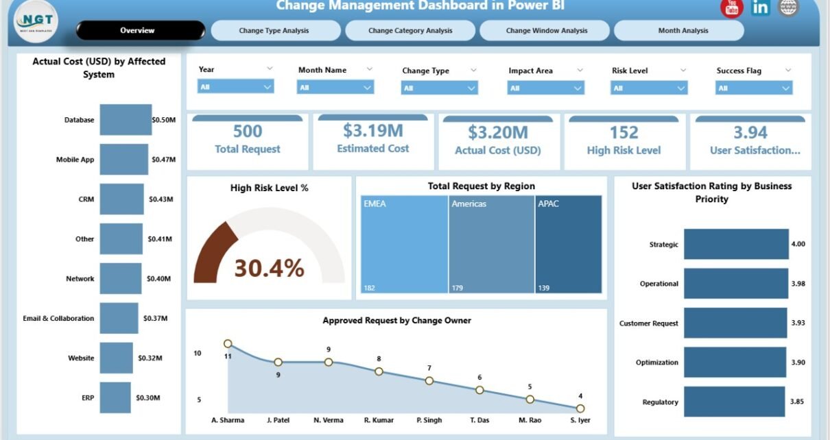
Overview Page: What Snapshot Does It Provide?
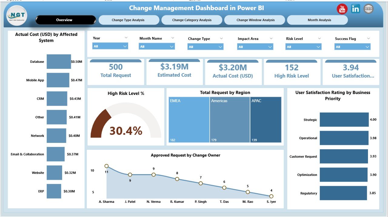
The Overview Page acts as the control center of the dashboard. It gives a high-level summary of all change management activities.
Key elements on the Overview Page:
KPI Cards
These cards display quick metrics that support fast decisions. For example:
-
Overall change performance indicators
-
Summary of requests and risks
Charts Included:
-
Actual Cost USD by Affected System
Shows which systems drive the highest actual costs. -
High Risk Level %
Highlights the proportion of risky changes. -
Total Request by Region
Helps identify regions with heavy change activity. -
User Satisfaction Rating by Business Priority
Connects satisfaction scores with business importance. -
Approved Request by Change Owner
Evaluates approval patterns across owners.
Because slicers appear on this page, users can instantly filter the entire dashboard by region or other dimensions.
Change Type Analysis Page: How Do Different Change Types Perform?
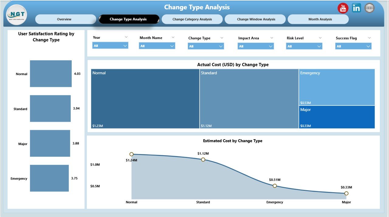
The Change Type Analysis Page focuses on comparing performance across various types of changes.
Charts on this page include:
-
User Satisfaction Rating by Change Type
Shows how different change types affect user experience. -
Actual Cost by Change Type
Highlights cost-intensive change categories. -
Estimated Cost by Change Type
Compares planned versus actual expectations.
Since this page groups data by change type, managers can quickly spot which types need better planning or stricter controls.
Change Category Analysis Page: Which Categories Need Attention?
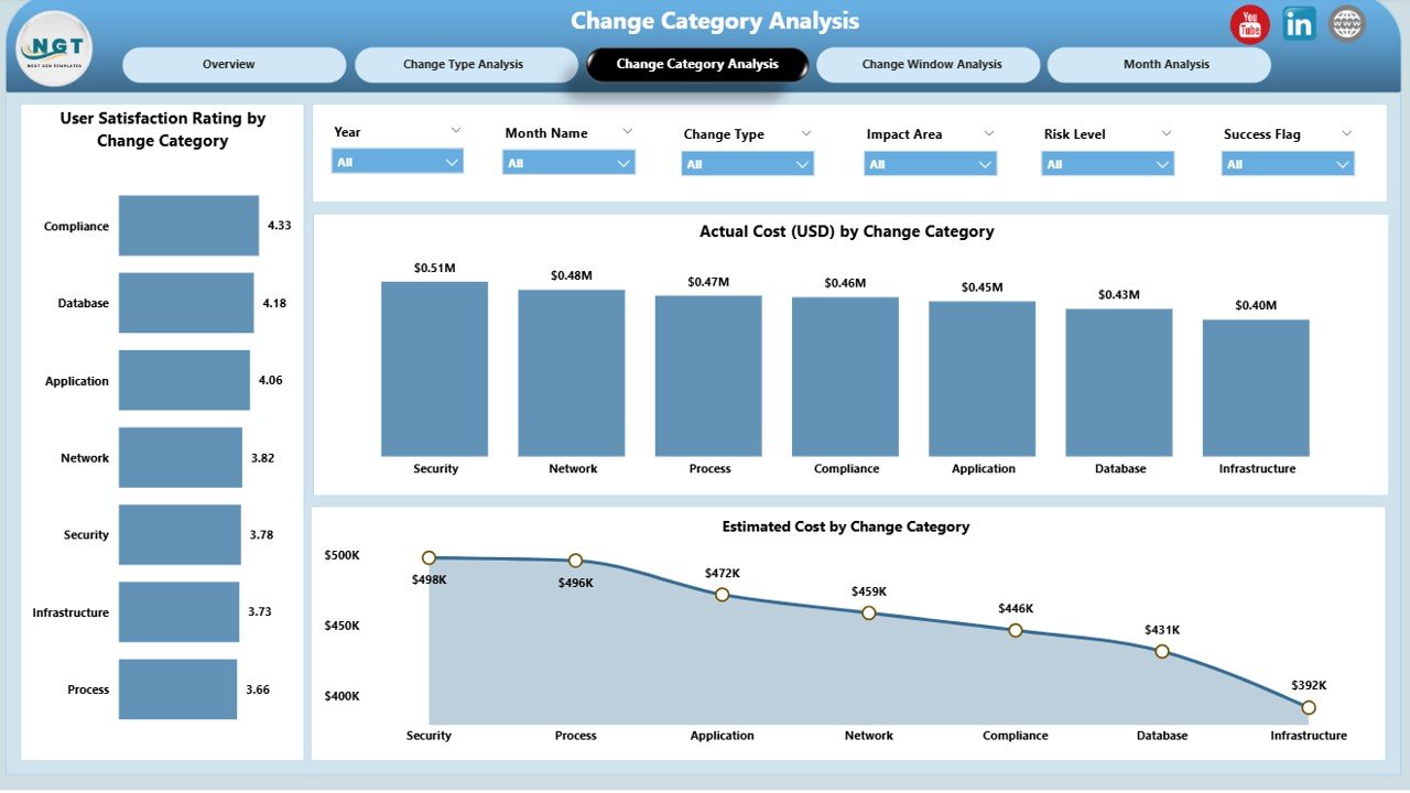
The Change Category Analysis Page helps teams understand performance across broader change categories.
Insights provided on this page:
-
User Satisfaction Rating by Change Category
Identifies categories that impact users positively or negatively. -
Actual Cost by Change Category
Exposes spending patterns across categories. -
Estimated Cost by Change Owner
Reveals how accurately owners estimate costs.
Because category-based insights reveal patterns, leaders can prioritize process improvements where they matter most.
Change Window Analysis Page: How Do Owners and Windows Affect Outcomes?
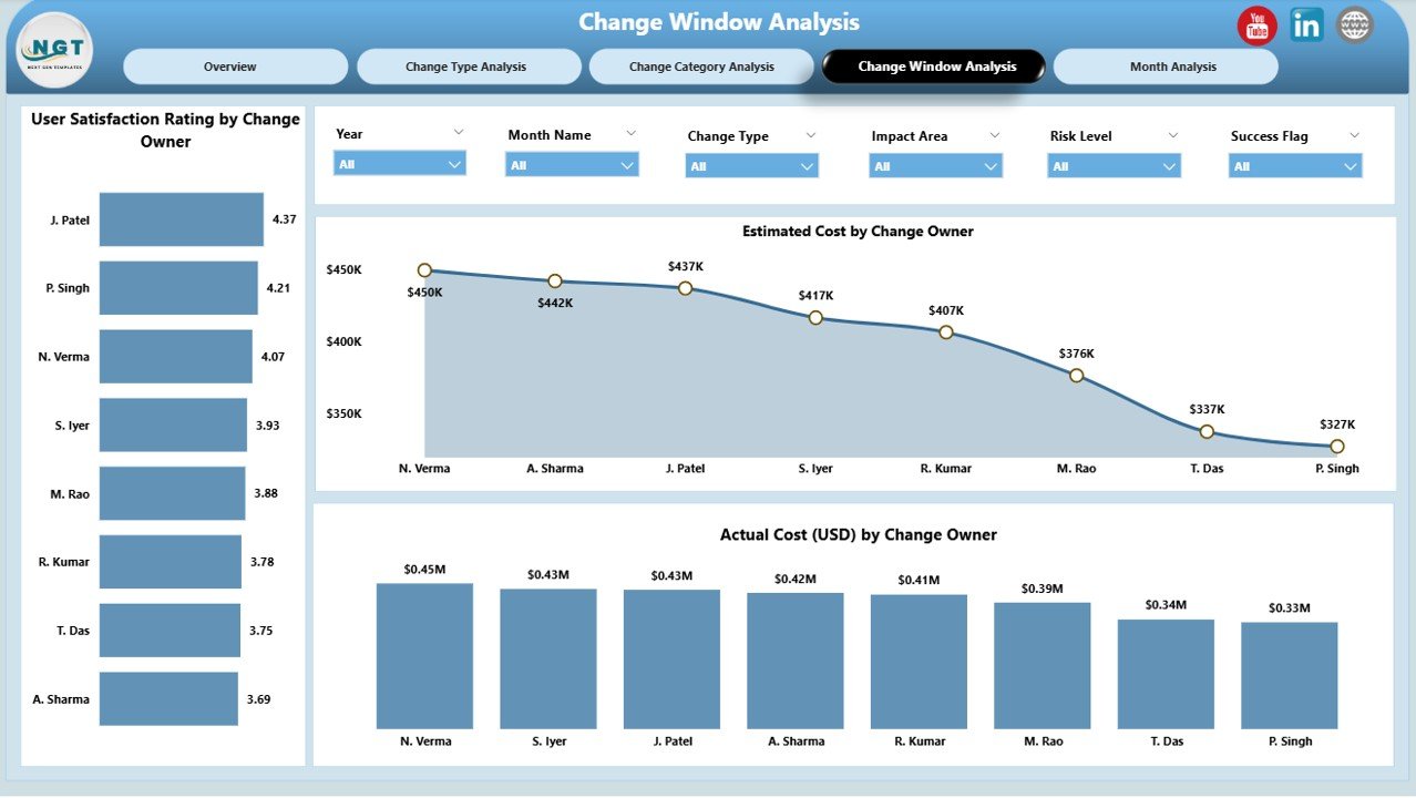
Timing plays a critical role in successful change management. The Change Window Analysis Page helps teams analyze performance by owners and execution windows.
Key visuals include:
-
User Satisfaction Rating by Change Owner
Compares owner effectiveness. -
Actual Cost by Change Owner
Highlights cost efficiency by owner. -
Estimated Cost by Change Owner
Evaluates estimation accuracy.
Since this page connects cost, ownership, and satisfaction, it improves accountability across the organization.
Click to Purchases Change Management Dashboard in Power BI
Monthly Trends Page: What Patterns Appear Over Time?
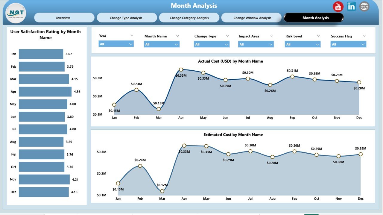
The Monthly Trends Page shows how change management performance evolves month by month.
Charts included:
-
User Satisfaction Rating by Month
Tracks improvement or decline in user experience. -
Actual Cost by Month
Shows monthly cost fluctuations. -
Estimated Cost by Month
Compares expected costs over time.
Because trends reveal seasonal or recurring issues, this page supports long-term planning and forecasting.
Advantages of Change Management Dashboard in Power BI
A well-designed dashboard delivers clear business value. Below are the major advantages explained simply.
✅ Advantages
-
Centralized Visibility
All change data stays in one interactive report. -
Faster Decision-Making
Leaders spot issues instantly through visuals. -
Improved Cost Control
Teams track estimated versus actual costs clearly. -
Better Risk Management
High-risk changes stand out immediately. -
Enhanced User Satisfaction Tracking
Feedback connects directly with change outcomes. -
Accountability Across Owners
Performance comparisons encourage responsibility.
Because of these advantages, organizations reduce change failures and improve overall efficiency.
Opportunities for Improvement in Change Management Dashboards
Even strong dashboards can evolve further when teams refine them.
🔧 Opportunities for Improvement
-
Add automated alerts for high-risk changes
-
Include SLA or approval time tracking
-
Integrate rollback success metrics
-
Add predictive insights using historical data
-
Enable drill-through to individual change records
By enhancing these areas, organizations unlock even greater value from their dashboards.
Best Practices for the Change Management Dashboard in Power BI
Following best practices ensures accuracy, adoption, and long-term success.
✅ Best Practices
-
Standardize Input Data
Use consistent formats for dates, categories, and costs. -
Define Clear KPIs
Align metrics with organizational goals. -
Keep Visuals Simple
Avoid clutter and focus on clarity. -
Use Slicers Thoughtfully
Allow filtering without overwhelming users. -
Validate Data Regularly
Ensure data quality through periodic checks. -
Secure Sensitive Information
Apply Power BI role-based access where required.
When teams follow these practices, dashboards stay reliable and trusted.
Who Should Use a Change Management Dashboard in Power BI?
This dashboard benefits multiple roles across the organization.
Ideal users include:
-
IT Change Managers
-
Service Delivery Teams
-
Project Managers
-
Operations Leaders
-
Risk and Compliance Teams
-
Senior Management
Because the dashboard adapts to different views, each stakeholder gains relevant insights.
How Does Power BI Make Change Management Better Than Excel?
Excel works well for data entry, but Power BI excels at visualization and analysis.
Key differences:
-
Power BI supports interactive visuals instead of static charts
-
Dashboards update automatically with refreshed data
-
Users explore data without editing formulas
-
Large datasets perform better in Power BI
Therefore, organizations often use Excel as a data source and Power BI for analysis.
Conclusion: Why Should You Use a Change Management Dashboard in Power BI?
Change never stops. However, unmanaged change always creates risk, cost overruns, and dissatisfaction. A Change Management Dashboard in Power BI solves this problem by turning raw data into actionable intelligence.
Because it provides visibility into costs, risks, satisfaction, ownership, and trends, the dashboard empowers leaders to act quickly and confidently. When organizations adopt this dashboard, they reduce failure rates, improve user trust, and build a culture of controlled change.
Frequently Asked Questions (FAQs)
What is the main purpose of a Change Management Dashboard in Power BI?
The main purpose is to track change performance, cost, risk, and satisfaction using interactive visuals that support faster decisions.
Can this dashboard use Excel as a data source?
Yes, most organizations store change data in Excel and connect it directly to Power BI.
Is Power BI required to view the dashboard?
Users need Power BI Desktop or Power BI Service access to view and interact with the dashboard.
Can this dashboard handle large datasets?
Yes, Power BI efficiently handles large datasets when models are properly designed.
How often should the data be refreshed?
Most teams refresh data daily or weekly, depending on change volume.
Can organizations customize KPIs and visuals?
Absolutely. Power BI allows complete customization based on business needs.
Visit our YouTube channel to learn step-by-step video tutorials