Managing channel sales becomes easy when every insight stays organized in one place. Because brands work with multiple distributors, partners, retailers, and online platforms, they need a clear view of sales performance. A Channel Sales Dashboard in Excel delivers this clarity. It shows all important KPIs, trends, and comparisons in a simple visual format so managers make faster and better decisions.
In this detailed article, you will learn everything about a Channel Sales Dashboard, including how it works, why companies use it, what benefits it offers, and how you can build or use one effectively. You will also explore page-by-page features, best practices, and answers to common questions.
Click to Purchases Channel Sales Dashboard in Excel
What Is a Channel Sales Dashboard in Excel?
A Channel Sales Dashboard in Excel tracks and displays sales performance across different channels such as retail stores, distributors, online platforms, wholesalers, and direct sales. It converts monthly and yearly data into easy-to-understand visuals like charts, cards, and tables. This dashboard helps you compare channels, measure profitability, check customer segments, and monitor product categories.
Because the dashboard runs entirely in Excel, you do not need special tools or advanced coding skills. You only update the data sheet and the visuals update instantly.
Why Do Businesses Need a Channel Sales Dashboard?
Sales teams deal with multiple categories, channels, months, regions, and customer segments. When this data stays scattered across files, teams lose time and accuracy. A Channel Sales Dashboard solves this problem because it:
-
Organizes all sales KPIs in one place
-
Shows performance instantly
-
Allows monthly, regional, and channel-level comparison
-
Helps managers take decisions based on facts
-
Improves forecasting and planning
As a result, teams respond faster to market changes and improve revenue.
Key Features of the Channel Sales Dashboard in Excel
This dashboard includes five professionally designed analysis pages, each offering unique insights.
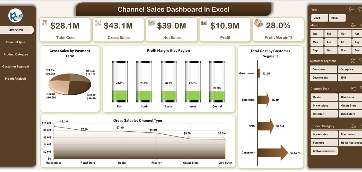
1. Overview Page – Your Main Control Center
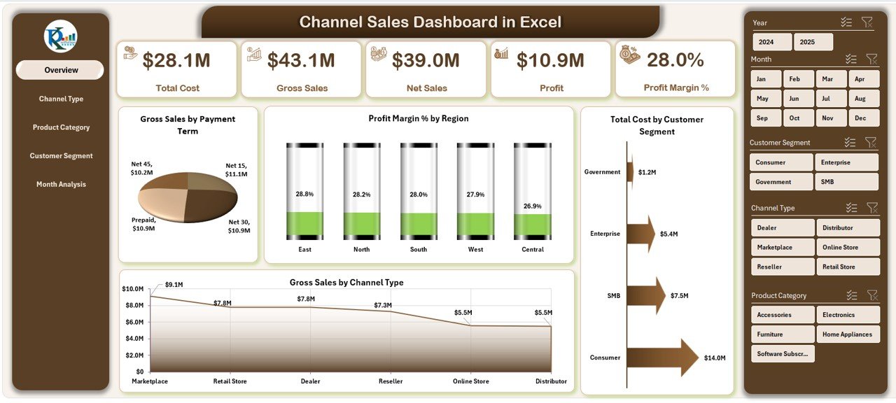
The Overview Page gives a quick view of overall sales performance. It helps managers understand what is happening across all channels at a glance.
Highlights of the Overview Page:
-
Page Navigator on the left
-
Five insight cards
-
Four powerful charts
Charts on the Overview Page:
-
Gross Sales by Payment Term
-
Profit Margin % by Region
-
Total Cost by Customer Segment
-
Gross Sales by Channel Type
These visuals help you identify high-performing channels, profitable regions, and cost-heavy customer segments instantly.
2. Channel Type Analysis Page
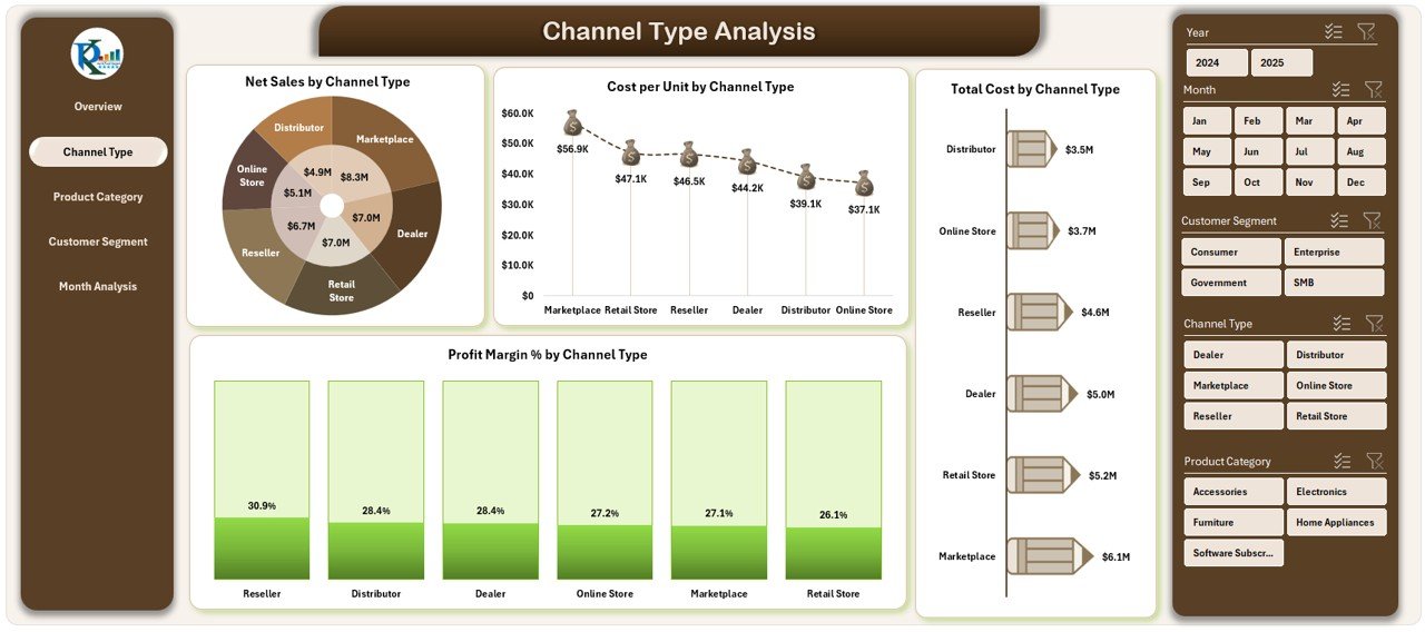
This page shows how each channel performs individually. Because every brand relies on multiple sales channels, these insights help you optimize strategies.
Charts on this page include:
-
Net Sales by Channel Type
-
Cost per Unit by Channel Type
-
Total Cost by Channel Type
-
Profit Margin % by Channel Type
You understand which channel brings the most revenue, which channel costs more, and where profitability improves.
3. Product Category Analysis Page
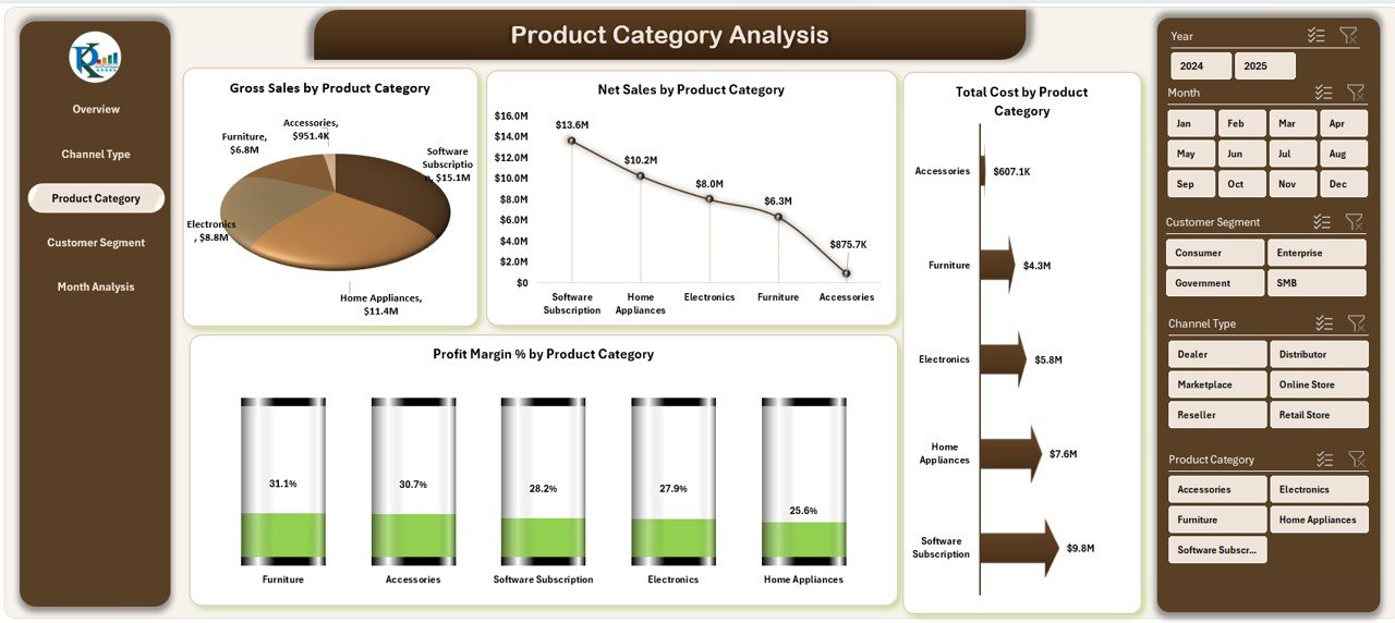
Every product category behaves differently in the market. This page highlights these variations and helps you make data-driven decisions.
Charts included:
-
Gross Sales by Product Category
-
Net Sales by Product Category
-
Total Cost by Product Category
-
Profit Margin % by Product Category
This way, you see whether to promote a high-margin category or reduce investment in low-performing categories.
4. Customer Segment Analysis Page
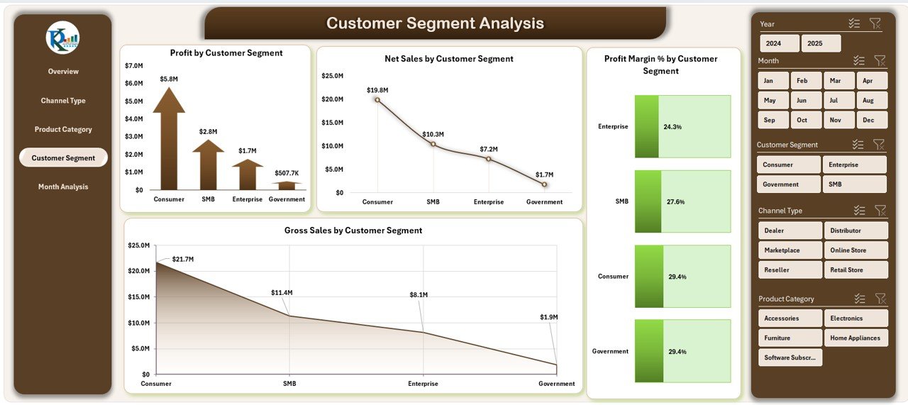
Customer segments influence profit and sales trends. This page shows detailed metrics for each segment.
Charts in this section:
-
Profit by Customer Segment
-
Net Sales by Customer Segment
-
Profit Margin % by Customer Segment
-
Gross Sales by Customer Segment
You immediately see which customer groups generate the most revenue and which need improvement.
Click to Purchases Channel Sales Dashboard in Excel
5. Month Analysis Page
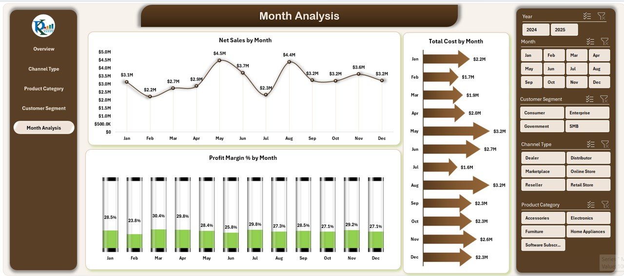
Monthly trends help brands understand seasonal changes, growth patterns, and cost behavior.
This page displays:
-
Net Sales by Month
-
Total Cost by Month
-
Profit Margin % by Month
Sales managers use this page to monitor monthly progress, compare previous periods, and plan sales targets.
How Does a Channel Sales Dashboard Work?
The dashboard connects with a data sheet where you enter sales information. This includes:
-
Sales Amount
-
Net Sales
-
Gross Sales
-
Channel Type
-
Customer Segment
-
Product Category
-
Profit Margin %
-
Total Cost
Once you update the data sheet, charts, cards, and analytics update automatically. Because of this, the dashboard delivers real-time insights without any manual calculations.
Why Should You Track Channel Sales in Excel?
Excel remains a powerful analysis tool. You can customize dashboards, apply formulas, add new visuals, and control the structure easily.
Excel-based dashboards give you:
-
Flexibility
-
Zero cost for software
-
Easy data entry
-
Unlimited customization
-
Simple sharing with teams
-
Support for advanced formulas
Because of this, small businesses, medium companies, and large enterprises use Excel dashboards daily.
What KPIs Should You Track in a Channel Sales Dashboard?
A strong dashboard includes KPIs that reflect sales performance clearly. You can track:
-
Gross Sales
-
Net Sales
-
Profit Margin %
-
Cost per Unit
-
Total Cost
-
Customer Segment Sales
-
Monthly Sales
-
Channel Type Profit
-
Product Category Sales
-
Region-wise Profitability
These KPIs help you measure financial health and operational success.
Advantages of Using a Channel Sales Dashboard in Excel
A Channel Sales Dashboard creates multiple benefits for sales teams. Here are some advantages:
1. Better Decision-Making
Managers understand performance across all channels instantly. Because insights appear clearly, decisions become smarter and faster.
2. Improved Profitability
The dashboard shows profit margin trends. You can adjust pricing, channel strategies, or product focus to improve profitability.
3. Faster Performance Tracking
Teams save time because they no longer search multiple files. The dashboard shows updated performance instantly after entering new data.
4. Enhanced Planning and Forecasting
Sales trends, monthly comparisons, and customer insights help companies plan better and forecast accurately.
5. Increased Sales Transparency
Every stakeholder sees the same data. Because of clear visuals, communication improves across departments.
Best Practices for Using a Channel Sales Dashboard in Excel
You gain more value from the dashboard when you follow best practices. Use these strategies for maximum performance:
1. Keep Data Updated
Update the data sheet regularly. Daily or weekly updates increase accuracy and make insights more meaningful.
2. Use Standard Naming Conventions
Consistent names for products, regions, customer segments, and channels help Excel process data efficiently.
3. Remove Unnecessary Data
Avoid extra columns or duplicated entries. Cleaner data improves dashboard speed.
4. Apply Filters Before Importing Data
Filtered data gives more accurate visuals and makes analysis simple.
5. Review KPIs Every Month
Check which KPIs reflect actual business performance. Add or adjust KPIs when needed.
6. Protect Your Dashboard
Use sheet protection or password features so no one changes formulas or charts accidentally.
7. Use Conditional Formatting
Highlight lower margins, higher costs, or declining sales trends to improve visibility.
8. Automate When Possible
Use formulas like SUMIFS, COUNTIFS, IFERROR, and VLOOKUP to reduce manual work.
How to Customize the Channel Sales Dashboard
Click to Purchases Channel Sales Dashboard in Excel
You can customize the dashboard based on your company needs. Here are some ideas:
-
Add new KPIs
-
Include slicers for easy filtering
-
Add regions, branches, or partners
-
Create new charts
-
Add trendlines for analysis
-
Insert comparison cards
-
Add currency conversion
This flexibility makes Excel dashboards powerful and scalable.
Conclusion
A Channel Sales Dashboard in Excel empowers sales teams with clear, meaningful, and actionable data. It helps companies track channel performance, optimize product categories, manage customer segments, and control monthly trends. Because the dashboard updates automatically, teams save time and improve decision-making. When you follow best practices, you get accurate insights and reach your sales goals faster.
This dashboard is perfect for brands that want quick visibility, smooth analysis, and data-driven sales performance.
Frequently Asked Questions (FAQs)
1. What is a Channel Sales Dashboard in Excel?
It is a visual tool that tracks and displays sales insights across different sales channels in one Excel file.
2. Why do companies use Channel Sales Dashboards?
Companies use dashboards to analyze performance, compare channels, measure profitability, and plan better.
3. Does this dashboard work with all Excel versions?
Yes, it works in most modern Excel versions without add-ins.
4. Can I customize the dashboard?
Yes, you can modify charts, KPIs, slicers, and calculations easily.
5. Does the dashboard update automatically?
Yes, it updates as soon as you refresh or change the data sheet.
6. Which KPIs should I include?
You should include Gross Sales, Net Sales, Profit Margin %, Total Cost, Customer Segment Sales, and Channel Sales.
7. Can beginners use this dashboard?
Yes, the dashboard is simple and requires basic Excel knowledge.
8. How often should I update the data?
Weekly or monthly updates give the best insights.
9. Can I add more product categories or regions?
Yes, Excel supports unlimited customization.
10. Does this dashboard support large data sets?
Yes, Excel handles moderate to large datasets very well with proper cleanup.
11. Can this dashboard replace CRM tools?
It cannot replace CRM tools, but it supports strong sales analysis.
12. How does this dashboard help improve revenue?
It highlights best-performing channels and helps adjust strategies for better profit and growth.
Visit our YouTube channel to learn step-by-step video tutorials
Click to Purchases Channel Sales Dashboard in Excel